Creating a website for the first time, any tips???
-
@Whitney-Simms I agree with @NessIllustration about watermarking. There are situations where unobtrusively placing a name or contact info in a corner or similar can be useful. I'm not a pro so take with a grain of salt, but someone stealing can remove a watermark anyway and someone caring about what's in your portfolio may save it and want to find you later. If it looks good I think a name or logo is acceptable, but not a watermark.
-
@ThisKateCreates i think what they meant by watermarks are like those ones stock image websites are using, huge, almost covering the entire image, or small yet repeated like a pattern all throughout.
 Now, Regarding stealing images. If the images are of low resolution they can’t actually do much about it. If they’ll print it on merchandise and stuff, it’ll look unpleasant. I don’t think most images need a watermark but i believe putting your signature or your website is very useful. If they posted it on their own platforms, removed your signature/logo and claim it as theirs, i guess you can’t do much about that other than calling them out and reporting them. However, this is more seldom than we think. Like what @NessIllustration said, most people won’t even know about your website. But if you do want your image to be secured, i guess you can also get a copyright for it.
 -
@ThisKateCreates @nyrrylcadiz @NessIllustration
You guys are great! Thanks for your input! Finally got the resolution that looks right on the page. It’s going much faster. 150 dpi works my images are pretty small so they look nicely on the screen at that resolution
-
You have to accept the fact that your images are going to stolen and they may even be sold or used on products without your permission. You can’t stop it.
Some of my work was being sold online on t-shirts, and used on websites. There is nothing you can do about other than send a C&D letter if you can find an actual address.
-
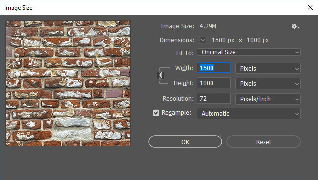
@Whitney-Simms Also worth considering tagging the copyright metadata and description in your images then if they do get stolen you can normally find them with a browser images search. Also useful for image search in general. 72 dpi is native resolution for online.
-
@sigross I don’t know what you’re talking about, but I will do that.
I’m not really worried about things getting stolen. That’s just part of this game these days. I just didn’t know if that was something professional people did. I see some images watermarked and others not.
I tried 72 dpi, but it made my images tiny. Still trying to work my way around this whole thing. There’s a learning curve for real.
But the website it up! Not even close to finished or polished. But I got a chunk uploaded today. And something is better than nothing. So for today, I’ll take the steps in this direction as a win!
The website it:
-
@Whitney-Simms Looking good!
 Be careful though: the first thing I see when I click is a warning that the site isn't secure and asking me if I want to continue anyway. This means your SSL security certificate isn't installed yet. The SSL is what gives a website that green lock in the address bar that tells people it's safe. You should have gotten a free one with SquareSpace, so make sure you look into installing it to secure your website!
 -
@NessIllustration thanks! It’s a work in progress. I did the verification thing a little bit ago. Hopefully that fixed it. If not I’ll look into it. I had to click on something before I went to the website as well. Then i saw something in my email to secure it. Fingers crossed!
-
@Whitney-Simms In Photoshop CC when you change resolution just increase the pixel count.


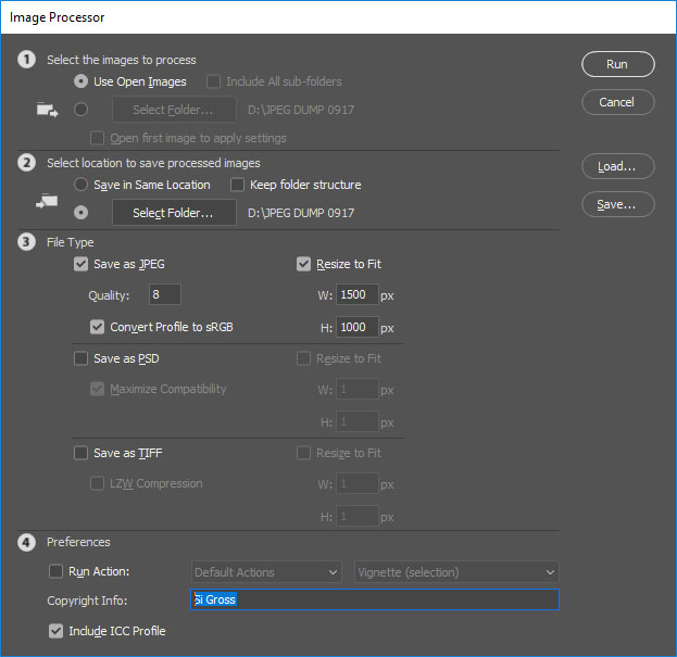
or you can do it all in FILE - SCRIPTS - Image Processor
if you have a few files to resize and copyright tag and want to do it as a batch command or with added actions -
@Whitney-Simms I checked just now and you have the green lock, you're all good!
-
@sigross magic! That’s awesome! I will totally use that trick! Hey, I bet i can upload a fold instead of regular images too. I’ll check that out. But changing the resolution for the whole folder sounds amazing! So much easier. Thanks for the tips!
-
Great tips from @sigross ! A standard desktop screen is 1920 pixels wide, so your web images never need to be bigger than that. A great web size is 1080-1350 pixels wide.
-
When it comes to compression of images, two website I used when I need to change file size quickly are:
- http://tinypng.com - good file compression for web-based images
- https://bulkresizephotos.com - bulk resizing of images. Great if you are uploading a bunch of images and you want them all to be the same size.
Something a little more advanced, but essential if you have a bunch of images on your site is the use of a Content Delivery Network (CDN).
A content delivery network (CDN) refers to a geographically distributed group of servers which work together to provide fast delivery of Internet content. A CDN allows for the quick transfer of assets needed for loading Internet content including HTML pages, javascript files, stylesheets, images, and videos.
I believe Squarespace has their own CDN options.
For SEO benefits, and also if you are considering an online store in the future, I would install an SSL certificate.
SSL certificates are small data files that encrypt data packets as they are sent through the Internet. SSL is often used to transfer data logins and credit card information online.
It's what makes an HTTPS an HTTPS instead of HTTP

Again, I believe Squarespace offers this as an option.
Lastly, install Google Analytics. This provides data on people who have come to your website and the actions they have taken. This helps measure your personal marketing efforts online and can help you make a decision about what is the most effective use of your time.
Also, regarding watermarking - watermark with your website URL or social media tag (eg I could watermark with @nathan_creates - maybe even include the Instagram icon to make it extra clear). If people do post your stuff online without permission, at least the URL will lead people back to you

Hope that helps

-
@Nathan dude, that’s so much information. But good stuff I have no clue about. I do remember google analytics from my blog a hundred years ago. I’ll check on that again. I saw an SEO (or whatever the acronym is) as a tab on square space. I’ll check into that as well. I know I paid for the business package. I hope that means I got that option. I know I got the option of selling things on the website. I don’t remember seeing CDN, but that could be because I didn’t know what that was either.
This is all extremely helpful information! The goal is to look more professional, but I may end up being professional so I better make sure I have my ducks in a row.
-
@Whitney-Simms No worries. Those are things I always recommend. They aren't essential to get a site up and running. However, later down the track when you get some traction, installing those things when you have site with heaps of images, and multiple pages can be a pain in the arse.
Better to get it in early, set and forget

-
@Whitney-Simms Congrats on getting the site up! Ship happens. Lol
Lots of good knowledge here too! -
The website is live! Most of my work is on it. I might have two more collections to add. I even got my friend to edit my “about me” page. Although, I think I still missed a few things in editing.
What do you think? Any glaring eye sores? Or things i could tweak?
www.whitneysimmsstudio.com
link text -
@Whitney-Simms It's SOOOO lovely!! Congrats on your hard work, it really paid off! My favorite part is how after scrolling through one of your lovely collections (which are full of high wuality content so it can take a while to scroll) the collections menu is right there at the bottom so you don't have to go all the way back up or hit the back button to see the other collections! I love this streamlined navigation experience!
-
@NessIllustration thanks for checking it out! I really had no idea what to do about the website. Squarespace had an awesome template. All i really knew was I wanted it crisp and clean. It was funny about the scrolling, I totally wanted to be a click slide show. I was working on it on the computer and scrolling was a pain. Then... on my phone I scrolled and was like “ah ha, that’s why it scrolls.” Is glad you saw how easy it was to continue looking at different collections. Still, not my template, but so stoked they had one that knew what i would want better than I did. Totally worth the money. Now, if I could only learn to write those darn descriptions. I wonder who actually reads those anyways.
-
@Whitney-Simms My guess is not many people! I have to admit I skipped them myself because they seem a bit long and mostly emotion-based (I felt like drawing pretty pink blush butterflies, etc.) I myself prefer short and to the point description that give the important info (client if there was one, goal, year made...) and leaves out flowery descriptions. That's just me though, there may be a lot of people who actually like the descriptions? And they can always skip them if they're not into them. To me it just feels like a lot of words without much purpose, but I'm an overly "straight to the point" kind of person haha...