Feedback Wanted on Illustration
-
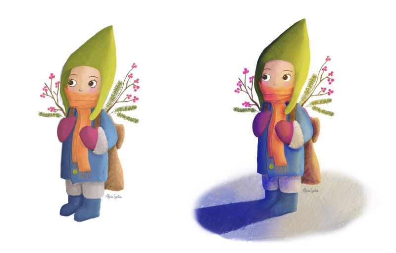
@alicia-spilde welcome to the forums, as far as feedback goes I would push more on the occlusion shadows. I think that would push the forms more.
-
@chip-valecek thank you! I'm going to try to make that change today and see how it goes.
-
I wouldn't worry too much about jumping about classes, I was the exact same but seemed to settle after I had had a wee look at most of them

I really like your style and palette choice.
I do feel some things look quite flat, like the scarf.
Also the eyes look different from the rest of the art work, this may be a design choice but it stands out (think they would look really nice if it was animation)
But over all I really like it and would love to see more (background, characters)Sorry my feedback is a bit rubbish, I have never done it until joining this forums and feel a bit out my depth sometimes.
-
I love the colors you chose and the texture is really nice. I agree with Chip's advice some really dark shadows in where the light can't get to.
Also with the eyes what you could do is vary the line weight - thicker at the top and skinny on the bottom, or loose the bottom all together, let the line taper, it will feel more like an eyelash and help the eyes sit better, hope i'm expaining that properly.
Having said that if you are new to digital illustration this is a fantastic start, in my opinion.
-
Welcome to the forum! The character looks like a fine start in my opinion. As far as personal touches I would echo what @Chip-Valecek said and suggest also to add a cast shadow on the ground to, well, ground the character and the shadows you already have. Your light source seems to just be a bit of white, which you may have intended, but I suggest experimenting with warmer tones like orange or yellow. Just a little bit of that warmer light on everything will help unify all the colors and help with the shadows to make your character look it exists in a real space even if it's stylized. As @Craig-Imrie pointed out the eyes feel disconnected somewhat. Maybe adjusting the value would help. You've got a good start that might just need a few details worked out. Nice!
-
@Craig-Imrie thank you for the feedback. I am going to work on making things not look so flat. Also, the eyes, yes they def need work. I really struggle with those.
@Phil-Cullen thank you for the tip on the eyes. Eyes are a definite weakness for me. I am going to try the technique that you described.
@Jon-Anderson I'm going to have to do a bit of searching to learn how to do the warmer light. I was concerned with veering off my color palette and making things look awful. I appreciate your encouraging words and feedback.
Thanks again, everyone! I am going to get busy working on this and hopefully I will have a second draft to show soon.
-
@alicia-spilde The nice thing about working digitally is that you can make a new layer on top, try the new idea, and then scrap it if you don't like it without destroying the progress you have (just make sure its on a new layer by itself). The white as you have it is fine I was just merely suggesting something else to try. There are a few SVS classes that touch on the subject or you can search for different lighting videos on YouTube that specifically use Procreate and try the methods that feel most comfortable. Once you grasp the concept (it seems complicated but it really is simple) you'll have a fancy new trick up your sleeve.
-
@jon-anderson Thank you! I really appreciate the help and encouragement.


-

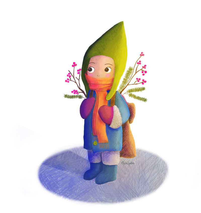
@Chip-Valecek, @Craig-Imrie, @Jon-Anderson, @Phil-Cullen - I worked on this today. :). Just wanted to show you what I accomplished with the feedback. With this second draft, is there anything glaring that should be improved? Thank you!
-
@alicia-spilde curious character. I love the pointy hat. I'd check your shadows though. Stand a fat marker up on your desk or a piece of fruit. And shine a torch at it, in the direction of where you want the light to come from. My guess is the big shadow is about 10 o' clock from where you have put your light and shadows.
-
@alicia-spilde I think the shadow on the ground seems a little too dark for the lighting you have. Other than that I think it looks good.
-
@jon-anderson ok thanks!
-
@sigross thanks, I'll do some experimentation with the shadow. Appreciate the help!
-
@alicia-spilde looking good, I do agree with @sigross that the shadow on the ground should be pointing more toward 10 o'clock vs 9ish.
-
@sigross and @Chip-Valecek I changed the shadow. This does look better. Thank you!

-
@alicia-spilde spot on. Good stuff.
-
@alicia-spilde perfect! I also like how you softened it up.
-
Looks awesome

-
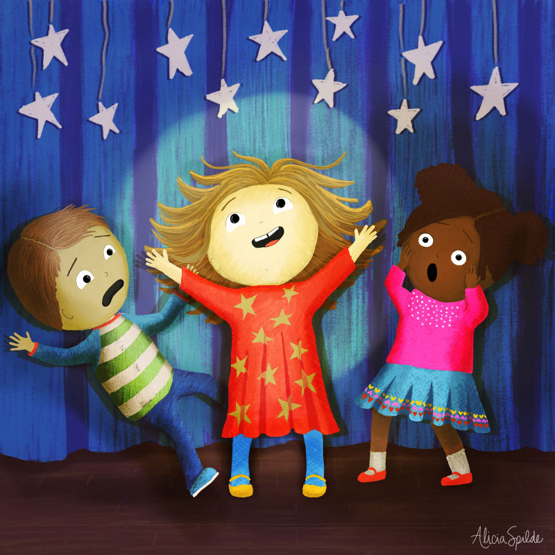
I’m back with another illustration that I’d like feedback on. I learned so much with the feedback last time, so thank you for that!
When you look at this illustration, what would you tweak? My inspiration was a children’s holiday program, where one little girl steals the show and knocks over a classmate in the process.
