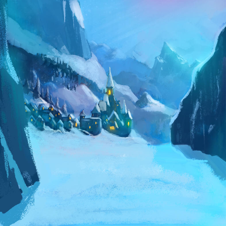
Frozen fanart- Environment practice
-
@Leontine beautiful, I love the feel of it!
-
lovely work!!
-
@Nille-Horgen wowww, is it for sale? love it thanx!
-
@Lynn-Larson Thank you Lynn! have a nice weekend!
-
@Thrace-Shirley-Mears Thanx Thrace! Wish you a wonderful weekend!
-
@Leontine Your painting has a beautiful monochromatic color scheme with warm emphasis in the windows. I also enjoy the mood it creates.
Quick tip, use a little atmospheric perspective for the mountains behind the castle. The link has lots of examples but the basic definition of atmospheric (or aerial) perspective is: depth in a landscape is created by making stuff more pale/lighter as it recedes.
I use it A LOT in my landscapes:
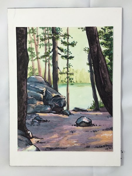
Photo example:
Have fun! And keep practicing! It took me time to use this technique effectively and I'm still working on it.
http://www.littlelobo.com
@LittleLoboArt - Twitter, Instagram, Pinterest -
Did you use a movie still as a reference or was the idea that this is some concept art you created that would fit in the Frozen universe?
If you had a reference it'd be good for crits if you could post it--it would give a better sense of where your hits and misses are.
One thing that jumps out to me is the large glacier-like structure on the right. It seems somewhat flat compared to the other forms--the shadow definitely helps define it thought.
Cute scene!
-
Hi @Leontine,
I think you are really off to a great start. One of the things that made the art almost magical and winter wonderland like was the colors.
I know in some parts of the movie it is very dark blues/grays but the overall feeling of the movie (for me anyway) are the scenes were the backgrounds are covered in snow but the blues are saturated and the highlights more turquoise. Which also carries over into the the sky which then also adds in wonderful pinks/purples from aurora borealis or perhaps Elsa's magic.
And I am well aware of the fact that I am the guy who might be a little too heavy handed on saturated colors and need to dial them back from time to time (thanks to input from everyone here) but I do feel like some hints of teal, pink and or purple added in would bring them more to life.
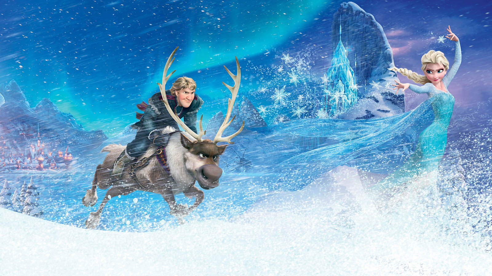
Here are a few samples of the movies original art, that I found online that show what I am talking about.
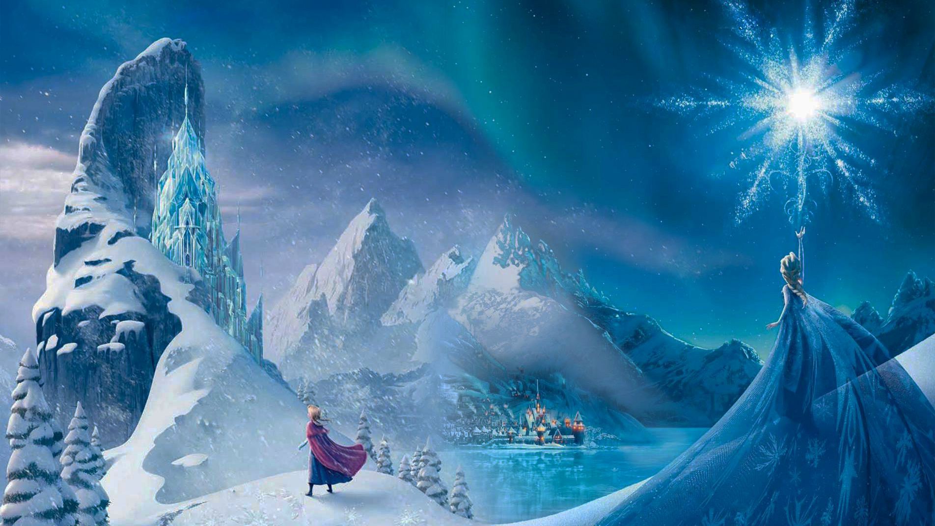
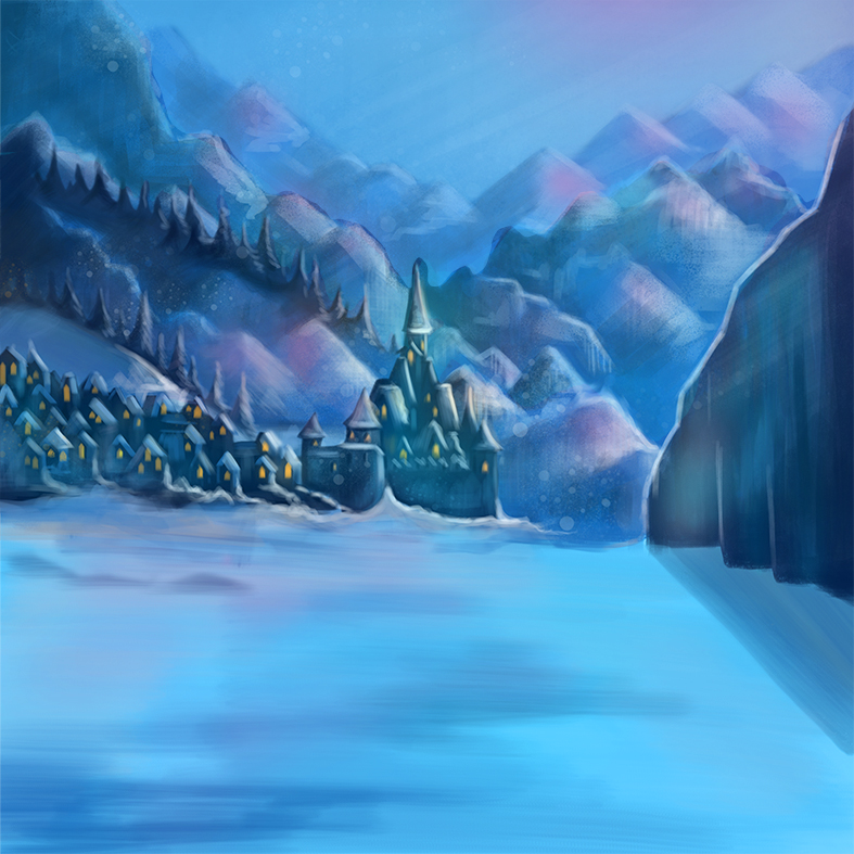
And then here I took your piece and faded some of the background mountains to add depth and worked in a little bit of pinks/teals in some of the highlights etc to start adding in that feeling we all have after in our memory of the movie Frozen.
Hope this makes sense and if of help to you!
-
@Rich-Green Do you own The Art of Frozen book? It's amazing. Also (funnily enough because of our other conversation in the Rapunzel thread), The Art of Tangled is one of my favourite art books. Seeing the research and vis dev they went through to nail the aesthetics is amazing to see but the best bit about it are all of the Glen Keane pencil sketches of poses and lines of actions for the characters.
Ace
-
@Ace-Connell I do not have the Art of Frozen or Tangled yet - but they are both in my Amazon wish list! I follow a few of the visual development artists from both of those films on various social media sites and am always thrilled when they share a piece they had worked on during the production process. Now I really want to get those books asap!
Glen Keane is amazing - I am a huge fan. All of those iconic characters - Ariel, Beast, Aladdin, Rapunzel, Tarzan - the list goes on and on!
Speaking of Art of Disney books - I did just get The Art of Disney Golden Books and I love it. It does not have a lot of the research and pencil work (there is some) but it does have such incredible pieces created by some of the greats at Disney over the years. And it really brings me back to my childhood as I read those very books over and over and over again - seeing as back then you could only see the movie if it was in the theaters. So you had to rely on these books to bring the stories to life afterwards.
-
@Rich-Green Yeah, I have the Golden Books one. I have a daughter who's 4 and I use her as an excuse to collect all the individual books as well haha. I've also got the Mary Blair Golden Books one and it's always great looking at her stuff. She's always complimented on her simplicity, but it's her layout that I think is her killer move. The Tangled art book is better than the Frozen one for me, although seeing the original Elsa character designs where she has black hair and looks kinda gothic is pretty cool. Haha we're suck geeks!
Ace
-
Hi Leontine, Here's a super quick paint over if you want some feedback. The reason for the paint over is that I want to encourage you to break up your shapes a bit more and think about the bigger masses. You have too much uniform shapes and sizes. If you look back at the mountains, they are all triangles and the same size, all your trees are on the ridgeline and are all the same shape and size, then all the houses are also the same size. So break that stuff up and make it more random if you can. Again, focus on bigger masses.
In terms of paint, watch out for it getting too soft on you. Edge control is crucial and you need to maintain sharp edges where needed. I did this paint over with a chalk brush set to 100% opacity. Then add the environmental "misty" look on top of those soft edges to create atmospheric haze.
Anyhoo, hope it helps some. I'm super excited to see you challenging yourself. Keep it up!
SVS Faculty Instructor
www.leewhiteillustration.com -
@Lauren-M. Thanx Lauren! Ill try it!
-
@mattramsey thank you! Ill be working on it!
-
@Rich-Green thats a very good gesture, thank you!
-
@Lee-White Thanks Lee, I think your right. I had to put it down quicker and use bolder strokes. Ill try again!
-
@leontine the place is not for sale. It has been a violinist called Ole Bull who owned before. And he is one of our famous musicians of course. But they hade guided tours in it. And you can find several houses like theese in small scales. But this is my favorite. The movie should have been even more true to norwegian houses. But thats me, still love the movie!
About your painting i dong know if anyone has said anything yet but i would have had more rough texture / strokes. And maybe even more something that can make the snow more sparkling in the moonlight:D
LoveLove Nille
-
@Nille-Horgen Thanks Nille! love the Norwegian houses. Ill try some bolder strokes.
-
@Leontine I really like this. Is it digital or traditional, I can't tell off the screen. Very cold.
