Chicago Treasures Project - Rapunzel
-
hi Rich, What a great idea! I love the style and the composition. There is one small thing, thats the hair of rapunzel. I would not let it wrap around the birdhouse. The horse is walking so as they continue walking it will be nasty. Now i think it might be nice to give the horsebud" some space and wrap the two tails together. For the rest chapeau!
-
I wanted to include some of my earlier steps in this thread as well - just to show some of my progression on this piece.
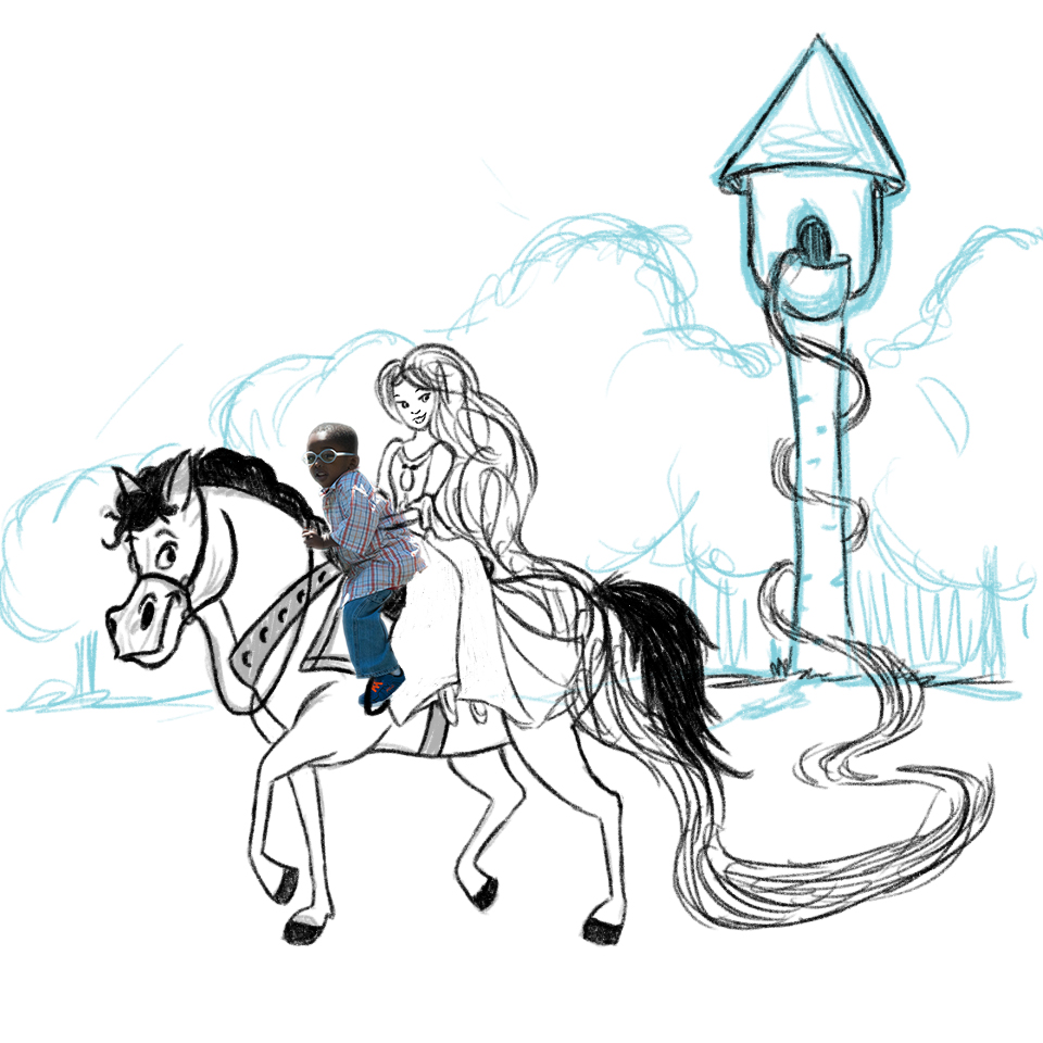
First was the original sketch. At the time I had the tower larger and closer to the characters but that will change as we need to make room for the sign etc.

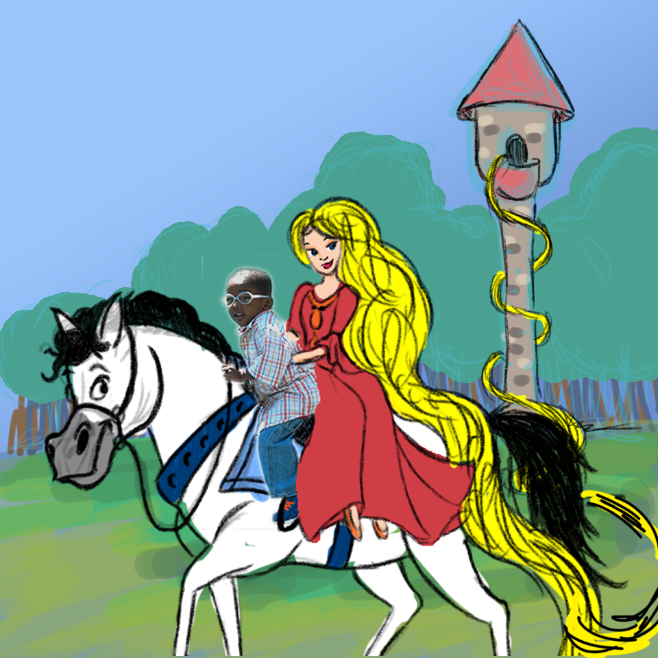
I then did a simple color block just to try and get a feel for the image - knowing that I would not really use pure yellow for the hair etc. In this one I moved them even closer to the foreground but did not like that as much as I wanted to provide more depth and layers.

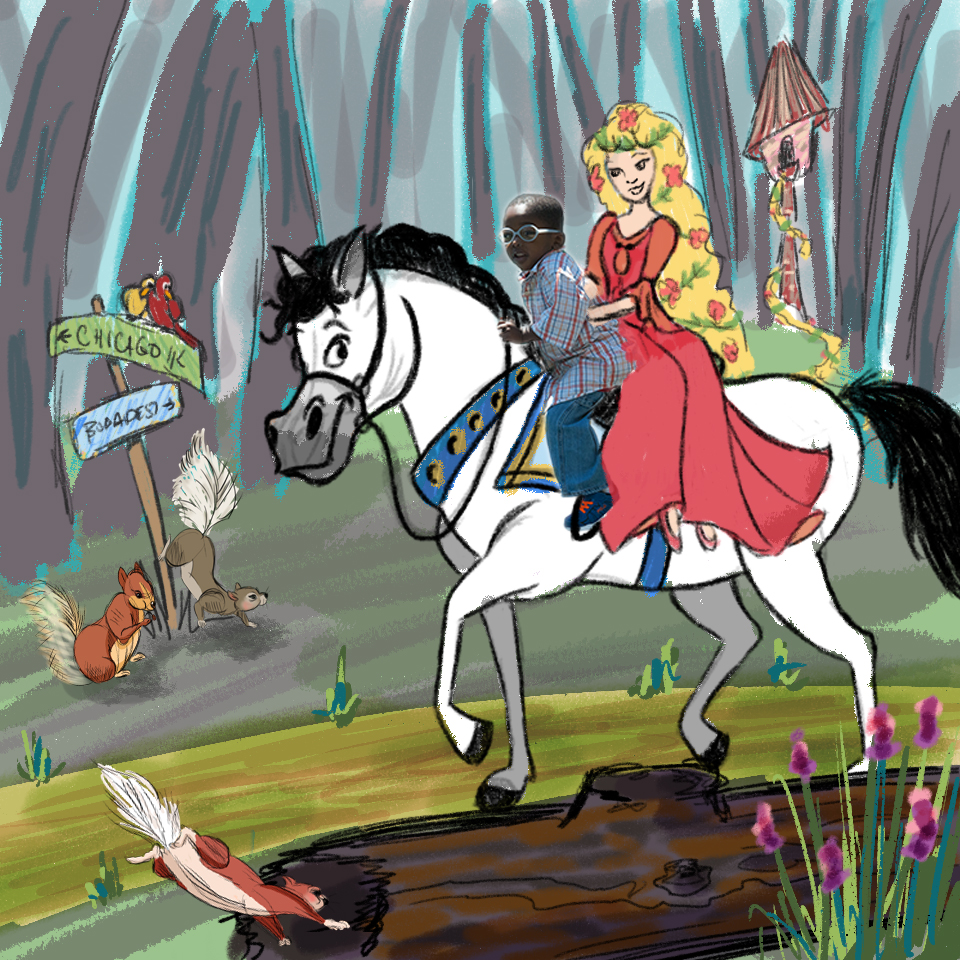
So then once I had to add in the sign - it made sense to move them back and push the tower further into the distance to really give the entire scene more depth than I had. I also moved them into the forest (as opposed to be out in front of it). I thought that seemed more accurate with him being by her tower which was hidden deep in the forest. And here is where I also began to change the tower into a structure that looked more like a bird house. I did not want to do a traditional castle tower, or something too close to the version in the movie Tangled so I thought a bird house would be a good starting point as she is so close to nature and animals around her this way.

As I mentioned I took a whole bunch of time to study other illustrations of forest settings. I pulled out colors, tried to understand the layering and how they achieved the illusion of sunlight coming through. This really took me a while but I feel like it made me so much better, already, at not only forest but other color/light/rendering techniques and picking up on subtle details.
-
Thank you so much @Lynn-Larson. I will certainly let you know about the book once it is released (scheduled for sometime in 2016). And I think it is so neat that you are aware of the Chicago Lighthouse organization, such a small world really!
-
Rich, this is a beautiful project and you should be so proud of what you are doing! Very nice work!!
-
Hi @Leontine-Gaasenbeek - thank you so much. You know the realist in me thought about how her hair would probably get caught around the tower (the same way my garden hose gets caught on everything in the yard when I am trying to unwind or reel it in). But then I also wanted it to have this real sense of fantasy and to lead the eye back up to the tower where the hero just saved her from. Since each scene only gets one image in the book - I felt like it tells the story a bit more and adds visual interest but I definitely see what you mean..hmmmm
-
Really cool idea! Love trying to integrate reality into illustrations and I think you did a great job.
One quick crit though. The lighting hitting the boy is very direct and crisp (casting hard shadows since he's in full sunlight). The light hitting the boy isn't hitting anything else which takes away from the illusion a bit. Maybe try hitting some other spots with direct sunlight and dapple it on the ground a little. This would also cast a shadow from the boy across the Rapunzel and really integrate the two.
Cool job. Show us more when you get a chance. : )
-L
-
@Lee-White first all of I can I just geek out for a moment and say how exciting it was to see that you had provided a comment on this project!
I love how much time and energy you give to everyone here and your advice is always such a wonderful learning tool for me when I see it on other threads.
Yes I can see exactly what you are saying about the lighting and it was certainly one of my biggest challenges in merging the real with the illustration. In the real photo the sun appears to have been above and actually coming from slighting behind the boy (the side of him we can not see). So his face and everything are all in the shadow. But I did not wan to illustrate the scene in that way so I took out some of the bright light off the back of his shirt and toned it down some in other spots to try and slightly adjust the positioning of the light source relative to the new surroundings
But I agree after reading your comment and studying it again with fresh eyes that it could be pushed further. I will definitely revisit it and see if I can get the effect you have recommended!
Thank you so much for taking the time to view this work and provide this feedback, much appreciated!!!
Rich -
Thank you so much @Thrace-Shirley-Mears! I can not tell you how much fun it is to be able to re-imagine these classic stories and work in these amazing little kids. I just think to myself how neat it will be for them and their families to see the final images and make them all feel special for a little while!
-
This is very interesting and I think you got a lovely style there.
-
You have a great concept going here. I too enjoy your style. Keep sharing your work!
-
What a wonderful project to be involved with. I agree with the comments on lighting so I won't go further. I say that I like how you've integrated the child's clothing color to the horse. However, I think Rapunzel's colors stick out with all the yellow, pink and orange. Perhaps you could find a way to get the colors to mesh better... ? Just my two cents. Great work!
-
Wow thank you so much for the very kind words @Rob-Smith and @Naroth-Kean !
-
Hi @Katrina-Fowler - thanks for the input!
This is an interesting discussion as the colors for Rapunzel's dress are actually pulled directly out of the reddish/orange stripes in the boys shirt. (I wonder if the added shadows that Lee White pointed out that would fall from the boy onto Rapunzel will help set her in the scene better than adjusting the color?) I will have to see what happens.
I had also tried (while creating this) a few variations on the color of the flowers in her hair but I did not want them to be a perfect match to the colors of her dress - it became a little too matchy-matchy if that makes sense. And I also did want to draw attention to her hair as its what makes her special and magical.
But going back to the color story here - the colors on the horse (and the 6 pointed star shapes) are taken from the city of Chicago flag to help tie it back into the Chicago Lighthouse theme and the boy and his horse being from Chicago. And it just so happens to also tie into what the boy is wearing.
I love how you all are helping me to revisit this piece and challenging me to see this from different points of view! Thank you!!!