MARCH ILLUSTRATION CONTEST: OLD AND NEW
-
Love this month's prompt. Please see my entry. I just finished it last week and I had the same idea of 'Old and New' in my head while working on it. I just shared it a couple hours ago in another thread

Never grow up....


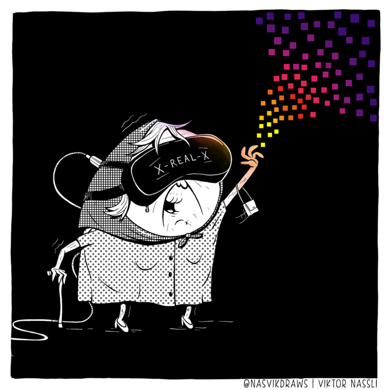
(UPDATE: added name and resized to 1200px)
It was inspired by an old lady in the park. She was very old, in a wheelchair with large sunglasses trying to catch soap bubbles with some little kids around. Such an innocent moment. ️
️Hope you like it. I can't wait to see the other entries

-
-
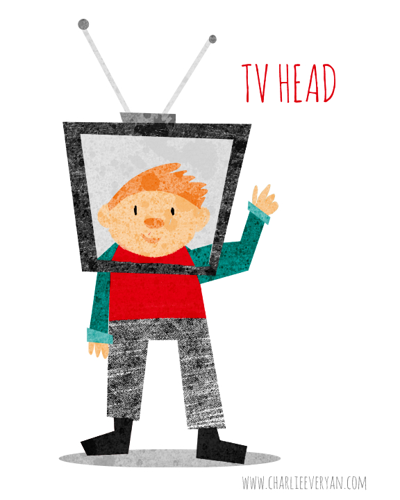
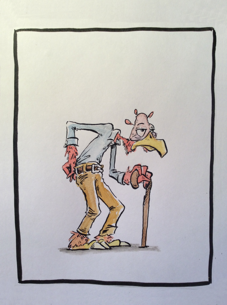
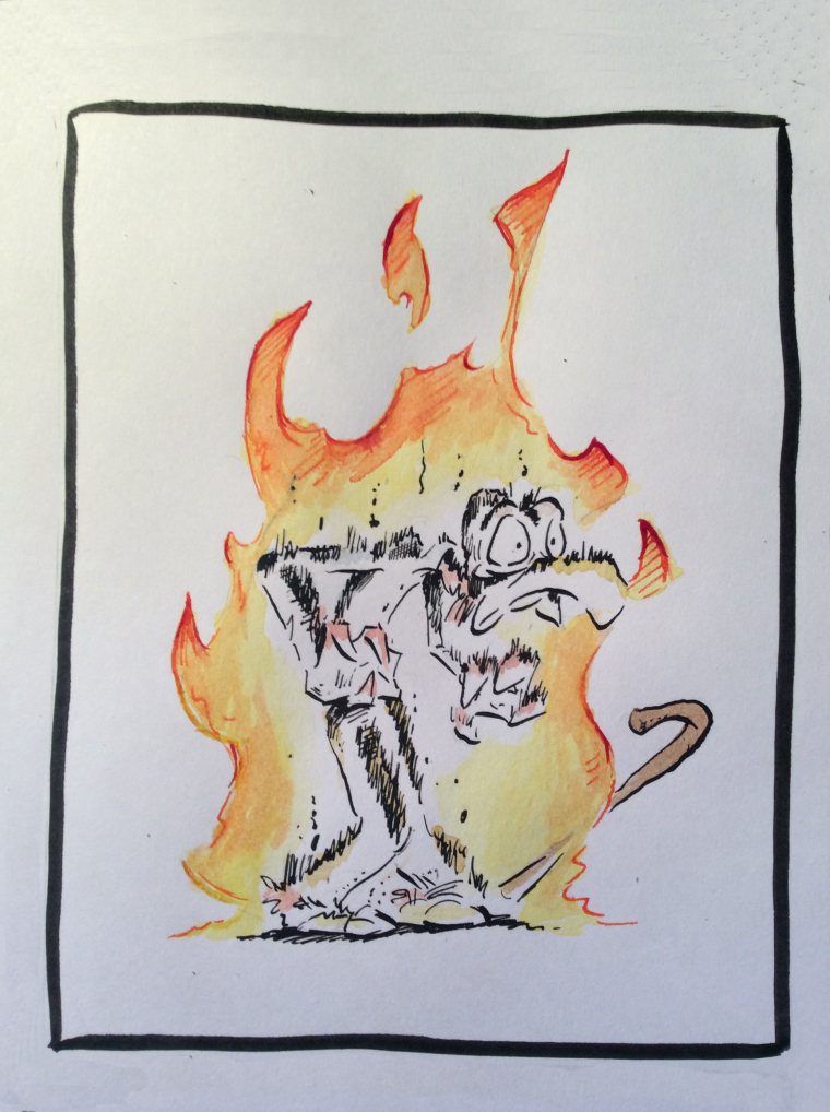
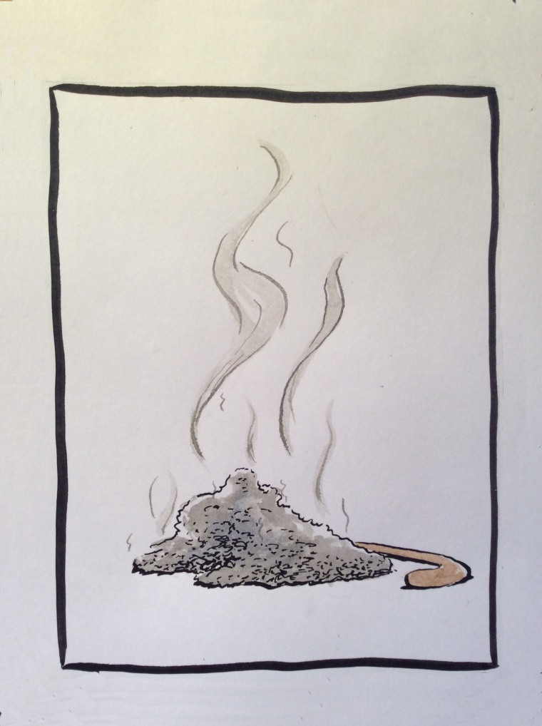
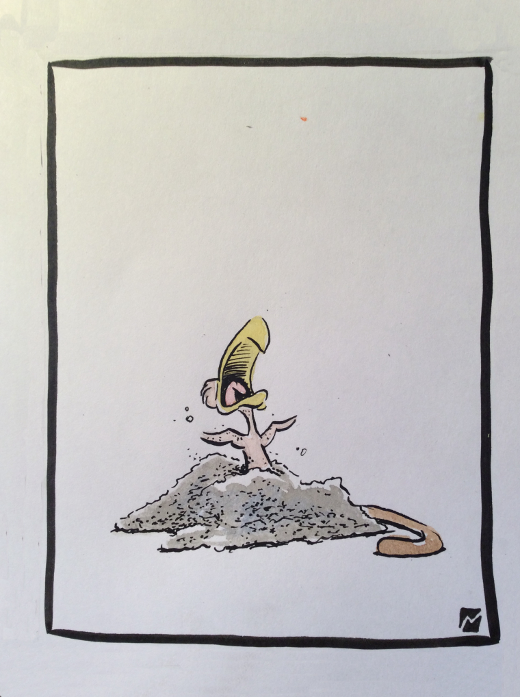
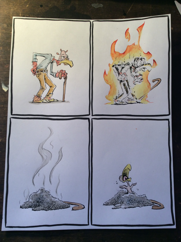
I liked the open ended prompt this month. I love comics because they use simple art to serve a simple purpose: Storytelling. I love that they're disposable, that once they've told their story, they can be discarded. And I love that comics seem to have been bestowed with as inherent silliness. So, using traditional pen and ink, I went with a simple silent comic strip gag. Enjoy.
-
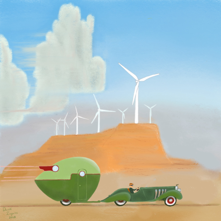 I have always admired the work of Robert LaDuke and thought this would be a fun challenge to play around with his style. I was thinking of all the scenic drives my family and I have made here in the west that are now watched over by these silent giants. I am awestruck be the knowledge and work they represent and at the same time discussed at the sight of them breaking up God’s handiwork.
 -
I'm super novice at digital drawing, as well as to SVS. I started using Procreate only about three weeks ago, so please go easy on me

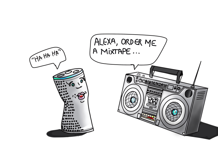
Old and new... hmmmmm... when I thought old, a beatbox came to mind, then I thought what is new 'relatively speaking' that could contrast that, I thought 'Amazon's Alexa'.
I tried to convey the current news about 'Alexa' laughing out loud randomly' tied in with contrasting the old Beatbox. Trying to be current (contemporary) ( for the fancy art people)

Really will appreciate some feedback/ideas/advice, I'm so ready to learn and grow.
-
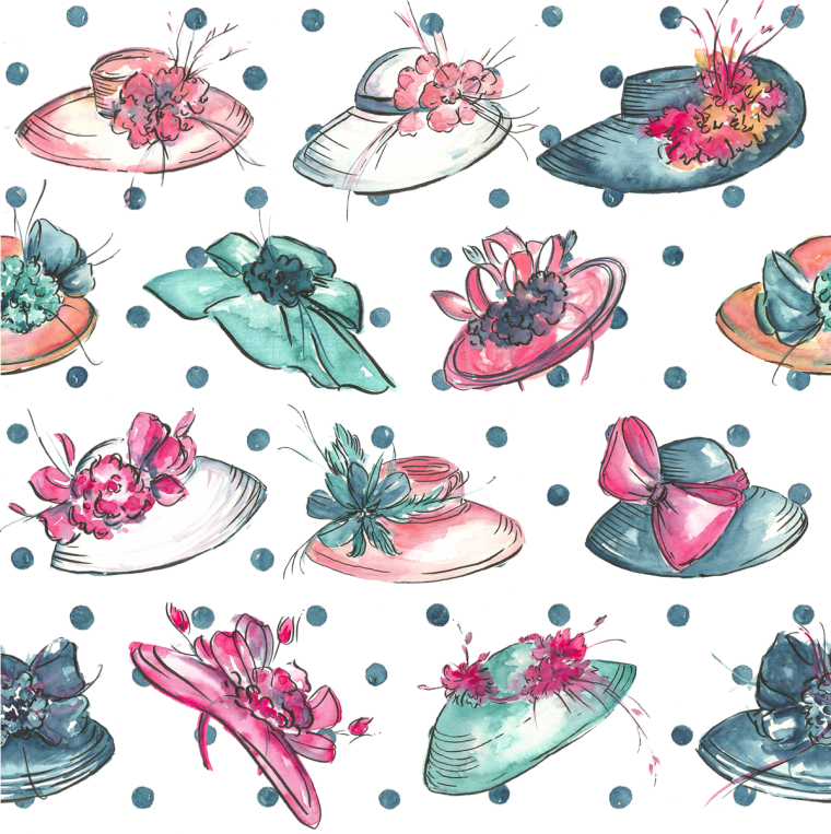
Is there anything more charming than the "old" tradition of the Kentucky Derby? It's a magical place where you can dream about the time that ladies get all dolled up to go out and gentlemen are just as dapper. Where does the "new" come in? Well, in welcoming new comers and being sweet as honey as you explain that wearing the hat brings good luck. And of course wearing the same hat and dress as the year before just won't do. Every lady loves to shop for her "new" attire that will just let her shine. The hat parade makes the derby "The two greatest minutes in sports."Sometimes hearing the explanations of people's work was the best part of a critique in school. This is a pattern design for spoonflower's "off to the races" challenge. Figured I would share. It fits in the theme? Right?
-
-
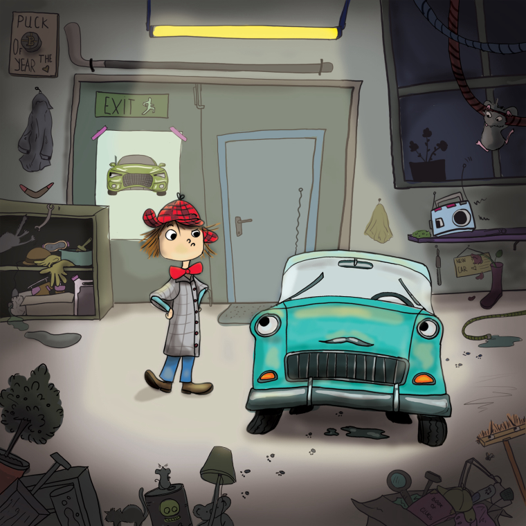
Ok so my little guy is having trouble deciding whether to sell his old friend and buy a new "terminator" or not. Some objects in his quite messy garage have split opinion about the whole thing. I hope it is all legible. Feel free to leave your comments.
SVS @orsi
Orsolya Orbán -
@davidingalls Livermore? I recognize that road

-
-
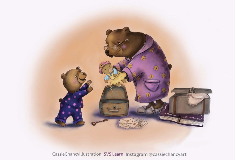
@cassie-chancy Super cute vignette. Love the little details, as well (suitcase key, letters, postcard, book, clothing, thread on teddy's skirt.
-
@johanna-kim thanks so much johanna! I am new to digital painting but learning so much from SVS. I see your work on Instagram and it is wonderful! Thanks for the kind words.
-
@cassie-chancy Wow! Looks great for new! I haven' t quite got to the digital point. Hope I can do as well!
-
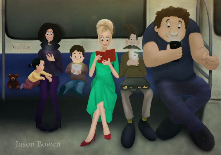
This is my entry into Old and New: Jason Bowen @jasonbowenoils
-
@marsha-kay-ottum-owen Thank you! Iv'e always struggled with photoshop so I got procreate and it's making it a lot easier for me to go digital. I highly recommend it!
-
@cassie-chancy Good to know! Thanks.
-
@jason-bowen I love this. Only one thing that kind of bothers me is the man between the book lady and the big guy is in need of some more contrast around the head . It is hard to discern without looking very close. It almost looks like his head is gone or very tiny. Or maybe it's a lady! Now I see the tall hair and the noustache (ha! ). Maybe a little sliver of lighness around the toddler's head too. I like how the book reader really stands out
 My older eyes might be part of the problem though. When I clicked on the pic to look at it larger the head was more
defined but I still think it needs a little bit of contrast against the light backing. -
@naters-calderone I love this so much, I have no desire to enter this month because who can top this one. Cracks me up every time I look at it.
-
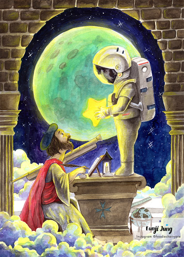
Just finished my entry for this month!
-
@eunji-jung Just--WOW. Very, very cool!!