Cover for Microactivist Foundation
-
Hallo All!
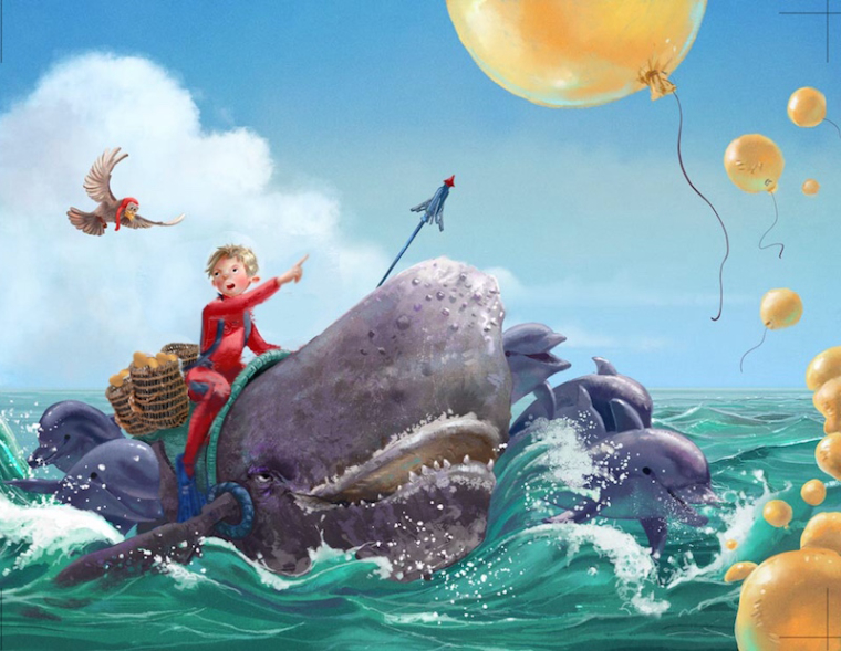
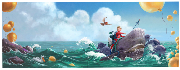
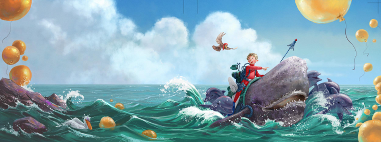
I've been working on a wraparound book cover for the Microactivist Foundation - it's a pro-bono project to support their campaign around the impact of balloon releases on the oceans. The subject matter has been very tightly art-directed, so there is no discussion with that. Same with color scheme, which has been agreed on a while ago.
I am looking for feedback on the painting itself. It's still unfinished and needs a lot of refinement and polishing. They specifically wanted a very rendered style, which I am more and more falling out-of-love with...but anyhow. I don't have a lot of time left for this, so I was wondering where to focus my effort: what looks most in need of refinement in your eyes?
-
@smceccarelli looking good! I particularly love the dolphins & rocks!
I can imagine the issues balloons cause marine life (which makes me think of The Great Pacific Garbage Patch, which saddens me)
The first thing I noticed:
I don't think it would take much effort, but I think I would suggest considering to pull more of the colors throughout. Specifically, there are 3 possibilities I see:
-
First, since it is used so strongly on the boy & bird, I'd consider pulling that red throughout. I see you've already gently hinted at it in the balloons (just as you did the green of the water in them), but I think that it could be stronger. It also could be seen more apparent in the whale's skin that's closer to the kid (such as a wet reflections or just more hints of red — BTW, the kid looks pretty dry for riding a whale in water) and in the mouth (note: I don't think it necessarily has to be the same hue or value of red, but enough to start pulling the eye around, and perhaps keep connecting back to that boy & bird) Maybe you could warm up various areas of the water too
-
Perhaps the rocks could have some yellow/orange hint in them. I do love that purple in them and would consider bringing that into the water (and maybe into the balloons, but that might be tricky since they are yellow/orange)
-
It might be worth considering hinting at these colors more in the clouds, I'm particularly thinking of the yellow/orange on the light side and the red/pink/violet/purples in the shadow areas (and perhaps more of the water's color in the bottom areas).
To be clear, I'm not advocating an explosion of color everywhere. I'm just thinking that the red stands out quite strong (which is good as a first read but is hard to lead away from) and that the illustration's elements are somewhat segmented or separate from one another in regards to the colors. The hopeful idea is that just a little bit more will go a long way.
The second thing I noticed:
To me, this seems a bit foreground heavy. Could there be something in the midground? Maybe more balloons or a buoy or a boat (maybe an oil tanker closer to or on the horizon line) or more bird silhouettes. I don't think it would take much and could firm up the sense of distance. Of course, perhaps the text & any other graphics added would take care of this.
Even if you didn't do these things (maybe I'm just plain wrong!), I think they are getting an amazing book cover, especially as a pro-bono! Congratulations on having & taking this opportunity. I'm sure the tight art direction was a little difficult, but the work is looking great and sounds like it gets to be part of a good cause.
-
-
@smceccarelli Very nice painting - for feedback i had just a couple of things that popped out - the horizon line and spear do not read as being straight to me - the spearpoint tips up relative to the shaft and the right of the horizon dips down relative to the the left - one other thing is perhaps the figure's pose - i like the pose you have - it has a nice "once more unto the breach" feel to it - i am thinking though that it makes the whale appear to have very little thickness at the point where the figures legs are - i did a quick sketch with the legs drawn up to see how it might look (i bent the arm and pointed it more toward most prominent balloon too) - i think your original is better of course but wanted to share the thought - lastly the accouterments on the boys back - was thinking the space between the boy and the bird seemed very active and wanted to see what it would look like without the gear on the his back - i thought it might add to the story to have giant creels around the boy too to show that he has been deflating and collecting the balloons all morning - really nice piece - it it great as is of course! Just sharing my thoughts


-
@smceccarelli wow, I don't know what to say. This is pretty much perfect for me. This is a really GREAT WORK.


-
I think this is phenominal. However, I straight away looked at the image before reading what you had to say, and without knowing the subject matter, I couldn’t figure out that it had to do with what I read after. I did see how the balloons had some aspect of lifelessness to them, which makes sense, but I think it might need another balloon in the water to signify the the polution aspect. I don’t know id you are able to add that or not, but just my thoughts.
-
Hopefully this isn’t rude of me to do, but this reads much more threatening. Just a couple more balloons in the water really sells the threat. I hope I am not reading your post wrong. Anywho just my one thought. Otherwise this is great imho

-
Thank you so very much to all for helping with the refinements! All very good points. @QuietYell thank you for your thorough critique. I have put subtle hints of colors on every aspect you mentioned. It's maybe not that visible in this small version (the painting is huge!! They wanted super high-res for posters and stuff...), but it does make a noticeable difference, particularly in the feeling of the water. I have added more balloons in the mid ground, as @Eric-Castleman mentioned (excellent suggestion, Eric!), hopefully it helps to give more depth. The back and the front are not seen together of course, once they wrap around the book, so the effect will be different.
@Kevin-Longueil - it would be awesome to follow your suggestions - unfortunately all the gear has to stay: they gave me a one page long list of everything that needed to go on the poor whale...Same with the pose, we went through three iterations, so I am reluctant to try and change that. I did however change the shape of the "saddle" slightly to solve the "narrowness" feeling - and of course straightened the spear: good catch! The horizon is actually straight - it seems to be an optical illusion. I guess it will not be that visible once front and back are separated. @Eric-Castleman @Nyrryl-Cadiz excellent suggestion. With three more balloons the effect is stronger and it adds depth.
Thank you all! Final out today (I am tired and want to close this...)

-
@smceccarelli I am so glad to offer helpful words! Looks great! Congrats!!!
