Need Help Choosing Color Scheme! 10/12
-
I like the accents in number 2 best, but to evaluate the color scheme you should really work in the color of the background too - otherwise it is difficult to imagine how the piece works overall. If you use pastel, you can make full color studies on a very small scale (like 2`` or so). Pixar artists used pastel for color keys for a long time - because pastel is about the brightest pigment you can get on paper. There is a whole book about Pixar color keys and at least half of them are in pastel (and awesome!). Looking forward to the final piece!
-
Thank you, @Chip-Valecek, @evilrobot & @smceccarelli! I'm going to go with #2...
I didn't know that info about Pixar artists - that's so neat! I'm going to have to look for that book...
I'm trying to learn how to do color studies right now - I'm finding it hard to understand how much/little detail to include in them, for some reason...
-
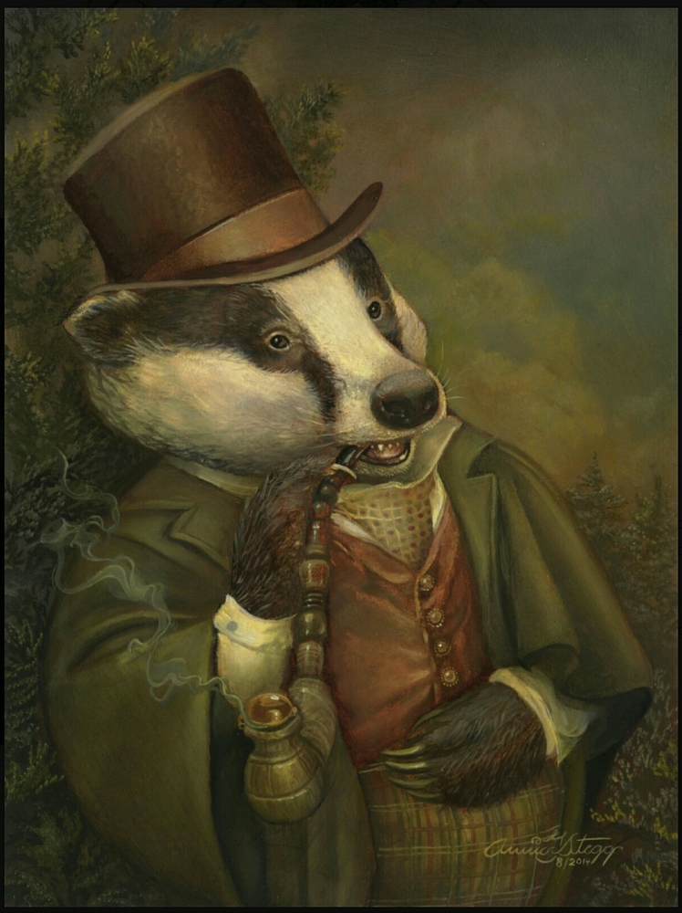
Btw, here's a piece I found with the same animal in almost the identical setting that I envision. This is by the amazing artist Annie Stegg... I'm thinking of trying something like this & having his clothes be green and the same tone as the background so that his face, the palette and the painting pop...What are everyone's thoughts on that, @smceccarelli, @Chip-Valecek & @evilrobot?
Facebook Page: http://www.facebook.com/amberwingart
Instagram: @savinafranciscoart
YouTube: http://www.youtube.com/amberwingart
Website: http://www.amberwingart.com
SVS Sketchbook: http://forum.svslearn.com/topic/915/savina-s-sketchbook-updated-2-13-16 -
@amberwingart this is a beautiful piece. You can really see how the values play a roll to separate the elements. Look forward to seeing yours. Keep us posted.
-
@amberwingart I love it, cause the face of the badger is the focal point, when you create contrast. Cant wait to see the next version! Go Amber go! Pastel is so appealing!
-
@Chip-Valecek I just don't know if I'm good enough yet to pull this off!

But I have a question: is it really bad to egregiously steal someone's color scheme like this? Especially when it's the same animal, just doing something different? I genuinely thought up my idea before seeing Annie Stegg's piece, but I don't know that that matters...
Facebook Page: http://www.facebook.com/amberwingart
Instagram: @savinafranciscoart
YouTube: http://www.youtube.com/amberwingart
Website: http://www.amberwingart.com
SVS Sketchbook: http://forum.svslearn.com/topic/915/savina-s-sketchbook-updated-2-13-16 -
@amberwingart This color scheme belongs to everyone
") If i am not mistaken it is simply a complimentary color scheme - been done millions of times - green and red are on opposite sides of the color wheel making them each others compliment - its funny i feel like the image has a limited value range and that nothing seems to pop - i feel like it needs a bit more range and at least a hint of saturation around a focal point - it does have an antique look about though which may make those choices intentional - i think if you like this scheme that you should go for it - nothing egregious about it - can't wait to see the finish!
If i am not mistaken it is simply a complimentary color scheme - been done millions of times - green and red are on opposite sides of the color wheel making them each others compliment - its funny i feel like the image has a limited value range and that nothing seems to pop - i feel like it needs a bit more range and at least a hint of saturation around a focal point - it does have an antique look about though which may make those choices intentional - i think if you like this scheme that you should go for it - nothing egregious about it - can't wait to see the finish! -
As @Kevin-Longueil says, color and lighting schemes belong to everyone - part of the wonders of the world
")
Doing the same animal with the same light and color treatment will obviously seem derivative to people who know both you and your inspiration. But Annie Stegg is also derivative of many others before her (I can see hints of several sources, including Renaissance art). As the saying go, plagiarism is stealing from one, originality is stealing from many. There is another quote which I like a lot "the growing artist borrows, the established artists steals".
So, by all means you can use her color scheme, understand it and make it yours! -
I also agree with above. Use it and learn from it. I also use this tool when designing logos/websites for a client that has no idea what they want. They would be like "I like blue" so then what other colors would go good with blue? http://paletton.com/ I have also used this when designing character outfits.
-
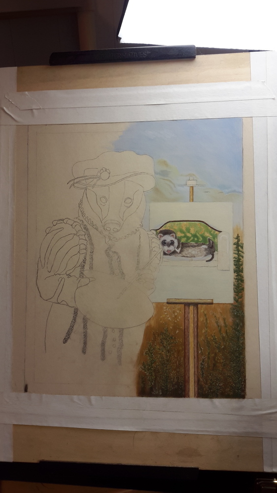
HELP! I decided not to use her exact palette, but to kind of riff off of it and now I'm lost and could really really use some help (I'm supposed to have this finished in 4 days for a show).
I'm thinking of using the brownish red color she used for the vest as my guy's main shirt color and making it a very deep tone so that his jacket and his face draw attention to him. But I'm completely lost on how to handle the rest of the scene. What should I put in front of him and what colors? Should I do the brownish color all around him? I did a color study, but I started changing it as I went along and now I'm lost in the weeds...Any help would be greatly appreciated!!
Facebook Page: http://www.facebook.com/amberwingart
Instagram: @savinafranciscoart
YouTube: http://www.youtube.com/amberwingart
Website: http://www.amberwingart.com
SVS Sketchbook: http://forum.svslearn.com/topic/915/savina-s-sketchbook-updated-2-13-16 -
@amberwingart Looking great so far. I think if you went with red on the shirt i would make the brown light so the character pops.
-
I think you are on the right track. Just continue the sky and weed colors around your painter. The brownish red for the shirt will look nice. Be careful about the colors on his painting. They are much brighter than what you propose for the main character and may distract from him. Good luck!
Twitter: @Joy_Illustrated
Instagram: joy_illustrated
Website: joyheyer.com -
That's a fancy badger!
Obviously, I really like the whole "animals in period costumes" thing (see my avatar). I've got several more planned for a card game I'm developing.
The way I go about it is to get renaissance paintings for my reference photos and that solves a lot of the issues you are struggling with. My tiger painting is based on a work Rembrandt did.
I'm guessing you will not want to do that since you were a bit skittish about even using someone's color scheme but that is an option. And the point, to me, is not to say: look at this piece that has clothing and colors that I completely invented. But rather: look at this well known painting I tweaked a bit (put my own spin on) to include an animal instead of a human subject.
-
@Joy-Heyer & @Chip-Valecek - thank you! I'll try to mute the painting colors some - thanks, Joy!
-
@mattramsey That's a good idea & that's what I should have done...I just started thinking about using other artists' color schemes... My one concern with using Annie Stegg's is that she's really well known and modern and the animal we used is the same and unusual (a badger), so if someone sees mine and sees that it looks so similar to hers, I'm afraid I'll get a reputation for being a biter & I want to be really careful of that. From now on, I think I'll stick to dead painters' color palettes, lol. At least this has (once again) pointed out for me the importance of planning down the details before I start! Now we'll see if I can pull this off! Lol