Lebron James Caricature
-
So far...
-
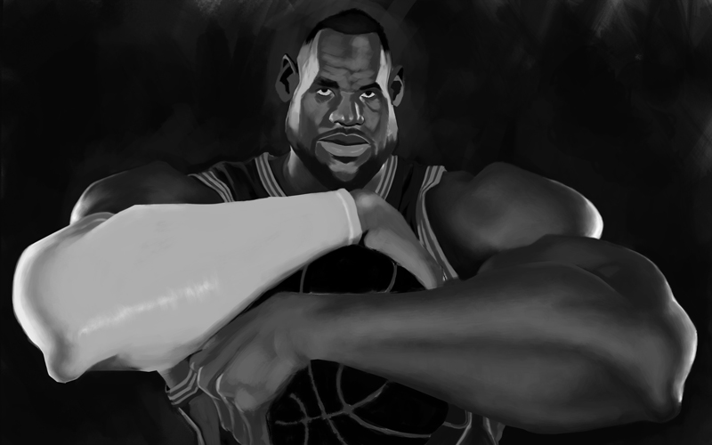
It was too dark. Like this better.
-
Calibrated this to my monitor. Looks exactly the way I wanted so far.
-

-
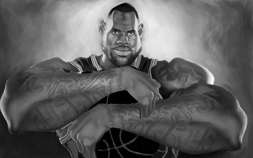
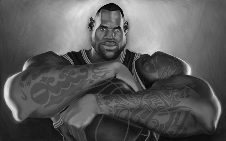
Tattoos are about to be pain in da arse.
-
Very cool! I really like the style of this piece
-
@Durrell-Odom Wow! This is turning out really fantastic! Capturing likeness in a stylized portrait is really difficult, nice work.
Nat Iwata
www.iwataillustration.com -
This is very well done. The face and anatomy look amazing!!
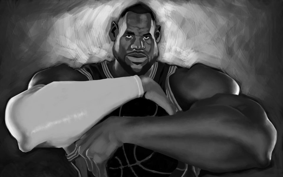
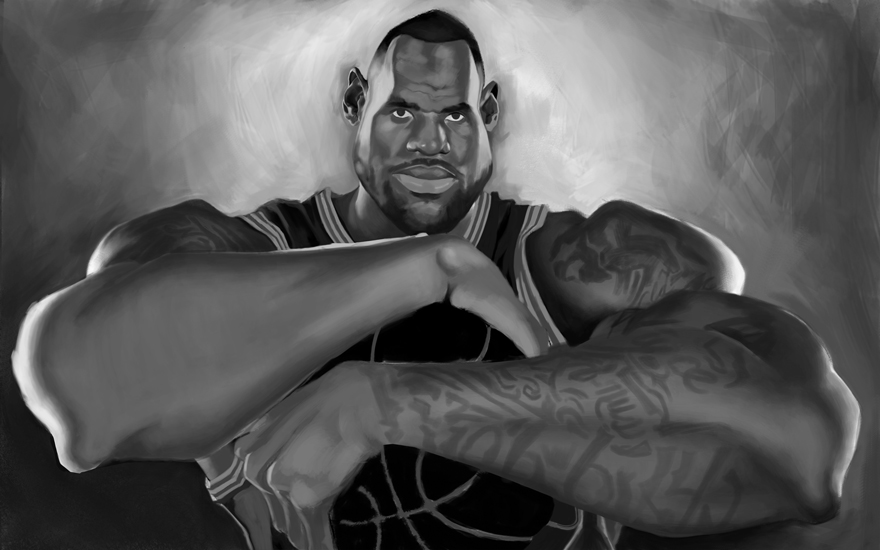
But, I do have a comment that is similar to my comment about the other image you did with the guy sitting down in the city. It's regarding focal point and controlling your audience to look where you want them to. In that last image (with the guy sitting), I mentioned that his foot was a literal block for the viewer to enter the picture. It became an unintended focal point. In this one, the sleeve he is wearing on his arm draws a massive amount of attention to his forearm. I'm pretty sure you don't want the viewer looking at his forearm when his face is SO AWESOMELY PAINTED!
The reason his arm stands out is just due to it's high value. The solution is to simply remove it. I know he wears it in real life and you are being true to that. But this is the reason clients hire illustrators and not photographers. We can choose what we include and what we don't.
Here's a sample where I just copied the other arm you painted and flopped it. Now look how much more focus his face has. At some point I think it needs a bit of color too. But thats for later.
As always, take what you want from this suggestion (including doing nothing at all). It's just what I would recommend. I'd love to hear what others think.
Great work. It's cool seeing your process and you are quite a skilled painter!
SVS Faculty Instructor
www.leewhiteillustration.com -
@natiwata Thanks. It's very difficult to achieve but not impossible. I try to focus intensely on one thing (head shape) before I move on to the features or even the body.
-
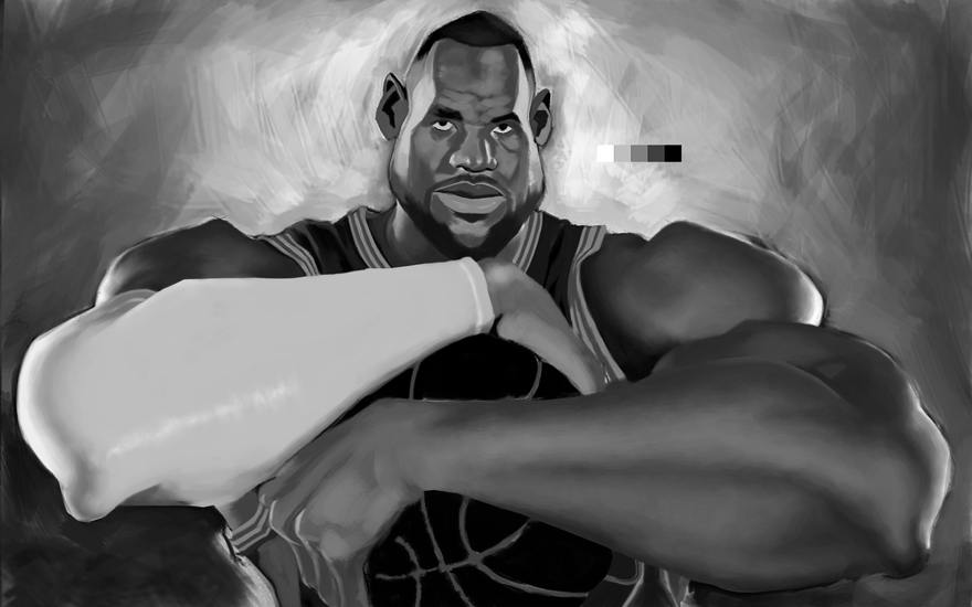
@Lee-White Thanks for your feedback. You're right about his armband. I do not want to make that mistake again but I know he has a lot of tattoos so I know it's gonna be a ton of work for the arms alone. I thought about darkening the armband but that would the easy way out. How you think I should approach his arm tats? As realistic as possible but just enough it doesn't take away from his face where I still have much more work to go on it.
-
Durrell,these are really good.Good balance of expression and drawing ability...
-
@bluesky71 Thanks.
-
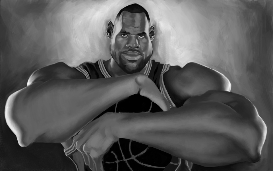
@Lee-White As a challenge, here's a start with a new arm.
-
-
@Durrell-Odom .....you
re welcome.speak as I find...very engaging.Its a curious thing that in art if your passionate with your intentions,and the marks your making,the viewer picks up on it... -
@bluesky71 glad to know that cause I struggled for a long time to draw with this kind of passion since prolly middle school. Just hope I can keep this up.
-
@Durrell-Odom....no one would know you
ve struggled,and hey who hasnt!")
-
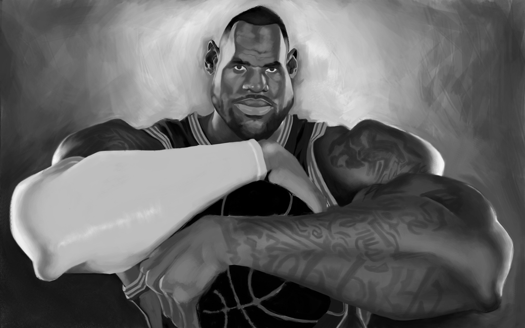
Improved on the face.
-
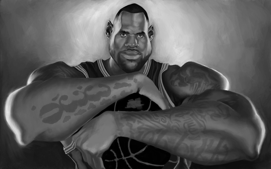
More improvement. Finally getting closer to just stopping. lol
-
@Durrell-Odom Holy crap man, this is such a great piece for so many reasons. You have completely nailed Lebron while giving it your own flair and I am learning so much while studying each step.
I wanted to mention that tattoo's could go either way depending on what you want to accomplish. Much like @Lee-White said, Lebron's tattoo's are part of what people recognize but as illustrators you get to make that choice as to how detailed you want them to be. TBH, I like the less crisp detail. Because you did the tatt's so well I keep stopping at his arms to admire the work put into them. Something to try: convert the tattoo layer to a smart object and then apply a surface blur to it.
Great work Durrell!