Third Thursday - Willie and Tod
-
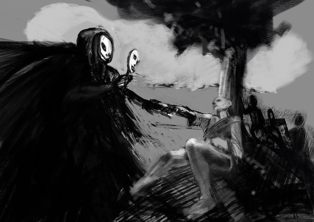
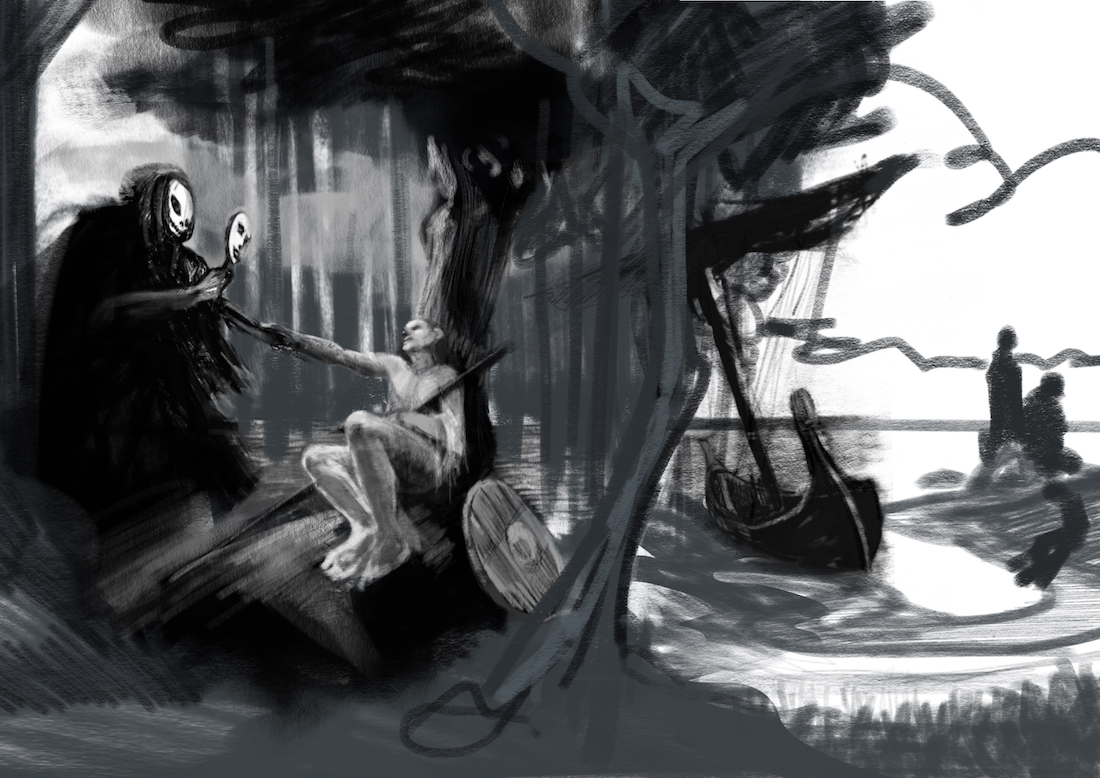
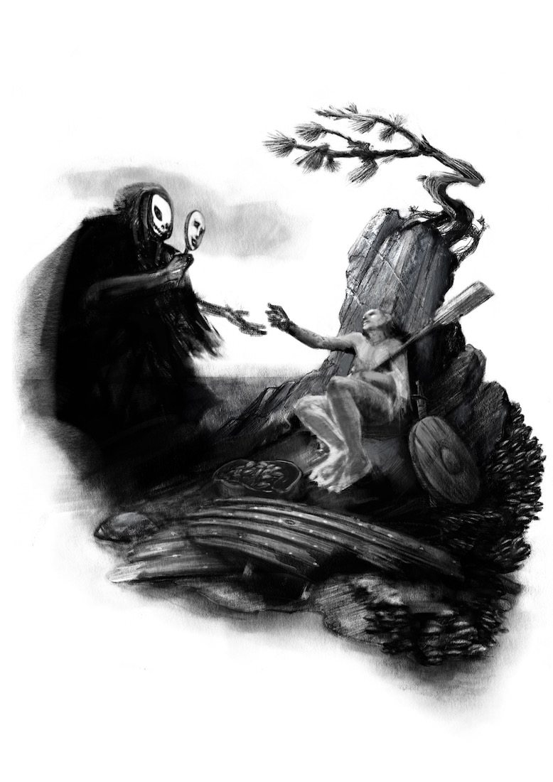
Here is my rough sketch for Third Thursday - i know it is not vey cheerful - in the gestures i am trying to show Death as not being sinister but compassionate - not sure i can pull that off without shaping the brow but i was hoping for a blank look to the skull - he is holding a little mask - my idea being that the dying man sees who he most wishes to see as death guides him to the underworld - there are figures in the background - they were originally mermaids - the may still end up being - compassionate ones of course - one worry i have is that the pose of death and the man is very similar to my last drawing... i should probably not worry about that but i do a little - anyways it is very rough but i was hoping for some feedback if anyone has the time - thanks!
-
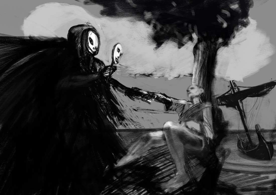
i keep going back and forth about the boat - composition seems better without it but story and hitting the prompt seems better with it
-
Hey there. I prefer the composition with the boat. It definitely reads more like an island and it's a clearer composition. The other one is not clear (only since the dark shapes are not defined). The sketch is really rough so I can't tell from what you've drawn as to what you're planning to do within the darkest areas of your painting. But I think tonally the composition works good so far, with only one issue: make sure that the grim reaper character isn't a complete black rectangle shape in the bottom left side of your image - I'd add some subtle variances in the tonal value in this area so it's not a big dark patch, which I'm sure you'd do in the final since this is just a b/w version. (flowing drapery with darks and lights, etc)
I'd love to see the color version when you're ready to post it!IG: @larissadrawsstuff
Twitter: @ocartstudios
Blog: larissamarantz.blogspot.com -
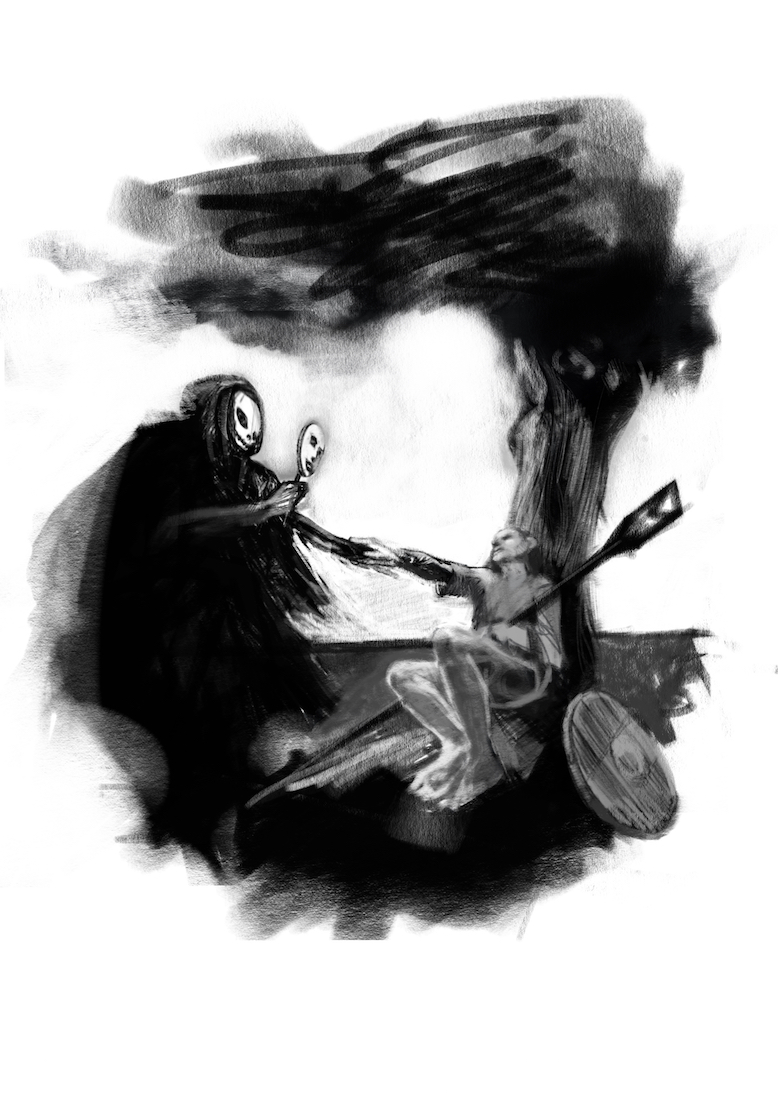
@Larissa-Brown-Marantz Thank you Larissa - really helpful to get your input - i am a bit stuck really - my original sketch had an energy that seems to be extinguished with every detail i add - i will work through it though - hopefully i'll find something good on the other side - i will most likely stay in black and white for this one - here is the original - i though maybe the thing cradled in the man's arm would not read as an oar to folks so i abandoned the idea - it might be working though now that i look at it ?? - anyways really appreciate you taking the time to share your thoughts
")
-
Ok - sorry to hit you guys with every little move i make on this - but i am thinking of going with this original sketch - i made a few tweaks to see if i could make it read better before i start in on it - would love to know if the oar is reading as an oar - i am liking this as a spot illustration - hoping for a second opinion of this though - thanks
-
@Kevin-Longueil I really like it with the boat.
-
@Kevin-Longueil Beautiful work on this one. Love where that last sketch has taken it. Can't wait to see the finish on this.
-
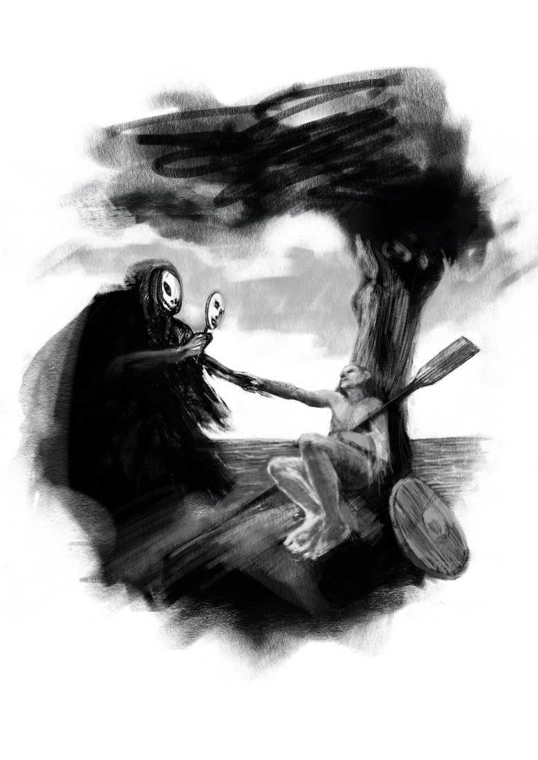
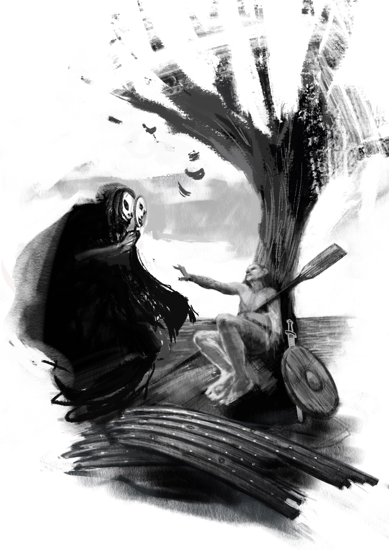
Looking at your sketch...I like the gestures and I think the concept is great, very hard-hitting/emotional (I like that!) I think what I'd like to see is just a little more storytelling....the oar reads as an oar, but what is that other item - a shield? Part of the boat? Could there be some more items around that tell of his struggle against death, perhaps? eg an empty water bottle, food supplies all gone, a diary...parts of a shipwrecked boat perhaps... I get the impression that you want to keep the composition tight, with the relation between the two characters the main focus...but I wonder if you could tell a little more story with the details, even while keeping it as a spot.
The other thing is, I don't know if you skewed parts of the sketch in Photoshop but something is bugging me about the perspective of the characters...the way the lower parts of both bodies are bigger and the heads very distant...even though the faces/expressions are the most important thing holding the piece together. I'm not sure what to suggest, apart from it might be worth trying a few other perspectives, if you don't mind exploring other options. I kinda feel like I'd like to see Death's face a bit more clearly, as if we're almost looking over Willie's shoulder (or rotated a little more that way)...might make us feel like we're in Willie's position, seeing Death beckoning to come closer...At the moment, we could take either side (Death or Willie, it's quite equal in that sense). Hope this is making sense....
This is sounding like a lot of critique but please don't think so! I don't mean it in a negative way, it's definitely going to be a great piece and it's only because I know that your drawing skills are so very good indeed, that I think you can push it further before going to final. And of course it's only personal opinion, you can ignore it all and go with your first sketch if that's what you want
Will be great to see how this develops! -
@Carrie Thank you Carrie - very helpful!
@evilrobot Thank you William!
@Dulcie Wow - thanks Dulcie - great critique! - i really do want to just make it about Death and Willie - i also did draw his legs larger to help with foreshortening - maybe i went too far i also did warp death in Procreate in the earlier version ... good eye! - here is a real quick sketch using your suggestions - the round thing was supposed to be a shield so i added the outline of a sword (did not render it) added shipwreck too - do you think this helps! is the perspective to extreme for the planks? - really appreciate your critique - i always hope for a laundry list of problems from folk - never need to worry what i will think - thank you again!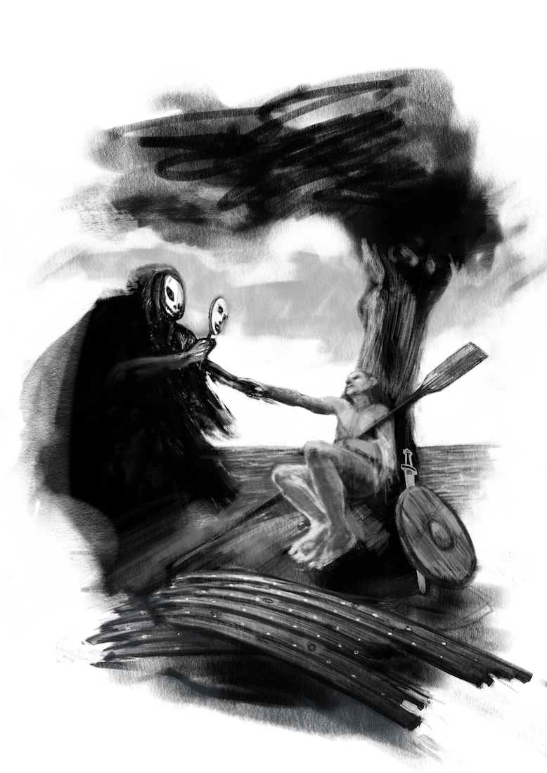
-
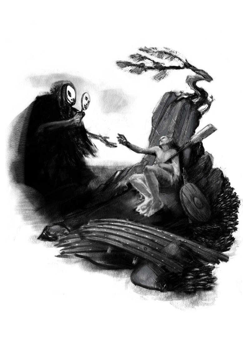
pretty cool to see it evolving here in the thread. i like what you have. I thought maybe I could offer some other suggestions. I love the idea of showing them not yet connected. Somewhat like the moment before his fate is sealed. I thought I "sistine chapel" type pose might be a good one here. I also moved the mask closer to the death's head so they would hold together as a unit a bit more. The black tree was taking way too much attention. I also feel that maybe a dead tree could be cool symbolism there. Maybe have a few leaves falling down?
Feel free to keep anything you like and discard what you don't. Look forward to seeing the finish. : )
SVS Faculty Instructor
www.leewhiteillustration.com -
@Lee-White Thank you Lee - this looks great - i like the idea of the characters not yet touching and will try that for sure - the mask closer to Death looks good also - i really played around with that in the doodle stage but never put it right up there - i was trying to show that he was not trying to fool anyone he was just trying to show the dying man who he wished to see so i wanted it to be obvious - i think it works better though where you have it - you are right also about the tree - on the way home from fireworks last night i was thinking i needed to lose the tree - i like the idea of the dead tree (maybe with a few leaves) - also going to try rocks and a little tree (bonsai like tree) surviving near the top as a bit of life or hope in the picture - I really appreciate you taking the time to comment and do the paint over - Thank you again
-
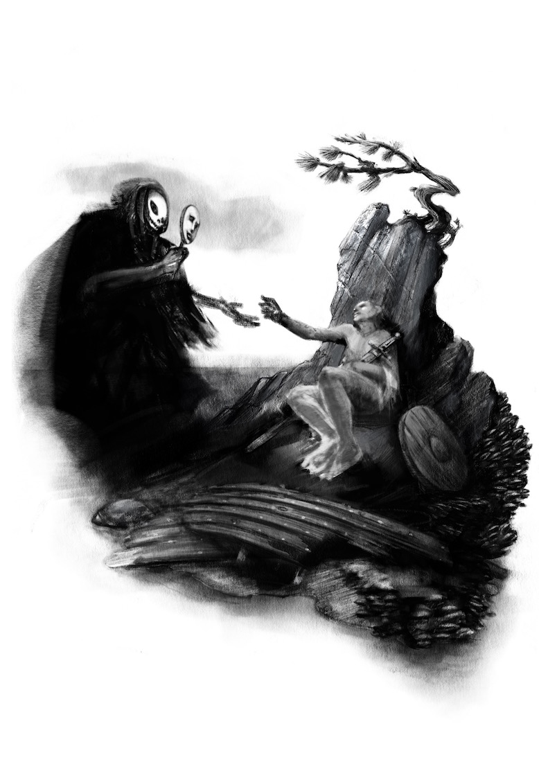
Here are some of the changes that Lee suggested - i think i like this a lot better - thank you Lee - Willie is supposed to be leaning on a rock now with a little wind blown tree on top of it - i still have work to do on the figures and tree and....well everything really - but wanted to share my progress - thank you all for all of your feedback - really helpful!.... wow, just noticed that horizon line tangent.... got to fix the too
-
Here is a minor update - the little island is covered with mussels - could he live for months on them - doubtful i'm sure - but i placed a basket full of mussels in front of Willie to try to show a bit more story - i improved the little tree and the lighting on the rock - i think i improved the wreckage a tiny bit too - if anyone has an opinion about the basket please let me know - right now the basket is the only other layer in the drawing because i'm not too sure about it - oh... other thing is i dropped a stone texture behind the stone that i drew( 'a la Jim Madsen's Photoshop Demo) - as expected it really made the stone look more stone like - my question is does it look too real above Willie? does it not fit with the rest of the image?
-
@Kevin-Longueil It's looking great! I like the stone texture, it fits with the feel of the tree which has fine detailed textures in it too.
I really like the idea of adding a few items to try and convey the idea that Willie has been there for months...but I wonder if the basket of mussels is the right choice, because it implies that he still has a food supply...and if he does, why is Death coming for him now? The sword and the shield presumably imply that he is a warrior, and I'd start to think that if he's still got food, then maybe he is injured (eg from battle) and that's why he's dying. So none of these choices are right or wrong, I'd just think about what story the items are telling. Perhaps his basket could be empty, with just a few shells around? But it is looking very good and will be good to see the next version
-
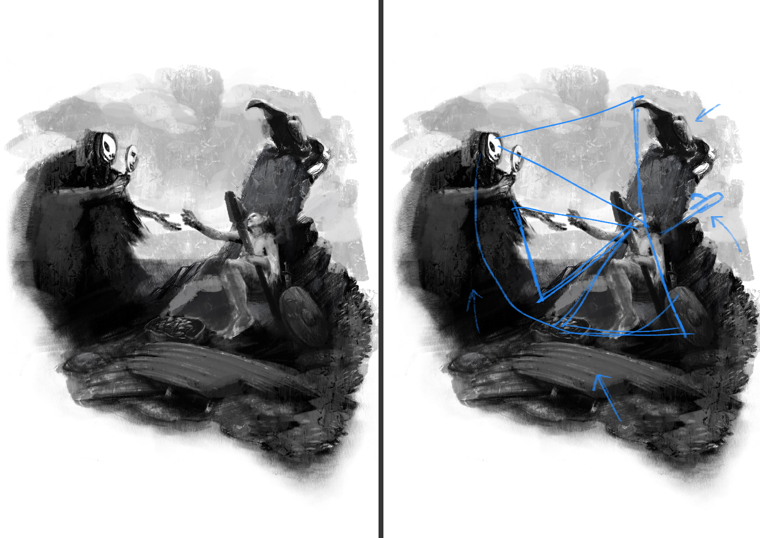
It's coming along great. I see what you mean by losing energy. You are getting really close, I did a paint over with some strong suggestions to help you emphasize your focal point and tone down other areas of high contrast. In the image I am posting you will see that I moved your oar over, because it's creating a line that leads out of the image. I also experimented with the small tree on the rock, I placed a buzzard there (the tree was really pulling strong attention there), still strong enough to grab attention but not too strong. I toned down the contrast in the boat pieces, I angled his leg back to how you had it (it creates a strong leading line into his "triangle" shape). The sky has some value now to give you room to place clouds to emphasize the reaching hands. Lastly I toned down the rock and added some lighter tones to the reaper. It's feeling good, can't wait to see your final! ![alt text]
-
This is a beautiful piece. The emotional content is very strong, the idea really original and moving. I have been out traveling for a while, and there has been already a lot of discussion. Nothing more to add, as I think the composition is working now very well (maybe some consideration on taking away the whole tree/bird feature over his head and have it just be a simple rock behind his back, letting the image be only about death and the stranded guy).
One thing that you left throughout and I am not sure is intentional is that death's face is really flat (I mean its real face, not the mask). It looks like painted on a flat surface rather than dimensional. Is that a wished effect? It does not look bad, actually, it could be an artistic choice.
Looking forward to the finished piece - though I would try to keep this really painterly and loose, because it already works now! -
@Dulcie Thank you so much for taking the time to critique my piece! - i keep trying different items on the ground i end up making it look cluttered - i will keep at it though - in my mind Willie is dying from exposure and has done his best to survive but ultimately could not survive - if truth be told this was originally going to be the blind man from the last drawing i did (for the fortune cookie 3rd Thursday) but i could not bring myself to give him such a bitter ending - that is why there is a sword and shield at his side though - i am definitely falling short story wise... too much in my head and not enough on the page - possibly i should add a coil of rope and some other boat related item and not try to show too specifically how he has spent his days - really appreciate that you are making me to struggle with my decisions
Thank you again!@DavidJMacias Wow David - Thank you for the awesome paint over - your work is very impressive and you have given me a lot to think about - i have toggled back and forth between a tones background and not and always end up like it without but i will try again - i like the toned down lighting on the strakes of the boat - i will do that - the oar has been a question mark for me - it was my way of saying Willie was on a boat and now he is shipwrecked - it's funny because i read it as pulling the eye back into the drawing but i think you are correct - i think i will try reversing the oar or losing the oar - You are making me reconsider my little tree.... this is painful indeed
I love my little tree - a tenacious symbol of life - the small bit of hope on this little island..... i was thinking of it a a third character that sent you back round to Death - from Death to Willie to Tree..to Death.... that was how i was trying to work it anyways - i will try reducing the size and possibly contrast too to see if it works better.... but man i am really attached to that tree Your buzzard is awesome for sure though - i hope i am not sounding like i am defending my bad choices i really do admire your work and take your advice very seriously - thank you so much for taking the time to do this paint over - really thankful@smceccarelli Thank you Simona! Yes - you are right about his face for sure - some of the things in the image are place holders - Death's face, the hands of Willie and Death, and parts of Willie (especially his feet) - i do have a habit of leaving things like that so long that they start to seem right to me - i like something about Death's face right now but know it needs to change a bit...but do not want to loose what it is i like about it - i'm hoping when i add a bit of shadow to the upper forehead of the skull that it will add volume - i'm kind of saving these things till last though - i will really have to look at my little tree a bit harder too .. you and David both are suggesting this - i will definitely try to keep things painterly and loose too as you say - thank you again for taking the time to critique - it is so helpful to me!
-
Another minor update - @DavidJMacias and @smceccarelli - thank you both for making me rethink my tree - it is still there as you see but it has diminished considerably - still working out many other issues - but i think minimizing the tree was something i would not have even considered had you not mentioned it being a problem - so thank you again! now that i have posted it i see that the bottom right of the image may seem heavy because of it... i'll keep working on it - adding tone to the sky make help this
-
Such a powerful piece! I love it

-
I like the concept.