Now I’m just being greedy asking for advice, but I’d also love feedback on my Glow piece
-
Hi folks,
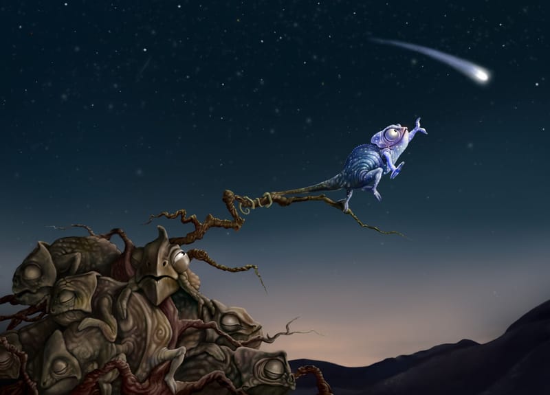
I’d love some feedback on this drawing - I submitted to last month’s arena but didn’t make it into the top 16. I’d love any thoughts on how to improve it, since I’m hoping to use it in my portfolio. Thanks so much! Any advice very much appreciated")
-
@allysa your piece was actually one of my favourites and on any other day would have easily made it into the top 16. I personally wouldn't change a thing, but maybe there are people in the forum with more experience than me who can be more helpful!
-
@allysa I love it! Only praise. Love how the bunch of them is sleeping in the tree/shrubbery and this little fellow is reaching out for the stars changing his colours according to the background. Love the composition and love the colours. And love the one peaking. Only thing that might be fun to try is that the peaking one reaches out an arm to pluck him back. But I think it's totally portfolio worthy.
-
@allysa I love this piece! It was one of my favorites, and I was honestly surprised that it didn't make it into the top 16. I think it may just have been because the image size was too small. I had the same issue with my images this time.
 I don't think I would change a thing about it. It looks like a lovely portfolio piece to me!
 -
@allysa Honestly it's perfect the way it is. Tough luck you were competing with so many other great works this round! I would go ahead and put it in your portfolio
-
@allysa I like the colors & the "glow" effect. The sky transitions nicely from dark at the top to light at the bottom.
I thought it was a little strange that the chameleon is reaching with just its foot, since they would use their tongue to catch something. So I would expect to see at least an open mouth getting ready to shoot its tongue out.
As far as I know, they are solitary creatures, so I didn't understand the pile of other lizards at the bottom, except it seems to be going for a humor element. If the one with an eye open is supposed to be annoyed—it's not very clear to me why.
I also don't understand why the lizards & branches are all tangled together.Chameleon eyes don't really close with a long slit.
"The chameleon's eyes are the most distinctive among reptiles. Each eye has a scaly lid shaped like a cone, with only a small, round opening in the middle for the pupil."
— https://animals.sandiegozoo.org/animals/chameleonThe tail of the protagonist looks like it disappears into the branch and I'm not sure if that vine-like bit is supposed to be the tail. It doesn't look like a chameleon's tail to me. I think they have a smooth curve. Also, I don't think I've seen their skin wrinkle or bunch up (but it's been a long time since I've been around one). Otherwise, the anatomy looks good. Good job on making the toes work correctly.
The story I'm reading here is: a chameleon is trying to catch a falling star & is annoying its neighbor.
-
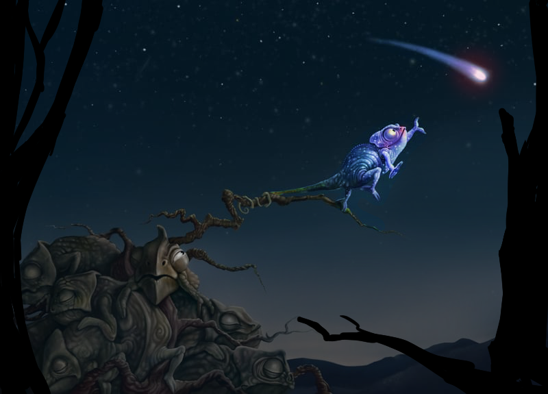
@allysa I really love your concept and story, and it already looks amazing! But since you asked for feedback I will give you some things that I would do.
First I would make the sky going from light to dark a bit less, because of the high value contrast between the mountain and the sky, my eye kinda gets distracted by it. I would also darken the group of chameleons (except the one peeking to make the viewer still look at that) with some dark blue because the values structure there is also pretty high in contrast. What I mean by that is that the darkest value of the group of chameleons is almost pure black and the lightest is almost pure white. This gives a really high contrast, and high contrast askes for attention. I think Tyler Edlin has some great videos about this on his youtube channel but I can't remember which one, sorry.

Secondly, I would add more saturation to the colours of the chameleon and comet, I feel like they are a bit too desaturated and by adding more saturation, it will emphasise the story even more. And I just like saturated colours but this is probably just a personal preference.
 I would also add a linear dodge layer with a dark red on the comet to get a nice purple glow to it as well.
And thirdly, I would add some tree trunks or something on the foreground. It feels a bit empty to me and this way you can lead the eye a bit more since now the comet is leading the eye of the page.
Hope this isn't all too much, but I made a quick paint over for you to clarify what I mean. I might have overdone it a bit though. Hope this helps!

-
@Miriam thanks for this detailed feedback! I was thinking to take some creative license with the anatomy of chameleons, but perhaps it’s a step too far - you’re right that their eyes and tails are the most defining bits about them.
-
@LittleRaven wow, thank you for this! I agree the contrast makes it look better.
-
@allysa Yes, you’ll have to decide how much realism vs. artistic license / stylization you want for the feel you are going for here. It is clear that they are chameleons, so you could leave it as is.
-
I have to admit, I was really confused as to why yours didn’t make it into the top 16 since I personally found it so solid and interesting in concept, composition and rendering. I was trying to reason that maybe it was because you weren’t a subscriber at the time, maybe the guys didn’t see a good resolution image of it (even though it looked fine on the Critique Arena website). Your style, by the way, feels reminiscent of James C. Christensen to me, which is fun. I’d actually love to hear from the judges @Lee-White @Jake-Parker @Will-Terry and @SVS why it didn’t pan out in your favor because maybe it would be informative for future contests.
https://sarahvandam.art/
Instagram: @sarahvandam.art and @artistsandbox.etsy -
@Sarah-VanDam They said there were just so many good ones; it was difficult to choose the top 16.
I can’t remember for sure, but I think they said that some that didn’t make the cut were good portfolio quality illustrations, so this was probably one of the ones they were referring to.
-
This image was amazing and did make it into the serious contenders group. The only reason it didn't make it into the top 16 was we felt that there is a difference between something being "lit" and something "glowing". In this case it seems lit, but not actually glowing. If that makes sense.
It's a very nit picky and small thing, but the group was SO good this time we had to come up with the criteria for what to pick.
That said, this image is freakin' awesome and should be included in your promo and on your website. I just love it!