Frustrated with my process- How much reference do you use?
-
I think it's because I wanted to push myself to see how I could do without it. Ultimately it just caused me to spend too much time reworking stuff. Also, it's hard to find a kid that takes direction.
-
@Matthew-Oberdier I really recommend doing the dream portfolio assignment for figuring out what kind of lighting and how much rendering you want to do, it will really help you narrow down what you like stylistically
Also when I use reference I also look at other artists to see how they simplify things, I often find that more helpful than photos
My rule for reference is generally if I’m struggling to figure it out from my head I grab reference, I struggle with lighting the most so I mostly use reference for that and I’ve done so much figure drawing at this point I don’t need reference for that as often.. but if I’m struggling I grab it
-
@carlianne How do you go about getting the lighting reference?
-
@carlianne said in Frustrated with my process- How much reference do you use?:
I really recommend doing the dream portfolio assignment
I will try this, but I have a feeling there will be a few different styles in my dream portfolio.
-
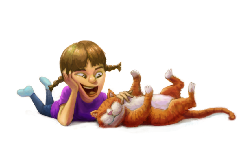
@Matthew-Oberdier Great rendering in my opinion! The only thing that feels off to me is the foreshortening of the girl's body and her left arm. The legs and torso recede in a very forced perspective on a ground plane that seems too low for the rest of the composition. It almost feel like the vanishing point would be on the page for this setup. I painted out the body in a quick draw over and it showed me that the angle of the neck is really anchoring the pose in opposition the rest of the body. When the torso and legs are gone it looks very much like she is at the edge of a table petting the kitty. But maybe i am wrong...the area below her chin reads as neck to me...so it makes her looks very vertical like she is standing or that here ribcage is curving impossibly...but maybe it is not supposed to be the neck? I think making her legs much larger and not forcing the one on our right into the composition if it is blocked by her head might be good to try maybe?...her leg on our right looks longer than her other to me because of the perspective.. lastly her left arm (on our right) seems like a super difficult position to get into... for it to work, her upper arm would have to go almost straight to the side and back a bit and the forearm would double back which would make the angle for the handle super difficult and not relaxed.. we would see much more of her shoulder on that side too i think - anyways... i could be wrong on this stuff of course
 i really like the style of this and think the made up lighting looks very believable.
 -
@Kevin-Longueil Thanks for the feedback. Maybe the pose being off is what makes the lighting look off to me.
-
@Kevin-Longueil I think you would see the neck, but maybe it's too far to our right:

-
@Matthew-Oberdier i agree - moving the neck to the left would help for sure

-
@Matthew-Oberdier There are a lot of great elements to this piece. My two initial observations are some potential changes to shadow and lighting, and stiffness of the poses could make the piece stronger or more believable, depending on how stylized you are going.
The light on the girls face felt the most disconnected from what I perceive as a light source up and to the left of the scene. If that is the case then it seems that: eye highlights wouldn’t show up in the current rendered form if they are recessed under the brow of the forehead; the nose highlight position suggests a different position since highlight is normally incident to light source, from the viewers perspective, and the lighting of the cheeks and forehead suggests a different light source position ( which maybe this is a two or more light setup?)
Regarding shadows it feels like the girls nose could show a stronger cast shadow with a harder edge, and her arm would seemingly not see full lighting to the point it is occurring (again assuming up and to left/slight behind). If the lighting is to the left and more forward then other shadows would need to be adjusted for that placement. And while animal fur is certainly not going to render to the same contrast as skin I do think the strong contrasts in the girls face and head vs low contrast of cat makes the cat fairly flat. One way to deal with that might be to go darker on the shadow shapes on and around the cat?
In the other area it feels like the poses read a bit stiff on both the girl and cat. Part of that seems to me from what feels like a lot of straights or near straights on the girls contour and the angle of the cats legs. Also the girls pigtails position and perpendicular design seem to add to almost a freeze frame effect of the scene.
Obviously take everything I saw with a giant grain of salt or just throw it all out
 . I still struggle with pose stiffness, even with reference. So I may be coming with a little more bias on that front.
 -
@davido Thanks for that very detailed response. You are right, somehow I got the light position switched in my head halfway through this thing. I made some quick adjustments and decided to keep the light to the left/front instead of left/behind.
I don't think I have it in me to make any big pose adjustments right now after all that heartbreaking rendering, but I will work on more curvy dynamic poses going forward for sure.

-
@Matthew-Oberdier I love Pinterest this is a board I’ve created for reference
-
@carlianne Awesome, thanks for sharing this