Help me turn this into a spot illustration?
-
@Kevin-Longueil Hi Kevin, thanks so much for the feedback - it’s positively genius. Thank you also for doing the draw-over. It really helps to show how it would work to crop the image down. This will be a great help! Looking forward to seeing your piece in the end too! It looks fantastic so far - nice to see Mr. Fox make a reappearance.

-
@Casual-T Hi T, thanks so much for taking the time to share your opinion and encouragement. I think Kevin did give some great advice... now I hope whatever changes I manage actually look good in the end!

-
I don’t think you’d need any of the interior pot at all try just getting rid of all the dark grey, the perspective of the spoon and ingredients falling in and the steam will still tell us what’s going in the in the picture and they will stand out against the white background.
-
@Asyas_illos Hello! Thank you so much for your idea. I had never considered that! I’ll definitely try it! Thanks again!
-
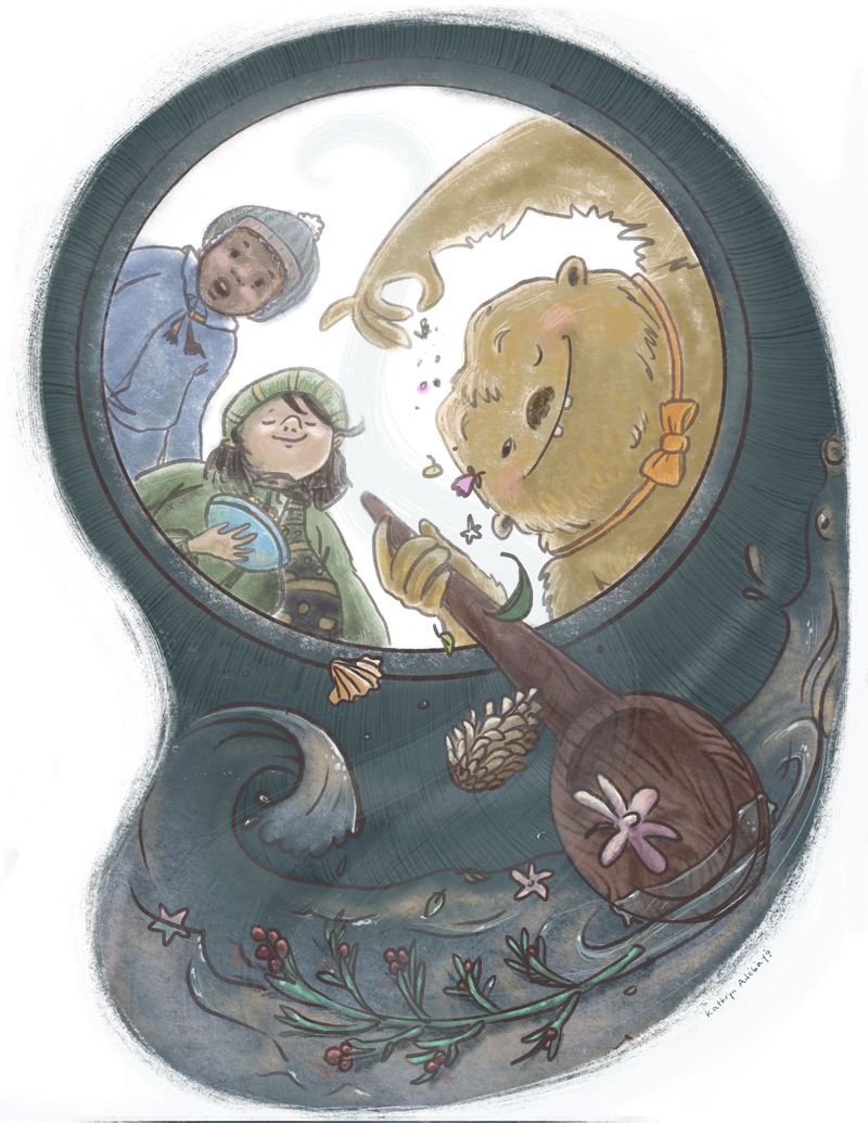
Here are the changes so far...

-
@KathrynAdebayo I feel like the save and the inverted of the bean are fighting there, but I really mostly just wanted to say I love this idea and image! My favorite of all of them so far

-
@HeatherBouteneff Oh my goodness, you’re completely right about the wave. It’s so helpful to have more than my own eyes on this! And thank you - wow, that’s quite a compliment.
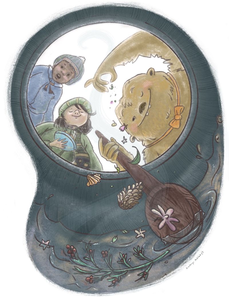
 Does this look better?
-
@KathrynAdebayo really loving the changes you're making here! Like it even better than the original with the entire page being dark (though it did give a cool effect of the reader sitting inside the cauldron...)
For me, the bean shape and wave are fighting for attention with the characters. Where do you want the focus? Everything else about the composition should draw the viewer's eyes there.
What if, instead of a bean shape, it was more of an oval? What if less were going on in the water? Just my opinion, but that would help draw and keep the focus on the yeti.
Good call on the change. Looking forward to seeing your new spot!
-
@Melissa-Bailey-0 Hi Melissa! Thank you so much for your valuable advice. I agree with you completely - that wave was random and distracting, so I got rid of it. I kept the bean shape for now just because the piece already has such a bold geometric oval in it, but I am open to changing the shape if it still seems distracting. I’m kinda going for having the eye travel in a figure 8 while looking at the piece, but I’m not sure if it’s working well or not. Thanks again for your help!!

-
@KathrynAdebayo this looks so good! - I do think that the bean shape is so strong that it is The focus for me at the moment... i think breaking up the edge could soften the pull of that edge but right now the bean shape seems super important somehow...maybe not softening the edge but even if you just erased a tiny bit of the inside of the cauldron where it meets the liquid on the bottom left...to imply overlap and break the line of the edge and possibly not having the shape of the bottom edge line up perfectly with the bean shape line? I don't know - it does look really good though and is a really nice drawing!!
-
@KathrynAdebayo much better!
Because this is a spot illustration, isn’t it meant to have a single focus? Think of a spotlight—there’s nothing competing for attention.
Again, just my opinion, a circle or oval would complement the composition and be a better choice. The very graphic and strong oval shape is more of a distraction for me. But it’s totally your call. This is YOUR piece!
-
This is really awesome! Such a unique perspective. Love the interesting point of view!
I agree with @Melissa-Bailey-0 that the shape is a little distracting. I think the idea of a figure-eight eye movement is pretty cool, though, as well. Maybe you could break up or fade the edges of the bean shape a little bit? The dark cauldron creates a big contrast with the white surrounding it, and I think that's why it's a little too noticeable. And the bean shape doesn't do anything story-wise--it doesn't help describe the shape of the cauldron or anything. Maybe something a little less strong would still carry the eye movement like that?
I really love how they all have different expressions/reactions. It's a really great piece. Good job!
-
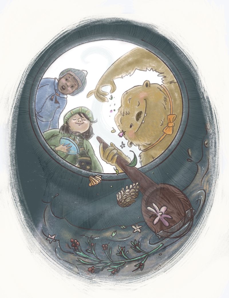
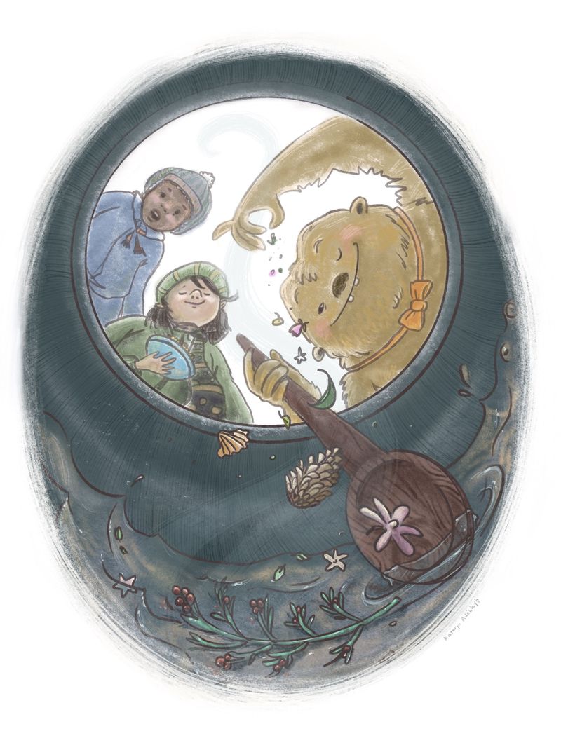
@Kevin-Longueil @Melissa-Bailey-0 @MarksByMallory Hello Kevin, Melissa and Mallory! You are all so kind to comment and share advice. Thank you so much. It was helpful to have such a clear consensus from you three. I thought to myself that I’d try a few other ways of shaping the image... as soon as I tried roughing in an oval as suggested - whallah! It looked much better to me. What do you think? You guys are truly great for pointing this out. When there is more time later in the day I’ll try different ways of making the edge look and finish the details.
Thanks again!

-
@KathrynAdebayo This is so wonderful! I love seeing how this piece has evolved. I'm learning so much by watching other people work through a design process like this!
-
@Valerie-Light Thank you, Valerie. I also learn tremendously from this forum and all the works in progress people post. It’s such a helpful community and learning space!
Well, I think this is it for now. Thanks again for all the help everyone!
