Dragonfly WIP - Can I Get Some Comp Feedback?
-
Hey all!
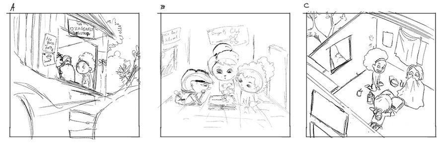
I finally think I have my idea solidified but I'm struggling with what perspective/comp works best. I kind of like A where we're looking up into the treehouse, but it's obscuring the characters. I also like C, but it seems like I'll need to do a "cutaway" kind of thing with the roof so we can see the outside a bit to give it some context.
B was kind of a thought to solve that by making it like we're just looking at the characters from inside the room, but it also feels like the most boring layout.
Do any of these strike as an obvious standout?
-
@jdubz Hi Josh!
I really like A--it might present more of a challenge since (as you said) it's obscuring the characters, but I think it's the most interesting for composition.
C would be my second choice. Have you thought about adding a skylight (or large hole) to the roof of comp C? It might be more natural than a "cutaway"--though it might also obscure the characters like in comp A.
-
@ @jdubz Nice! I really like A despite it’s obscurity problem..You could change your camera angle slightly though, zoom in a bit and pan to the right to see in through the door a bit more (which you could also design to be wider) to show more of the children and reveal less of the treehouse exterior (the location is very clear even in a tighter crop).
-
@jdubz I like 'A' the best. When you think "dragonfly" you think of the outdoors/nature so 'A' fits in perfectly. B and C are more interior illustrations so I'm personally not getting the same vibe.
In 'A', maybe change the character poses completely? Instead of having them huddle around, have one standing near the door, another one sitting with their legs hanging down or putting up the "The Dragonfly" signboard or picture. This way the focus will also go to the name which is the theme.
Really love the treehouse concept!
-
@jdubz I also really like A! I'll just echo what others said, maybe just play around with the camera angle and character placement. It looks like a fun piece!
-
@miranda-hoover @Lovsey @Neha-Rawat @carriecopadraws Thanks everyone! Really appreciate your input and it's a huge help confirming A seems like the one to try and work out.
-
I think going for A is a good decision. I think you might need to be a little careful of the 50/50 split composition though,. but i'm sure once its developed more it will look awesome
-
@Gary-Wilkinson Thanks for the comments Gary! Are you seeing that as a problem mostly with the character position? I was trying to make it so the treehouse was 2/3 and the lower tree area was 1/3, but I think I see what you mean as a possible problem on the characters being split in the middle in the actual treehouse.
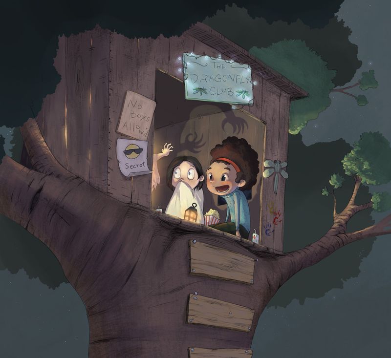
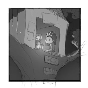
@Lovsey @Neha-Rawat One thing I'm struggling with is what the kids were actually doing. My initial idea was more of a night scene where they were maybe telling scary stories or just reading books together in the dark.
I haven't tightened anything up yet or moved the view over but one thing I wanted to try and do is if it was a night scene I wanted to get some of that light coming through the boards on the left side.
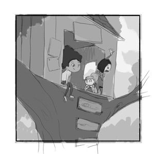
I tried some quick value passes for a day and the initial night idea, and then on the 2nd one I had the kids waving to friends and milling about. Do they look like they're actually doing anything interesting?
-
@jdubz I really like the idea of the night scene, it will be fun to paint the light effects you have planned. Both your ideas could do with a lot more of a drama injection. If they are telling ghost stories at night there should be a lot more tension. I imagine one of the children standing pretending to be a beast hands clawed with dramatic shadows and the others hugging or leaning forward with intense interest. It could be difficult to fit into the space but suggestion in the secondary characters is all that is necessary.
For the daytime scene, it also needs more excitement. Kids might just hang out in their clubhouses but they usually create clubs to explore through imaginative play so you should show the most exciting part of the reality. What if a friend was arriving climbing up the tree with supplies (to suggest the adventure to come) to friends excited, examining a new clue they had found in a mystery they were solving?
-
@Lovsey Hmm very good points - appreciate your thoughts.
-
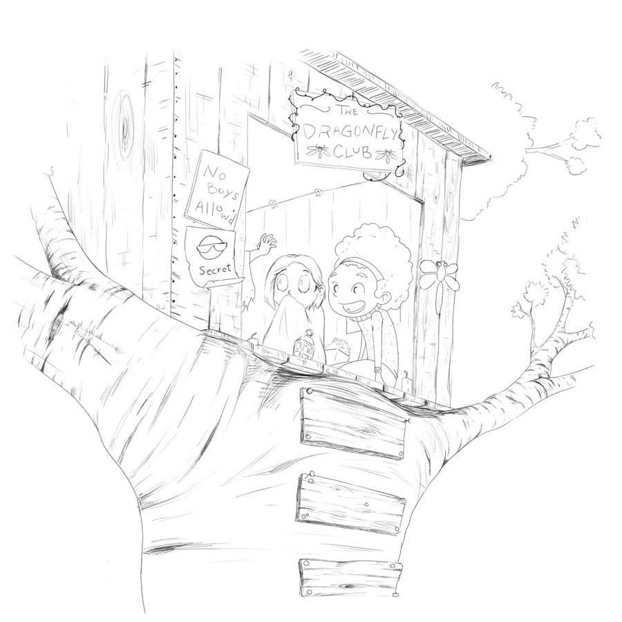
Finally had some time to work on the larger one. This month I really want to push myself to use only photoshop past the initial doodling phase. So it's taking a bit longer, but I'm liking the results so far. I made the image much larger than I normally do and that's helped solve some of the issues where I feel like the software is fighting me

I widened the door, and originally I was going to show more of the third character, but what I think I might try and do instead is build the drama into the shadows instead of directly showing it. I'm also going way outside the lines so I can get more options for cropping it to the final image.
So here are the lines done in PS so far.
-
@jdubz it’s looking great! Love the line work and I can’t wait to see how your lighting heightens the drama even further

-
Hello Josh, I think A works the best, you could try lowering the house so that the characters are in the center and also maybe scale up the center point of the illustration. Now 2/3 of your composition is occupied by the tree and the house, it is enough if you only hint that they are in a tree house.
Good Luck! -
@cszoltan said in Dragonfly WIP - Can I Get Some Comp Feedback?:
Now 2/3 of your composition is occupied by the tree and the house, it is enough if you only hint that they are in a tree house.
Good thought - that's kind of the direction I was thinking once I got all the lines in place!
-
Here's the full size colored - I brought the crop in a good amount for the final submitted one. I kinda thought a bit closer to the door would be more effective.