Critique on my new piece WIP: Lotus seed harvest
-
Hi, eveyrone
I am working on a piece for a compitition at
http://www.picturehooks.org.uk/from-seed-to-table-competition/
(yes, the piece has a dragonfly, but it is not about the dragonfly, so it would not be a good fit for SVS's monthly contest this months )
)The subject is about food, as the compition brief puts it:
"The journey between the sowing of a seed and a dish of food being placed on a table has many stages. We invite you to create an illustration that celebrates just one moment along that journey, with the emphasis on celebration. "I am not sure if the subject matter is well picked for the contest, but I just gravitated towards the compotion for this image. Also I had a fun memory of picking lotus seeds in the summer as a teen.
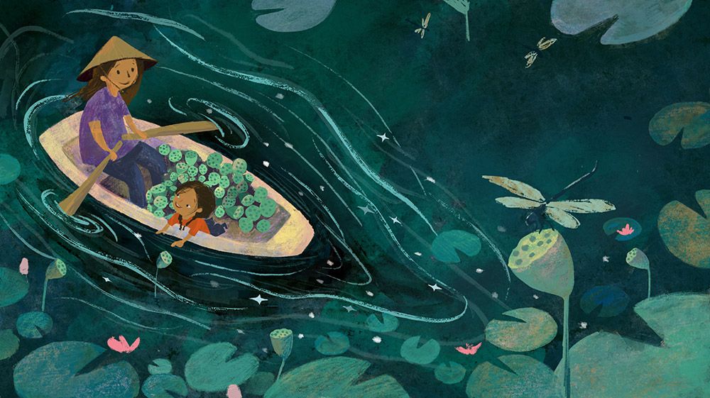
I am still working on the characters on the boat, and details here and there. I am wondering:
- Has the image give a sense of celebration, and appreciation to the havest?
- Is the focal point clear, or the dragonfly in the foreground is too distracting?
- Any other compostional critiques?
-
@xin-li think you are all set with the composition. I don’t think the dragonfly is distracting. It blends in the background because of its color. As for celebration, i think the girl is showing enjoyment while picking but it does not immediately convey celebration for me at least. For me, celebrations brings pictures of merry-making, end of harvest, a party perhaps. But these are just my thoughts.
-
@xin-li phenomenally beautiful image. I think the dragonfly is fine; your value and color choices there are perfect and not distracting. I think the word celebration does not fit quite right. To me, the gentle flowing lines, cool palate, and relaxed postures of the people evoke emotions of calm, peace, contentment, gentle joy, enjoyment. Whereas the word “Celebration” in my mind conjures bright colors, dancing, movement, like a party. But your image is absolutely gorgeous and definitely captures my imagination. I hope this is helpful. Some ideas for how to work toward more of a celebratory feel might be- You could keep the same composition but liven up the postures of the characters and/or engage them with their surrounds in a more active way, or maybe try brightening up your complimentary colors in the environment. I actually love your picture the way it is, but am just trying to address the questions you asked about the prompt and such. Good luck!! Amazing work.
-
when you are not sure about the focal point the first thing i would always check is the black and white version of it.
this way you see if the lightning is "right" and what you want to have to be the focal point stand out enough. there are of course other factors like color but thats something you tackled well already.here a quick example of little tweaks in term of shadow/highlighting areas and how it change it in a subtile way to let the boat stand out more.

-
@xin-li I actually think the dragonfly might stand out more. I didn't notice it at first. Maybe add some color like the stuff in the boat to tie the two parts togther. Then the eye will travel back and forth between them. The dragonfly needs to stand out. Really love the composition and the colors.
-
@xin-li I think based on the subject brief, I think I'd increase the size of the characters in the boat a bit and bring them slightly more into the piece. It just feels to me divided in half since the dragonfly definitely isn't the focal point. Looks awesome so far!
-
@Nyrryl-Cadiz, @Ruth-Tripp thank you so much for your input. I am debating about the concept with myself. I wonder if I should try a more high enegy idea to show more of a celebration, or stick with the current idea - which will be a good portfolio piece, but not fits with the contest fully.
@Molambo thank you so much for the paint over. I think I might use the value you suggested for the dragonfly, but making the color leaning towards warm yellow/redish to separte it a bit more from the backgorund. I am always very interested in exploring the nauances of value contrast and color contrast.
@MOO thank you for your input. I think I will play a bit more with the color on the dragon fly.
@jdubz thank you so much. Your input is very interesting. I originally thought about making the characters smaller, to give readers more the feel of the environment. I think mainly because I am better at rendering the environment than characters :-). I think I will give a try of your suggestion.
-
@xin-li Love the color palette! And yes, you are super at rendering environments
When you think "celebrate", you do think of a more colorful dynamic moment. But since the brief says that you can choose any moment of the journey from seed to dish, I think your concept on point! I would see celebration in this context as more of bringing awareness to the time and effort that goes into every stage than necessarily reaping rewards at the end.
I like the dragonfly. The main reason it's attracting attention for me is because the mom is looking at it. I'd like to see the mom looking at the daughter instead and having their own special moment.
Also, the boat looks flat from the outside. As in the edge of the boat seems like it's in line with the water level. Maybe show a little of the side of the boat above the water as well?
Good luck for the competition!
")
-
@xin-li This is a lovely image! I really like how your style is evolving.
For the contest description with the word "celebrate," to me as a native English speaker it sounds like a modern use of the verb "to celebrate." It's true that "celebrate" in English (as opposed to the more strictly Latin languages) is often connected with parties. But more modern English also uses celebrate in a less literal sense, such as, "This book celebrates our differences." That's how I interpret this description.
Practically speaking, I'd say that if you drew people sweating miserably and being exploited while picking fruit, that wouldn't be very celebratory. But this seems to be a happy moment between mother and daughter. Maybe it's a more introverted celebration, but to me it does celebrate the moment. If you could only depict festivals that would really limit the steps you could choose from the food chain! Plus I looked on the contest site and the scenes seem to be varied.
Then again, it all depends on what the creators of the contest meant, so I could be wrong!
As for your composition, I love it and the dragonfly doesn't bother me at all. In fact, I think the dragonfly adds scale and balance. There is only one thing that bothers me slightly, and it's the paint stroke directly over the mother's head. It doesn't seem to sit in place like the others, maybe because it's slightly thicker even though it's in the background, and so it's distracting me a bit. But that's a small thing.
Good luck in the contest! I hope you will soon find yourself celebrating your placement in the competition, maybe even with friends, good food, and other party trappings!
-
@Neha-Rawat thank you so much for your imput
I will definitely work on the character and the mom's eye direction more. I was thinking of re-paint the characters, it is always a struggle for me to paint characters :-). I often ended up painting them like 10 times to get something decent.Yes. Adding a bit of the side of the boat will definitely help.
-
@LauraA thank you so much for sharing your interpretation of the word "celebrate" :-). I always felt word is not my strongest side - currently I work with manuscripts that are in English and Norwegian - which I am far from matering any of these languages. Soemtimes, I feel like the reason I ended up becoming an illustrator is that because I would rather reply people with a drawing than with words :-).
The characters are unfinished :-). I will keep treaking them.
I am glad to hear that a few of you think the concept fits the theme some how :-). It is not really important for me about the contest. I use the contest to motivate me doing more personal pieces. I had recently learned that when I work with client based work, it is not allows for me to share WIPs in public, or forums such as SVS. Everthing has to stay within the agent, me and the publisher. So I try to really push myself to work on personal projects on the side so I always have something to discuss with fellow artists. I believe what has benifit my art growth the most is to stay in the discussion with fellow artists, sharing works, critique each other's art.
-
@xin-li no problem, at the end its easier to show it this way then to explain it in words .i just wanted to show how some lil tweaks can change it and now its up to you to go your way in term of lightning/shadow. so far its on a good way in my opinion.
-
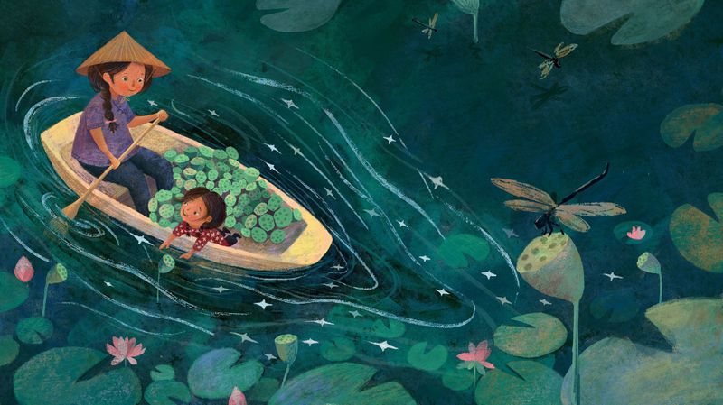
Hi, everyone.
Here is my "amlost final" version for this piece.
Does the color gets a bit muddy?
Any critiques on the characters? I always struggle with the character painting.
-
I don't think it looks muddy at all. The color is really beautiful and the characters look great. Maybe the mom would only have one longer paddle or pushing pole? I think the rowing style for two paddles, the mom would be facing the other way in order to propel the boat forward? Maybe it doesn't matter though- I know everything doesn't have to be accurate to make a good illustration.
Website: www.tessawrathall.com
Instagram: www.instagram.com/tessawrathall_art/
-
@xin-li I like your colors. The skin colors compliment nicely with the green surroundings.
-
@xin-li I love it! Good luck!
-
@TessaW thank you so much for pointing out about the paddle. I think it is really important to get that detail right, to paint a believable world. I knew nothing about rowing a boat :-), looking at youtube video now. I remmber once an art mentor pointing a mouse character I drew and asked me "hmmm, he has a huge head, how would he be able to put on a t-shirt. I suggest you give him a shirt with buttons instead." I was enlightened that day :-).
-
@Nyrryl-Cadiz @Julia thank you so much.
-
I changed to one long paddle for mamma. Thank you so much @TessaW
I still got some days before the deadline for submission. I will let the piece sit for a day or two now. Let me know if you have any more thoughts, comments :-).
-
The colors are beautiful! Not mudy at all. Nice value and color contrasts! Very cool image!