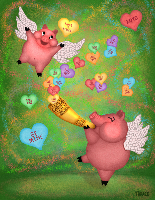
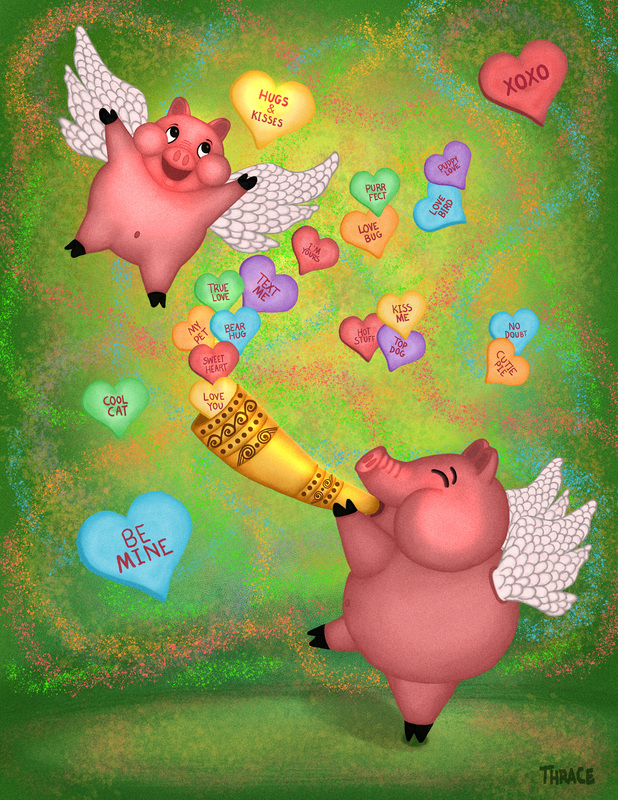
My "when pigs fly" pigs are getting ready for Valentine's Day!
-
Using my pigs from December 3rd Thursday for another project. What do you think?

-
Lovely! The only thing that bothers me a bit is the green background. It seems quite hard, but maybe you've tried other colors already and this works the best for you? I think that blue might me less 'screaming' and more like they really fly into the sky.
-
@Leontine I will try it thanks!
-
I can't believe it's January already and we already have to think about Valentine's Day... I'll be working on Christmas illustrations again before too long haha
Ace
-
@Leontine I didn't like it with the blue but I did change it a bit.

-
Nice! I just love the characters!
-
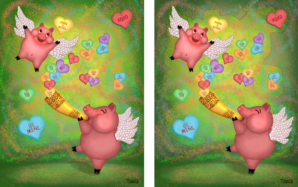
@Thrace-Shirley-Mears Hello Thrace - i am not sure about this idea of mine but here is what i was thinking - it is possible that the saturated edges are pulling my eye off the page - i think saturation is a way to guide the eye of the viewer - i just did a quick cut and past of slightly desaturated edges to see if it helped with this (i didn't push it very far) - i think the way i did it is not good but i do think that it is easier for me to focus on the characters with the edges being less saturated - what do you think?...... i just did a little poking around and discovered the "Sponge tool"!!! you can use it like a brush to desaturate areas - hold down the "Dodge tool" icon and it will appear
