Gabby's DragonFly WIP thread
-
or you could larger the shadow a bit up. one thing i dont like in the newest version are the wings of the dragonfly. it looks as if it falls down instead to lift up. i personally would go back to the bw version.
-
@Gabby-Correia, I totally see that now. I like the idea of the huge shadow, but I'm not sure why I totally missed the shadow in the color version. I saw it in the BW version. I think one thing that helps is how the shadow only falls on part of the one boy's face in the BW version. Makes the shadow more "readable". Rather than changing the lighting in the whole pic, maybe just light up part of that boy's face in the color version... as if the shadow is only falling on part of him. See what that does. I think that will really look good. Could possibly be a simple solution so that you keep all that interesting color work.
-
@Eric-Droke YES! I had that same idea in mind with lighting half of the one boy's face. Thank you so much for your input!
-
@Molambo definitely going to try making the shadow more readable, thank you for the feedback x
-
@Gabby-Correia hi! I really like how your piece is becoming. I like your colors, lighting, and the kids’ expression. However, I can see 2 major issues that you should consider:
-
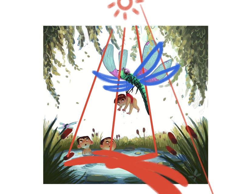
The Dragonfly’s wings. Dragonfly wings don’t actually bend like that when in flight. Keeping them more rigid looking is more accurate. Here’s a video on how dragonflies fly
https://www.youtube.com/watch?v=cJJowVxiaRU
https://www.youtube.com/watch?v=m5XUdvBO_TE -
The Dragonfly’s Shadow. Seeing that your lighting is directly from the top, your shadow should be angles differently. I made a rough sketch below to show how I would go about drawing the shadows.
I hope this was helpful. I’m excited to see where you’ll take this piece.

-
-
@Nyrryl-Cadiz Oh wow! Thank you very much for all your help, thought, and effort, it is very appreciated it. I will definitely take it on board!
-
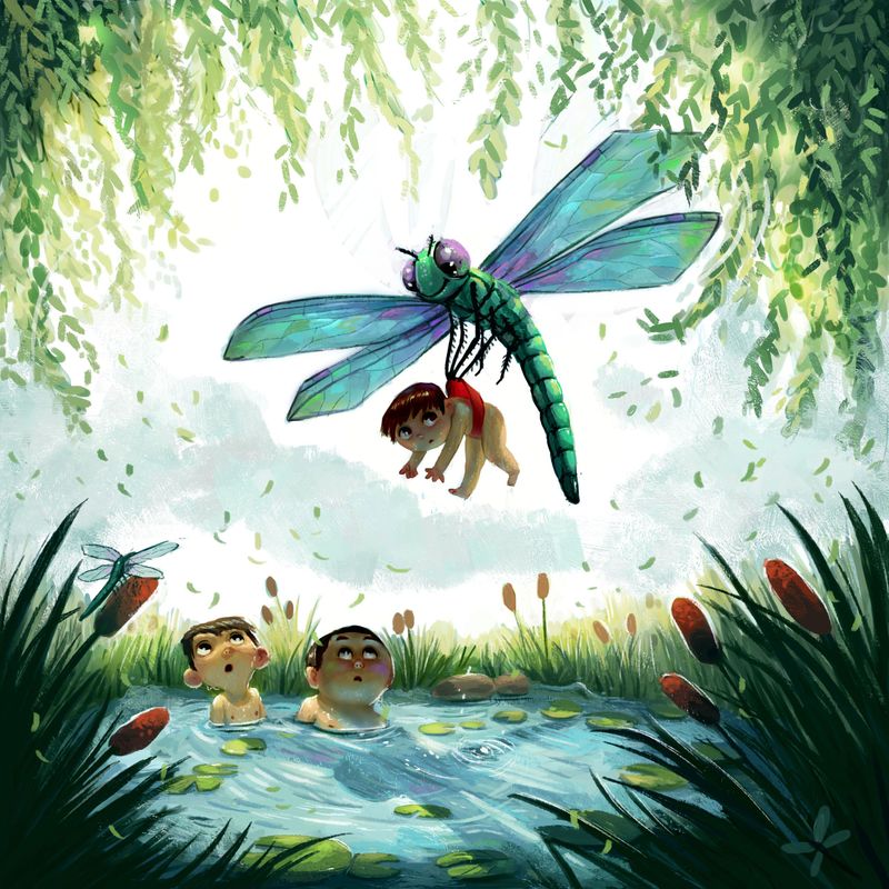
Any final adjustments before I call this one finished?
Thank you to everyone who helpe me out so nicely

-
@Gabby-Correia This is beautiful!!! I love how this turned out. Your lighting is amazing!
-
@Nyrryl-Cadiz thank you so much for your help!
-
@Gabby-Correia no probs! I’m always happy to lend a hand.
-
@Gabby-Correia , GREAT job!!!
-
@Gabby-Correia This is a beautiful illustration, Gabby! I'm just wondering if the dragonfly has eyebrows or if they're supposed to be antennae. Either way, it makes the dragonfly look menacing, which is great if that's what you're going for! If not, I would remove the eyebrows/antennae altogether. Really stunning piece either way! I love your colors and textures.

-
@Nyrryl-Cadiz You probably know this but rays of light from the sun are parallel, so the shadow would be the same size as the dragonfly (or cloud or airplane) in the real world - though I know we aren't in the real world. Closer light sources make bigger shadows, obviously. So the spreading-out rays could create the effect of a miniature world, which might be cool.

-
@fpichel hi! You are absolutely correct. When making an illustration though, the artist can bend the rules as much as they want to achieve the most pleasing effect. It's helpful to think of one's piece as a film set and you are the director. You can move elements whichever way you want, you can use whatever type of lighting you want, you can do whatever you want.
-
@Gabby-Correia wow this is really nice Gabby, I just love how everything in your scene interacts with the Light, and blends the colors together.
Great job! -
@cszoltan Thank you very much!
