3 Areas of Feedback Request
-
These are a few of the illustrations (and cover) for a series called: “Guess What I Can Be?“
It is focused on professions.
I work in two styles. This is the “lined-heavy” style. A bit less rendered. My other Style is fully rendered.
I would love feedback on three areas:
- How do the compositions read?
- How do my character silhouettes read?
- Does the image make you contemplate a “back-story” or “front story”: What is motivating the character‘s action? (A past and/or future anticipated experience)
Thanks in advance!
Dud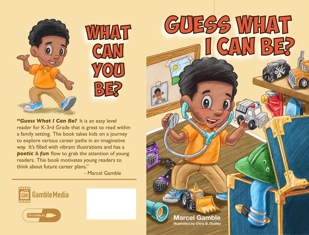
www.chrisdudleyart.com
@artdud
Instagram: @chrisdudleyart -
@Art-Dud sure! would you like me to do a paint over?
Portfolio: nyrrylcadiz.com
Instagram: https://www.instagram.com/nyrryl_cadiz/
YouTube: https://www.youtube.com/channel/UCbJCF1Im8ZO7hpGWTKOJMuA -
@Art-Dud said in 3 Areas of Feedback Request:
I would love feedback on three areas:
- How do the compositions read?
- How do my character silhouettes read?
- Does the image make you contemplate a “back-story” or “front story”: What is motivating the character‘s action? (A past and/or future anticipated experience)
1 & 2) I really like your style and the character is in a great variety of dynamic poses that read well for each scene. I love the secondary focal points like the hip hop teddy winking and the apple juice I.V. haha

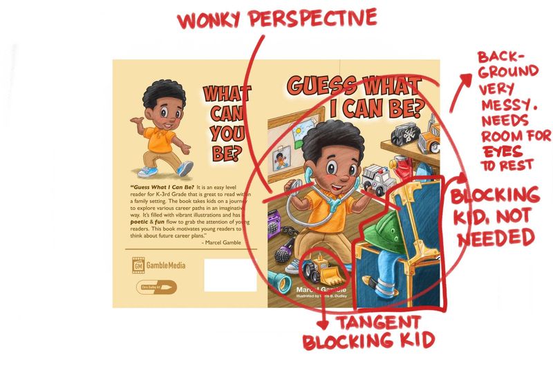
First up for feedback: the perspective is a bit wonky in all of the images, sometimes it kind of works (to push the backgrounds into more obscurity) so I’m not sure if it was intentional but it stands out as a bit visually jarring in other areas (especially the shelves because they look unstable).
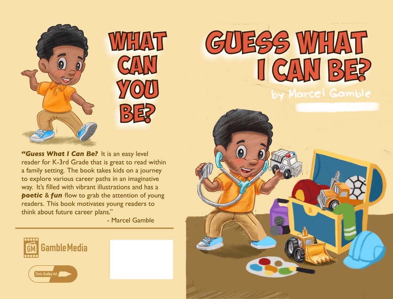
Front cover: Would a brighter colour shirt work better? That yellow blends in a bit to the background. I feel like a red shirt would showcase his energy and enthusiasm for so many different occupations. This is the image to really represent your character’s personality considering he is ‘in costume’ for the rest of the scenes.
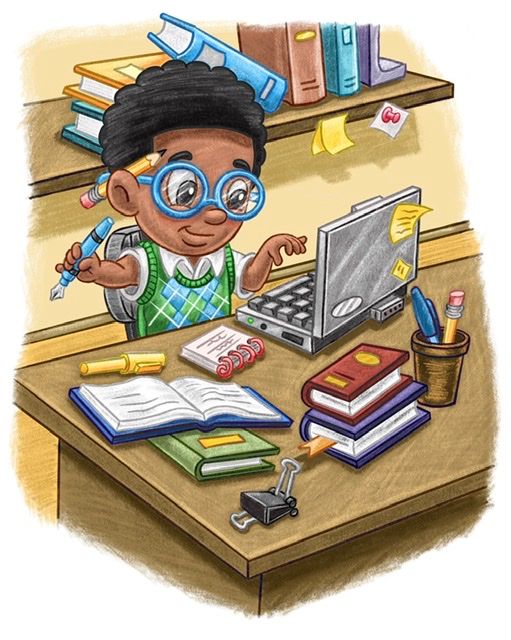
The ‘office’ scene: doesn’t really give a specific career angle, I have no idea what he is working on so it doesn’t invite me in like the others. It’s also a very all beige, tight space - I really want to remove or push back the books behind his head and see some more intriguing objects.
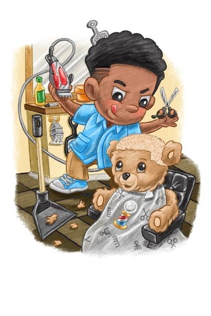
The haircut scene: is my favourite storytelling. I love how earnest he is in his work and teddy’s expression looking up at his new do
 The problem here is that the boy looks like he is standing too far back to be that close to and high above the teddy (especially if he’s seated in a chair)
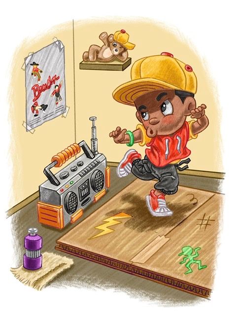
In the dancing scene: the back leg could do with being resized down a bit and shaded to push it back, I keep getting confused about which leg is closest to the viewer


 I wonder if he is singing or whistling or just pouting in concentration. Also a lot of attention is being drawn to the water bottle in the foreground, perhaps fade it or move the purple tone to the boom box or hoodie instead? There are a lot of warm colours dominating in that scene.
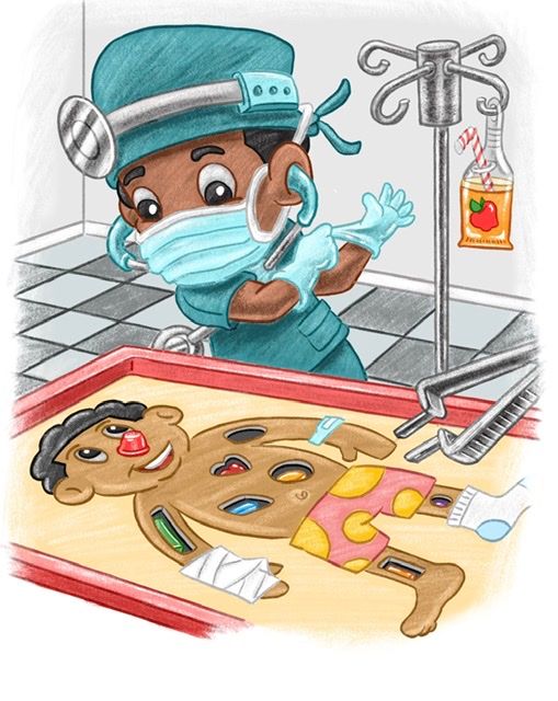
The surgeon scene: is my favourite! It has a really satisfying harmonious colour palette (good balance between cooler and warmer tones that helps us see the character more clearly) I also instantly recognise the game and appreciate the humour (I’d be interested to know if it could cause any copyright issues with Hasbro in publication though?)
3)As for back-story/front-story, it’s tricky because you’re communicating his aspirations more than his reality. I read that the character has a lot of varied interests is energetic and imaginative. I want him to win in life and stay curious to learn more and find what makes him happy. I think you could show a bit more personality in his surroundings to help the audience get to know him and get more involved making estimations about which career we think fits him best because of the hints we saw. But that could be difficult too because most of your images are at a tighter crop - perhaps have some different camera angles...also what if he was outside in at least one of the scenes?
Sorry, that was looooong, but there were a lot of images to get through
 I’m nit-picking a bit but I really like your work and think you’re nearly there with it! Hopefully something I said helps you even just a little
-
Sure, if you are willing to do so! Thank you
www.chrisdudleyart.com
@artdud
Instagram: @chrisdudleyart -
@Art-Dud sure! I’m off to bed right now but I’ll get back to you soon
-
First, I truly appreciate your taking the time to provide such great feedback!
There are 16 illustrations, so he is outside in some.
Yes, your observations helped tremendously. I can’t thank you enough.
Dud
www.chrisdudleyart.com
@artdud
Instagram: @chrisdudleyart -
@Art-Dud My pleasure. Woah, that’s a lot of illustrations! Have fun with it


-
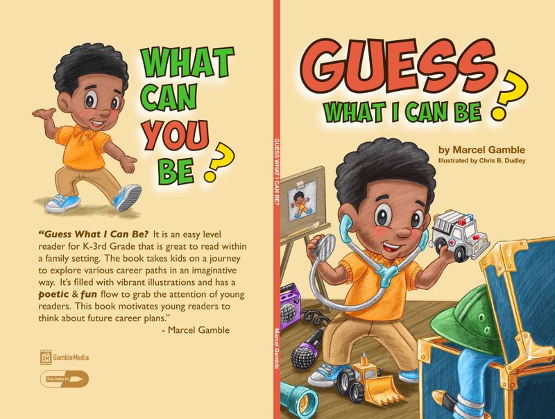
@Art-Dud HI! I think you've made beautiful illustrations but if there's one piece that I think needs critiquing, I think it's the cover. It's too busy. There so much happening that in my opinion, it looks garish. Remember, less is more. I love that you're trying to showcase all of the things this kid could be via props but we need to tone them down, remove a few. Below is my paint over. You can definitely go about this revision whichever way you like but I hope this will be a good starting point. Also, is there a chance you can have the title design redone? it looks a bit too plain. Maybe spruce it up with different font size or colors. I'm sure the graphic designer will know what to do.
Portfolio: nyrrylcadiz.com
Instagram: https://www.instagram.com/nyrryl_cadiz/
YouTube: https://www.youtube.com/channel/UCbJCF1Im8ZO7hpGWTKOJMuA -
Thank you so much for this...we are reworking things now.
This is RIGHT ON TIME. THANK YOU, THANK YOU, THANK YOU -
There are a lot of people with input. But I think I got some of your GREAT suggestions approved. Others are “fighting” their “wants”! Lol
They are pushing for deadline now! They wanted the chest facing away...to show more secrecy...thus the GUESS!
www.chrisdudleyart.com
@artdud
Instagram: @chrisdudleyart -
@Art-Dud There’s no way to put this nicely so here I go... that’s a bad decision composition-wise. Why would they want it to be a secret? They want it to be a surprise? Even if you show the toys and props, the audience still don’t know how you’re going to utilize them. The element of surprise is still there. Also, there are already toys strewn on the floor, don’t they think it’s already a giveaway? You need to put your foot down and tell them they need to trust you. Tell them your decision has been backed by fellow pro artists, You know what works best art-wise.
Portfolio: nyrrylcadiz.com
Instagram: https://www.instagram.com/nyrryl_cadiz/
YouTube: https://www.youtube.com/channel/UCbJCF1Im8ZO7hpGWTKOJMuA -
@Nyrryl-Cadiz
You are so correct! The plight of the illustrator. I had a lot of creative freedom for some things. Others they insisted on. It was a great experience over all...with decent pay too!Your help has been invaluable!