Last minute help for Wizard of Oz front cover
-
Hi all,
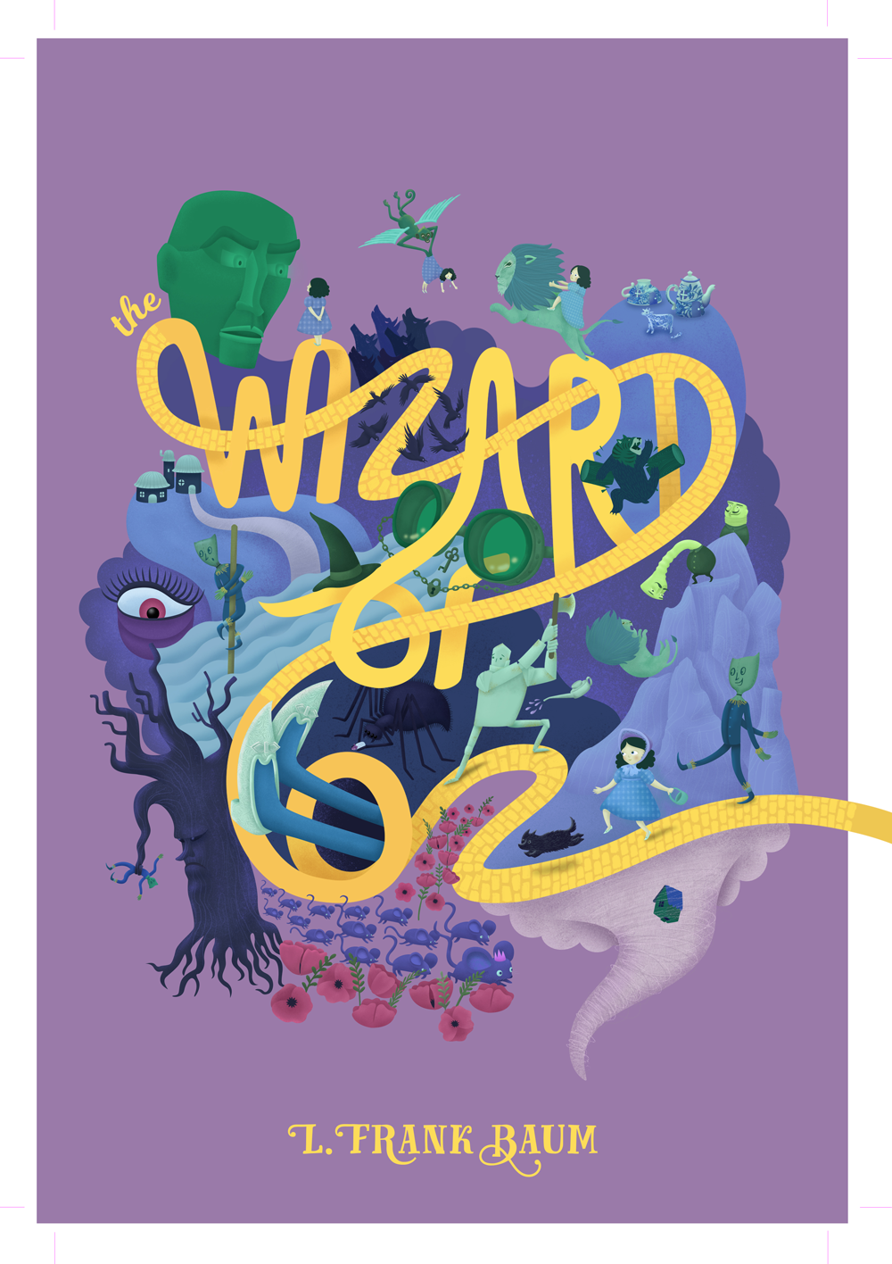
I'm looking for a bit of last minute advice on this month's submission. The idea is that the title is the yellow brick road. I have started adding brick texture to the lettering, my question is do you think it is worth continuing as it is proving very time consuming. Are there any other issues you see that I can make quick changes to? Or even large issues that I can change after the submission to make it better for my portfolio?
Thanks in advance! Sorry this is so last minute. -
@carrieannebrown I really love it! I personally don’t think the brick texture adds too much to the road, it still reads as the yellow brick road without and I am finding it easier to actually read read it that way as well - though that might be because the brick work is only partially finished on the top one. It’s really gorgeous, nice work.
-
@mamadraw thanks a lot! Yeah, that's what I thought, if it's not adding much there's no point spending another couple of hours drawing them
-
@gavpartridge That's a good idea, I don't know why I didn't try that! I need a reminder of how to do custom Photoshop brushes though, so I'll google it and give it a try
-
@carrieannebrown Beautiful!!! I love the illustration and the lettering! Sorry this is coming in late but I think your illustration and the background have quite similar values. Perhaps you can darken or lighten the illustration or the background in order to create more contrast between the two. I know you've already submitted but maybe you can take note of this in future pieces. Overall, great work! I love what you're doing.
Portfolio: nyrrylcadiz.com
Instagram: https://www.instagram.com/nyrryl_cadiz/
YouTube: https://www.youtube.com/channel/UCbJCF1Im8ZO7hpGWTKOJMuA -
@Nyrryl-Cadiz thanks so much for replying. I tried to keep everything back a level so that the title would stand out and to try to minimise the illustration elements looking messy. I know what you mean though, the monkey for example is getting lost. I'll look at it again in a few days with fresh eyes.
-
I don't have much in terms of advice, but I wanted to say I love that you added the cannon ball head creatures - I find them hilarious.
 Really cool cover!
 -
@ina They are funny, I'd never read the story until this month, there were so many great parts that painted such a vivid picture. Loved the porcelain (china) town too!
-
@carrieannebrown Same here. There were many fun ideas but I have to say the characters left me utterly cold, particularly Dorothy. Porcelain town was great though, in a somewhat creepy sort of way.