July contest feedback
-
Howdy, folks!
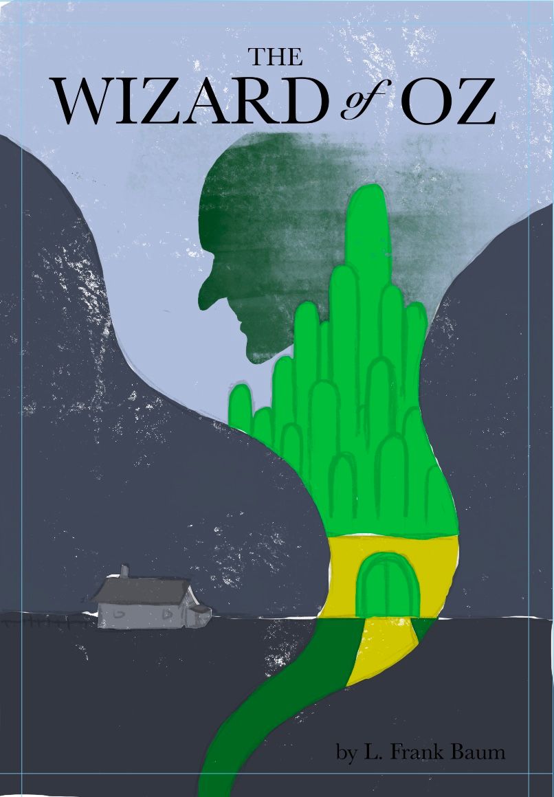
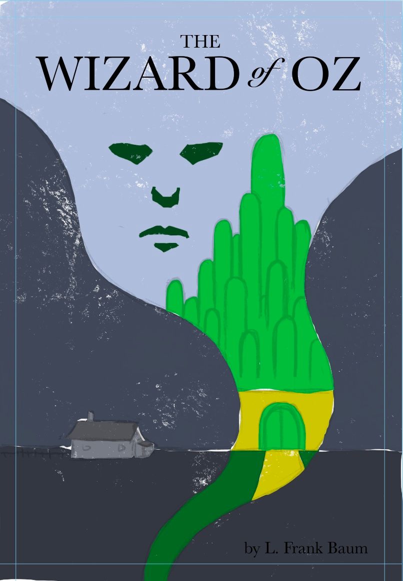
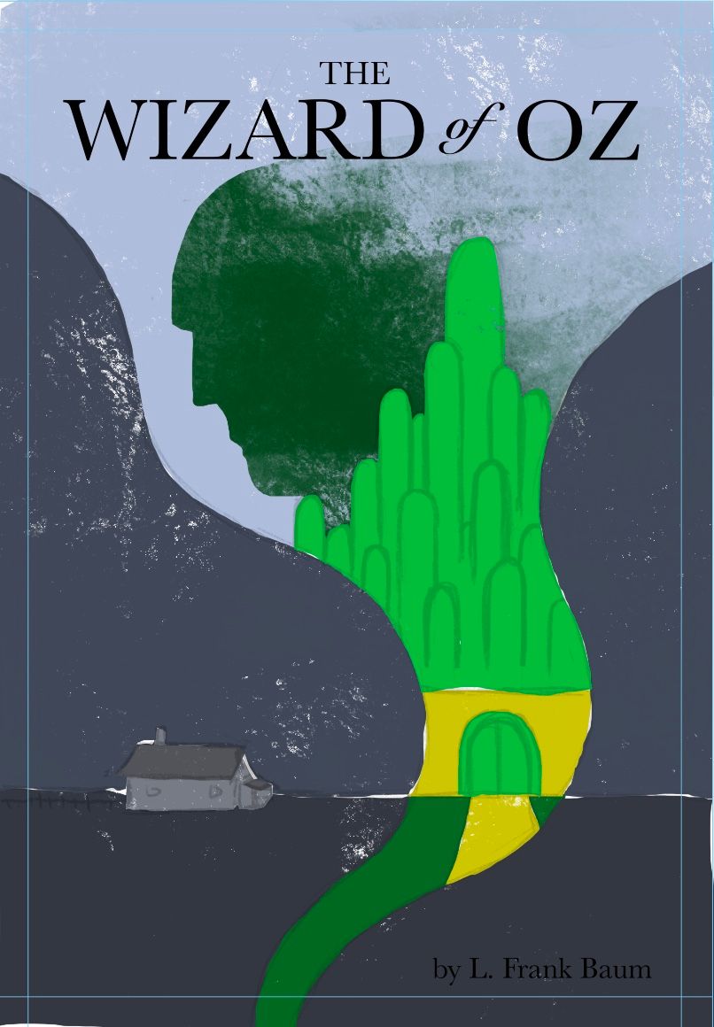
So I’ve got these three rough versions of my oz concept
I’ve got one with the wizard in profile which is my favorite but I also realize this may not be familiar enough and the association with the wizard might not be strong enough. I’m just trying to a different take on things so let me know how that’s working in your opinion.
I also have the witch in profile which doesn’t look right to me because she’s just bald and when I gave her hair or her hat it looked even weirder so I’m not sure if that’s the right option
Then I have the wizards floating face which was my original idea in the thumbnails but I don’t find it very compelling or dynamic with the rest of the image, however it is a bit more recognizable than the profile wizard I think.
Let me know your thoughts!
-
I personally like the floating face. I'd recommend seeing what it looks like if you extend the yellow brick road down into the funnel of the tornado a bit more. I'm getting 60-70's vibes from this cover- it's cool!
Website: www.tessawrathall.com
Instagram: www.instagram.com/tessawrathall_art/
-
@Griff I’m liking the middle composition best
-
@TessaW glad you’re liking it! I definitely need to play around with the yellow brick road. Still much to do!
-
@Kevin-Longueil awesome, thanks for the feedback!
-
I also vote for the middle cover design with the face in frontal view. Loving the retro vibe on these!
