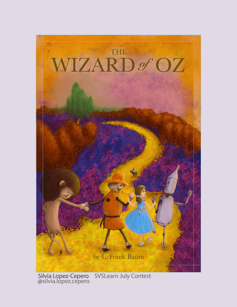
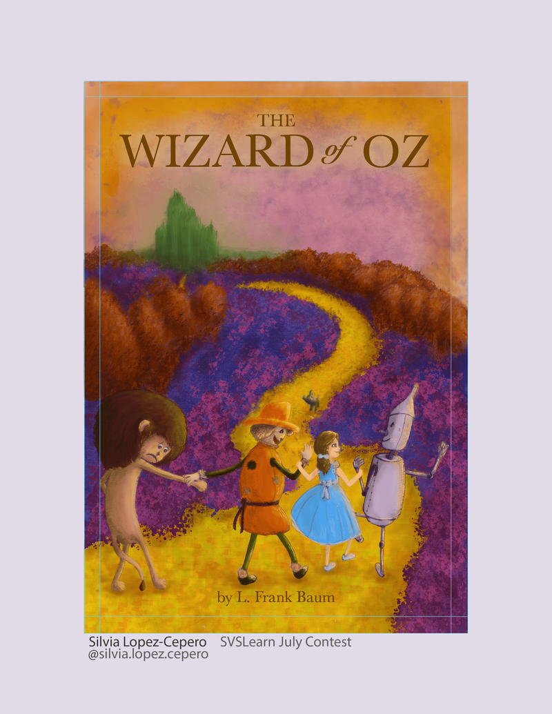
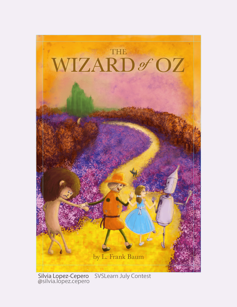
July contest - any feedback please?
-
Thanks! Great tips. I didn't remember Toto was black! Oops! I was thinking of changing the hat to a more orange or green too... I think I'll give it a go
-
Ok, this is it! My last two versions, with black Toto and an orange hat for the scarecrow... one with reduced saturation... now the question is... which one is better? Thank you everyone for your help!


-
@silvialcg hi! With your permission would you let me do a paint over of your work?
-
@Nyrryl-Cadiz You mean to show us here? Sure. Curious to see what you’re doing lol
-
@Nyrryl-Cadiz by the way, is Cadiz your last name? That’s the name of my province

-
@silvialcg yeah it’s my surname.
 I’m Filipino and we were under Spanish rule for 330 years since the 1500s to the 1900s. They gave us all spanish surnames like Gonzales, Garcia, dela Cruz, and sometimes Cadiz.
 -
@Nyrryl-Cadiz Hmmm... in the name of my ancestors: sorry...
-
@silvialcg im sure @Nyrryl-Cadiz will demonstrate this, but a good rule of thumb is 'light over dark, dark over light'. So as your background, largely purple, is so dark, in order to stand out, everything in the foreground should be lighter. See how tin man stands out ok, but lions hair blends in.
But in nature, things rarely work this way. The further away things are, the lighter they become, because od atmospheric perspective. So if you just make that purple 'greyer' the foreground elements should read better. Im sure this has been said but i skim read the posts, and im drunk, so i apologise if im repeating other, surely better, advice. Compositionally though, and character design, i think its a really fun piece. I just think the colour theory/values are the things you could improve.
-
@gavpartridge Thanks for your feedback. Yes, I've been playing with the saturation of the purple flowers and I may bring it down more to emphasise the characters. My problem with that was that I really liked the bright, playful colours of the background. I'm trying to create a world that is closer to a dream than reality. Any other way I could increase the contrast without sacrificing the colours?
-
@gavpartridge I'm thinking I could add extra flowers and make these a light colour to contrast with the lion... Not sure what I could change on the path to emphasise the scarecrow and Dorothy...
-
@silvialcg one solution to help dorothy etc, would be to take the path colour, and lighten it a bit and desaturate it slightly, the paint the path around their heads this new lighter colour. Continue to do that as the path recedes into the distance. At the minute its all the same colour, from the foreground, to miles away in the distance, its all the same colour.
Same goes for the purple, and for the brown trees, they need to fade out the further back they go, otherwise it removes all depth from the painting.The range of values you use should get smaller the further away things get. Save your darkest darks and lightest lights for the foreground characters and elements, you always get a the greatest value range for those things closest to you.
You can paint really dark saturated flowers right up close in the foreground, but they shouldnt really be so dark if they are far away.
-
@gavpartridge Thank you so much! Very helpful feedback. Let's see how much I can apply before the deadline!
-
Well, ran out of time, but I tried to apply as much of your feedback as possible. Thank you so much! Definitely an improvement.
