Missed the June critique arena--would love some feedback on this
-
-
I don’t think June critique arena happened yet. Maybe it will be this Thursday or next. I’m sure they’ll announce something soon.
-
@Coley Thanks, yeah unfortunatly I missed the deadline for entry. I was just looking for any critique folks in the forum might have.
-
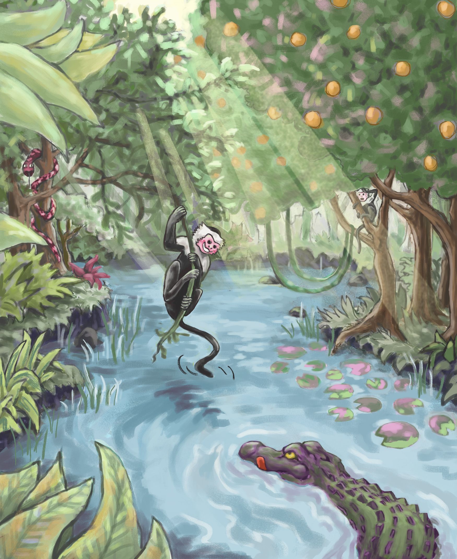
@amiklo This is so beautiful! I love the sense of depth in this.
Some feedback:- I'd soften the edges of the light rays shining in and maybe experiment with some other blend modes? Right now it feels like you've just lowered the opacity on it.
- If you're showing distinct light rays, it would be cool if you could show distinct shadows as well. The underside of the orange tree could be darker, there could be spots of light/shadow on clyde etc.
- Overall increase contrast and value range. Although you've given a good sense of depth through perspective and overlapping, the colors are all the same. The green of the leaf in the foreground is the same green of the grass and tree in the background. You'd want the foreground to be darker values and more saturated in color, and slowly fade into lighter values and desaturated colors with distance.
- The edges of the leaves in the foreground could be sharper.
Overall, lovely detailling and character desinging!
")
-
@Neha-Rawat Thank you so much! This is really helpful and I appreciate you taking the time.
-
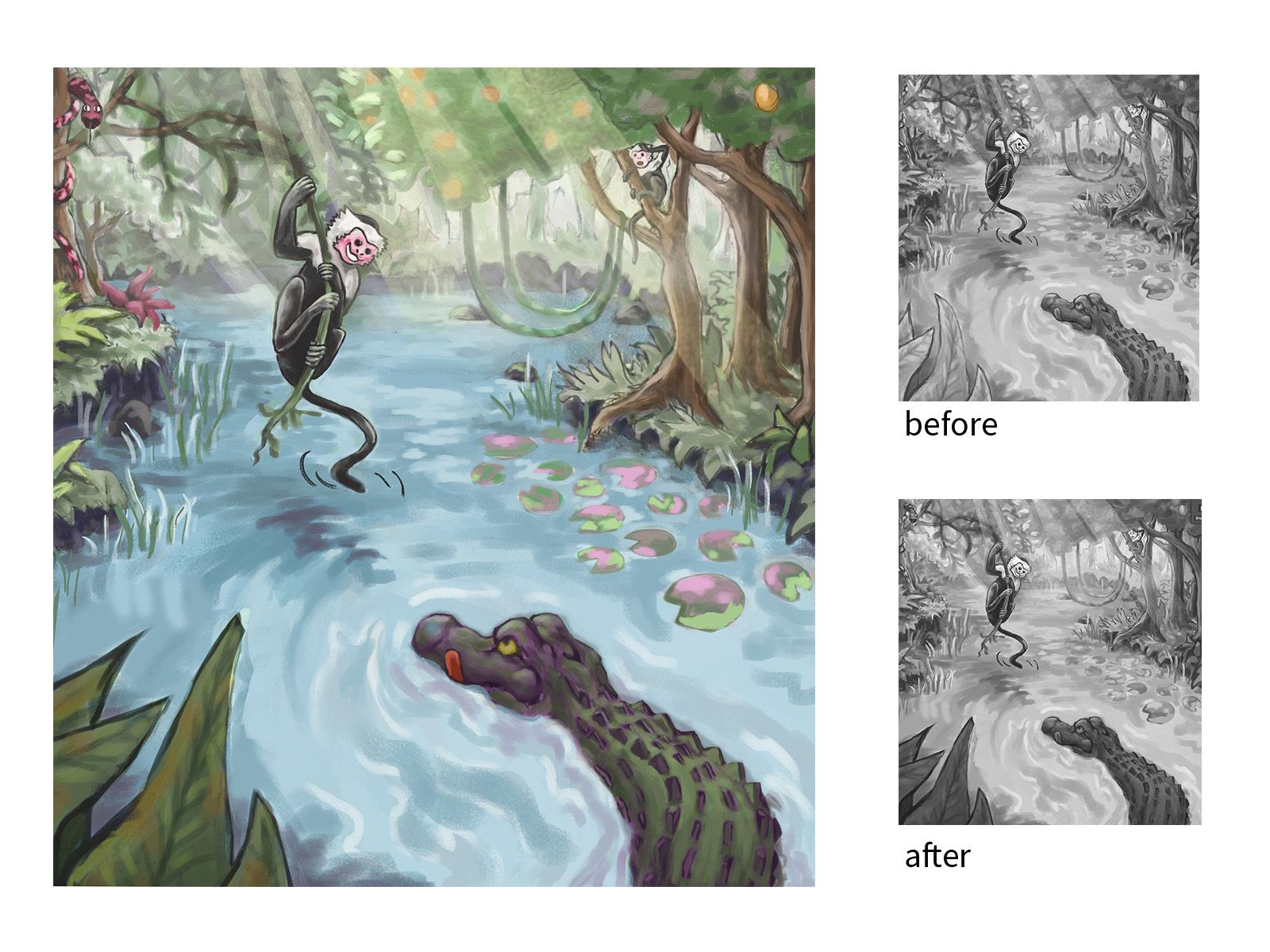
Hey @amiklo I did a couple things to show you
-
i changed the crop to better utilize the rule of thirds, I think you just had a little too much jungle on the edges there.
-
things in the foreground would be darker while things in the background would get lighter, I lightened the background and darkened the foreground leaves in value to separate the foreground/middleground/background and help make the characters pop
-
I took those leaves in the foreground and warped them to point back into your composition instead of leading the eye out. I also faced the snake inward so his head is pointing into the picture instead of out of it.
You can see how these things effect the value range of the piece to strengthen the focal point of the illustration. Some other things you could work on to take this to the next level:
-
watch your edges and use of outlining, it looks like you've used an outline on the alligator and the foreground leaves but there are places where you've painted over it and it gets a bit squishy and flat. you've also not used outline on the leaves of the tree bongo is on but brought the outline back for the orange tree, which is further back in space and should have less detail showing. This makes it confusing to try and figure out where that tree is in space.
-
pay attention to color value and saturation. I feel like right now the trees, water, and characters are all hovering right around the same value and saturation. save clyde and bongo. The focal point should have the most value contrast but playing with saturation and more subtle value shifts in the background will help give your illustration more depth.
Taylor Woolley
(Formerly Taylor Ackerman / StudioLooong)
Website: www.woolleystories.com
Instagram: https://www.instagram.com/woolleystories/ -
-
@StudioLooong Awesome. I appreciate the detailed feedback and visual examples. This is exactly what I need.