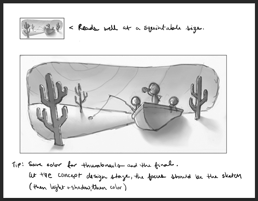
Portfolio piece WIP
-
Hello,
I am new to SVS but I have been loving all of the content. Now I am ready to start participating in and taking advantage of the community.
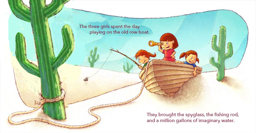
I am hoping to finish this illustration for the SCBWI winter conference in February. Can I please get some composition feedback before I start my final sketch?
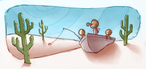
THANKS,
ANDY -
-
Thanks for the feedback Kendra!
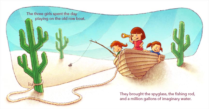
Any more thoughts now that it is painted?
-
This is a great illustration! I love your style, and the painting is great!
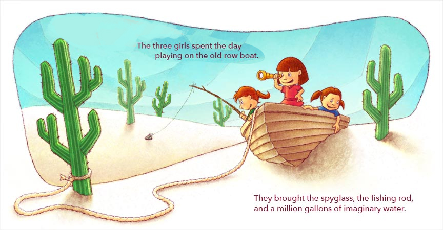
I try 2 changes that could maybe improve it (but I'm not a professional and your illustration is already great!) : I try changing the placement of the text because I felt it was a little tight where it was. I also tried adding more cactus in the distance.
I hope it helps, but as I said it's already a great piece!
-
@Andy-Meeker Hello Andy - i did a quick draw over...but i did it over Noemie's by mistake
 - but it is just to convey an idea so i think it still works just to show my thoughts - really it looks very good - what jumps at me though is the scale, angularity, and similarity of shape of the cacti - i think varying the shape and size might be good - the sharp angle on the cactus arms makes them look very graphic to me and almost stamp like -one other thing is that there is no focal point just yet - i take that back...there is a focal point but not made with color and light - the figures are where we should be looking but i think that the cactus closest to us commands almost as much attention because of how saturated it is.... i am not a color and light guy yet but i think it is worth thinking about - the image is very nice it just seems like you could light it a bit more to guide our eye where you want it to go...even just by lowering the saturation of the cactus or increasing that of the figures - anyways these are just my thoughts
  - really nice piece!
-
I have no insights to add - I think the others covered that well - I just wanted to say that I really enjoy this piece!
-
@Andy-Meeker Hello again Andy - one other thing I think might be worth looking at - the row boat does not have a stem - this would really help the anatomy of the boat if you add this
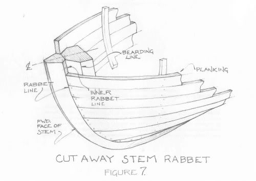 - I found this on google
 -
@Andy-Meeker This is a lovely piece. The colours are perfect and I love the new cut cactus to add more perspective. there is one slight change I think may add to this. I hope you don't mind me saying. The girl with her hand over the boat - her has is a bit of a tangent, if it was out slightly and dragging the sand, as if it was water, with wake behind it. Just a thought. Awesome work.
