Critique Please! - Fantasy Illustrations
-
Hi guys,
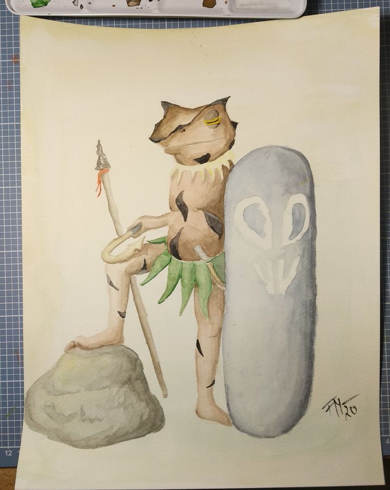
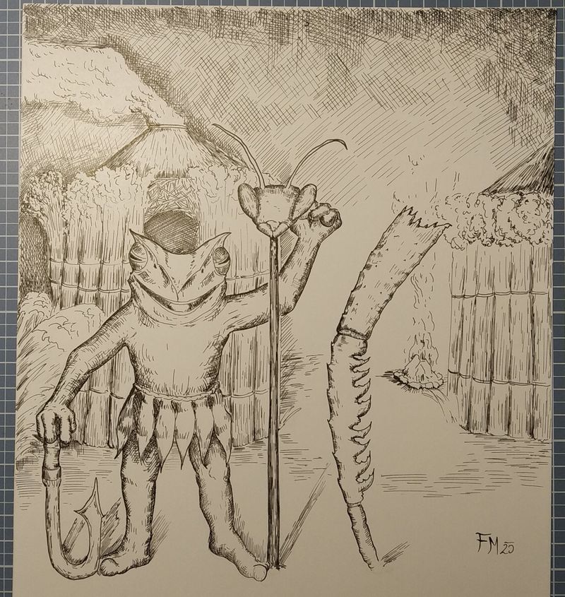
I am working on a group of sentient frog people for my fantasy world and did some illustrations for them, to kind of set the atmosphere for them.
What do you think?Also this is me forcing myself to post something on a forum for the first time.
")

-
@FMComics Hello and welcome to the forum! Good on you for posting your art here, considering it's the first time you are doing so.
The artwork has a very quaint feel to it, which I really like. Are you planning to go with the watercolours or ink as your final medium of choice? In the first ink drawing, I love the bold outline around the frog character making him stand out from his background. Would it help to have the character pose differently - perhaps a little turned to the side and engaged in some sort of activity? It might help make the character appear less stiff.
Keep going with these! -
Why do those frogs with the weird head shapes as opposed to normal frogs?
Traingles and sharpness in design mean danger. And I just can't help but get distracted by the head shape since it's the only sharp thing about them. Too sharp for my tastes, I would round it down.
But I really like the idea and the atomosphere is really cool!
-
Thank you for your replies!
@animatosoor This is one of my first watercolor pieces, until now I only worked with ink, so I am not sure yet. But I love the different atmosphere you get with watercolor in contrast to the sharp outlines of pen and ink!
@Frost-Drive I saw photographs of real frogs with this head shape online and thought they would make cool characters.
But the overall shape language is definitely a thing to keep in mind! -
It's challenging to respond to your question since it's not specific, but maybe you didn't have specific questions in mind? So I'll just respond generally:)
I really like the world-building happening in the pen and ink. The tools and costumes and setting are all so interesting and make me curious. Regarding the design of the frog people, are you in the exploration stage or are these designs pretty solid for you? Currently, the frog people read as sinister, with all the sharp angles in their heads and eyes, and their grass skirts. So their wide smiles are a bit confusing--I'd think they'd be sneering or not smiling. The non-smile of the watercolor version is perfect.
Regarding the two different styles, I like both, but with the level of detail you seem to want to convey, the pen and ink version, maybe with a wash of color or value, might work best. And if you do go that route, I find that a limited palette for so much detail is easier on the eyes and communicates much more effectively.