Feedback on this illustration...
-
Hi everybody
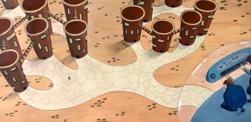
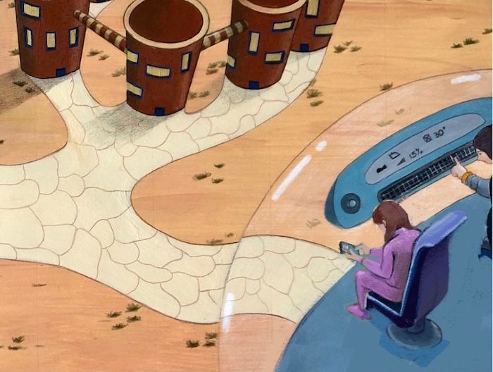
I am trying to illustrate a story I wrote to have a project of my own and make me draw and paint more. I would like to ask you to give me some feedback on this illustration. I should have asked this on a previous stage but I am happy to redo it if it's for the better. This illustration is suppose to show the main character which is tiny waving at her cousin who is arriving in the flying pod and is going to spend the weekend with the main character. This is suppose to be a kind of sci-fi, dystopian future story. My concern is that the main character may be too small considering that she is the main one. Any ideas on how to improve this would be great. If you also could give some feedback on composition, color or anything else that could be improved would be great.
Thank you so much,
Catarina
-
@gavpartridge Thank you for your feedback, I really like the idea of creating a landing site and at the same time highlight the main character. Will try to do that.
-
@catarina-c – Nice shot! Really like the angle... If this is a sequence of images supporting or telling your story, you could also 'fix it' in the next image – maybe then you show her 'over the shoulder', from the ground, waving to the pod in the sky?
Minor detail: if the window panes would follow the curvature of the towers a little tighter it would really strengthen the perspective. Oh and I'd love to see a little more of the second character on the pod! :-]
-
@PieterVanDerBeek Yes, I could do another illustration from the main character point of you, why didn't I think of that before? You are right about the windows, I will add more and draw them closer together.
Thank you for your feedback, really appreciate it. -
@catarina-c This looks very cool - the thing that popped out to me for critique is just the perspective of the girl and her chair - i did a super quick draw over - i'm not sure that i got the perspective right myself (i plotted the 3 points out in procreate so it should be fairly close...i see that i have her not sitting in the middle of the chair now that i am posting it
 I scooted the girl forward a bit too - hope you don't mind the draw over - very nice piece.
-
@Kevin-Longueil I don’t mind at all the draw over, I’m amazed you took the time to do that, thank you. The chair is indeed not following the perspective of the buildings because I wanted it to be tilted in comparison to the horizon line if that makes sense but you are right it looks weird now that you mentioned it, your version is much better. Thank you again, I will try to fix it.