May prompt thumbnails
-
Ok peeps, I quit asking for feedback on my contest WIP’s because I never seemed to actually finish a piece for the contest. Seemed like a disrespectful waste of the time of people who responded. But this month, I’m off work until at least the 18th, so I’m going to expect I’ll finish.
So, here’s some thumbs. The idea is simply a bear enjoying some fishing. I didn’t want to go with a sad theme because, frankly, I’m enjoying the isolation! So, do you have any thoughts or suggestions on any of these? Like one more than the rest? Thanks, all!

-
I think the 3/4 and side views are nice
-
My favorite is 3/4 front!

-
Thanks! I was favoring the 3/4 front myself

-
@Kat 3/4 is my favorite
-
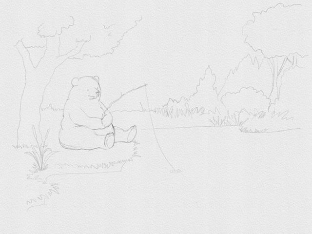
So this is a little sketch I came up with, after doodling bears and ponds and trees for awhile. I was thinking of the peace and calm of being alone. Any thoughts? Anything look wonky to you?
-
@Kat super cute, maybe give him a drink or a lunch box next to him. He does look happy

-
So cuuuute! I do like @Chip-Valecek's suggestion about adding some props to give the bear some more character.
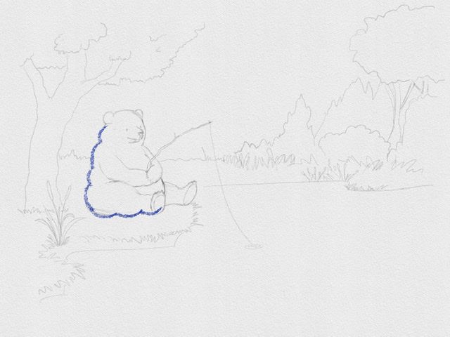
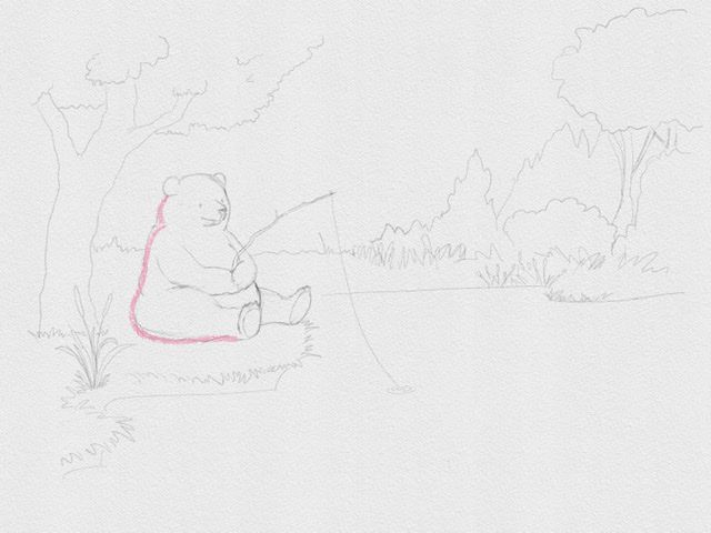
Another suggestion I have would be to vary or simplify your bear's shape/outline. I'm exaggerating what you have, but the shapes all seem too similar to each other. If you vary the shape, it'll make it look more organic.
Love this peaceful scene and I'm looking forward to seeing it in its final form!
-
Such a lovable bear! Like the suggestion about giving him/her some props...it could add more to story as a character. Also like how the background is turning out. There seems to be a lot of white space in the lower right corner. Needs something to round out/balance the scene. Not a lot of things...floating log? Some bushes in foreground? Dragonfly?
-
@Kat lovely - looking forward to seeing more of this bear!
@rachel_horne_art
rachel-horne.com -
Thanks all! @aprilshin , I agree about the bear shape. I’ll smooth him out a bit so he’s not so predictably rounded, good suggestion.
As for all the white space, I’m thinking I might crop the piece, which would eliminate some of the white space. But I like the suggestions of adding things in the corner, too.
Thanks again, great feedback! -
@Kat OMG this is going to be so cute! I did my thumbnails last night, also. I've narrowed it down to two. I'm favoring your 3/4 Front! The composition is nice and you could do a lot with that one to produce the visual "triangle." I can't wait to see it. I have gone with an upbeat isolation too!
-
@Kat You could even add some depth and put a lil frog watching the bear from afar on a lily pad somewhere around the bottom right corner. ;o)
-
@kittytreets awww...how cute!
Well, I got word that I’m going back to work on Monday. Really enjoyed the time off and I was starting to feel like I was making some progress with my skills. Hard to not feel depressed now, thinking of how little time I will have again. But I’ll do the best I can. At least I’ve got a good start on this months contest.
-
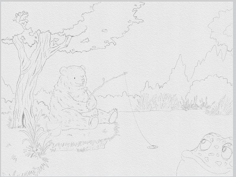
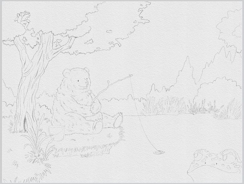
Did a little tweaking, adding a frog and a simple fishing pail, and cropped the image a bit. Do you have any preferences on the frog, or see anything wrong that stands out? Thank you all!
-
@Kat I vote for Frog #2

-
@Kat That bear looks so content. One thing that struck me as odd was how the bear is holding the fishing pole. It seems to end but I'm not sure how the pole would be lying against its belly. Super small thing, but thought I'd share it. I also prefer the frog in the second image.
I also like the shape of the tree.
-
@Christijan good point about how he’s holding the pole! He needs to be grasping it more, maybe change the angle of the pole. Thanks!
After thinking about it s’more, I decided to go with a log in the corner. Adding another character would mean he wasn’t isolated anymore

Thanks all! Great feedback, I appreciate it.