Sketches Feedback (This Pasts Aprils Prompt)
-
Hi, I know the April Contests has passed, but I've decided that I wanted to start participating in prompts to build a new portfolio. I loved last's months Prompt. " Lisa's robot invention worked great until it did this."
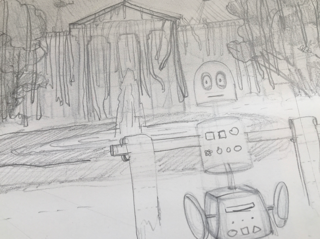
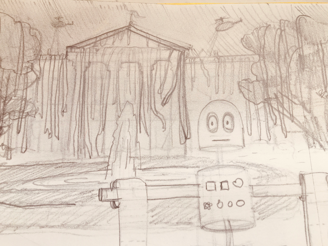
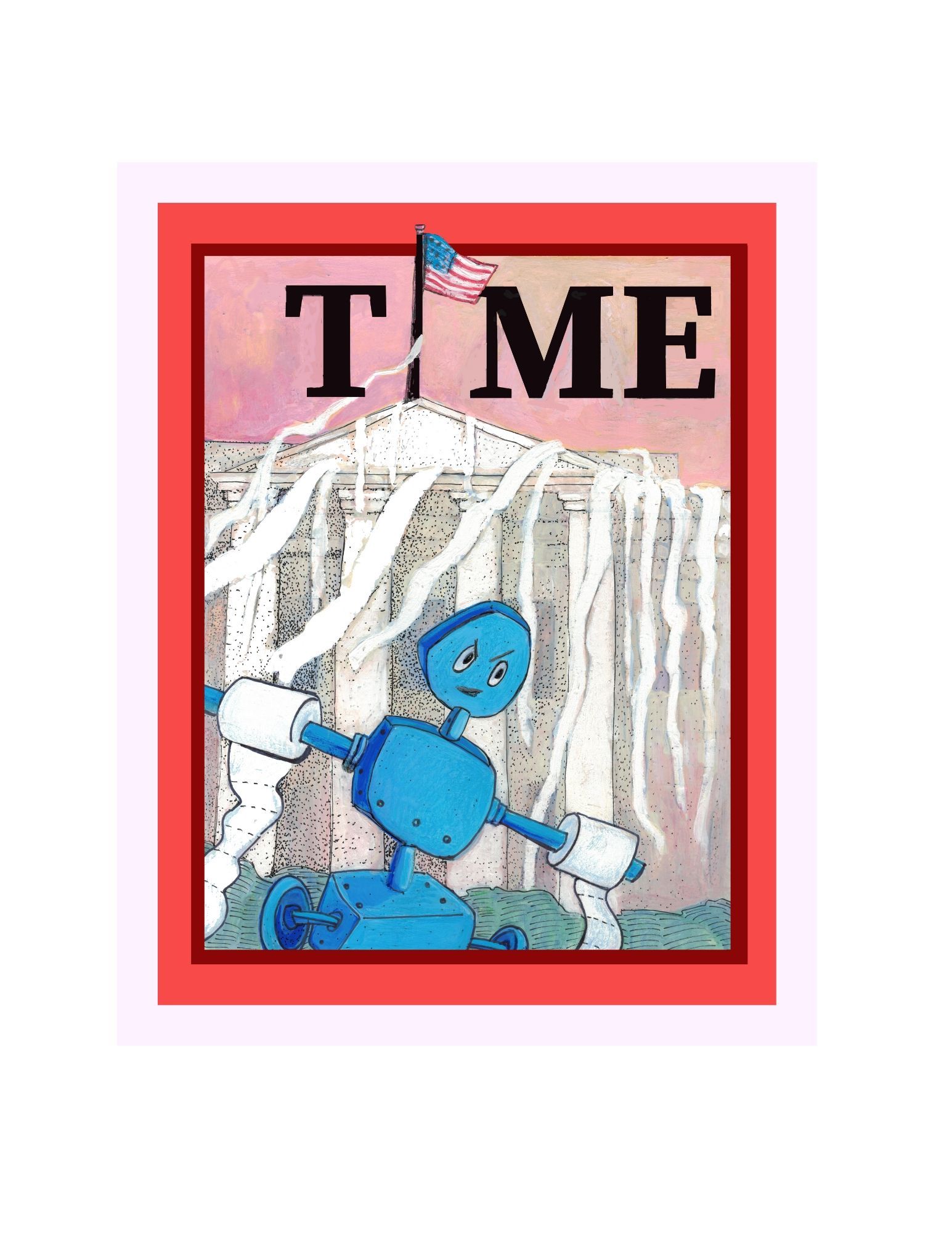
This is the concept that I've chosen to go with. I did some ideation around funny things that kids would would do, and that I remember as a teenager. I wondered what it would be like if Lisa's Robot TP'ed the Neighborhood. Next, I thought that might be too small of an idea. I wanted Lisa's robot to do something shocking that could get it into trouble. So, then I thought what if Lisa's Robot Toilet Papered the White House. The one house on the block that supposed to be secured.
So that's the idea I went with.
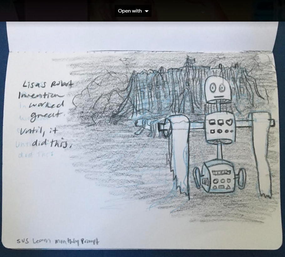
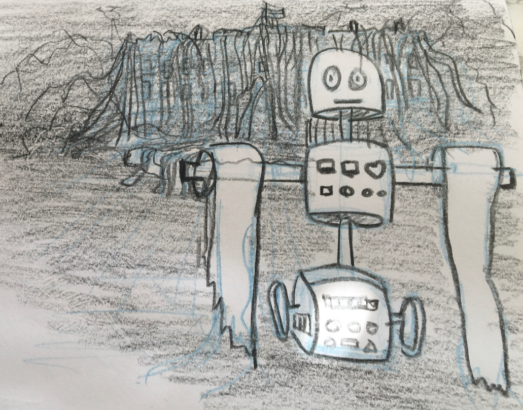
For the robot, I was thinking about who Lisa is, even though I'm not representing her in the image. I thought about the kids in Robotics at middle school, and the first D.I.Y. robots that they've made. So, I came up with a simple design, with some buttons and a heart barret or pin. To express the personality of Lisa. The sketch doesn't fully express that yet, but that's where I'm going.
I needed some advice on the overall sketch, composition, and positioning.
@xin-li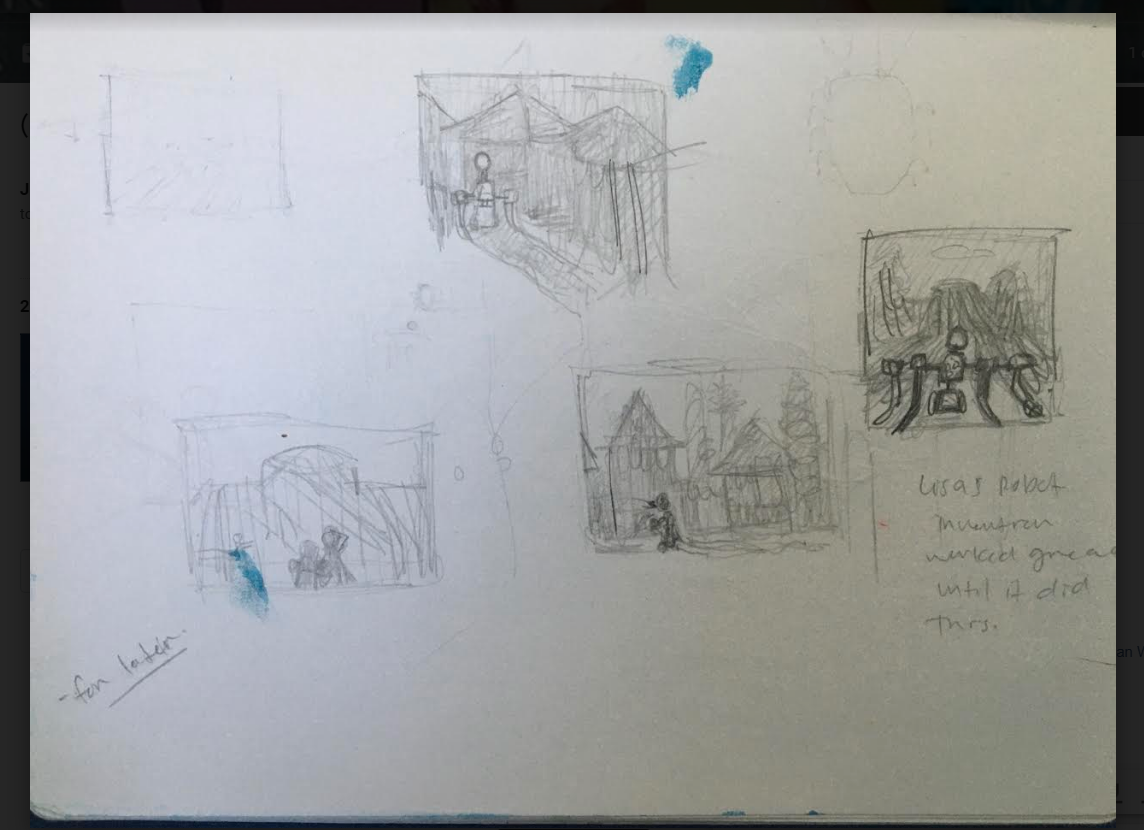
-
It's not too late to enter! The deadline is April 30th, so you have a couple more days if you work really fast!

Regarding the sketch/composition/positioning: I liked the sketch you did in your sketchbook the best. It reminds me of a Middle Grade gray scale illustration, not filling up the whole page, lovely textures, etc. I wonder if you leaned into that, you actually might lift off some pressure to complete a fully rendered full page illustration and challenge yourself to develop something within strict parameters?
One thing I would change, though--I'd flip the values to make the foreground a bit darker than the background. Lean on "atmospheric distortion" and make the things you want to recede into the back planes of the picture appear a bit lighter and less detailed. That way, you can really emphasize the wonderful robot and his toilet paper rolls. The TP'd White House in the background is great, but I feel like right now it appears to be in the dark of night. And that's a great choice, but that means you'd need to really emphasize the shadows and such on the robot, too, so they'd look like they're in the same world... And that might be really challenging on a short timeline.
My 2¢.

-
@Jennyann regarding overall sketch, and composition, I follow more or less Lee white's process. Here are 2 of his videos which I find extremely informative, and I recommend to every illustrator who wants to learn more about how to ideate for a great illustration.
https://www.youtube.com/watch?v=h6u_g0RPiCA&t=11s
https://www.youtube.com/watch?v=jghVE4V5FfUA couple of things I would always keek in mind when I make thumbnails:
-
Always have emotional keywords to anke your composition, design choices. Think about how you want to your viewers to feel about your illustration, and use that to decide your composition, choise of shapes, and camera angles, etc.
-
keep it simple. Think what is the simplest way to express your idea.
-
Lee used to say this in his class "is it a light shape in a dark background, or a dark shape in a light background?". I always think about this, especially in the thumbnail stage.
Hope this is helpful, and keep going with your robot :-).
-
-
@Coreyartus Oh, that's great. I had thought it was due on the 20th. Thanks for the feedback. I think in my next round I'll work on the values. I'll also challenge myself to complete this in the next 3 days. Fingers crossed.
-
@xin-li, Thanks for the links. Some of what you mentioned is are some of the goals I'm working on. Especially around keeping it simple, and working on my values. I'm more of an experimental artist who dallies a lot, but since I've been getting more serious about my Illustration. I'm trying to stick to a process, but I often abandon it.
I love the ideas of emotional keywords. I think that this will definitely keep me anchored while doing my sketches.
I always love your feedback. It pushes me. Thank you!
-
W.I.P.
Which one are you drawn to?
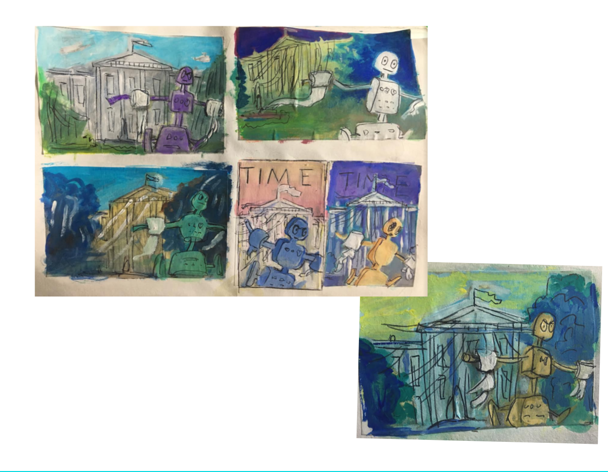
After finishing the thumbnails, and adding some emotional prompts. I played with some color studies today. I don't think I'll finish this by tonight, but I'm happy with my production progress so far. Next, I plan to choose one, enlarge it, and transfer it to another sheet of paper. Then I'll work on rendering it a bit more, and then I'll work on the final piece.
-
@Jennyann i like the top right
-
@Jennyann I like the time magazine with the red background! I feel like it adds more to you story and made me smile!
-
I like the top right as well. The composition as well as color study. I would assume if any sort of prank as this would be done during dusk/night time. And I also like the asymmetry of the bushes covering only one side of the White House.
-
Quick Update.
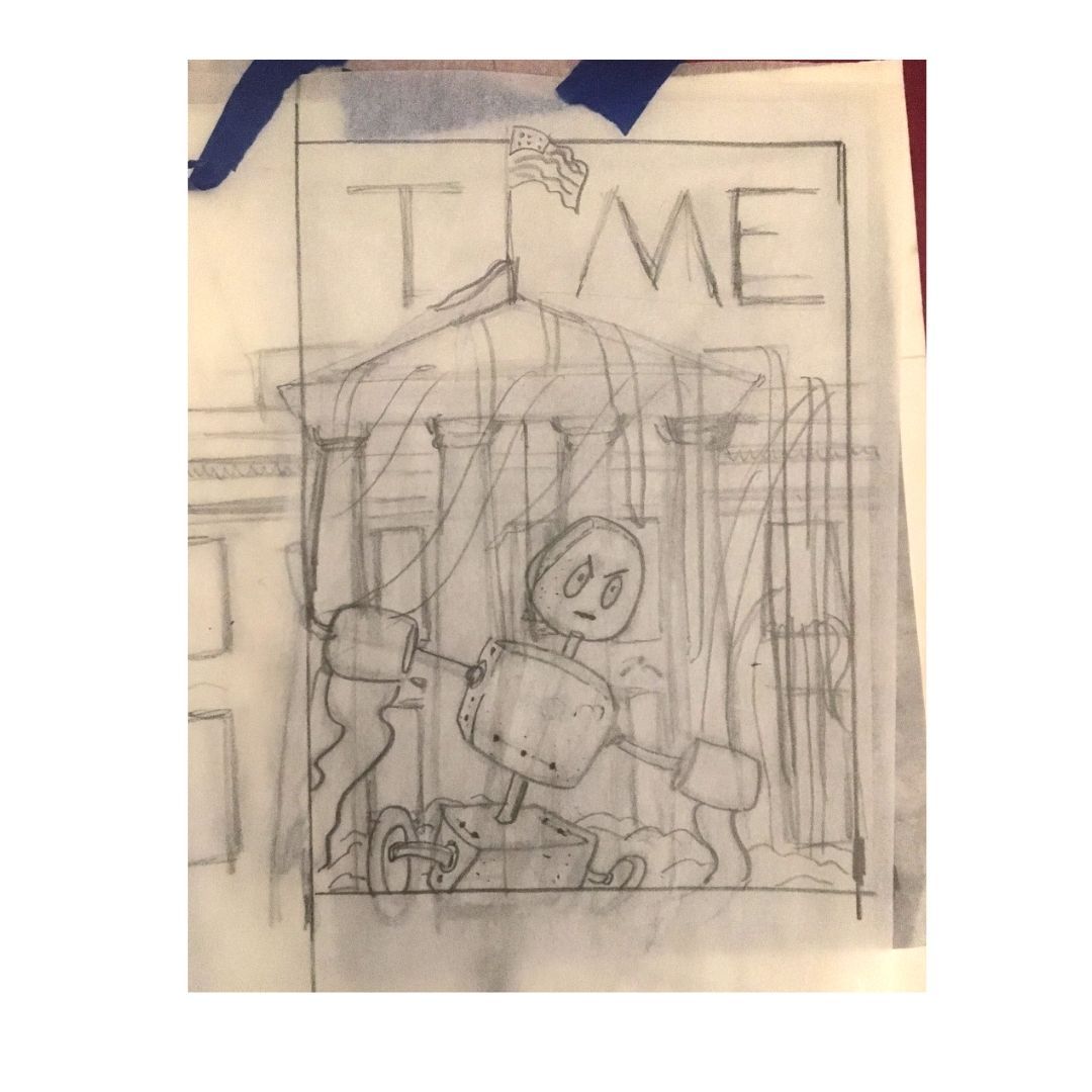
I decided to go with the pink background. I refined the drawing, and next, I'm going to transfer and then ink this.
-
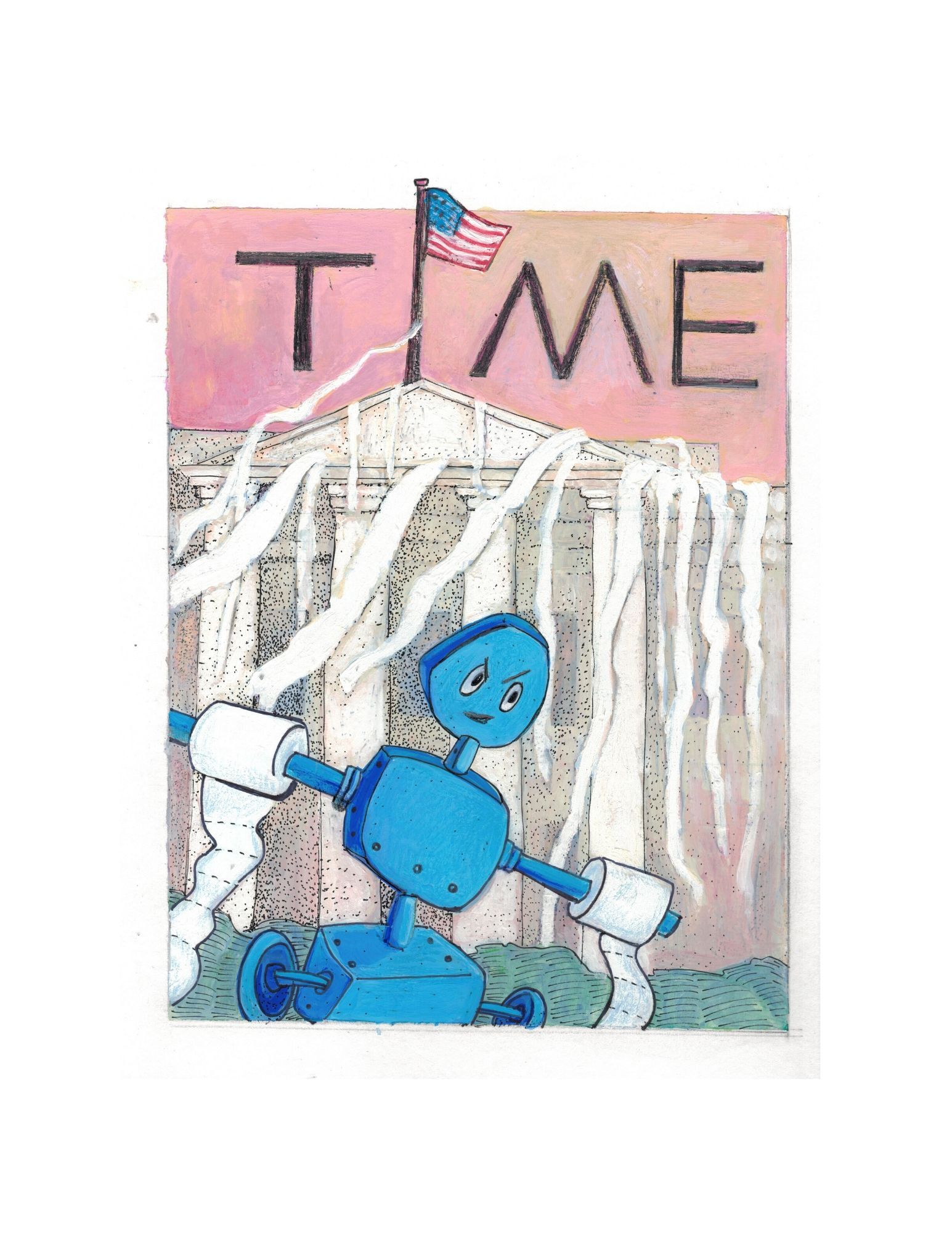
**I finally completed Aprils Project about Lisa's Robot.
Here are some learning milestones I hit during this time:**
-
I realized that I need to limit my materials in the starting stage so that I can focus on the drawing only. No paints, No other mediums, etc. This helped me get clear and focus on the drawing first.
-
I learned how to use gouche a little. I mostly used to acrylic, but I wanted to try something new.
-
I really loved mixing my materials.
-
If I'm going to draw my own text, next time I'll make some guides, and draw the text on a separate sheet of tracing paper instead of on my drawing.
-