need help making a dicision
-
i have a quistion.
This is a double page nr 1 is the previous illustration and nr 2 is the paint over.
not fully rendered for now. so forget the details for now.
What do you guys think? witch one is better? so i would know witch one i would make it to a finnished painting? and is the vocalpoint (hedgehog) readable? i think the hedge on the left must be higer becous i think the hedgehog looks realy big?
Hope i can get some profesional feedback here.
thanks anyway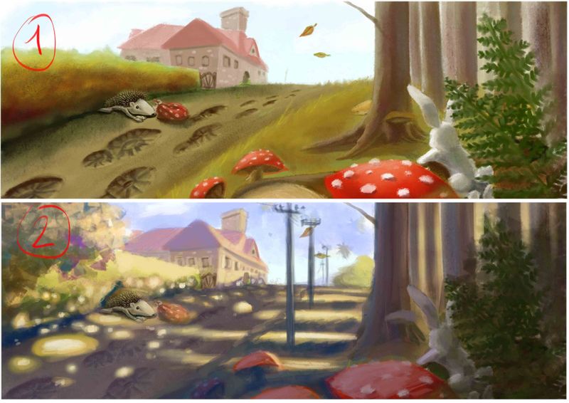
smoke
-
These are both lovely but I feel like 1 is working better.
I understand the want to put shadows on the ground, but for this illustration I feel that it is actually taking away from the illustration. They feel distracting right now, and clutter the composition. I had a harder time finding the hedgehog and almost couldn't find the bunny.
I would recommend really thinking about the story you're trying to tell.
Is it that the hedgehog is trying to cross the road? Is it that he is trying to find the bunny? Or is he hiding?
What ever the story is make the shadows work for that story. Use them as paths/arrows to direct the eye. I also wouldn't make them quite so dark. The high contrast always draws the eye first. So the question is what time is it? Mid day the shadows are short, morning evening? The shadows are long.
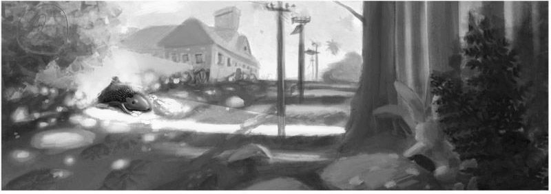
Turn the illustration black and white and then stand back and see what catches your eye first. And then think about what you want your eye to look at first. Make that the highest contrast.
I'd recommend writing the story down and seeing what you really need and then use less. The simpler the better for most illustration!
Instagram: https://www.instagram.com/eliamurrayart/
Portfolio: www.eliamurray.com -
@smoke
which one is better?
Both of them have good qualities. I do like the bigger hedge from the bottom one. Unfortunately the hedgehog is tough to see in both Images. You need to separate him more with value and color saturation. The first thing I saw were the lovely red mushrooms. The dappled light is lovely but @EliaMurrayArt is right it’s too much and is distracting from the hedgehog. I too recommend turning it into greyscale so you can SEE where the low and high contrast areas are.
Lisa Burvant
www.lisaburvant.com
Instagram & Twitter & SVS: @burvantill -
Hi. I believe option nr. 1 works great, because in the 2nd op (which is great too!) the focal points get lost, which is the hedge indeed. So, I´ll pick up the first one. Cheers!
-
Personally, I think 2 is far more interesting to look at. What I might suggest is change the lighting to work for you... so the hedgehog gets a bit lost, so make one of the beams of sunlight much broader so that it "points" to the hedgehog and then it let's you have a wide beam of light you can then darken the hedgehog so that you can create a lot of contrast for that character.
-
@jdubz yeah i think i like to go for nr 2 also,it yust needs a lots of rendering and i need to overthinking how to make my vocal point stand out. i have my illustrations for the book nearly ready, but i want to relook them all again and do a paint over where needit.
Thanks for the feedback
-
@Alvaro-Morales your right, i think i go work a little further on nr 2 and look how it comes out
but i realy have to overlook how to make my vocal point stand out.thanks for feedback
-
@burvantill thank you, i will look in to that, i will keep posting my
progressions here.
thanks again, all the feedback is appreciated. -
@EliaMurrayArt the story is finished and and the colorsketch of every page also, i yust over look them again to see if i can make the illustrations more interesting, the bunny is yust there to fill in to make the composition more alive. i know nr to needs alot of rendering, but its yust about the general idee of the light. i yust want to see if it works that way. i think that i gonna make a lightbeam straight on the hedgehog and make the shadow of th trees higher onto the hedge, also gonna make the hedge a bit higher, and see if i can make the contrast better readable with the lightbeam and the hedgehog
thank you for the insight. I appreciate this -
@jdubz and thank you for the overview on my painting, this is gonna be it
-
@smoke Cool I'm glad it helped out!