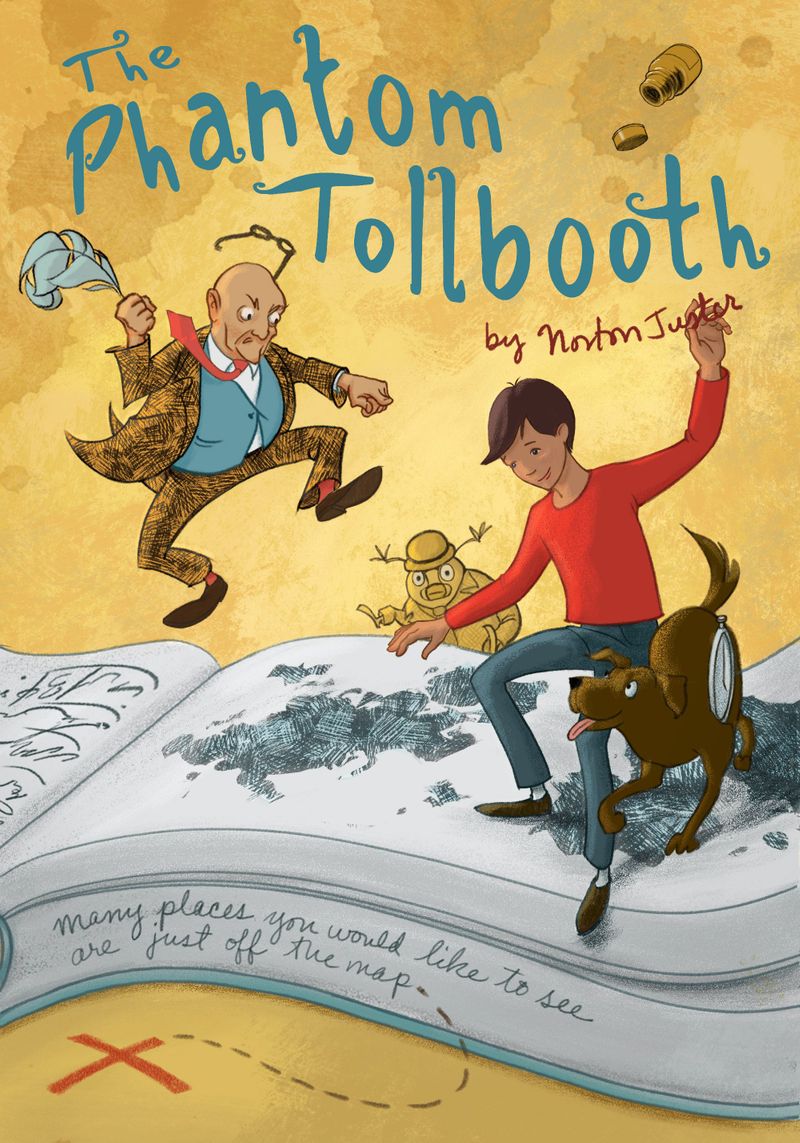
Finishing a book cover from the Ideation class. Critique?
-

Here’s an update on the Phantom Tollbooth cover that I posted color studies for a while back. I think it’s getting there, but still needs a few things. The parts that don’t sit well with me yet include:
-
The subtitle, which I really just don’t like yet. Either it’s my handwriting and I want a font, or I need better handwriting.
-
The area around the dog still looks confusing to me, even with some highlighting to bring him out.
-
I’m still not sure the texture or treatment of the pages of the book match with the rest.
-
I have a tried to put an unobtrusive texture in the background, since there's no room environment or landscape, but does it mix well with the light?
Anything else you can think of? Thank you!
-