Feb contest WIP: Rene the mouse - feedback requested :-)
-
It took me to go all over the places before landing a concept for this month. Open-ended themes always require more time for concept development for me. I wanted to draw more of an everyday life scene, and making it interesting somehow (but ended up not being so ordinary after all maybe?).
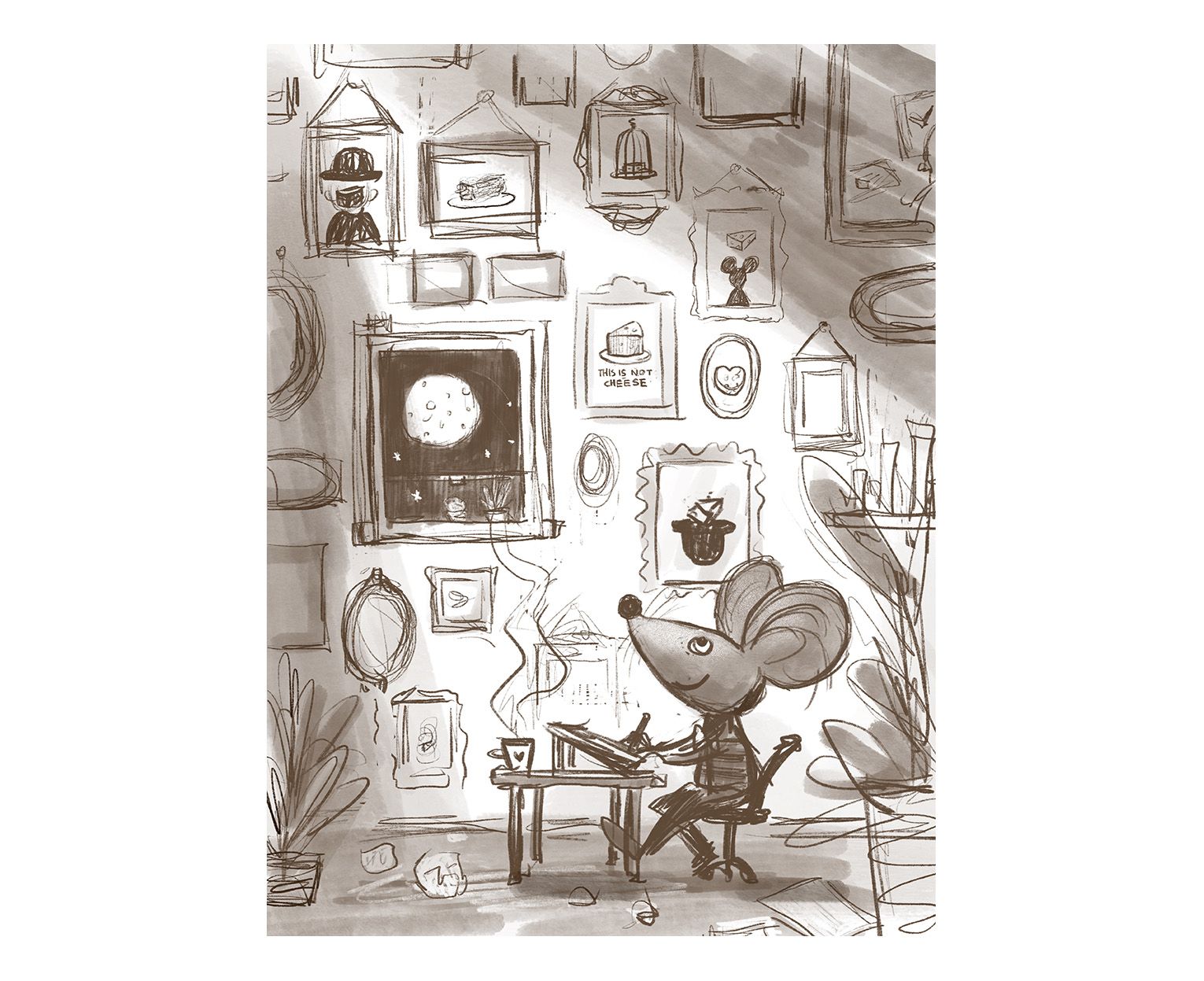
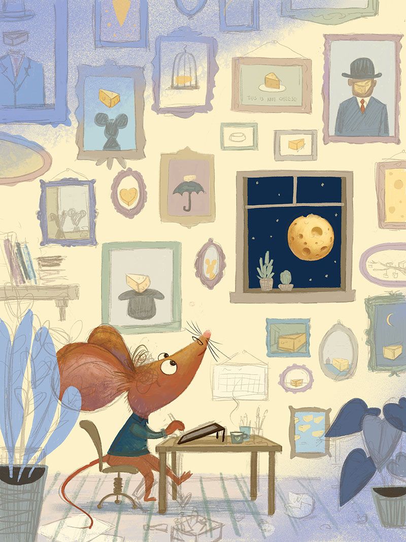
Pitch: Little mouse working late at night and discovered the moon is really made of cheese. The pictures on the wall are referencing surrealists paintings, mostly Rene Magritte's.
Keywords: content, joy, calm.I have a couple of questions:
- Is this image still interesting if the views do not know who Rene Magritte is?
- recently, I got a comment from an art director about avoiding generic characters. So I want to push a bit more on my character design. Do you have suggestions on how to make this little mouse more like a hard-working illustrator?
- Any feedback on the composition/concept? There might be a better image hiding behind this concept...
- Any more suggestions for the little images on the background (I only have a coupe of, and I need more ideas on surrealists paintings that I can turn into something about cheese
 .
.

-
Is this image still interesting if the views do not know who Rene Magritte is?
Yes.Do you have suggestions on how to make this little mouse more like a hard-working illustrator?
Clock on the wall, harried expression, exhausted posture. Lol.Any feedback on the composition/concept?
Looking forward to where this goes.
Any more suggestions for the little images on the background. No. Be careful the background doesn’t interfere with the main character.
 This is cute.
 -
I would say give him some glasses sitting close to his nose and messy hair. Perhaps rolled up sleeves and a cup of coffee next to him. (Edit: You already have a cup of coffee disregard the last bit)
Also a trash can with a few crumbled papers in it but more balls of paper outside than inside, like he’s really bad at throwing them into the trash can.
Oh and a desk lamp! You can make it a fun shape! Like with a bendy arm attached to the desk
-
- Yes, I don’t think knowing margritte’s work is essential, it’s more like a fun little easter egg!
- Character design is not a strong suit of mine but I would suggest doing a whole bunch of sketches of this character. I would try 20 or 30 and really push yourself to make decisions you might not normally make. When I do this for any concept I often find the best designs in the last few that I thought I didn’t have in me.
- I think you should try playing around a lot with the picture frames, widely varying shapes and designs. I’m also struggling to see the window as standing out from the frames. I think the image might be a bit too linear at the moment. Try some thumbnails with different angles (I’m a big fan of perspective so that would be how I would explore it).
- Not sure if I’ll be much help with the paintings but I will say that I don’t think they should ask, be surrealist paintings based on cheese, just a handful I think would be perfectly effective.
Hope this helps, let me know if you have questions about any of this!
-
@xin-li I love this idea. I would play around with POV more. You have him lined up with the bottom plane. Will says that can look amateurish. (Not that yours does) Maybe play with the angles to create more visual interest. BTW we just did a Rene Magritte inspired work at our school. I love him! What if he was munching on an apple in deep thought as a little added easter egg?
Also for surrealism you could have a piece of cheese melting off the edge of something like Dali's melting clock.
-
@burvantill thank you for the feedback. I will remember to pay attention to not be carried away by the background details.
@Aleksey love your suggestions for the character. I will work on that.
@Griff thank you. I will work more ont eh picture frames. I tried to put in some variations. It seems it is still not enough :-).
@chrisaakins I kind of like the linear perspective for this image for some reason. It makes it feel calm and fitting with this concept. I could be wrong. I will explore some alternatives to see what I end up.
I would love to hear what others think about the POV for this image. Is it too boring, or is it fitting?
-
I agree that you don't need to know Magritte for the image to make sense but it definitely adds to it and my eye went straight to "This is not cheese" haha
For character design, maybe try out different types of clothing or props that he could have on him. Maybe more art supplies as an illustrator, or things to show other aspects of his personality. Maybe even some clothing/design choices based on Magritte, like a bowler hat? I struggle with sometimes having "generic" characters as well so I don't know if I can help much with suggestions.
I don't know that I really get the idea of him discovering that the moon is made of cheese, maybe you could add something else to suggest that concept. But I like the image anyway, so I don't think it's necessary.
I personally like the linear/straight on perspective for this one. It doesn't look amateur-ish if you do it well and you've clearly shown us that you can do different angles and perspective in your work so I wouldn't worry about that.
Super cute! Looking forward to seeing how it turns out

-
Looking great already. I'm useless with names so I don't know Magritte but straight away I still recognised the picture of the guy with a bowler hat with the apple replaced by cheese. This would then make me think the other pictures are probably also takes on famous works so I would look closer.
I really like the POV, it's calm and contemplative, I think reflecting the state of mind of the character.
I didn't realise one of the squares on the wall was a window, I thought they were all paintings, so maybe just make sure that's clear in the final piece.
I'm not sure I'd get that he's just found out the moon is made of cheese. I'd probably just think that we are in an alternative world where mice rule and cheese is very important.
-
@neschof @Melanie-Ortins thank you for the feedback. The "moon made of cheese" is more of a comment on how the Rene mouse percieve the world. I once heard a story about Edward Munch really believe the size of the moon is like a dinner plate, because that is how he percieved it.
I want to make the real window be not super obvious, but the 2rd read in this image, like a lot of surrealists paintings have this effet on me. I hope I can pull off this somehow

I will take the advice I read in another WIP thread: @carlianne mentioned about choose to improve what you are worst. I guess character design is my biggest challenge at this moment. I will focus on experiment with the Rene mouse character fo this piece.
-
@xin-li I'm sure you'll do great! This is already really a fun piece. When you said surrealist pieces I thought off Dali's melting clock, so melting cheese could be funny. You could also do other iconic paintings, like Andy Warhols soup cans or other pop art pieces. Or a piece of cheese on a lily pad? LOL
-
@xin-li I am excited to see this. I hope you didn't think I was being critical of your POV. It's a lovely piece and I love your inspiration for it.
-
@carlianne thank you. I love Warhols soup cans, might incorporate that. I laughed out loud when reading "a piece of cheese on a lily pad".
-
@chrisaakins I love getting critics. They made me think, and they gave me possibilities to tackle a piece from different angles. This is why I love SVS community so much.
-
work continued... I am a bit behind for this month's contest, still trying to make it to the deadline
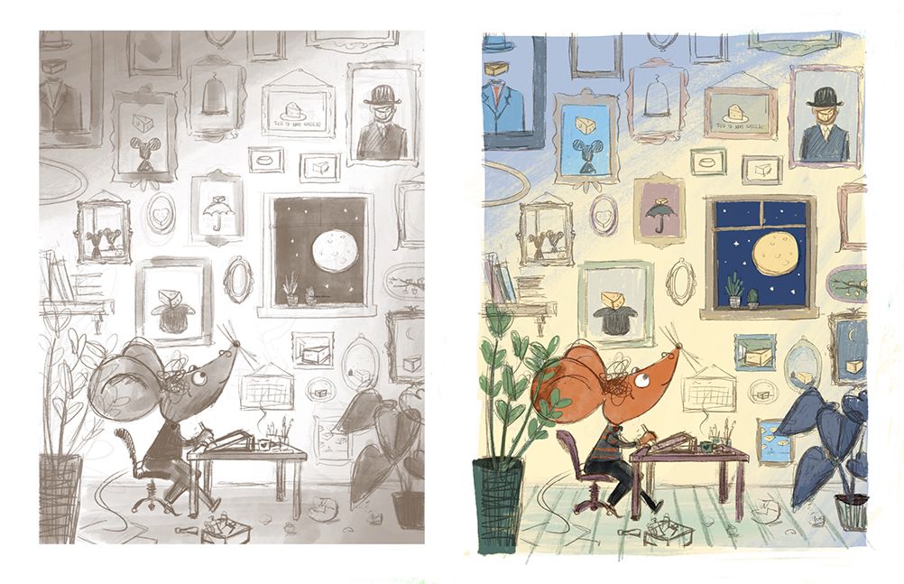
 Here is a more refined sketch, and a color study.
- Can you spot the window (as the second read)?
- Is the background still too distracting?

-
I don't find the background too distracting but if you want the window to be more of a second read, I would push it back a bit more. Right now, it's the area with the most contrast and the area that the mouse is looking so it starts to become a focal point. Maybe vignette everything around your character or make the lines on him thicker to help him stand out. It's looking super cute by the way! Love the colours
-
@xin-li I don't think the background is distracting at all but rather adds to the story. I like the vignette idea. Maybe a light shining on him from an overhead lamp and place him in a lightened cone and the other colors recede a little?
-
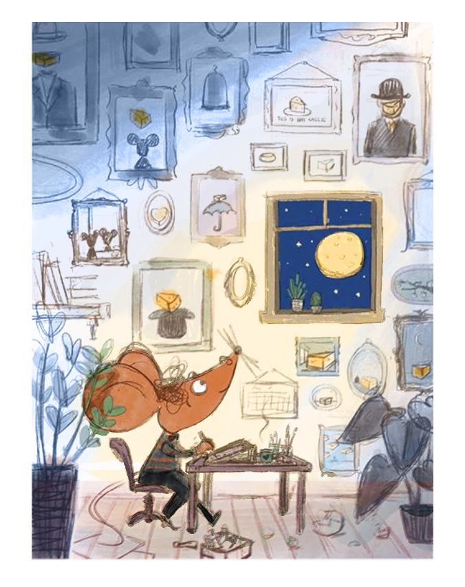
So I think this is super cute and fun! I think the color feels warm and cozy which fits with your theme.
Hopefully you don't mind, and I didn't get all your details in, so this is more monochrome than I think you should go. But I did a quick color pass because I was wondering if there was too many colors in the shadows and if you tint it back with more blue that will help it feel a little more harmonious and let the cheese pop? Also the green for me wasn't feeling as harmonious, especially with the green in the foreground plant as it is creating a lot of contrast with the mouse's ear.

feel free to ignore it though and do what feels right to you!
-
@carlianne thank you so much. Your paint-over is so much more harmonious than my original color study. I will definitely incorporate that in my final painting.
-
@Melanie-Ortins thank you so much for the feedback. I will play around with the vignette idea or find other ways to pop the main character a bit more

@chrisaakinsI like the lightened cone idea. I will see if I can pull it through.
-
I am trying to fight my tendency of making the anthropomorphic character looks like a human wearing an animal mask rather than an animal wearing human cloth.
It is a lot of detail left, I spent a lot of time tweaking the value and color. Things always take a bit more time, and I hope I can still make the deadline this month.
Feedback are always welcome

