FEEDBACK PLEASE! Feb. Contest NIGHTFALL rough sketch.
-
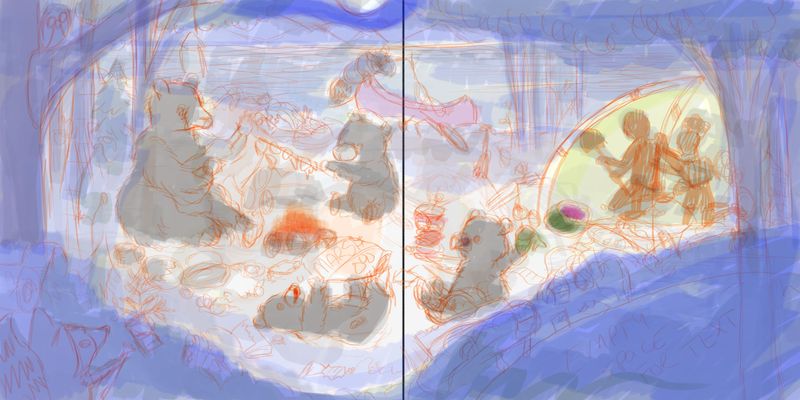
I hope that a couple of people can see what this is supposed to be, and give me some feedback. I know that it is very rough and scribbly, but I would like a couple of opinions before I move on.
The idea is that the bears have come out after nightfall and are enjoying the campfire, while the people hide in the tent. In the final drawing the bears will have broken up all of the people's things, and made a big mess of the site.
The things I would really like to know, at this point are...- How is the composition so far. Does the darker areas around the outside, bring your eye into the center where the bears are?
- Does the perspective look okay?
- This is a spread, do you think the fold in the page is going to be too close to the one cub's sandwich? (the tall scribbly thing the cub furthest to the right is holding)
- The large dark space in the bottom right is allowing space for text. Does that look right? Should it be bigger?
- Are the raccoons too much?
Thanks!!
-
@jenithornhill I think it works overall. The value of the tent is drawing my eye. Is that a focal point? I think the canoe over the central bear is creating a tangent. I would leave out the raccoons. I think we can help you more when you flesh it out more, but I say you are off to a good start.
-
It's not quite rendered enough for me to be able to answer most of your questions ( I have a hard time decifering most people's preliminary sketches including my own!)...the space in the bottom would depend on the length of text but that would be a good place for it.
-
it feels very crowded. It's hard to tell the perspective with all the soft lines and colors. i think that bush on the right is fine but that combined with the tree beside it is creating too much dark mass. Also i cant see any raccoons is it that little one on the top?
I think overall this works really well as a spread.
-
Overall, I'm liking the composition. I think you're probably right about the sandwich. I'm finding the canoe quite distracting as it's right in the middle and seems like it's on the bear's head but it could be fine depending on how you handle the values / colours. I think it will be easier to comment when it's a little bit more finished.
-
@jenithornhill It is a lovely start of a piece. I like the overall value structure: the dark tree framing a scene with a light background and darker figures in them. It reads really well. I think it is also a very ambitions illustration with many characters and details.
What will help you continue developing the image might be to take a moment and think a bit further on the storytelling aspect.
- How do the characters feel in this story? (bears might be victorious, the campers might be scared, etc.) What do they want?
- Who's point of view is this story? (who is the main character here?)
- What do you want the reader to feel when they see the image?
Once you figured out the story, it is much easier to decide the first read, second, and third. It also makes it easier to make the shape and color choice.
Hope this helps. Looking forward to seeing this image develop further.
-
I have done a little more work on this... (a little work that took a long time!) I think some of it will be easier to make out now. I have shaded the foreground section just to visually separate it while I am working.
My biggest question at this point is about the linework on the bear. I have used a solid line to outline everything so far, but a sketchy-furry line for the outline of the bear. Does that look ok? Should I do a solid line?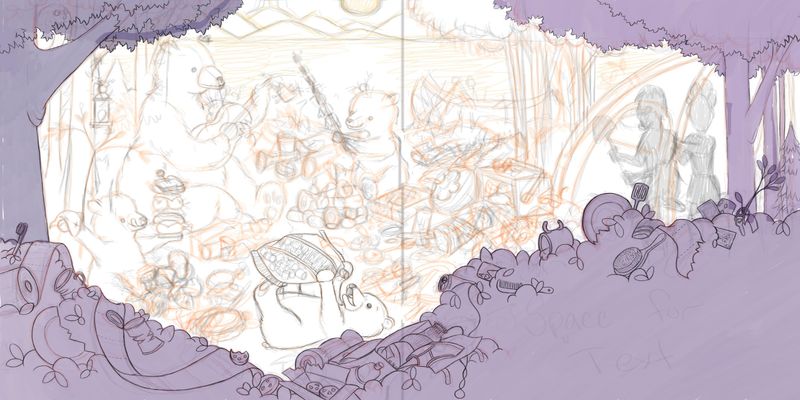
-
@jenithornhill The bear is adorable. I love the fur lines. I'm wondering, if you are presenting this as an actual spread, that the bears faces may be too close to the spine? Also there is something off with the canoe...is it too big? I don't know. Maybe someone else can give better advice on that. It just feels in competition with the young bear. I would almost be tempted to make the background a forest and let it just be a dark background since there are so many fun details going on in the fore and mid ground already. Overall I love the concept and can't wait to see your progress!
-
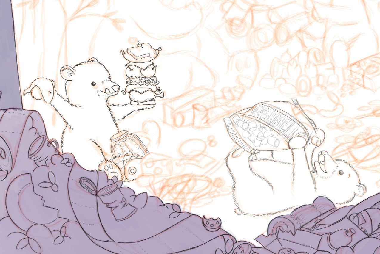
I am still undecided. Here is a close up clip of the 2 styles of fur. I think the line work on the bear with the sandwich looks more consistent with the rest of the piece. But the bear with the marshmallows looks fluffier.
What do you guys think? Which one should I go with? -
@KaraDaniel I have moved the canoe a dozen times now. I think it may have to come out. I need to keep the moonlight though because I am counting on it lighting up the campsite.
-
@jenithornhill I love the line work of the bear with the marshmello bag! Nice texture. I see your dilemma though, because both are so nice!
-
I'd remove the canoe. Both bears look very cute but I feel like the one with the marshmallows is too soft and faded for such a defined foreground. The details in the bushes is just getting all my attention but maybe it'll change once you line and color the whole thing.
-
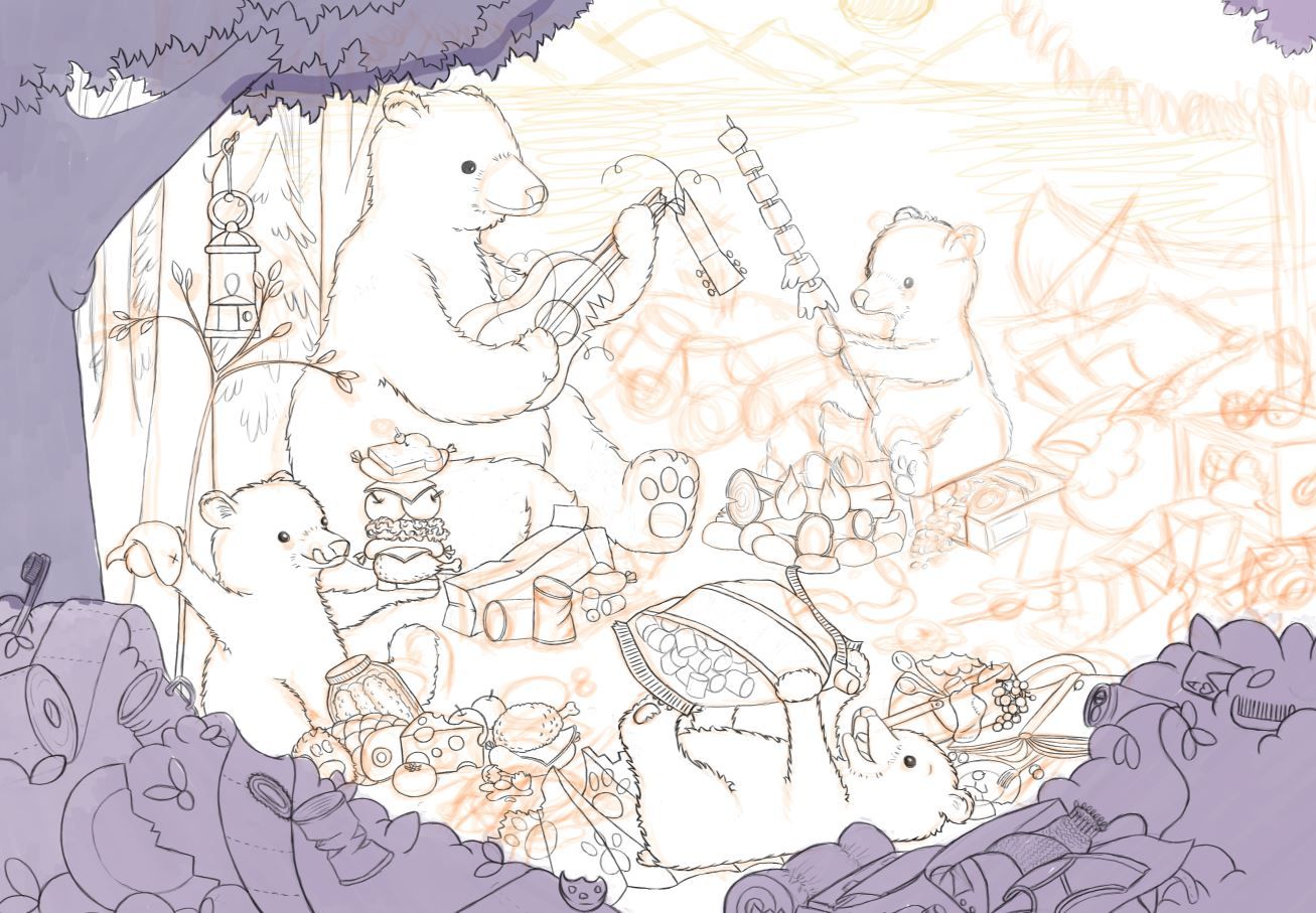
I thought I would share today's progress. It is slow going... but I hope to have it done by the end of the month.
I am still considering getting rid of the canoe... -
@jenithornhill looking good. I'm noticing a tangent where the chip bag is touching the rocks on the fire pit...it's took me a minute to realize they weren't connected. Color may help to rectify that but it could just be an easy fix of lowering the bag a touch. Love the bears!
-
@KaraDaniel thanks...I didnt notice that. I will make that part of the bag curl up a bit more so it doesn't touch. I dont think coloring would help...its a clear plastic bag.