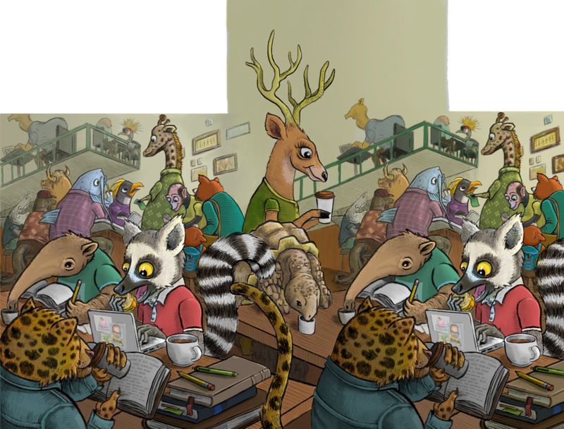
Critique request-animals in coffee shop
-
Hey folks,
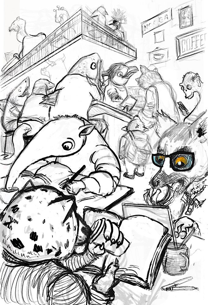
My first post! I’m a high school English teacher, and aspiring artist on the side. Been listening to the podcast for a while and got a subscription to the site for Christmas! Im excited! I tried to take some of what I learned from the composition course and apply it to this piece. It’s a local art contest in my town, and it’s sort of an homage to some of my favorite things in town—the coffee shops, the aquarium, and the zoo.
")
Anyways, I was hoping I could get some feedback from y’all on the composition and anything else, before I do final line work and then color it. Also, I’m not confident at all in my coloring abilities, especially with digital work. I’ve taken the color theory course, but still feel at a loss when it comes to choosing my colors. Maybe it’s just experience/trial and error? Any recommendations with regards to colors, or maybe which other classes would help me most?
Btw a lot of the scratchy lines are more for contours and I won’t be doing final line work over those.
Thanks!
Daniel
-
@Daniel-Grissom Hello fellow Teacher by day and artist by night.
I love your drawing and style. The animals look well drawn and are very interesting. I would say that there doesn't seem to be a central focal point and I am not sure what to look at in the picture. You might want to think about what is most important and center all the animals around that point. Maybe the barista or a central table? As far as color scheme I would find a few pics of coffee houses and steal their palette to try out.Hope this helps! If this is your starting point you are doing really well. I can't wait to see how it turns out.
-
Thanks a lot, Chris! Great to hear from another teacher and artist. Great advice. I’ll definitely check out coffee shop color schemes.
Yeah I was hoping that maybe with lighting, contrast, and color I could create a focal point. I wonder if that’s still possible with such busy line work. For example, I’m going to darken the Jaguar with his back turned to us and lighten the lemur eating the biscuit. I’m going to try to shoot for putting focal point on the lemur and anteater, but I’m not sure if the line work is too busy to pull that off. I was going for a lively coffee shop, but hoping I could pull that off without being overwhelming for the viewer.
-
@Daniel-Grissom one quick way to see if your focal point is going to come out the way you want is to do a quick value study. Just overlay the areas with basic greys to see if the focus will happen and the values will work.
I always do value study once a sketch is in place (and almost always edit the sketch bases on the value study afterward.)
-
@Daniel-Grissom great sketch! I hope you win the contest. You said you want to put the focal point on the lemur and anteater but I feel like the most natural focal point would be at the cash register. The reason I say that is because there is a comfortable space around that area, especially the kid while the rest of the image is busy. Wherever you put the focal point perhaps add a bit of story or amp up the emotion that contrasts with the rest of the scene. I hope that made sense.
With color, I find it best to start almost monochromatic and with desaturated tones. You can slowly build on top of that adding more color and saturation as needed. All the color classes here are worth taking. Once again great sketch!
-
I agree with the others. Do a quick value study and that should organize it a bit. It's a crowd scene, so of course the line work is busy, but you can do a lot to simplify it with light and value. The final will be a lot more coherent.
My eye goes right to that fantastic fish sitting at the counter! That is close to the cash register, too, so I agree with @Zachary-Drenski.
Your perspective on the balcony and in the signs is looking slightly wonky, but I'm sure you'll figure it out as your refine.
For color I might start with a multiply layer over everything in one tone, to unify it, and then try different local colors. But I do think it's really important not to use too many, or to have a lot of saturated colors, in a crowd scene like this. Maybe look at Zootopia stills!
I love the drawing and all the characters you have here. The more I look, the more I see. Just noticed that the anteater is sipping with his..umm, nose?
-
Really nice sketch, nice vibe. It feels busy like a coffee shop should be.
One thing I would suggest is with the perspective, I would pull your vanishing points even further apart, you will have less of a fish eye lens effect with the balcony. Also be careful of the perspective on the counter vs the balcony.
Have you seen any of Peter De Seve's work he does a lot of animals, like in coffee shops and what not, he also has a cool approach to colour you may get some ideas.
-
@Daniel-Grissom I would check out the composition 2.0 class and the draw 50 things exercise. You could definitely use light and color to emphasize your focal point. I think making your focal point large and in charge of the middle bottom third might be a better way. Especially with a steaming cup of coffee in its paw.
-
Excellent feedback from all of you! Really helpful. I’m going through it, processing it, and will play with the composition this week. Thanks!
-
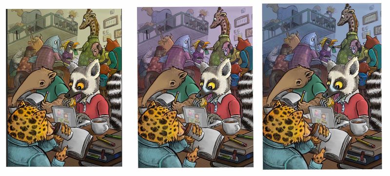
So I put a lot of work into this. There's a lot I like, but I'm not sure how the colors work. I took a couple of the color courses. Whew, overload! Hopefully I applied some of it well.
Which "haze" in the background looks best?
I think the anteater needs more detail along his face, since the lemur and jaguar have so much. And I think I need to put something on the pages of the open books. No idea what. Or how. Any references y'all could recommend for that? Any other critiques?
Thanks!
-
@Daniel-Grissom This is a really neat scene! Love all the animals. In my opinion to answer your question about the best "haze" I think the one at far left looks best, everything seems to pop better than the other two.
-
@Daniel-Grissom awesome, love it!
-
@Daniel-Grissom I really like your color schemes! I think the first one is somehow more unifying, though, and it does need unity with all those animals. When you squint at it, the lemur still reads as the central focus. But if you're wanting to simplify it a little more, I think you could still take down the saturation in the background, and darken the leopard's head a bit.
As for the book, this is going to take a bit of brainstorming! It's going to have to be a second read, but those are really worth it sometimes (think of all the great inside jokes in Zootopia!). I'd think of some classic novel and then adapt it to leopards, or a work about diversity and adapt it to the animals in the bar. But those are just two quick thoughts. I'm sure there are many things that would work.
-
Sweet. Yea I think you’re right...I’ll take down the saturation of the haze and stick with the yellow background as it seems to unify it more. I’ll try darkening the Jaguar too. I like the book suggestions! Thanks!
-
@Daniel-Grissom I definitely like the first best. It unifies it nicely with more of an analogous color scheme. I think you could grey the lemur up a little bit to tone down the white. It would still read white, but wouldn't blast it so much. The colors look great. I am loving how they really created a central focus.
-
First one would be my fav, nice work it's coming along nicely.
To help add depth you could literally add a layer behind the lemur and others in the foreground, on that layer fill with a neutral earth tone colour and drop the opacity so its barely visable, essential knocking back the black and unifying everything in the Background and helping the foreground characters pop just bit more. Nice piece well done.
-
@Phil-Cullen Great advice. I wish I could think of these things when I am doing my work.
-
@chrisaakins It's a nice trick to add depth. Further away stuff gets the less contrast there is, so I find digitally it's very handy to knock stuff back into the distance and add depth with layers of low opacity colour, also helps unify the elements in the background.
-
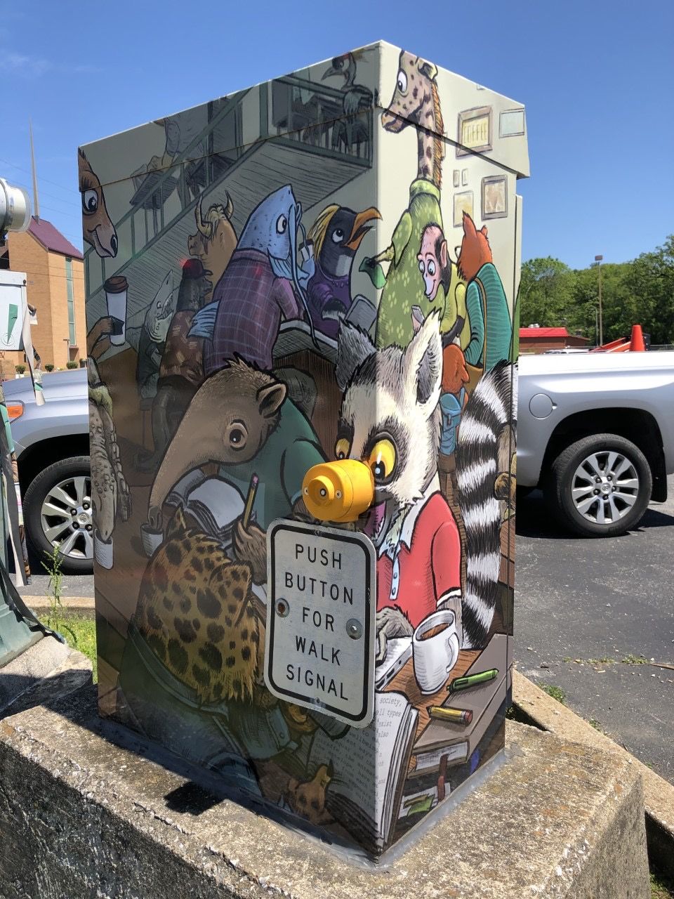
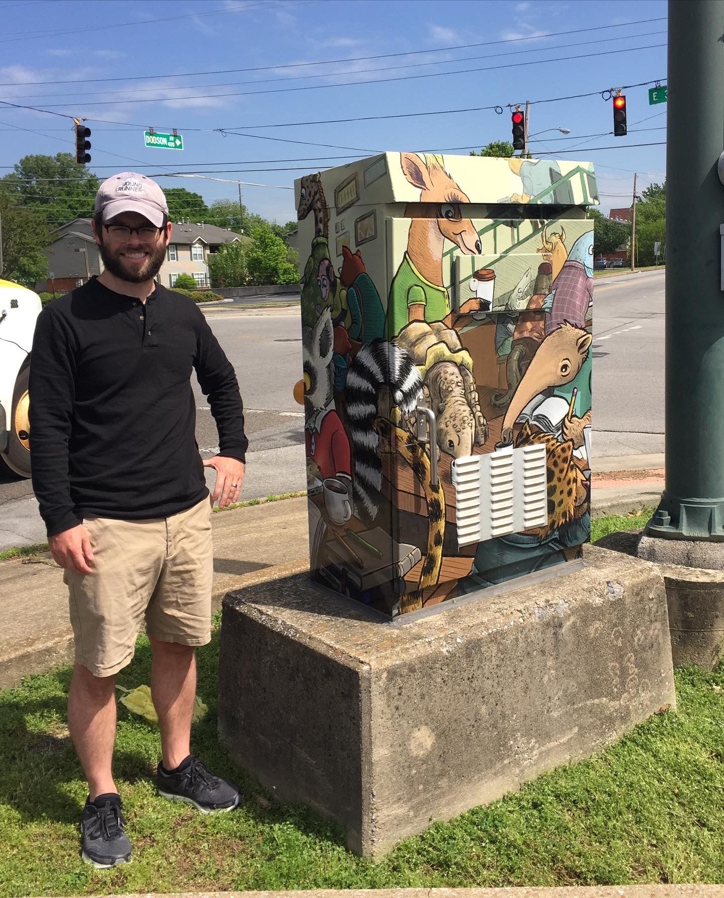
I thought I should post the end result. I was selected as one of the finalists for this local competition, won a cash prize, and got my art put up in the city. (It got complicated when they sent me the final template, but I learned some important lessons along the way.) Thanks very much to all of you for your input!
-
@Daniel-Grissom wow! Thanks for showing us such an interesting application of your work, and fantastic job! Congrats on the win.