Jan prompt - process flow and critique requested
-
This months prompt seemed quite constricted at first. I tried thinking outside the box and came up with 2 concepts, both of which were already displayed on the official prompt thread
 so then I thought some more.
I realised that “tracks” in the snow need not necessarily mean “footprints”, so I focused on that and decided to work on the concept of crop circles in the snow. Crop circles tend to fill you up with amazement and wonder.
I googled a few reference pictures and came up with a few thumbnail sketches.
At first I wanted to show the complete magnificence of a crop circle, which really restricted my character pose. With thr plane, I realised it’s ok to not show the character because it will be assumed he is flying thr plane. But I don’t particularly enjoy creating illustrations without a character.So in thr 2nd one I tried replacing the plane with a character looking onto the crop circles. Again, couldn’t see his expression so much, so it’s was mainly about the crop circle design. It all felt very blah.
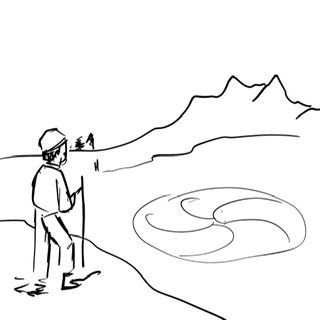
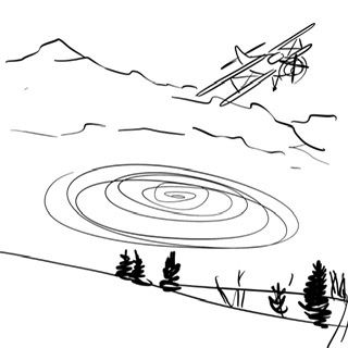
Then I searched for some snow scene references and found one too many pine sceneries which are always pleasing to see.
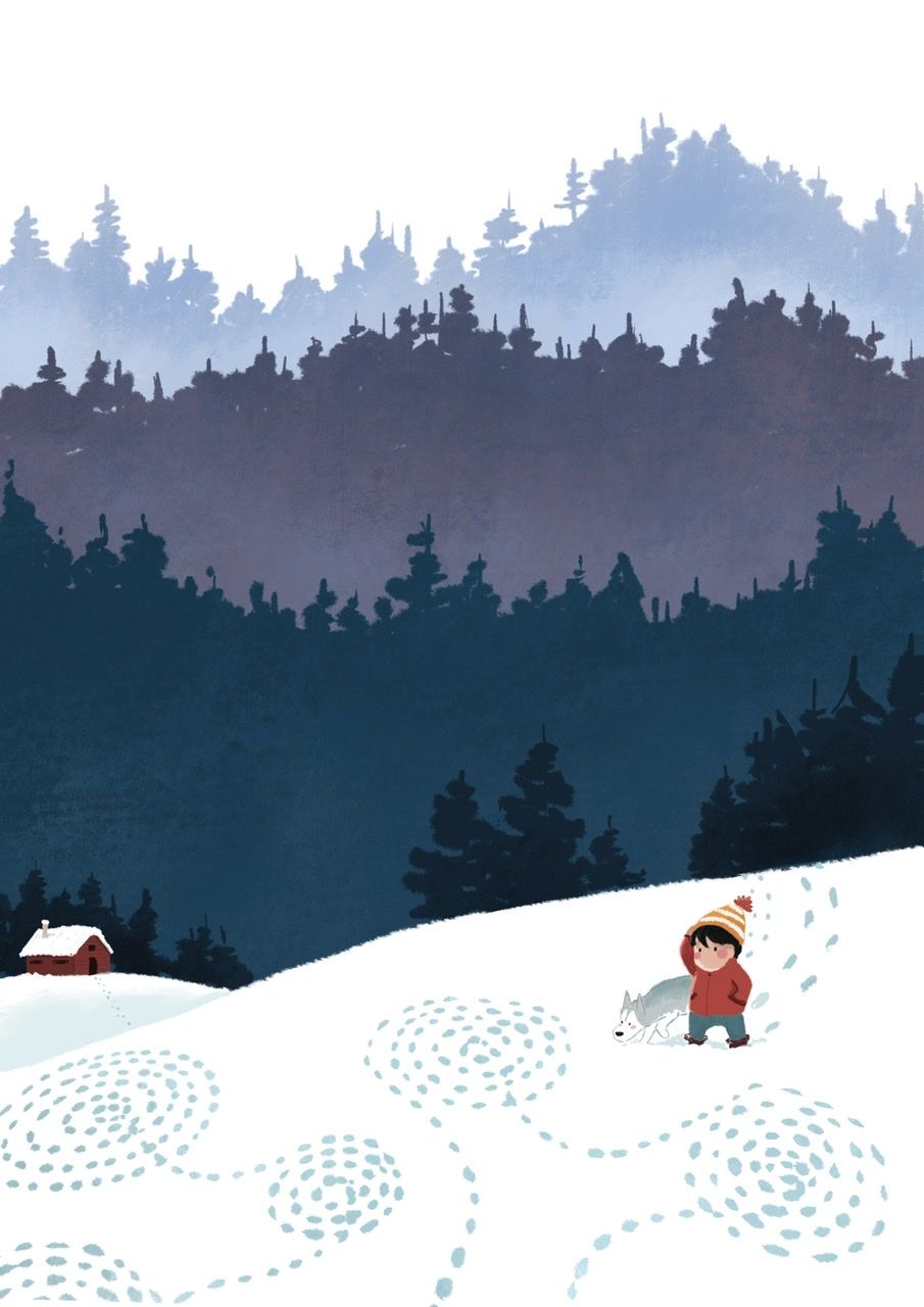
I also drew like 10 different crop circle designs but the big ones weren’t since only a part of them would be seen. So decided to take a simpler design which would emote equal wonderment.I’m happy with the background but I’m wondering if I can do something different with the characters. Is the dog positioned too close to the boy? Is there another pose which would look better?
Thank you for your time in reading the whole post
")
-
I like your both your take and your execution! And I think you thought through your problems well while exploring the possibilities. Your take, for what it's worth, is not entirely unlike mine, because it also has less to do with what kind of strange creature made the footprints than it does with what the creature was doing when it made them. And your execution is well-organized and simple, which is good.
The dog being close to the boy is fine, though you could show him/her running out ahead and sniffing an actual circle if you wanted to add a little more action. By having him sticking close, you show him as being perhaps afraid of an uncanny situation, which is also realistic.
The boy's gesture reads as puzzlement, which is what you want. Maybe there could just be a little more gesture in the limbs of the body? Where would the dog's back legs be if you drew them through? If you moved him just slightly you might see them, which would plant him more firmly in space. I'd also look at where the boy's raised arm meets his face. It looks like a tangent, even though it may not be. A slight change to the facial silhouette or the arm would probably be enough to resolve it. But these are mostly draw-through issues and are quite fixable without having to do a lot of extra work.
The whole thing reads nicely and is pleasant to look at. Good work!
-
Giving critique to pieces as stylised as this is often a hard task. You know, where to draw a line between a mistake and a stylistic choice?

However, I've managed to come up with two points that I can make that may be helpful and that will not interfere with the style you went for...which is great, by the way. I am completely mesmerized by this image.The first thing I'd like to point out is that tangent that has happend where the boy's hand touches his hat. The hand kinda blends in with the stripes of the hat, creating a bit of confusion. You may want to figure that area out a bit more.
The second point I'd like to mention is a compositional thing and it is about the background...
Yeah, I know that you're happy with it (you should be!) and you're primarly looking for some feedback on the characters,
however I feel like you can make some simple changes to it that will really help your focal area!
Let's talk shapes, shall we?You see, this forest in the background...it's quite a busy area. There is A LOT of small, different shapes that break into even more small shapes that break into even more shapes that break into.... you get the idea. The area is veeeryy detailed and active in comparison to the plain and simple shapes in the foreground In fact, it is SO busy and active that it creates a bit of a distraction. It's screaming at us, competing with the boy for attention.
Yes, the boy is still a focal point and we look at him immediately, yet my eyes still really want to go up, see what those active shapes are all about. My solution is simple. You've got three layers of the forest. Leave the first one the way it is but make those two back layers less busy the further away they go. Bigger shapes, less sharp edges, maybe even blurr 'em out, but only a tiny bit.
I honestly think that this simple change could turn out very beneficial for the composition of this piece.Besides that, I really have no other points. This is a great illustration, really. One of my favourites for the january prompt so far!
Oh, and about your questions. I don't feel like the dog is too close to the boy and the pose, as long as your aim is to make the boy look a bit confused, seems pretty solid to me!Keep up the good work!

-
@LauraA Thank you for your feedback! I too was not sure about the back legs of the dog. I think that's because I directly drew the half dog instead of drawing the complete characters and then overlapping them. Argh. Laziness will not get you anywhere!
@IgorWoznicki These are EXACTLY the kind of feedbacks I'm looking for! Thank you so much!

Your comment on the background makes a lot of sense. I think after struggling so much with the concept and finally coming to the pine forest decision, I convinced myself that this is the best I can do. A fresh perspective is always helpful! Thank you!
-
@Neha-Rawat I was wondering about what Igor said as well, but truthfully since the image was taking up the whole screen of my computer, I didn't see the whole that well. I just reduced it with a cmd - and now I can see what he's talking about. Yes, the background is all very pretty but a bit distracting. And I agree with his solution. Good luck finishing!
As for the dog, it's more that we can't see our own work after a while, and that's what these critiques are for!
-
My small laptop screen cropped it to this:
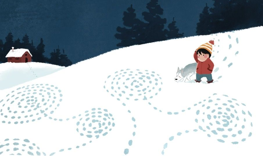
I don't think it needs the rest of the image because i really like it like this. The focus is on the swirls in the snow. You might consider changing the color of the dog to a tan or brown, something warm (this would also highlight the pink cheeks and get rid of the only distinct line), and changing the house to have less contrast and a cooler color. The house should blend into the background more.