Building Backgrounds
-
Hey all,
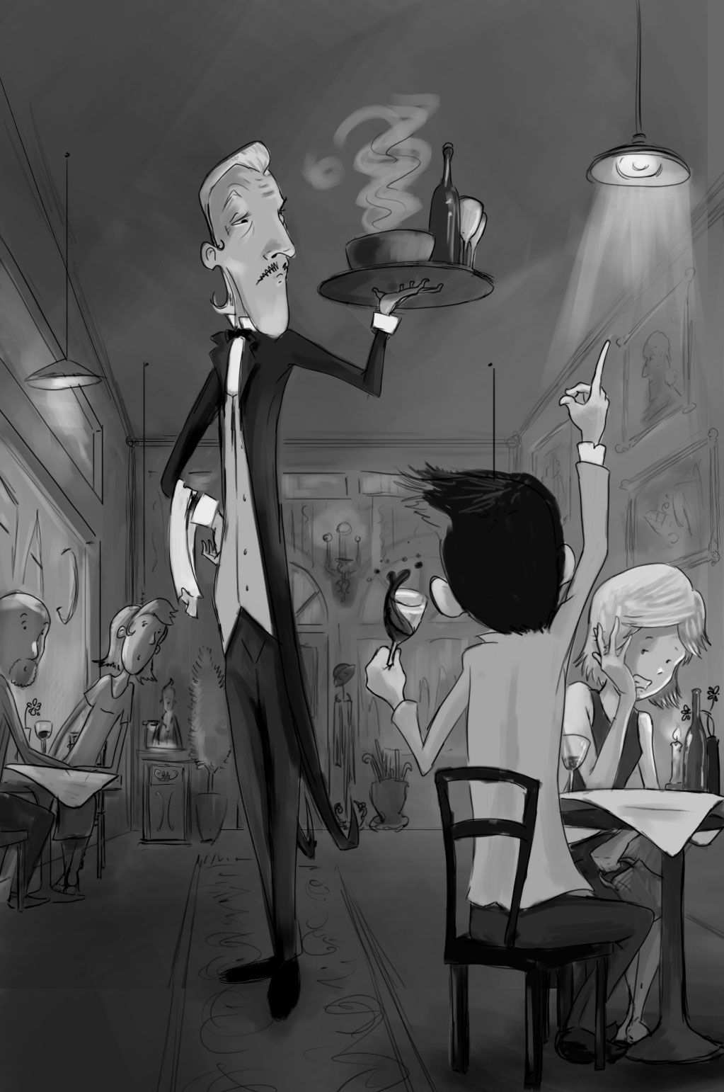
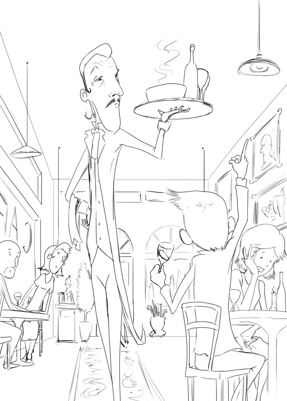
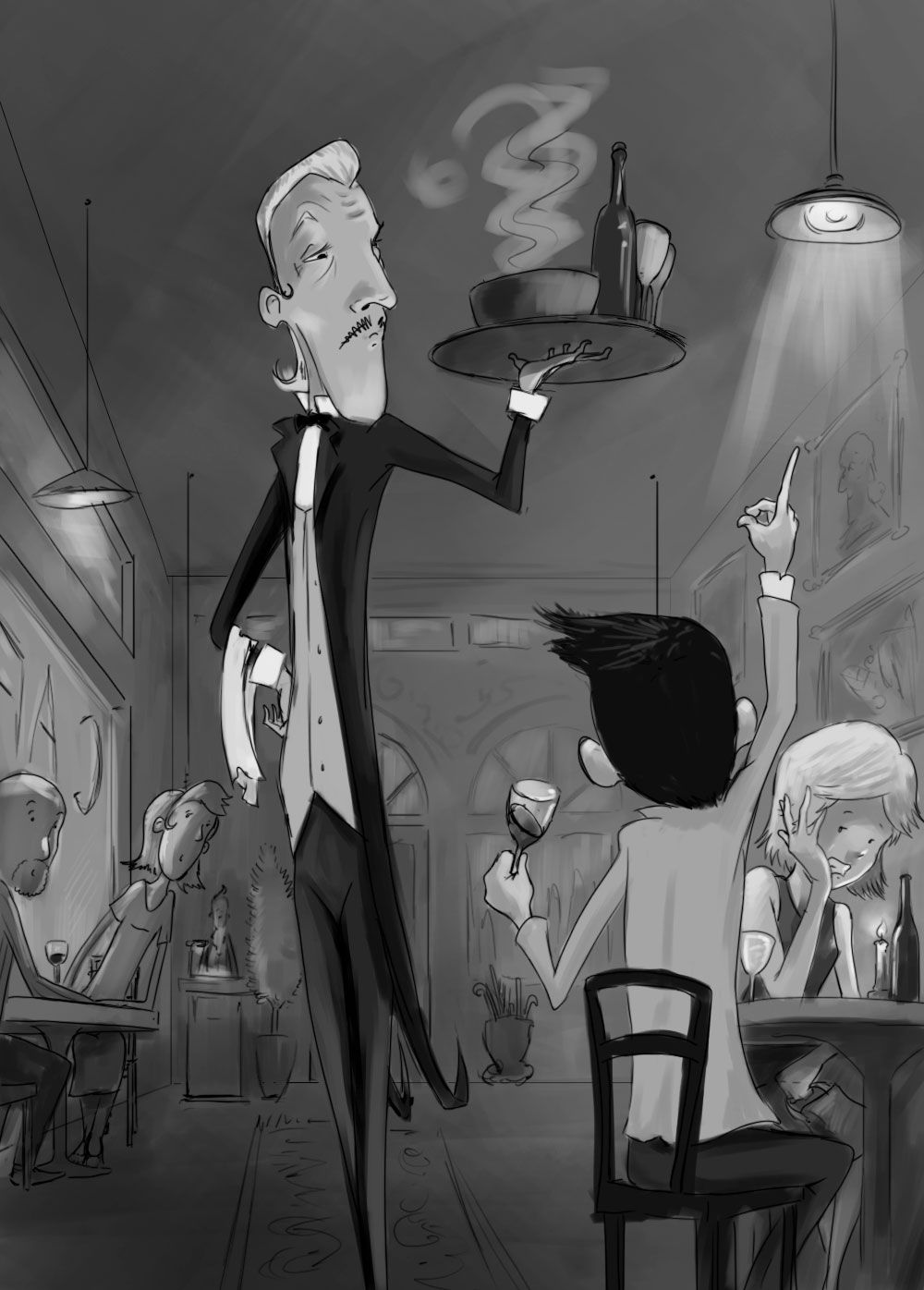
I'm going back through the Building Backgrounds course working on environments. I just finished one of the homework assignments. Just wanted to get some feedback. I've got lines and then some values.
I really wanted to take heart the assignment to get 3-5 characters in a scene interacting with each other to push what's going on. Is the scene clear and read well??
-
@jdubz Hi Josh,
Yes! The scene reads very well, I can tell what is going on right away. I really like the expression of the waiter.
My only comment is if you can add the waiter's feet, please do, or crop the image even more so that it feels more intentional. Right now the image ends right above the waiter's feet.
Otherwise, please go ahead and finish! nice job.
-
@Suji-Park Thanks for the feedback! I'll try and pull the whole image down a little - might be good to get everyone's feet in there

-
@jdubz Hi Josh, my only concern would be that the waiter kind of looks like he is the closest character. The character gesturing to the waiter kind of looks like he is behind the waiter given their size and proportions.
Maybe it'sthe size of the heads, I love the design maybe just make the waiter's head smaller and the guy that's gesturing his head bigger.
-
Maybe just move him back on the floor a little bit, so his feet are in the picture. That way I don't think you would have to include everyone elses feet and the area under the tables.
-
@jdubz the scene is good but I have 2 issues:
-
The waiter is too fancy for the restaurant. The restaurant looks like it could be a Diner but diners don’t have fancy shmancy waiters. Lol

 ️ Perhaps, work on the background. Change the hanging lamps to chandeliers. Remove the cafe sign on the window. Add luxurious curtains. Add interesting flooring. Add more details to hint that this is a high class establishment.
 -
Is the man calling for the waiter in front or behind the waiter? It’s not quite clear. If he’s in front, enlarge him and add a darker value. If he’s behind him, you should decrese his size more.
I hope this was helpful.
Portfolio: nyrrylcadiz.com
Instagram: https://www.instagram.com/nyrryl_cadiz/
YouTube: https://www.youtube.com/channel/UCbJCF1Im8ZO7hpGWTKOJMuA -
-
@Nyrryl-Cadiz Maybe white table cloths.
-
@deborah-Haagenson definitely
-
I think overall it's a nicely balanced composition. I have a few comments which have been touched on by others but I'll plough on regardless. I think the waiter's head is a little too big. I agree with setting the waiter a little further back so it's clear the customer gesturing is closer to the viewer. I also agree with making the setting more fancy to match the waiter. My last comment is about story. I can see the girlfriend is embarrassed and the waiter is disapproving but I don't feel like the customer gesturing is doing anything that bad. I can see he's raising a hand to get attention but if he was also clearly drunk, shouting the waiter over whilst spilling his drink it would lend a little more to the narrative. Perhaps he could be slumped in the chair after too many drinks. It's a really nice comp and I think with a few tweaks it'll make a great illustration!
-
Thanks for the comments. I've made some adjustments to see if I can help address some of the issues. I'm working on the horizontal homework now, so we'll see how much time I've got to dive back into this one.
Fancied the place up a bit with details around the room, so hopefully that helps, and I think adding everyone's feet really helped place where everything is. I didn't change the guy up too much - mainly just made him sloshing his wine to help sell that. This is kind of a riff on a situation with my wife's grandparents, who will snap at the waiters every where we go for literally everything lol.