Dream Portfolio help
-
Hello SVS'ers!
I "think" I have a good idea on what my ideal art style is, but I want to get a more in depth critique on what these artists and art pieces feel like to other people. This is a more modern version of what my older work use to be influenced by.

Following Slovember my idea is to come up with a good comic cover. I'm using my influences to map out a direction. With Lee's questionnaire I had hard time answering the first couple of questions.
- Is there any theme that tends to run through the work you look at (both art and non-art related)?
- How would you describe this theme to someone who wasn’t familiar with it? What is the best key¬words you could use to describe it?
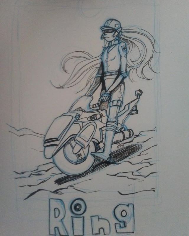
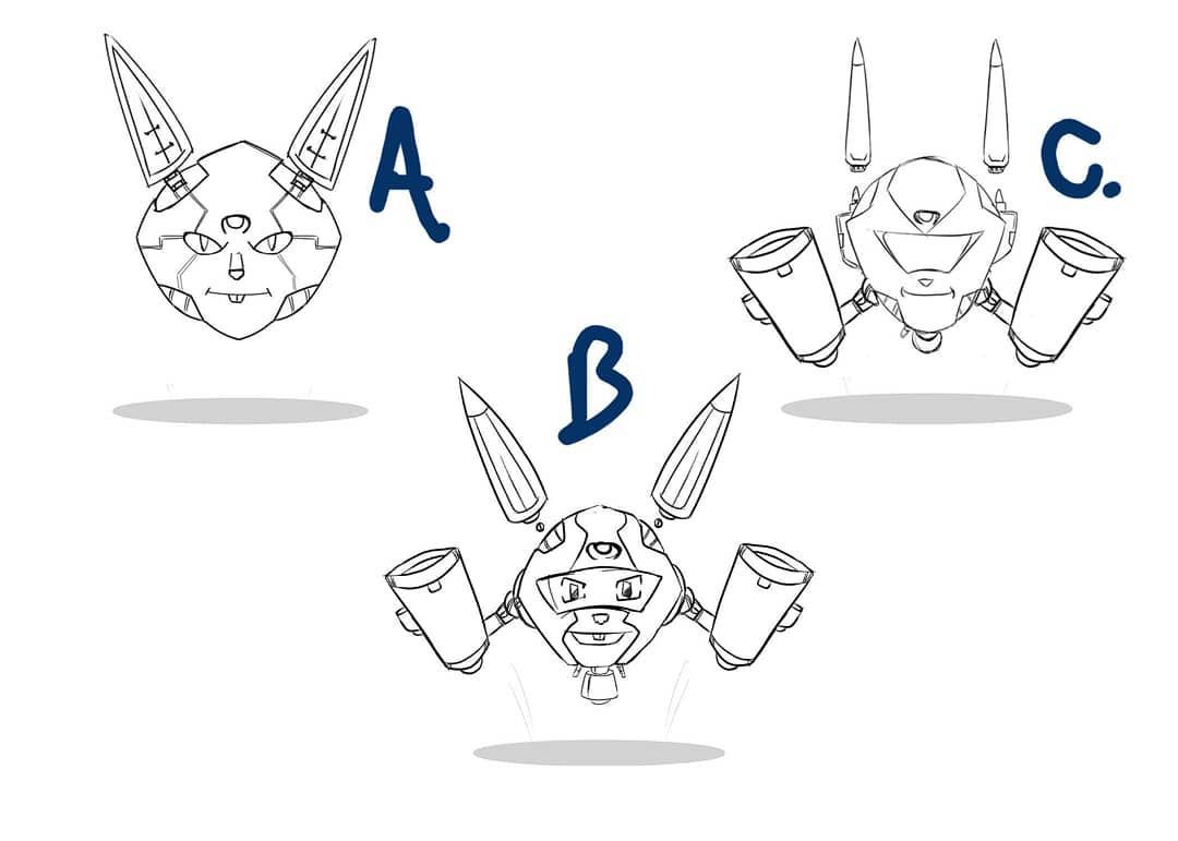
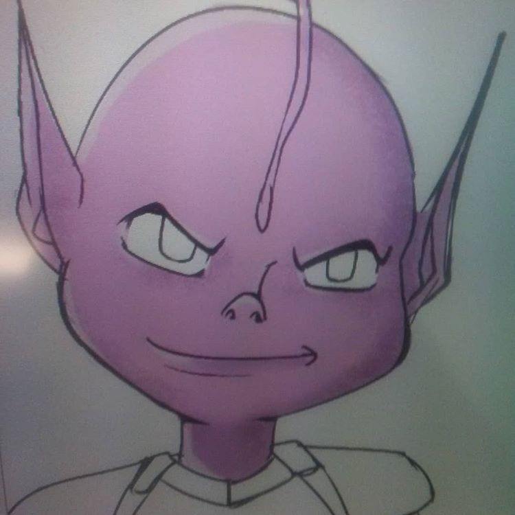
And here is a couple of my latests studies and drawings


 How would you describe this theme to someone who wasn’t familiar with it? What is the best key¬words you could use to describe it?
 -
@jthomas What I am seeing in your dream portfolio and your sketches here is a theme of futuristic or out of this world. Could also fit into alternate reality. Maybe another could be future technology.
-
@Chip-Valecek Awesome. Thanks! I do have an interest in trying to create futuristic technologies and cross dimensional storytelling.
-
Hi J Thomas, nice choice of work. It looks like you really know where you want to go.
Some key words that come to my mind when I look at it:
Futuristic,
Line art,
Sci-fi,
Graphic novel. -
I love the clarity of your dream portfolio!
I'm seeing technology juxtaposed in more desolate or sparse environments, that has a lot of depth and distance
Color-wise- many of the pieces are centered around neutrals/ lower saturated bases (0-50% saturation) with pops of color (40-80% saturation). The ones that have a higher saturation payoff overall is very limited in the palette and uses wide swathes of those colors- and even those stay around middle-saturation range (40-70% saturation).
-
@peteolczyk Thanks! I was hoping it translated into those words.
-
@TessaW Thank you! I can't really wrap my head on how you explained the color choices. I'll have to do more research on the saturation levels. I guess to me they feel more muted but still have punch and not overpowering in flashiness.
-
@jthomas -Yeah, I think you summed up what's happening with the color pretty well-
An overall muted palette with bolder pops of color.
The balance of muted colors vs bolder colors changes from piece to piece, but that's the overall impression when we look at the dream portfolio as a whole.
I tend to go overboard with analyzing colors, using the eyedropper tool in photoshop to see what's happening with hue shifts, and with saturation/value percentages- but that's not necessarily going to be valuable to everyone. I'd only worry about it if you find yourself struggling with getting the colors to look the way you want them to.