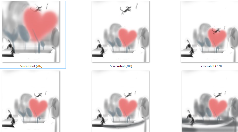
looking for some feedback and advice on (really ugly) thumbnails for leaping doggie
-
hey gang,
I've been trying very recently to really simplify my style. More childlike and rustic, I don't know if that's the way to describe it. Anyhow maybe that;s besides the point. I want to do some illustrations based on life with dogs.......I love my dog and he enriches my life so much! Last week I threw him a toy and he flew right over the couch to get it. repeatedly. lol. anyhow this idea came to me about throwing a stick and a dog leaping/flying to get it. I started rough thumbs and wanted to get some feedback on values/where the dog should be/height of trees/should there be a light or dark colored trail back to the girl from the woods?
I really like the little dog and the gesture/posture of the girl. Trees confuse me as does color so I'm mostly grayscaling. But I saw this oak tree photo circulating on facebook today and it's a heart shaped red tree in autumn. I thought that might be nice but there doesn't have to be a heart shaped tree there either...........
comments.advice/crits all appreciated as usual!
I'm feeling a bit mixed up but am really wanting to do this piece too.........!
-
now that I'm looking at it from this point of view I'm thinking the last one is best.......... also a bit of each thumb got a bit cut off , it's a little taller than is showing

-
I agree with you that the last one feels the best. I like all of the ones in the second row better than the first because if the dog is too close to the tree it looks like it's caught in the branches but if it's too high, it looks like it's flying. The second row has a better relationship between the dog and tre and I like the values in the last one best.
-
@demotlj thank you
-
@Coley I like the last one best too—I am impressed by your thumbnails. After watching Lee’s thumbnails youtube video, I want to do many more thumbnails before starting to draw, but I have a hard time visualizing more symbolic compositions like this—you seem to have struck a nice balance here between shapes and detail but still capture values.
-
I like the higher height of the second one but maybe a bit lower. And the last one is nice because it has the additional value added grey at the bottom.
-
thanks @BichonBistro and @Heather-Boyd . I kept playing with thumbnails and then I ended up getting a bit overwhelmed by trying to do things like other illustrators I think. So I decided to just do whatever felt natural to me and now I'm liking the way my more representational drawing is going, tho it's still illustrative. Thanks and I really appreciate the feedback
