Critiques Please :)
-
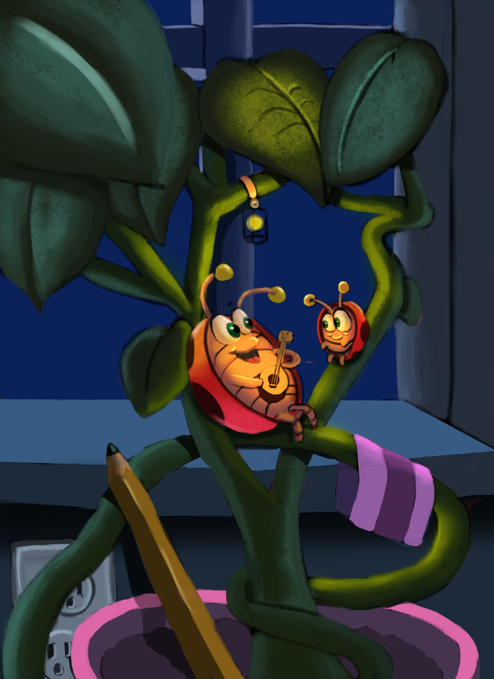
Hi everyone! My name is Raphael long time subscriber to SVS, and newcomer to the forum. I just finished this illustration a couple of days ago, and I want to know what you all think of it. I was trying to go for a mixture of cool colors, and warm colors. With the warm colors being the highest value in the center to grab the attention. The whole piece kind of feels rough around the edges, but I can't really put my finger on it, (maybe the rendering). Any critique would be be greatly appreciated, thanks!
-
@Raphael-R Thanks for submitting your work for our review. I see a couple of issues with your perspective and lighting. You have multiple light sources, which is fine, but you have them almost with the same value scale when it comes to the shadows they create. I think this is causing the picture to flatten a little bit and look 2D rather than the 3D effect you are going for. I really like the mood you are creating with the little lantern, especially as it glows through the one leaf. I think if you flattened the values a bit more in the background rather than just cooling them off, you might see more of the effect you are going for.
Also, in paintings, I use the rule: warm light, cool shadows, cool light, warm shadows. When you are using the warmer light you have warm shadows and this makes it a little like it does not fit in with the rest of the scene.
I hope this helps. I would do a draw over for you but I am not the expert in PS, like some of the others.
-
Hi to the forums.
I like how you’ve handle the cool and the warm colours. And I think that the story would be good for a bedtime book, singing a young one to sleep.
My only question is why is there a pencil in the picture, I find it an odd object to be in view and is that a ribbon. I find both a bit distracting. If they don’t have a purpose that adds to your story I would take them out. I don’t think it adds to what you are trying to say.
")
-
@chrisaakins thank you very much! It helps out a lot. I'm going to revisit the illustration with this in mind.
-
@Heather-Boyd Thank you
 I think ended up rushing it in the concept stage and not thinking it through enough.
 -
Hey @Raphael-R this piece is really nice! I did a quick draw over of your artwork to illustrate some things that I think could help your artwork be more successful. I hope that's ok!
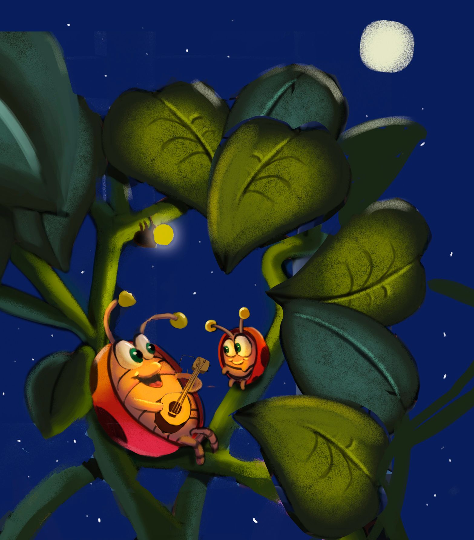
Mostly these are just little compositional tweaks - You've definitely done all the hardwork here. I think what I'm feeling is that you've Illustrated just a little too much. Here's the tweaks your seeing dumped into bullet points.
-
Tilted the guitar toward the little bug - just felt right for the composition and the strumming end of the guitar moves closer to his strumming hand which I thought helped.
-
Cropped out all of the setting below the bugs - I just felt that it all detracted from the bugs themselves which are the clear focal point of this piece.
-
Positioned the bugs in a rule-of-thirds position - Again just to give them more emphasis in the picture
-
Changed the light source to a firefly - Took some artistic license here! The lantern gave me some distracting questions about where did they get it and where the electricity is coming from yada yada. Overthinking I know. I thought the firefly was a good fit for the light source and theme

-
Added more leaves - This was mostly because of the changes I had made to the composition previously. I thought the one leaf turning in above the baby bug worked nicely and just kind of filled in some spaces that looked empty.
-
Changed the background to a night sky - Again took some artistic license here. I just thought it was a no nonsense way to keep the setting from interfering with your focal point. In retrospect the moon may be a bit much.
And I think that's pretty much all I would say needs changing - I could write a whole separate post about everything that's working really well! You have a wonderful sense of rendering and color. Keep up the good work man!
-
-
@SFischer Thank you! I know composition is one of the things I'm trying to work on
-
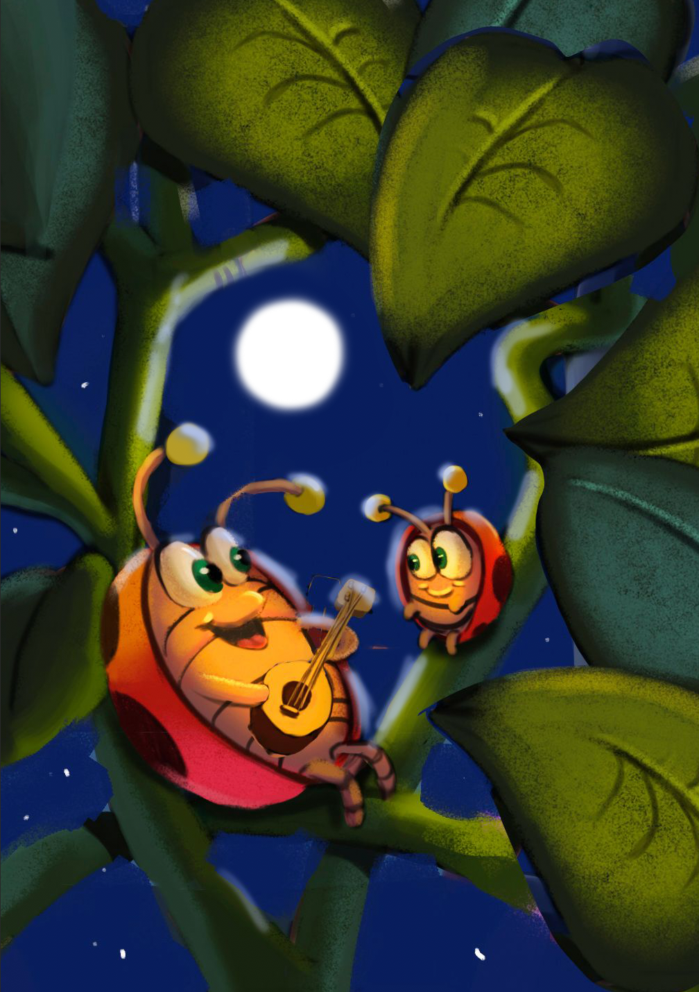
I agree with @SFischer 's suggestions and would take it a step further, crop in on the subjects and simplify to a single light source (the moon) in the BG.
Taylor Woolley
(Formerly Taylor Ackerman / StudioLooong)
Website: www.woolleystories.com
Instagram: https://www.instagram.com/woolleystories/ -
@StudioLooong oh good point. You guys are so good at this.
-
Thank you everyone
It's so nice to hear feedback. I don't know any artists so getting critiques on my work is very refreshing.