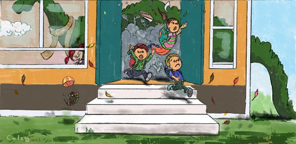
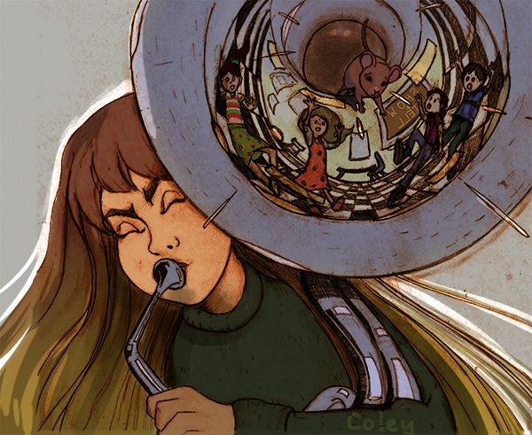
this one or that one, Coley vs Coley September contest
-
ok it's too late for me to ask peeps to pick which one I should enter, I ended up painting both and decided to submit the one that had probably the least typical concept....was hard decision, so much I wish I could do better at this point but this sort of stuff does push us all forward doesn't it?
anyhow I wanted to share the dragon school end product because I didn;t submit it. And here is the one I did submit (rusty tuba/mouse house).
Any feedback extremely welcome even if it's "bad" lol


-
@Coley definitely the second one
-
@Nyrryl-Cadiz thanks. Realizing I missed the mark on the color of the mouse, it matches the background. That's what I get for staying up all night LoL. I'll see all sorts of stuff now LoL
-
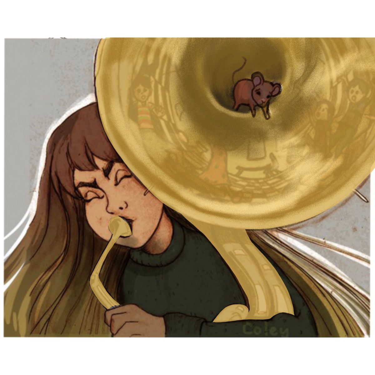
@Coley perhaps you can make the instrument more golden to help the mouse standout.
-
@Nyrryl-Cadiz I found when I made it more golden it didn't look right but I couldn't put my finger on exactly why. The whole thing was grotesquely warmish . I guess I need to tone it down a bit, will learn how to do that with practice I guess. I should have made the mouse white! I'll probably fix it up a bit once I look at it a bit more. thanks

-
@Coley here’s a quick draw over. I hope this may helps.

-
@Nyrryl-Cadiz yeah that does look good
 I wanted to keep the kid's reflections a bit stronger, but this looks wayyyyy better than when I tried to turn it golden looking. It really makes the mouse pop this way. Mine was way too yellow when I tried. Maybe I'll try eyedroppering this one to see the difference! Thanks so much!
 -
If you want the mouse to really contrast, it needs to be a light object on a darker background, or a dark object on a lighter background. The greater the contrast in light and dark, the more that mouse'll pop.
Try a white mouse is my suggestion

-
@Braden-Hallett thanks
 I had realized that after I submitted it ha ha ha. I will change it though. Giving it a few days to stare at it! Thanks so much for the input