September Prompt Initial Idea
-
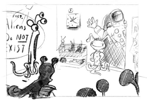
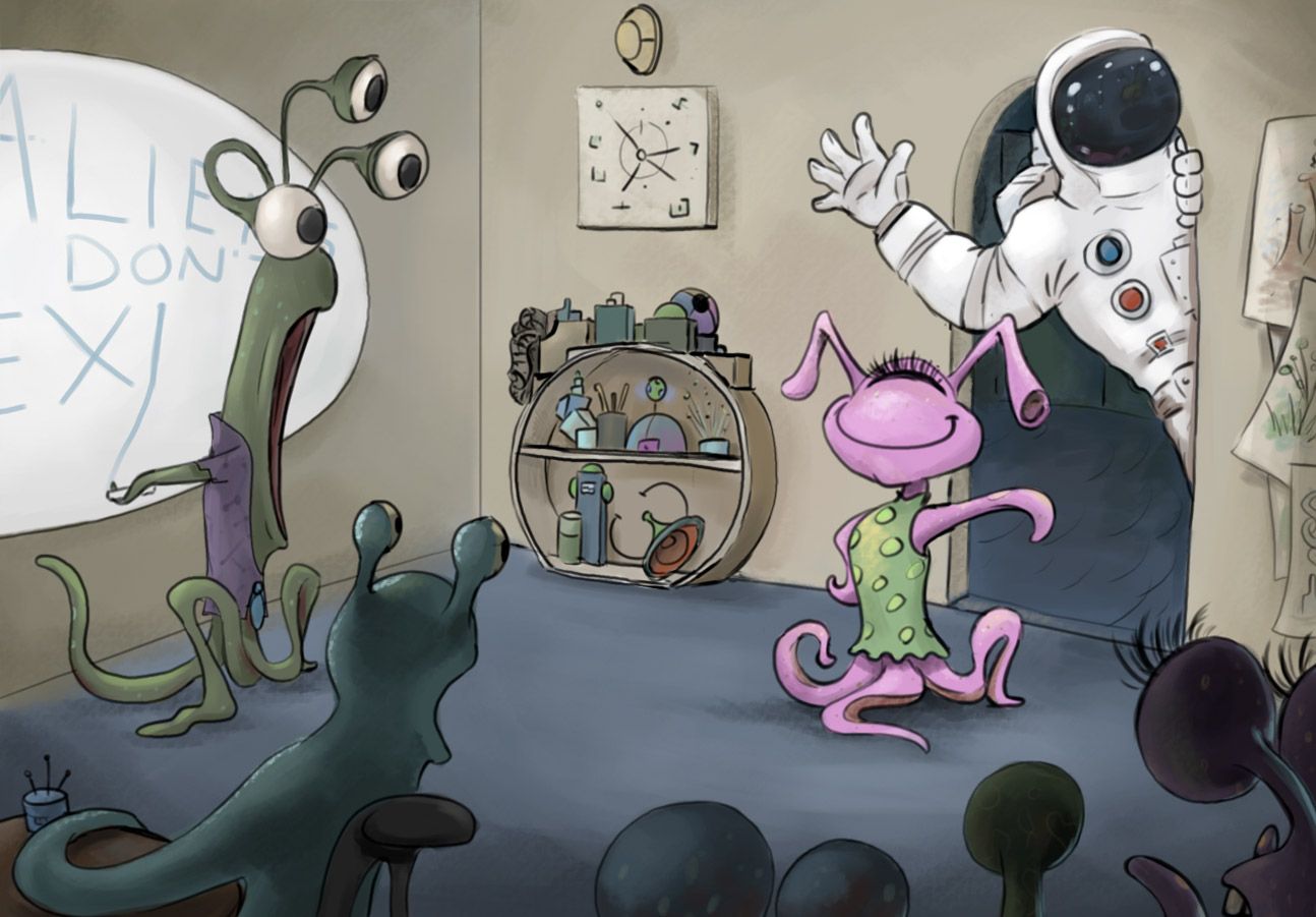
Working on my idea for the September Prompt and I thought about some of the recent podcasts and sometime stuck with me about when Terry talked about trying to vastly change your perceived idea about what the scene could be about and I thought maybe Susie isn't on earth at all, so the craziest thing she could bring was... a human!
I'm trying to keep a lot of ideas familiar to what you might see to maintain a mental continuity. Through about 5-6 thumbnails and ideas, here's something that I felt like stuck and I felt the best about how it came together conceptually.
Please feel free to offer any advice or ideas on how I can improve the idea. I might try and work up some more ideas and try to flesh out another couple of ideas before taking it forward beyond a sketch.
-
Oh my gosh, this was my idea too! I really like this composition and the potential for some really fun story telling details. (What kind of toys/supplies would be on an alien bookshelf, what would the alien clock look like, etc.) Also the teachers' expression is great, the design of the character really lends to the over dramatized expression. Can't wait to see the finished piece!
-
Great concept and composition! I'm just going to lay in every microthought and nit-picky thing I can squeeze out of here just to do it!
One thing I noticed is that all of the "shock" seems to be on the left side of the room. Perhaps you could make those eye silhouettes on the right pop with the same intensity as the teacher.
I love the teacher's long mouth and how it shows such an exaggerated reaction. I think that feature works well for her/him and is worth preserving in the finished piece. Maybe bottom weight it with some teeth?
You get a good sense that Susie's a girl with her hairstyle and funky dress. Does that make the teacher naked? Maybe just add a tie?
Susie's stance is nice and proud. It reads really well me thinks! However, I feel like it could be more obvious that she "brought" the astronaut to school. I think it'd be nice to see some gesture from Susie acknowledging the astronauts presence.
Just noticed the detail that the blackboard is round. That's a fun choice! To be consistent maybe change the shelving next to Susie and the Wallclock/art above it could be round too. Oh and I guess to riff off that - Why not make all the aliens be curvey and rounded with the astronaut having more of an angular presence? Kind of would make him look more out of place - Just a thought!
Is that a piece of chalk that the teacher dropped when seeing the astronaut? It might be fun to have the chalk still in his/her tentacle just finishing up the T in EXIST
Here's something, Suzie looks a little too close to the wall which flattens her out a little. Maybe you could pull her forward or push the wall back a little to give room for her dimension.
You have the opportunity for a lot of colors in this piece which could get overwhelming when working toward completion. Before moving into rendering detail, I think it'll be extra important to test out some color thumbnails first to save yourself some headache later on.
Make sure to add some depth into whatever room or hallway that doorway leads to.
Oo heres one that I almost forgot to mention (are you still reading? lol). One of Susie's pigtail antenna things is riding the astronaut's armpit too closely. Tangents like that can be distracting if they make it into the final illustration.
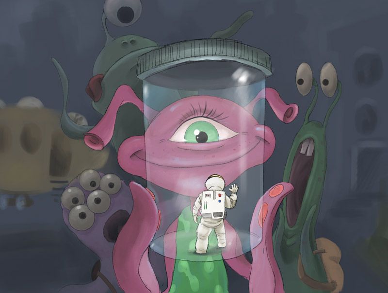
Here's a thought - The astronaut doesn't really have to be full "adult" size as we consider adults here on earth. These aliens good be HUGE and the astronaut could be kitten sized in her hand, or even a jar! PS astronauts suit is looking great!
So that's my 22 cents.. Just want you to have an outsider's perspective!
-
Thanks for the feedback! Great things to incorporate. The next "phase" I had added some clothes to the teacher with just the same thought.
I'll work on adding some of those gestural things into the next phase and see how I can communicate that better.
-
@lauramarie_art Shoot lol sorry. Don't let this keep you from doing the same concept - it'd be fun to see the same idea fleshed out a number of ways I think

-
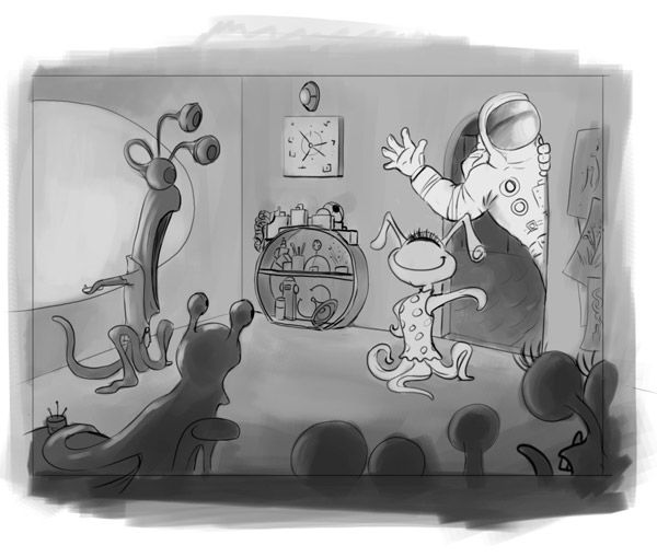
I've moved on to the 2nd version with more refinement, and then adding some of the value to get a sense of the room space. I tried to incorporate a lot of your feedback in mind - huge help to get some really good critical notes so thank you again for that. I'll work on taking this into color when I get the spare time and maybe change a few things further.
-
"Here's a thought - The astronaut doesn't really have to be full "adult" size as we consider adults here on earth. These aliens good be HUGE and the astronaut could be kitten sized in her hand, or even a jar! PS astronauts suit is looking great!"
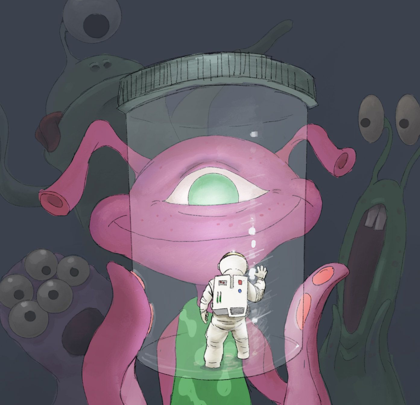
I had some spare time at a dentist appointment to flesh that out a little using Procreate to create a rough idea of something like this. This is basically just one single idea refined and then brought into rough painted color.
One thing I'm really trying to work on intentionally pushing elements to the background and bringing things to the foreground.
-
@jdubz Sorry I haven't seen your reply until now. I need to make it a habit to check these forums.
Great Work!! All around huge improvement on an already great start. I love your second drawing too with him in a jar. Definitely looks like you're having fun with this one

-
@jdubz this is a fun idea

-
@jdubz I really like the smaller astronaut idea and composition better.
-
I like both of these, but the astronaut in the jar is a great twist on the theme.
-
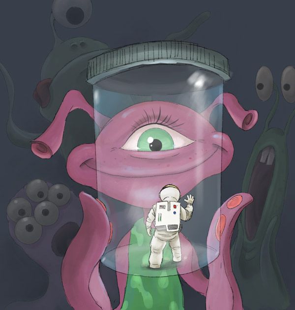
Finally had time to put some more work into these. I took the version 2 with the jar further and just fixed some of the colors and sizing and polished it up a bit.
-
I've taken that very first version into color. I honestly don't know how much further I'll take this one. With some big projects coming up I'm not sure I can dedicate much more time but I REALLY wanted to get it to the point where it's a bit more finalized.
-
I really like both of these images! But I don't really see the setting of "school" in the one with the astronaut in a jar. It's a super fun image, definitely, but it could be set anywhere. Is there a way to indicate it's happening in a school? They're both great images, tho, really imaginative!
-
That's a good point. I may be able to expand the background to include some familiar images in the darker region that would give that impression.
-
@Kat What do you think about adding some familiar background elements? Something like a schoolbus type of vehicle and some kind of backpack imagery is my first thought to solve that problem.
-
@jdubz I love the tiny man giant aliens concept and composition! The story is a much faster and stronger read. The alien has more eye candy bits, but there's also more potential for confusion in those shapes. In the jar version everything is SUPER clear and cute and funny. Even the alien anatomy is crystal clear. Where in the classroom, the eyeballs on the edge of the frame leave some questions as to if they're individual heads? Multiple to a head? How many? Are they objects?
I totally dig the subtle additional elements too. Kind of a toss up which is stronger to me between the verticle crop and the extended horizontal though. Actually... I still lean to the vertical because the focal area is stronger. The question is which is the focal point? The eye or the little guy? I'm eye 1 guy 2 other aliens 3.
Might consider some thickness to the jar?
So fun!
-
@jdubz I'm just happening back into this thread. Wow the second illustration has really come along! I agree with the others on how strong of a composition you have in that one!! The anatomy of your aliens really shines here as well.
One note that might be a little bit of a wrestling match (if you're not sick of me yet). The lighting in your artwork seems to be coming from the jar. Unless the setting is in a dark, closed off place there should be some source of light coming from outside the jar. Maybe you could place them in the classroom, since you've already designed that setting so well?
Even still, if you just want the jar to have that special emphasis because you like it that way, then more power to you. It makes sense compositionally, just not physically.
Also just another thing to mention - I think the classmates' eyes should be pointed more toward the astronaut himself. My favorite of the three is the top left classmate and that's likely because his gaze is so well placed on the astronaut! (He's also very fun!) You could also have some fun with the lower left student by pointing only some their eyes at the astronaut while their other eyes express shock elsewhere.
Good work!!
-
@jdubz I think you're headed in the right direction, definitely! But I'm not sure if the items are strongly defining the space as being in school. In your first one, it seemed a bit more obvious that it was a classroom even tho things were alien - clock, teacher writing on the board, etc. Maybe this scene could take place in the classroom you originally had? Or something similar? Either way, I love the idea and I think the expressions on the kid's faces are great!
-
Thanks for all the feedback everyone. I made some changes and smashed some of the ideas together a bit to hopefully make it more cohesive. In the end I ran out of time to explore making it brighter unfortunately. But I think I'm happy with how it ended up.