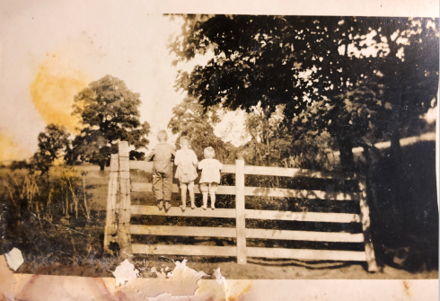
1900`s photo
-
Hi everyone! I am part of the SVS and is a great experience for me!
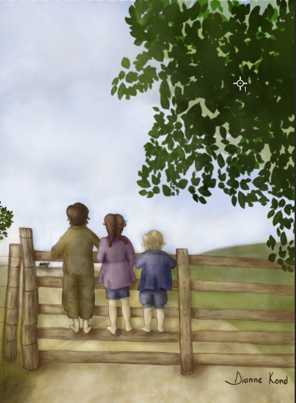
I found an old photo and did a version of it. Its my first post, please give any suggestions and directions that you have and be as direct as you can

Thank you!
https://www.instagram.com/diannekond/

-
I like it! I always find myself interested in an artwork that somehow edits an old photo, can't tell ya why
 Your work looks cool and painterly, I dig that style.
There are some things, howewer, that I'd like to adress here, some suggestions that I think you may benefit from.
First thing I'd like to say is that you should study values a bit more carefully here. If ya look at the photo, the value range is quite huge. You've got VERY dark leaves and bushes on the right, very light clothes and sky and fence that clearly stand out in comparison to the ground behind them...I don't really see that in your painting. There are no strong lights and no strong darks, which kinda makes it slightly dull in terms of value. Having more contrast would definitely help.
If you struggle with observing value, try color picking. See how light is the lightest light, how dark are the darkest elements, take notes, apply that to the painting. That's a really good way to use reference, you know?

Next thing - story.
I am not the master when it comes to telling stories with paintings ( yet! Just sit back and watch
 ), but I have learned that the story is actually one of the most, if not the most, important parts of an illustration. All the decisions you make during painting should benefit the story.
So what is the story here and how can we enchance it?
Some kids are looking at an object in the distance. Story is present, I am also a bit hooked. What it is that they're looking at, I ask myself. Is that their parent coming home from a voyage? Or is he going away and they look at that? You made me ask questions with that painting, so you're on the right track. How do you enchance it though?
Well, look at refference. Bigger fence could be a key here! The kids in the photo seem so small and vulnerable, becase the fance that they stand on is so big in comparison to them. The fact that the fence that they climb on is so much bigger than they are adds so much to the story, it's quite a shame that it went unused
I am not telling you that you did something wrong here, you;ve got a story and it's nice
 What I am getting at is that by thinking about the ways to enchance a story that you've came up with can add a lot to your work.
If your story is that someone dies and you draw someone laying on the ground, how do you push that further? Paint some blood and your message is clearer. If the story is about a small guy facing a bigger guy, push the contrast between them! Make the big guy extra bulky and the small guy extra small. Exaggerate that!
If the story is about bunch of kids climbing on a fence? You get the idea by now, don't you?
Do I make sense here? I hope I do!Last but not least, watch the perspective. The fence seems kinda flat. The horizon line is quite high. The lower you go from it, the more of the top plane of those planks should be revealed. Can't see it present here, which is a shame.
That would be all I got to say! Hope it didn't came off too negative
 Looking forward for your next illustrations!
 -
Thank you so much, Igor, for your time and for such a valuable feedback.
Its really helpful that you point the problems and give the solutions to. A really good push in the right directions
Thank you again!
-
You're welcome

Glad to see that you've found this helpful -
I actually prefer the non-replicated quality of the choices you've made in your illustration.
I sometimes think there's a downside to showing one's work side-by-side with one's references. It seems that most of the criticisms I've received of my own work when I've done that are usually about how closely the pieces resemble the reference. Nothing against @IgorWoznicki , but I personally think context is everything...
It's hard to offer suggestions or proffer a valuable constructive critique when there's nothing to guide it. What are your intentions for the illustration? Is it part of a story? Is it a stand-alone image intended as a piece unto itself? Or perhaps a greeting card?
Is your goal to try to replicate what you see in the reference material, or create your own expression using elements of it?
I've done quite a bit of replicating reference myself. I love to take old photos and daguerreotypes and try my hand at drawing them. Sometimes it was about replicating values. Sometimes it was about practicing fabric folds. Sometimes it was about creating textures. But when I shared these images on social media, I inevitably got comments about how "real" they looked. And that wasn't really why I was doing them. Photographic realism doesn't automatically equate quality or a job well done. It means you're good at seeing and then translating what you see through your eyes and hands. How it comes out of you is up to you and what you're trying to do with it.
If I were to look at the piece by itself without comparing it to the photo reference, I would urge you to ponder a couple things:
-
The intensity and sharpness of your shadows in comparison to the highlights. It seems that the source of light is coming from the left, and it's relatively diffused. Even so, the shadows of their legs upon the fence and the cast shadow of the fence planks on the ground might need some attention.
-
@IgorWoznicki 's points about perspective are spot on. The lower planks would have a suggestion of thickness that would come from seeing the top edge's plane.
-
It appears to me that there's a wagon and horses peaking over the horizon line in the distance, where the kids are staring. You might want to shift that whole horizon line up and above the kids maybe coming in midway through the tree, so we can more clearly see what they're looking at. This would lower them in the picture plane, and we'd see even more of the planks thicknesses and probably the tops of the posts. It would also make the story of the image a bit clearer, and reduce a bit of the big sky space that seems a bit empty right now...
It's lovely work--keep going! It has a strong "Little House/Garth Williams" vibe in some ways. It has a real nostalgic feel that comes out of your soft brownish colors. It feels earthy and homespun (is that possible in a rendering? LOL!). Very nice!!
-
-
@Coreyartus funny, it's such a simple thing to think about, but yet I've never bothered myself with asking for context before diving into critique... Here's a lesson for me! I will make sure to keep the context in mind while critiquing and to give it to the others when asking for feedback.

-
I can't add anything to what has already been said but, I do love your color palette and the image is very appealing to me.