Evil Poodle - Critique
-
This past year I changed up my style to keeping my line work and inking it. Also not spending so much time noodling on painting. I sorta miss working in my old process so I am taking this past weeks JimBob Prompt since it hit home with me after adopting a standard poodle a few weeks back. I am going to share my process but I am also open to critiques on it. Please feel free to let loose. I don't always feel I get the most honest feedback from people.
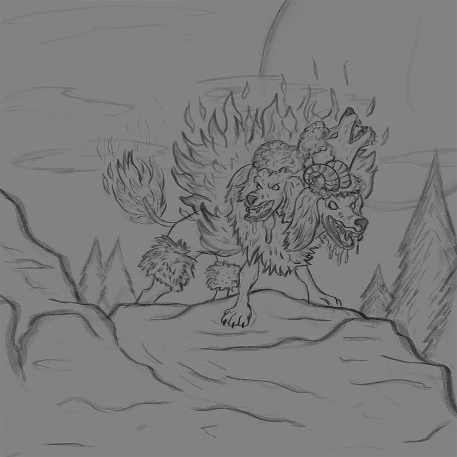
Step 1: thumbnails/rough sketch... I didn't save any of this because I usually delete all the thumbs when I find one I like. Then I rough it out.
Step 2: Drop the opacity down to about 60% and clean it up meanwhile erasing some of the rough but keeping some to give it some life.
Step 3: Merge those two layers together and throw in some local color under the lines layer. Thinking about light source a little but mainly just thinking color at this point.
Step 4: Adding some shadow and lighting. I add a multiple layer and a overlay layer. This is where I really push where the light will be coming from.
Working on step 5 where I start to render out the forms and paint over the lines. Then step 6 is pushing the shadow and light.
With that, please give me your feedback. What needs to change? What works? What doesn't?
-
Love it, Chip! And yay! for Standard Poodles. They are the best. My partner has one. Super smart, funny and friendly dogs.
-
Hey @Chip-Valecek Nice! Thanks for sharing your process.
The first thing I see is that when I squint and look at your piece, the big shapes could be more strongly defined. What I mean by that is where are the big light and dark areas, and how are they grouping elements and guiding the eye.
One suggestion is to take your painting and make thumbnails and play with just black and white or at the most 3 values (black, white, and a middle value) to see how you can push the main areas of value. You'll have a stronger painting if you can create this "abstract" read.
So as an example, here's a quick one I did with a soft brush over your painting. I'm not saying this is the right way to organize the values, but you can see how there is more of a distinct value structure to the painting.
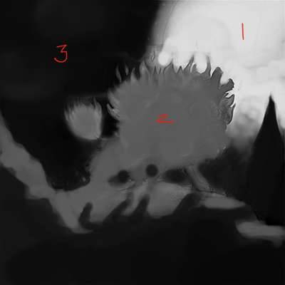
The idea is that you want to start to see how your colors and shapes are grouping to create a stronger sense of depth and I think, a more interesting composition.
Let me know if that is helpful, or confusing, or if you have questions.
Cheers, and keep up the good work!
Rob Gale
instagram: www.instagram.com/robgalestudio/
website: www.robgaleillustration.com -
@robgale i understand what you mean. I guess that is the benefit of my other process is that I do gray scale first and then use color layers to add the color. Maybe I need to mix both processes together.
-
I would go without the horns on the head. I think they are great without. Maybe more contract or work on values, that all the heads are more clear. It will be great thing for the Jim Bob drawing show, do You do it for its promt?
-
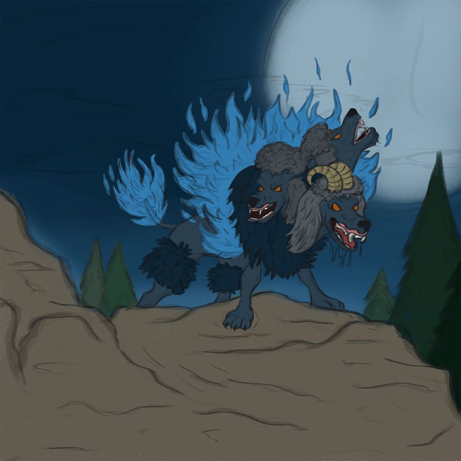
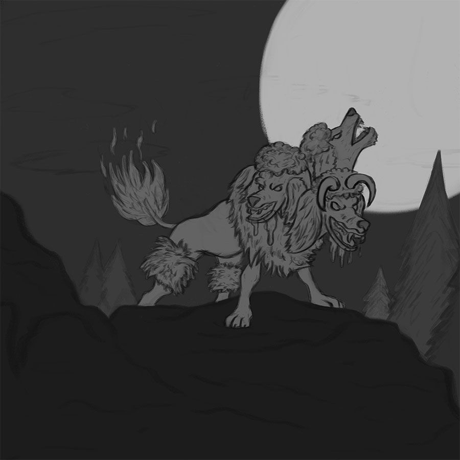
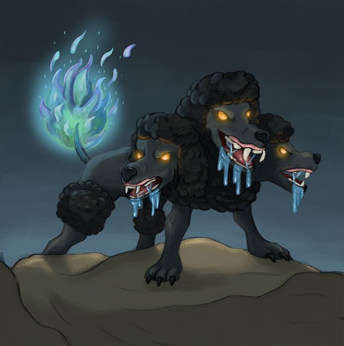
I actually updated the horns and removed the fire around the body and just going to keep the fire on the tail. This is for the jimbob prompt but since I am going to take my time on it, it will not be finished by Thursday.
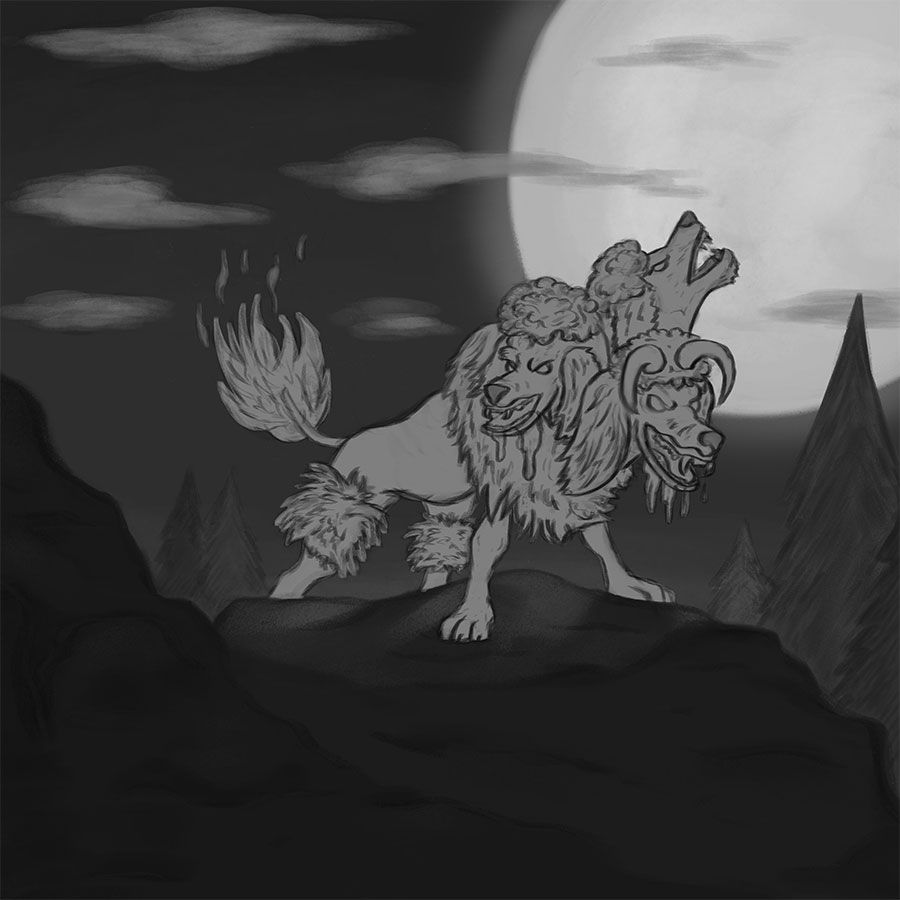
I stepped back and started to layout in gray scale like @robgale suggested. Here is just the solid values.
From here I am building off those values. Most of the background/foreground is done. I will work on the poodle later.
-
@Chip-Valecek Looking like it turn into a nice piece. I think @robgale made some great points with the value studies and I would probably experiment with those a bit more as the lighting will be a big part of how well this image turns out. You may need another light to light up the faces of the dogs in the foreground, or you could go for a rim light and leave the details to be dimly lit by a bounce light or something. If you are taking your time with it, I would say don't rush into the later stages without a good foundation and just do a bunch of tiny versions to avoid wasted time later.
-
There is one thing that catches my eye as being a bit off and that is the far head. It doesn't seem to be attached right. That's the only critique I have right now. Wow! That's a scary poodle!
") When I lived in San Jose my son came home one day from high school and was talking about a rumor of a colony of albino cannibals with wild poodles living up in the hills.
When I lived in San Jose my son came home one day from high school and was talking about a rumor of a colony of albino cannibals with wild poodles living up in the hills.
I imagine those poodles may have resembled these. Ha! Ha!Marsha Ottum Owen
-
@Marsha-Kay-Ottum-Owen oh I would love to see a movie about a bunch of albino cannibals with poodles LOL. When you mention the far head are you talking about the one that is howling at the moon?
@Gary-Wilkinson when you mention starting with a good foundation, are you talking about the values or the actual drawing? I want to make sure I understand. I think for the light on the face I was going to have a light source coming from the right front to add some rim lighting around the head. The tail is going to be blue fire which will light up the back of them.
-
@Chip-Valecek Yes, I was talking about the howling head. Maybe you can make that movie
Or at least make an illustration to go with your horror theme -
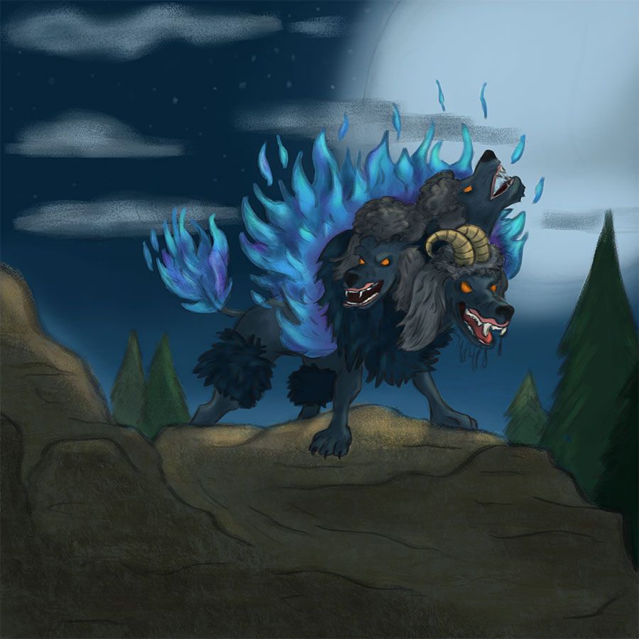
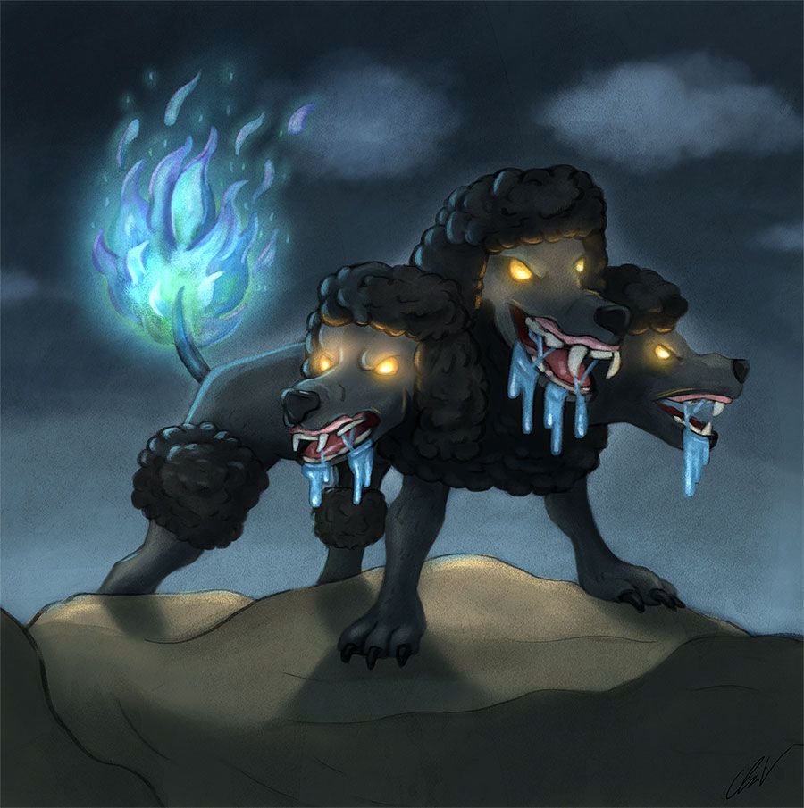
So I took a step back and changed this around a little. Instead of creating a full scene around them, I am just going to focus on the poodle. My biggest influence since I started to digital paint is Aaron Blaise. I love to watch his live streams. So this weekend while listening to him and his son (always good banter) I am following his process and moving along with this piece.
What do you think of the changes? Should I have kept it like it was before or since I am now just focusing on the character does this work?
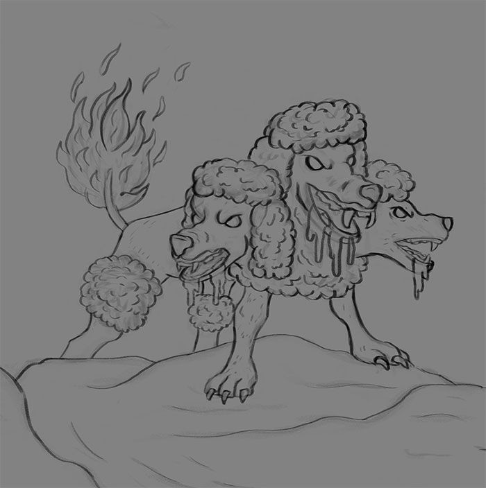
I style have to work on the rim lighting and push the shadows some more. I might add a few clouds/stars in the back but nothing crazy.
Thoughts?
-
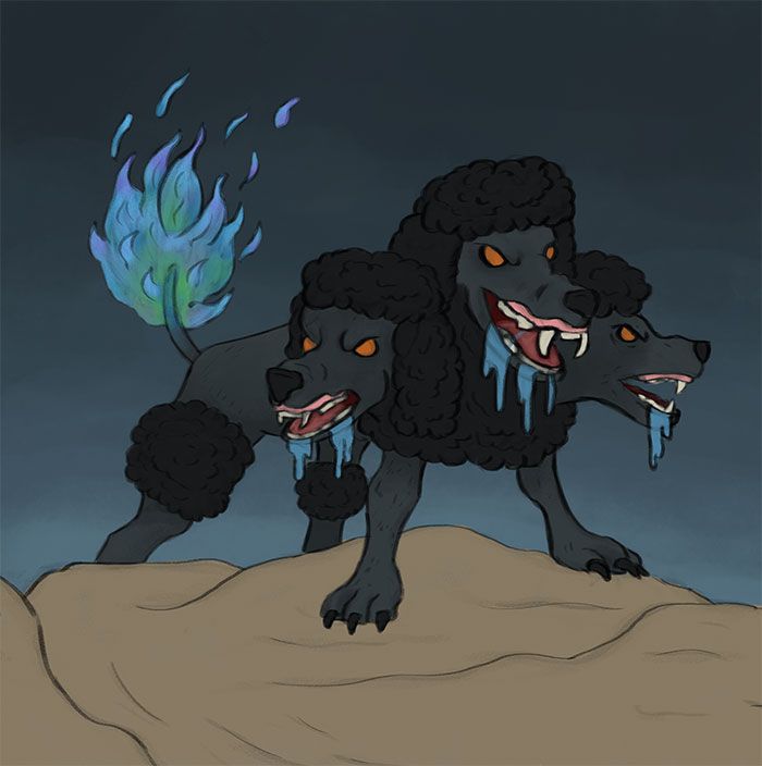
Here is the final. Please let me know what you think? What can be improved next time?
-
This is really cool! It's like a wicked contemporary take on Cerberus. "But, Muffy, darling--'standard' poodles are so blasé nowadays, aren't they? This is so much more au courant..."
")
The only thing that I might adjust is to sharpen the shadows on the ground... I think they're from the tail light, yes? They might need to be just smidge bit crisper on the edges, maybe? I dunno... That's just a personal preference.
I am totally digging the texture on this, too! Is that an overlay or is that with the brushes themselves? It has a wonderful pastel feel that I'm personally really attracted to. The glowing eyes are nicely effective, too!! Very cool, Chip!
-
Very nice concept Chip, I don't think I ever have seen anything like it and would hope to god I will never get to see one in real life otherwise I'll shit myself. I love the pastel strokes and grainy effects.
Now I'll try my best to point things that I think could improve on this, now take it as a grain a salt cause I haven't critiqued a piece in a long time, so I apologize in advance if anything does make sense what I'm saying, also I'm a terrible writer, and refused to pay for a Grammarly subscription.
The first thing that I would suggest and its something I learned over the years it's to choose one main key light to show your scene usually one that will give you a clear read on your subject and gives the appropriate mood to your scene. In this case, I would say it will be the flames in the back, which will give it a nice dramatic rim light and strong shadows to obscure its faces. I probably dim down a couple of values on the light around the eyes. Also, the top of the eyebrows and hair won't receive any light due to the brown blocking it same goes around the cheeks. The mouth its receiving a lot of light from the front but I don't see any other form being affected by it. I find it helpful to add some cross contours at the earlier stages to help you figure out where the light hits and can't reach.
I also see the light on the ground having a warm temperate to it when the light hitting that forms its that cool tail light, so you can shift that towards the cool side it might fix that. Also since that light, its quite close and that strong you probably want to use a more hard edge to it, at the moment it's far too soft try to connect the shadows it gives a strong read ( something I learn from James Gurney color and light Book). I notice that the rim light in some places has a dark outline around it, and some don't. Try to be keep everything consistent. I would suggest that maybe darken up the area behind the flames and the doggo to pop it up a bit more, it will make the light seem brighter fo shizzle!
Another thing you could start thinking about it's varying up the shapes and spaces in the piece. Like for example the saliva they all seem to be at the length and space apart. It is something that I still struggle with.
Now In the previous attempts, I notice there were trees around that the image that made the doggo look quite massive. I can't tell how big its this doggo on the recent one. Maybe add something to help gauge its size may be something that the creature its hunting or play up with some atmospheric perspective or some clouds going thru it. Make sure its something the audience its familiar with its average size if you decide to do that.
I hope this has been helpful and not so confusing, I'll try my best to answer any questions on my critique. Wish you best on this, it's one my favorite pieces that you have made by far and I can tell you put in a lot of work went into this. Cheers!

-
@Jorge-Valentin I understand your critique. I did struggle with the lighting on the rocks. I believe the dark outline you mention is just the sketch layer showing through the color. I will work to remove that.
@Coreyartus I do have a layer on top set to multiple that has the paper texture and then another for the grunge texture. But with out them the you can see in a previous post that the brushes I am using do have a chalky feel to them. The texture layers just help it pop more. I wasn't sure if it was too much.
-
@Chip-Valecek Nice work!
I think it was a wise choice to simplify to just focusing on the poodles.
I think the values have gotten better in this one, but I think you could still push it further. I would love to see the silhouette of the poodles stand out a bit more, which you could do by playing with the lightness of the background a bit. I know you said you are moving on to your next piece, but just something to keep in mind for next time.
I like how you treated the flame tail!
-
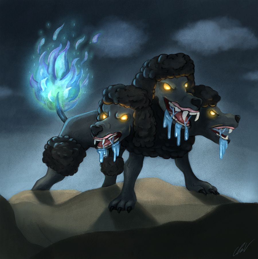
I decided to go back in and tweak some of the feedback i got. Here it is with cleaned up line work, stronger shadows, removed warm light, removed extra glow from eyes, lighten up the background around the poodle to pop the silhouette.
-
@Chip-Valecek that looks like a Ray Harryhausen style dog.
If you’re still after critical feedback I wondered what would happen if the blue of the saliva was toned back so it was less saturated. Would it make the flame on the tail look brighter? Would the saliva still look wet? Is this the effect you want?
Or is the saliva glowing and giving off its own light? If it is how would this bounce off the mouth and teeth.
Cool pick Chip. Love the concept and the cold blue flame and the glowing eyes. Now I have to try and sleep