Improving/revising work from book covers class
-
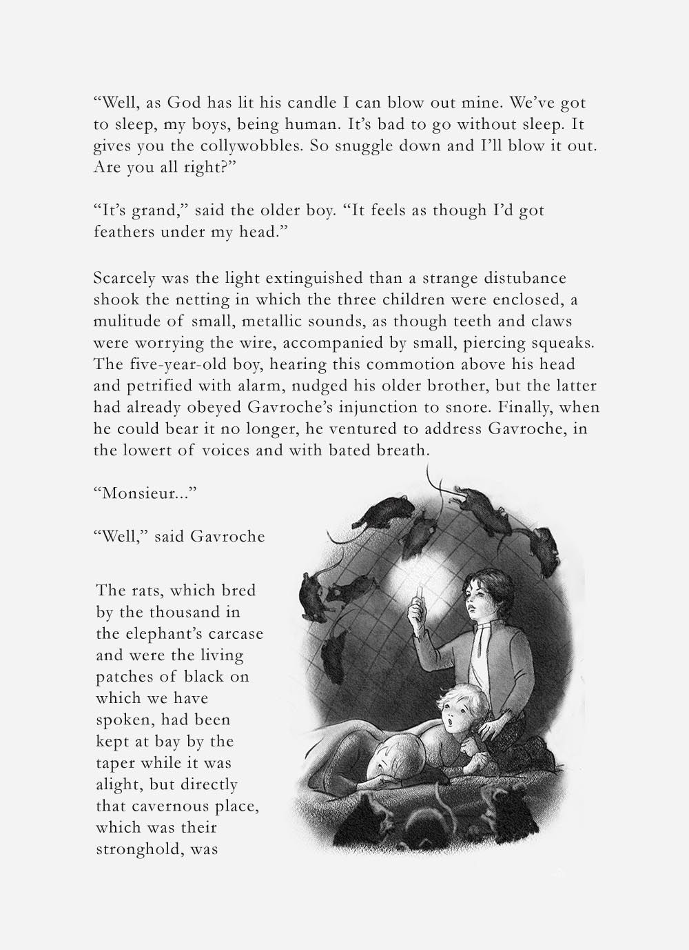
Which is better? I think the light one but I've lost all objectivity. Also asking for serious critique from anyone who feels so inclined. I want to finish this thing! Thanks!

-
@Laura Beautiful work! The background rats in the lighter version are much more legible but the foreground ones are still difficult to read. I'd like to see a somewhat sharper edge on them and some lighter values in it. The shapes need to be more refined as they're unclear right now, especially the left one. I like the idea of the kids being in focus and all else blurred but it's not working completely yet. Overall very strong work — love it!
-
@Su How's this? I firmed them up but then took down the value, because I really don't want them to take center stage.
-
@LauraA That weird z thing on the older boy's leg is one of those stray Photoshop marks. Didn't notice it until now. I'll get rid of it, but just ignore it for now.
-
That looks better! Your illustration looks really nice on the book page. Great job!
-
@Su Thank you!!
-
Love the style! Perhaps balance the long title a bit more so it's not so vertical?
I don't know where you landed with this piece as I see it's from last year. -
Hi @Adriana-Bergstrom! Most of this series is on my Instagram now. But thanks! I can always take a look at revising these pieces later for a portfolio website.
-
@LauraA
Wow, Beautiful covers! May I ask what class you took on Book Cover design? I am trying to learn how to do book covers and looking for anything that would help me learn more. Thank you. -
@RG-Spaulding There is a live SVS Book Covers class that has been offered twice that I know of. When I saw people's work from the first one, I asked to be on the waiting list for the next one. I really liked it! But right now there don't seem to be live critiqued classes, and I don't even see the course in the "all courses" list. So maybe write them and ask to be put on a list!
-
Thanks @LauraA I will keep checking.