Godzilla WIP! "Intimidating"
-
So big that even Godzilla tucks his tail.
I wasn't going to participate, but finally had an idea pop in my head. Not really for young children exactly, but I put some humor in it.
So far, from sketch to this point, I've spent about 5 hours on it, not including drying time in between washes.
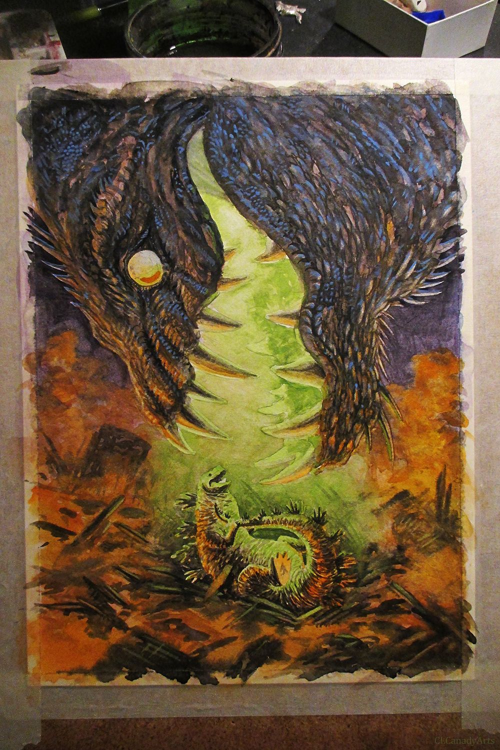
9x12 inches about 70% done. need to work on the giant mouth, and make godzilla more readable. Watercolors, with a bit of gouache so far. Might add some acrylic, and colored pencils to do highlights, fix some things, and make the fires pop. Then photoshop for touch ups if need be.
All my links: https://APHOTICMOTH.carrd.co/
-
Good job! I especially like the humor
")
-
Looks really cool. Great stuff
-
@CLCanadyArts fun stuff, can't wait to see it finished. Love to see others traditional media process!
-
Thanks, everyone.
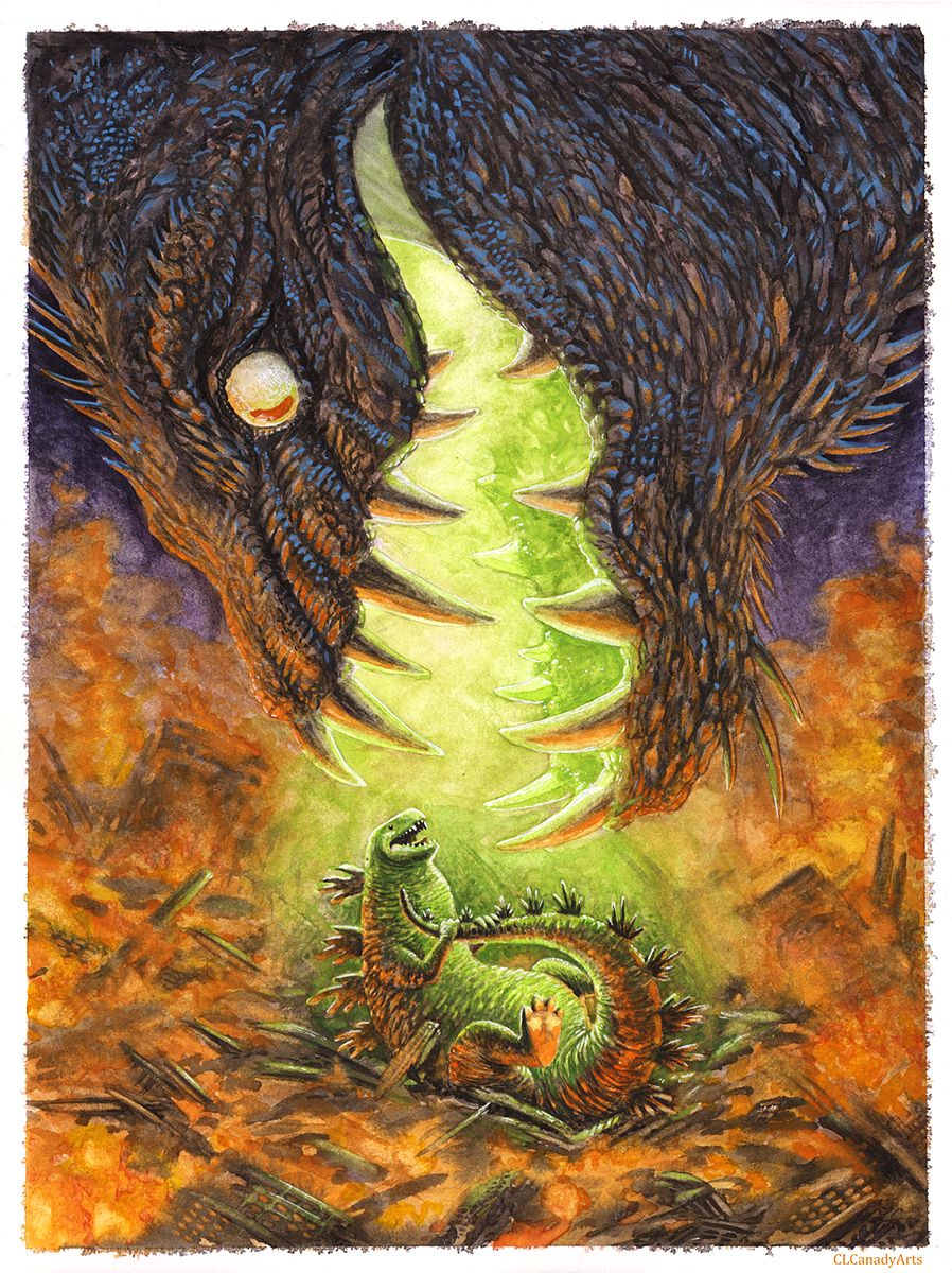
Here is the finished scanned painting. Watercolors, and a hint of gouache, and acrylic. Scrubbed a lot of the details in, lifting one color, then replacing with another. Good paper allows for more scrubbing, and for the pigment to be lifted easier.
Left the kaiju's body to the imagination. I wanted much of the focus to be on, Godzilla.
Going to play with some digital touch ups before submitting the finished piece. Trying to refine my pieces mostly traditionally so I can have some nice originals.
Feel free to give critique. I see many things that are a bit weak, but I'm fairly satisfied with it.
All my links: https://APHOTICMOTH.carrd.co/
-
@CLCanadyArts I think you did a wonderful job with this, especially with how you tackled the medium! I particularly like how the blue color of the monster pops up (I'm guessing this is the gouache), it really adds to its mystic appearance.
-
@CLCanadyArts Haha! That's awesome!
-
@CLCanadyArts liking your final. Came out beautifully!
-
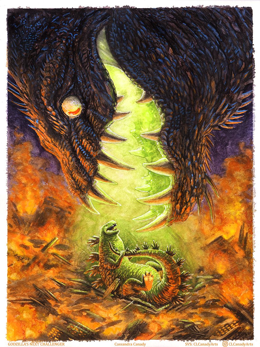
Original piece
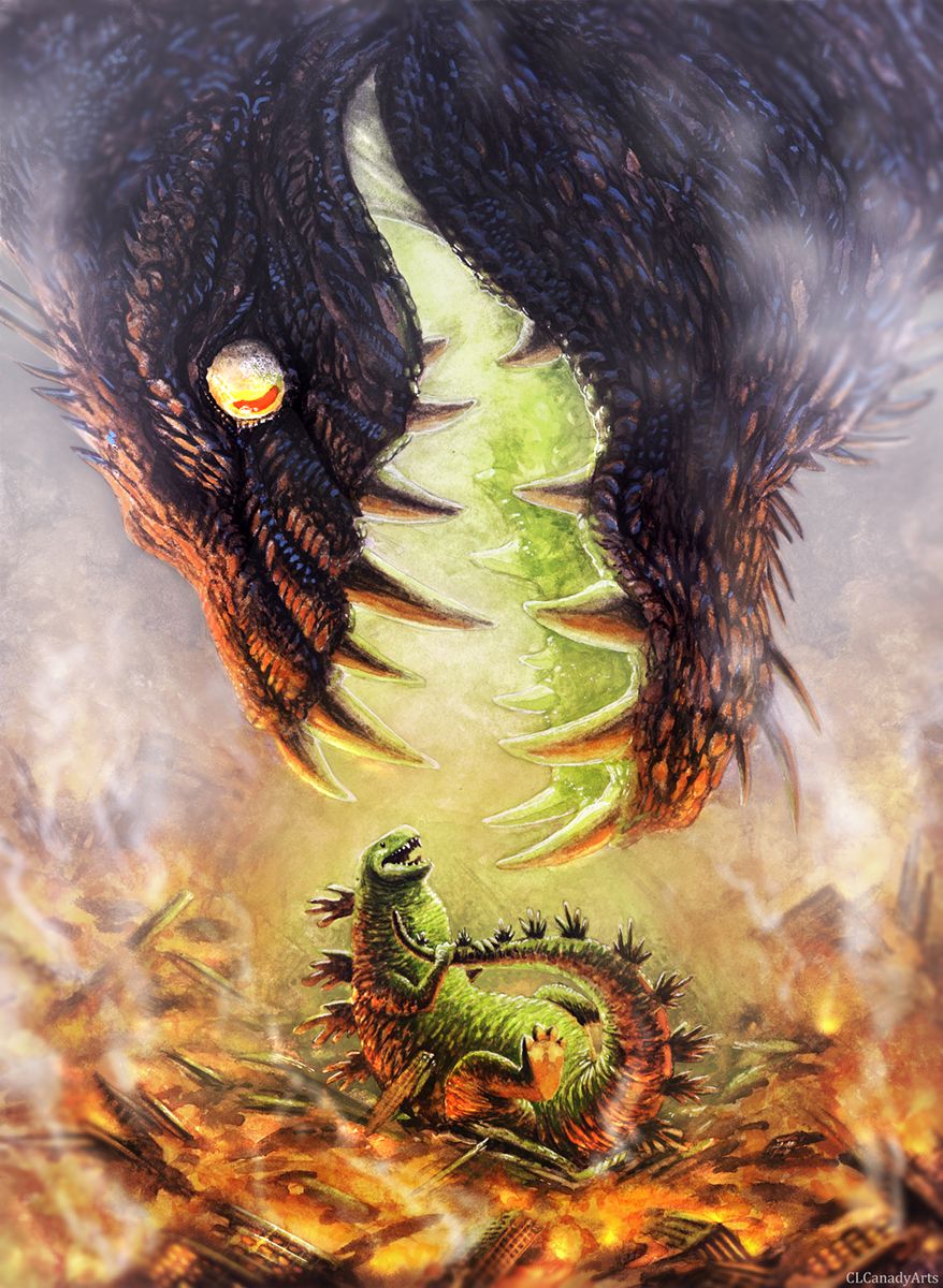
Revised piece
The critiques today were great. I'm so grateful to have received some unexpected feedback on my piece. Thank you @Will-Terry and @Jake-Parker
A comparison and analysis of the before and after:
I rushed the original piece and didn't plan anything out, instead I just went for it, and I think that hurt my colors pretty bad. I also didn't sketch any of the rubble, just free-handed it with paint. I really need to plan things out ahead of time.
I originally edited the piece as little as possible digitally, as it felt like I was lying about the process if edited too much, which I now realize is a bit silly to think. It's whatever looks good, right?
Initially I went for depth of field with the destroyed skyscrapers, but failed. Added a bit more detail to the buildings, along with pushing the depth, but I think my new depth of field blur almost gives a miniature effect, which wasn't intended. I think not having something else for size reference is creating the illusion. Thought about adding some helicopters, or perhaps a iconic building that is still standing to strengthen the sense of size.
The guys said that brightening the bg could help overall. It really defined the shape of the big beasts head, as well as zilla himself.
To justify all the light around the beast I added smoke, which broke things up a bit, it made things a little more interesting to look at as well, and now it looks as if the beast is appearing through the thick smoke choked atmosphere.
When comparing the edit to the original, I see just how flat and boring it looked.
Feel free to critique.