House Illustration-Perspective issue
-
Hi guys,
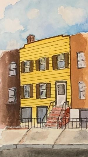
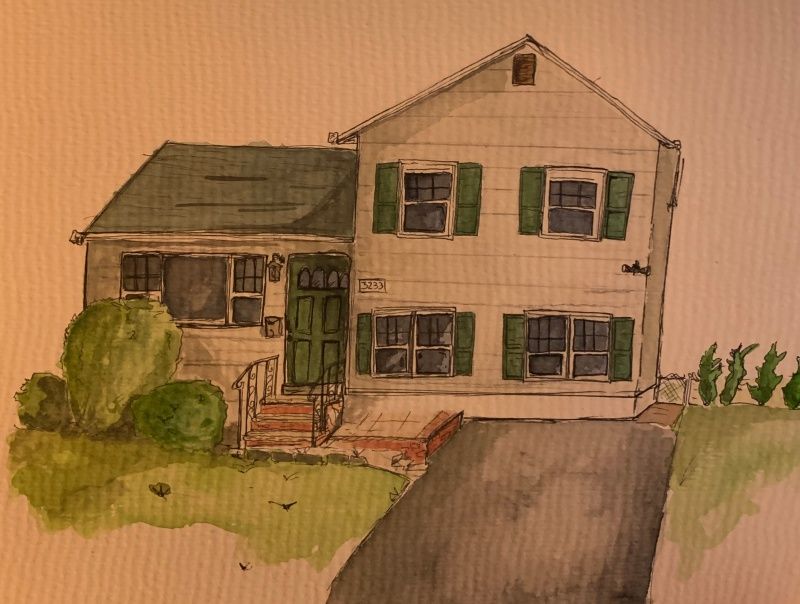
I've got a question/issue I'm hoping to get some feedback on. It deals with perspective. So, I have always had a bit of a perspective understanding issue. Having learned it in high school and then college, I never really put it to practice. Learning it was some years ago so revisiting it in my illustrations is proving to be a bit of a frustration. When drawing houses or buildings from a photo reference, do you typically sketch out the house first freehand and then draw your horizon line, vanishing points and connecting lines over your sketch to correct the perspective mistakes? Or do you draw all the lines first and then draw your building/house shapes on top of those lines? If the latter, how can you tell where to draw your lines? I feel like as I put in the shapes id be erasing my guide lines and readjusting them which seems like extra work. Im just stumped. I'm attaching an illustration of an apartment building I did of a family member's apartment they lived in 35 years ago (back when the style was bright yellow and browns lol) You can clearly see how off my windows and stairs are. As much as I love the illustrative, lively line work look I still want it to look pleasing but I feel like if I don't get a handle on the process of starting the sketch, then I can move onto practicing to improve. Sorry for the long winded paragraph. The illustration is done in watercolors and fineliner. I've also attached an illustration I did of a house that you can kind of see the same area of mistakes as the apartment building in terms of perspective which even I think affected proportions and size and overall affects the feel. (sorry about that bad photo quality lol)
-
@12before34 Hi!
for me, it is always horizon line first. Then drawing basic cubes on top of that as a representation. That is the point where I will make sure the perspective makes sense because it is easy to see.
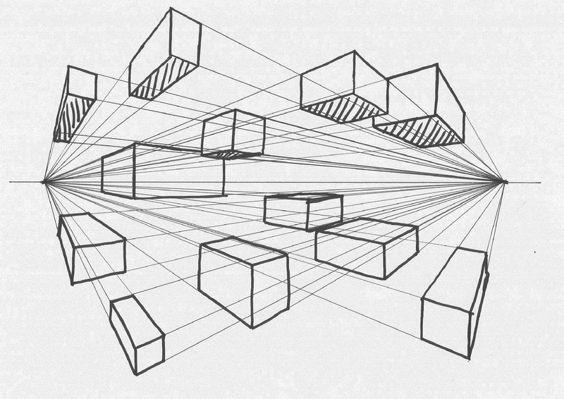
I totally get not knowing where to draw your lines. But if you know what kind of perspective you are going for, it will be easier. Put down your horizon line (that is where your eye level is) and then draw one line of the house (best works vertical line because, in 1 and 2 point perspective, those lines are not changing - they are straight ) Everything will relate to that. From that you can connect the line with vanishing point and soon you have the cube you can work from... and don't stress yourself much. Every line doesn't have to be perfectly placed. It just has to make sense.
To train yourself, perspective practice is a great way to do that (attached image). Or just drawing cubes in perspective as a warm-up. You do those couple of time and the process will start making more sense.

If there is anything unclear, please let me know! Good luck!
-
Hey there,
Jonas' advice sounds great, just thought i'd add this page which was really helpful for me - https://drawabox.com/lesson/1/6.
I do like your paintings and the wobbliness gives it a lot of character! but if you can combine that with solid fundamentals it will look even better

-
Thank you guys so much!
-
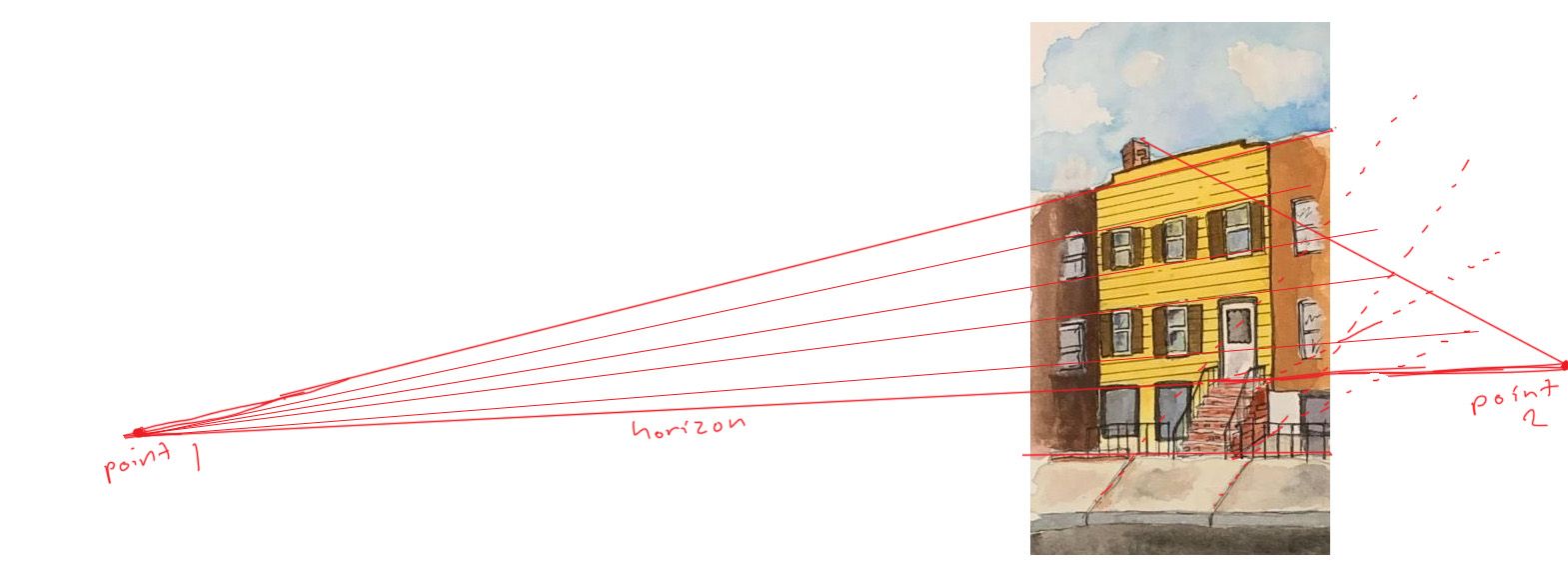
I like the style of your painting! Personally, when I draw buildings I like to start by freehand drawing the biggest outlines of the building, while paying careful attention to what angles the lines have. Then I like to figure out where the vanishing points should be based on those outlines, and I either draw vanishing points on the paper or just mentally keep track of where the vanishing points should be. One thing to remember is that in two point perspective views like this, the two vanishing points will always both be on the horizon line, and the horizon line is at the eye level of the camera. In your apartment building all the windows and siding lines are converging well toward the vanishing point on the left, but the issues are with the lines that should be converging toward the vanishing point on the right (like the stairs and sidewalk lines). If you think about where the vanishing point on the right side should be (which should be somewhere along the horizon line) then you can make the lines in the stairs and sidewalk converge toward that vanishing point.
-
Thank you for that! That actually helped a lot. All of your answers have helped me to understand it better. Im attaching the reference photo because I kinda wanted to show you how it looks. One of the biggest issues with doing this illustration is that the building no longer stands and this is the last photo of it that exists. As you can see, the photo is not very clear. Especially the stairs. Theres also a car in there too that I omitted when doing the illustration but if you look behind the car you can see where the top of those bottom windows are and I went off of that. Perhaps I should have printed the reference photo and drew my perspective lines over it to get a sense of where everything lies.
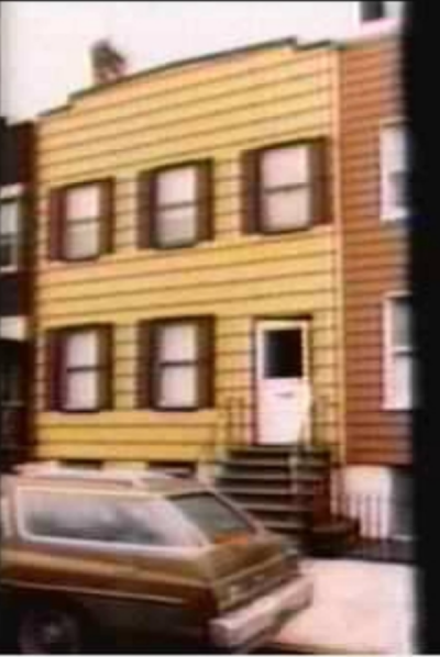
-
@12before34 When I'm drawing a perspective I usually freehand an under sketch, a really quick thumbnail just to visualize where I want things to be. From there I'll place the horizon line and a few guide lines to draw my final sketch over this. I don't put in vanishing points because they're almost always outside the drawing and that's a bit of a pain. However I can only get away with it because I drew so many backgrounds before where I did place the vanishing points and everything exactly where it should be and after a few years I was able to eyeball it accurately. I would suggest you don't skip this step! The construction lines and stuff can make the drawing pretty messy, but you can always use a tracing light table to do your inking on a new piece of paper

-
@NessIllustration so once you put the horizon line in, like okay lets say you're doing this building. do you do the basic shape of the building and then put the windows in and then put your horizon line and then vanishing point lines? or do you do the basic shape of the building (which in this case is the biggest shape is pretty much like right there in your face lol) and then put your horizon line, establish your vanishing points and then put the windows, door, etc in?
Edit: oh wait duh, you would need the windows in there first to even establish the vanishing point lines.
Edit 2: no wait you just need the basic outline. my gosh i am making this wayyy more complicated than it needs to be. I apologize for all the questions!
-
@12before34 Uhmmm okay, here's an example. Last year I made this illustration of a haunted library.
-
I started with a freehand quick sketch. I usually have an idea how I want it to look so I do this first, because it's very important to understand that you have to decide where you place your horizon and vanishing points depending on what angle YOU want. Not placing random points then being a slave to them to the end! That's why I use my freehand sketch to help me determine where to place my horizon and points to obtain the exact angle that I want.
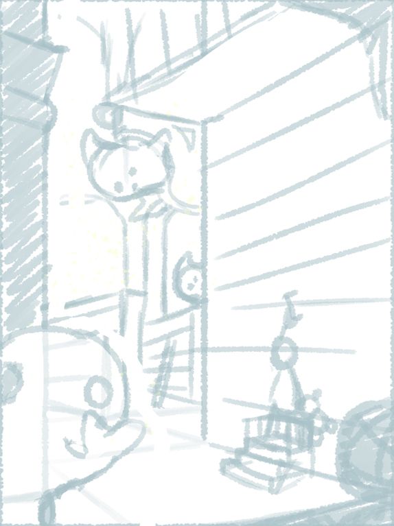
-
From there, I placed my horizon line and vanishing points. I place my VP in my mind, but you can physically place yours. If you draw traditionally it will often involve taping some additional pieces of paper to your drawing to draw vanishing points outside he frame. From there, I suggest you use your vanishing points to draw some guides on your picture (then you can remove your vanishing points because you won't need them anymore with the guides to help you). The guides look like this when I'm done:
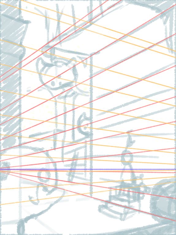
-
From there I draw my final sketch on top with the correct perspective. It's similar to my freehand because I'm good at eyeballing perspective, but sometimes there's a more drastic difference at this stage:
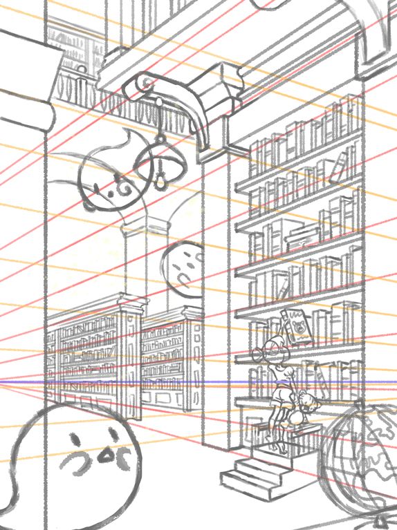
-
Final

There you go, that's my complete process.
-