Composition feedback needed for new project
-
For my new personal project, I’m creating a new calendar. It will be named “Les Saisons des Animaux”, and it will include whimsical animal illustrations. It will have a seasonal/weather changes theme. The second goal for these 12 new illustrations I’m creating, is to include in my new portfolio, that I want to send to publishers.
I have “finished” three illustrations. One if which is a little simpler, but I am including a couple of simpler illustrations to keep it balanced.
I would like to ask for some feedback on the illustrations, mainly about the composition. Of course if you see other aspects, feel free to give me tips on those as wel :D. I’m currently following Will Terry’s composition class.
About the medium: I normally tend to like to work more with water colors, graphite and/or ink, but for these illustrations I wanted to challenge myself to achieve some kind of analogue effect digitally, after having followed Lee’s “Painting Secrets” class.
PS; the images apparently have a “PHotoshop Express” watermark because I resized them on my phone to fit the forum’s size specifications

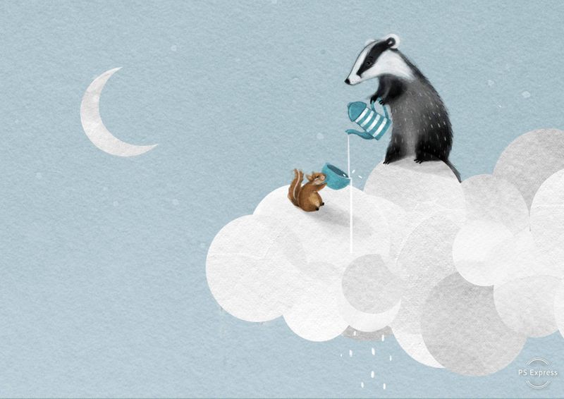
“Tea party in the clouds”

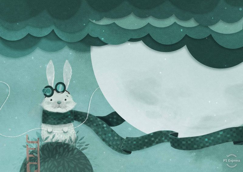
“Moon Keeper”

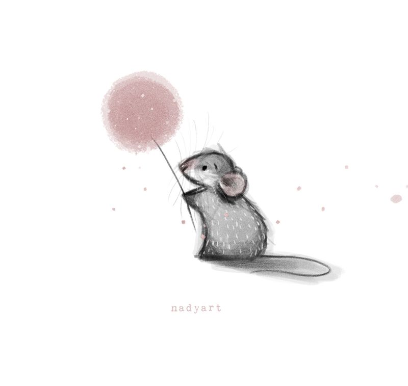
“Spreading Springtime”


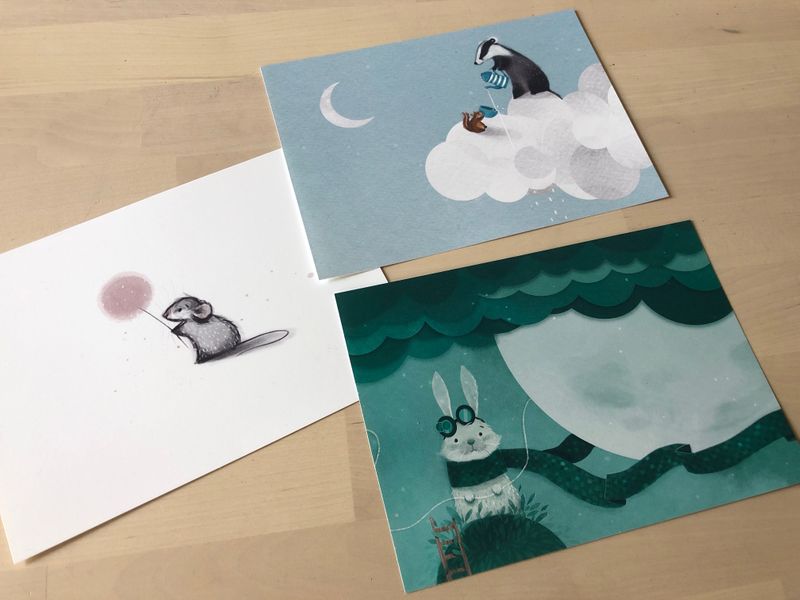
I printed them out to see if they look cohesive enough together;
-
@nadyart I can’t really advise on calendar cohesiveness, but I love your images, especially “tea party in the clouds”—my first reaction was “how do people think of such creative concepts?”
-
I think the compositions are very well done and overall the piece are lovely.
-
Composition wise it may help to continue to create ones with two or more interacting characters then you can play more with spacing between them and even some depth. I’d also suggest playing with your characters emotions and pushing a story like the tea cup one while still staying true to your style. Like your mouse looks sad but I don’t know why, other than the flower is blowing away. I’m not sure if my suggestions are what you were looking for,
 anyways.
 -
This is a totally amateur opinion, so take it for what it's worth: I feel like the rabbit and badger images are quite stylistically cohesive, but the mouse sticks out a little. In both the others, you've got kind of a paper cutout aesthetic going on in parts of the image, but don't use it with the mouse. There does seem to be a similar fur rendering approach in all three, and repetition of round shapes, though, so maybe it's ok as is.
All that aside, I really, really love all of these, and would buy that calendar in a heartbeat!
-
I think your first two images ("tea party in the clouds" and "Moon Keeper") are much stronger than "spreading Springtime-which feels more like a spot illustration. Also, the first two images have a really wonderful way that the creatures are interacting with the "weather" elements in the image that is really imaginative and charming. I would look for a way that that theme could be continued throughout. As far as composition goes, you are not creating a foreground and background...which is fine, as the action mainly lives in the middle space, but it could created more visual interest if you made more going on in background and foreground. (example: scarf moving forward at the viewer into the foreground in "moon keeper"). That being said, I love this style and I think your characters and color schemes are so appealing. Lovely work!
-
Thank you for taking the time to comment everyone!
@BichonBistro Thank you so much! I find it hard to think of new concepts, so it's good to know that you liked the Tea party in the clouds!
@demotlj Thanks!!@Heather-Boyd Your suggestions totally make sense! I'll try and incorporate them in my next pieces for the calendar. I think I often have a melancholic vibe in my art, which is probably why the mousey looks kind of sad. But it's good to be more diverse with the emotions and interaction between the characters. To make it less 2D :). Thanks!
@Jean-Gao I agree that the mouse sticks out. I think I will come up with a back/foreground for this piece still! And adding the paper cut style there will definitely help with the cohesiveness too. Thank you, that was very helpful!
@Laurasketches Spreadin Springtime indeed is more of a spot illustration. But maybe this will not work within a calendar, and based upon yours and the other comments, I will look into this piece again! I am currently following the Composition course by Will and hope to be able to incorporate more of a foreground and background in the upcoming pieces, thank you a lot!