logo design
-
@Erin-Cortese @animatosoor @CLCanadyArts thanks for all your input on this task. This is so tedious and it’s just at the sketch stage

So I didn’t have time to sketch the head holding scales of justice yet @CLCanadyArts but if you think it’s best to have another design concept, I am going to do that next Sunday (company this week).
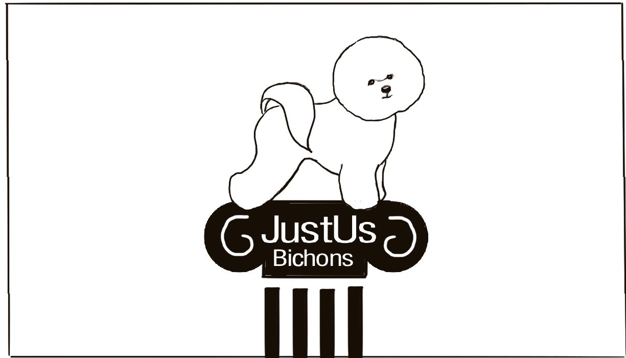
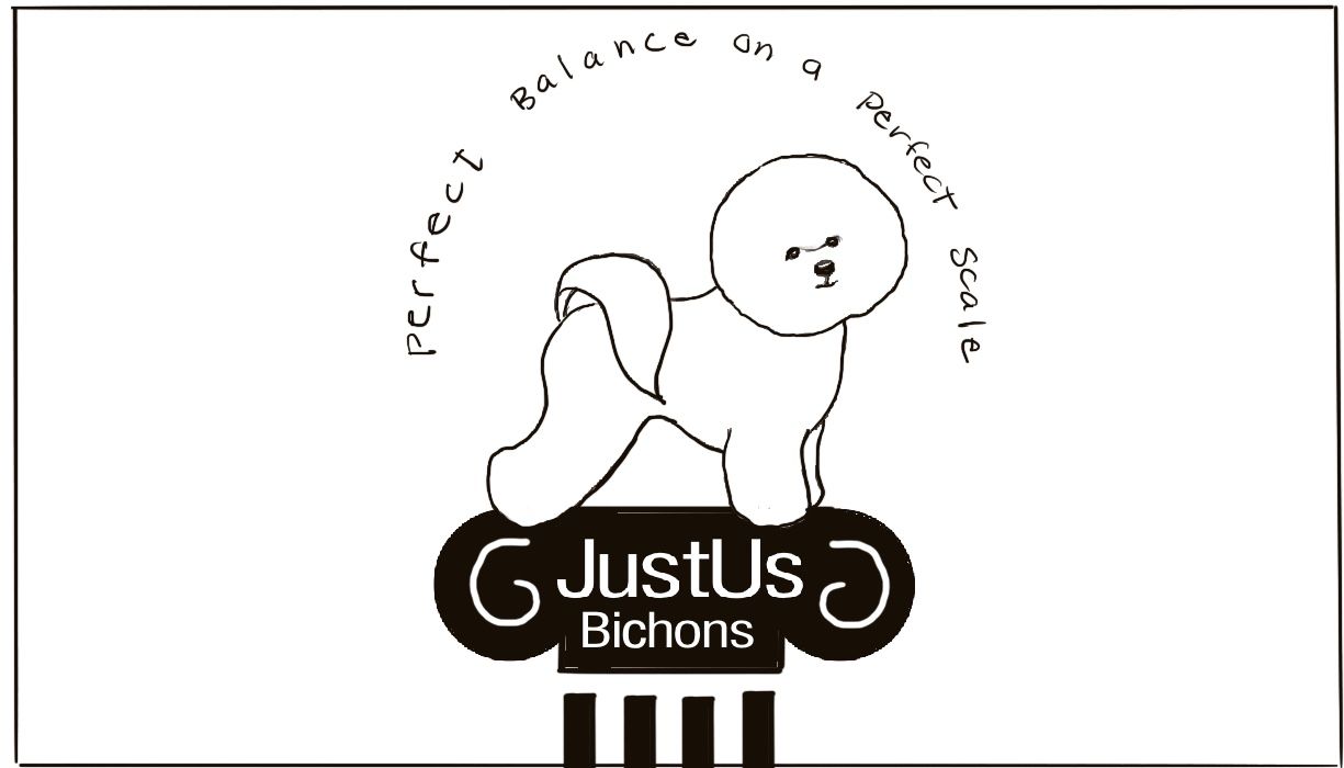
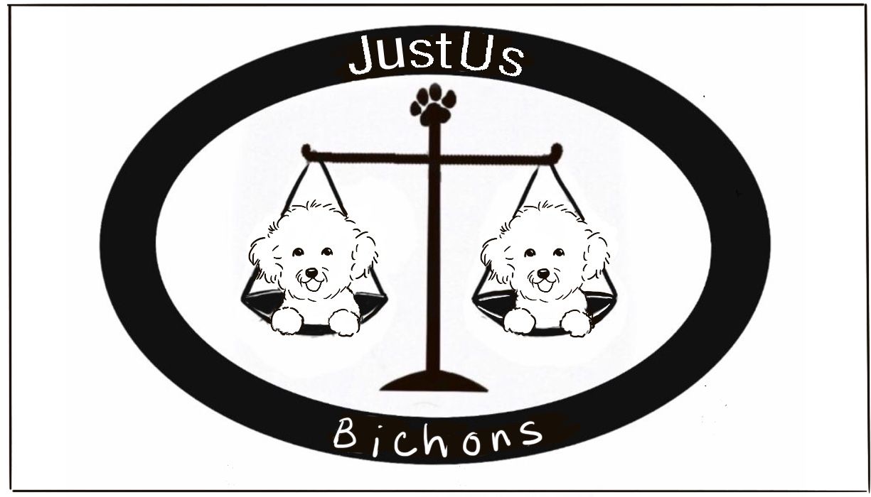
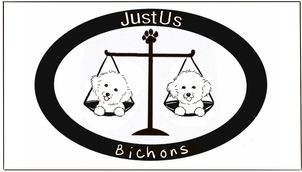
I wasn’t able to think of a way to use the scales in a manner similar to the Rocky Mountain Griffons logo @Erin-Cortese , so I put a standing Bichon on the pillar of justice with & without tag line.
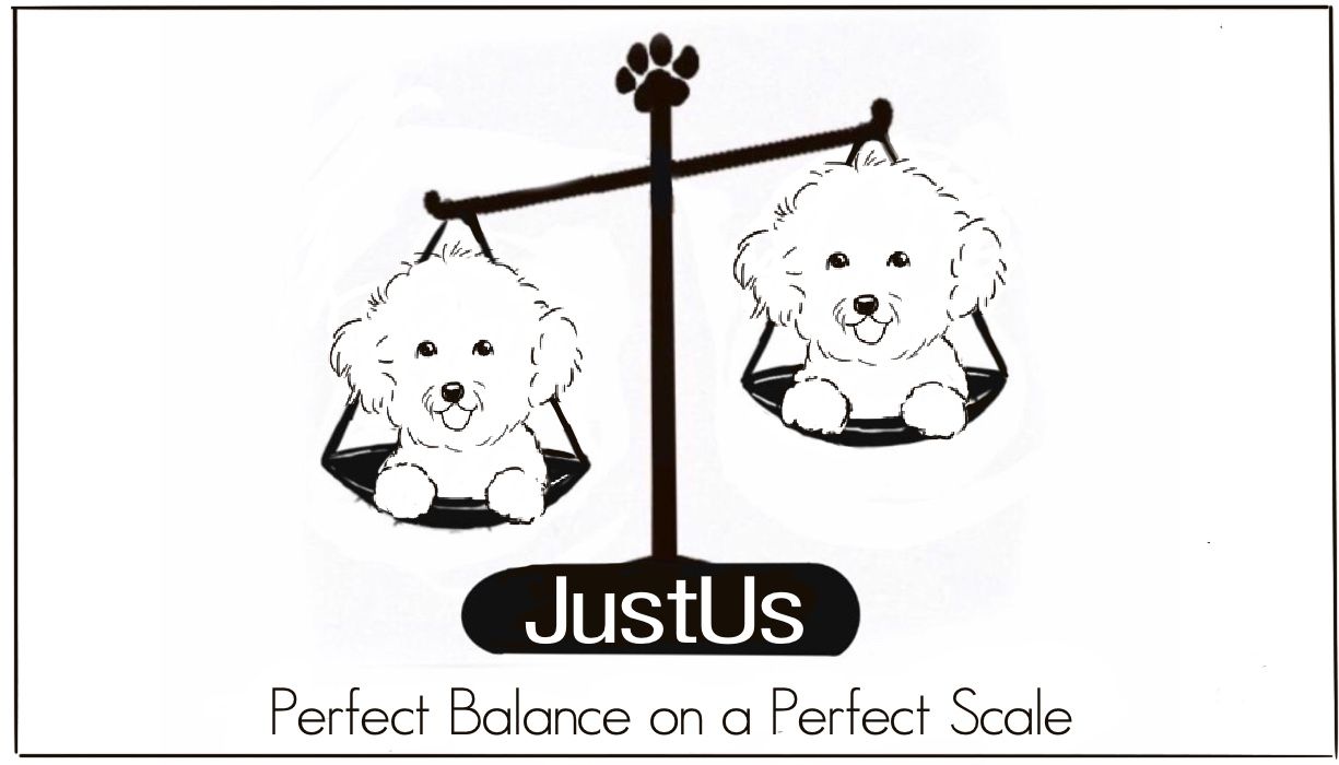
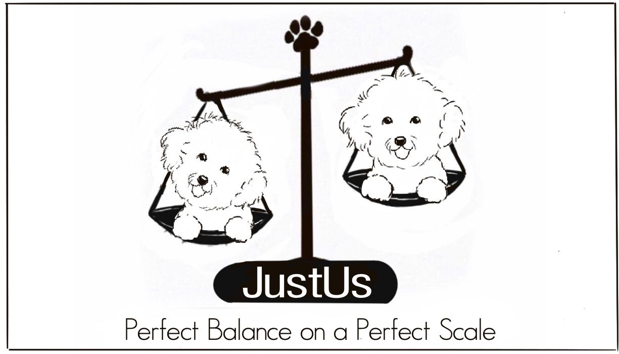
Since an exaggerated head tilt is a thing bichons do when they are communicating, I incorporated that as the contrast between the two bichons on the scale.
Questions:
- Which of these options is feasible to present to the breeder and how many options should generally be offered?
- I really don’t want to research fonts and go through the tedium of figuring out kerning and placement of type on a path until I know the direction she wants to go.
Is it reasonable to expect a person to decide on a concept when type hasn’t been fully fleshed out? (I know—she’s a hobby breeder, not Nike, but I don’t want to be too unprofessional about it)
Thanks again to you all. I am going to LOGOff for the night

-
When doing logo designs, giving many concepts for review is always good, including multiple font styles. Never know what will jump out at them (my font was bad, was just a rough idea to give a concept)
#1 is nice, really looks like a show dog up on the podium like that. Fancy classy dog, classy podium, not so classy fon't, not that script would be good. Maybe play with it. All the black is really heavy. Could try to break it up a bit artistically.
#2 a lot of dead space between the dog and text.
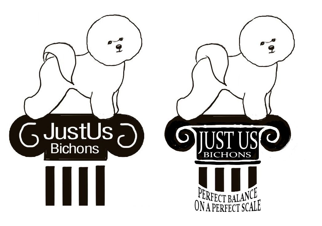
The tail base clashes with the rest of the look of the dog, you also don't really see the base of their tail like that. Could just erase erase a bi o jive it a fuller look.
Played with it to show you what I mean. Just thoughts. It's almost exactly the same height.
-
@CLCanadyArts Wow, look at those typos. You get the idea though. I'll proof-read more. Haha.
-
@BichonBistro It looks like your work is coming along nicely! I'm glad the others (@Erin-Cortese and @CLCanadyArts) have weighed in as well. I understand @Erin-Cortese provided the Bichon line drawings traced from your business card - and they are amazing! Would you still be giving the linework a shot on your own as well, to depict the two Bichons on the weighing scale? It would be great to see your personal take on it too, not only in terms of the cute Bichon head tilt, but to see how you would interpret the linework.
Again, it looks like it's progressing well, so good on you.

Also, off-topic: your sense of humour comes across in your posts, and it's quite sweet, hahah!
-
This post is deleted! -
@CLCanadyArts yes, I definitely got the idea and love it!
-
@BichonBistro Your Bichons are adorable and have really expressive faces, I think you did a great job!
It’s not as unusual as you might think for artists to find themselves in this situation, so don’t be too hard on yourself. I spent most of my early career in cold sweats wondering if I could actually pull off the work I committed to. I always did in the end, and I became better because of it. Now I have to go through it all over again with illustration lol.
Again if you have any technical questions about vectors, type, or otherwise, don’t hesitate to ask.
-
@BichonBistro said in HELP! I committed to a logo design and I am in a cold sweat:
@animatosoor I am so glad you got me from the ice-cold sweat stage to semi-thawed ability to move forward stage with your first reply!
I did give the line drawings of the two bichons my take (I tend to overdo and even with a heavier brush, they always come out too thin), but I basically traced my business card too—that’s my Bichon Zippy from the card I painted. I think the breeder will want me to work from photos of her dog/puppy.
Since we both traced my card, there’s not that much difference, although I think her linework reads much better. I just have too light a touch and don’t leave enough blank space for the eye to fill in.Aw, I was happy to chip in! I think your take on the Bichons looks great. I've never used Procreate before, so I am unable to help there. I'm just wondering, though, what software are you planning to do the finals in? Is it going to be Illustrator after all?
 If the pen tool on there is scary to you - I understand it is to many :face_savouring_delicious_food: - you could use the pencil tool on there and simply draw out your vector shapes. I was wondering if you had a particular platform in mind to execute the finals.
@BichonBistro said in HELP! I committed to a logo design and I am in a cold sweat:
I do have to laugh about what I got myself into here or I might cry!
Hahah! Oh I hear you, and I'm really glad we could all help in some way. I've felt like simultaneously laughing and crying through certain projects, so I hear you loud and clear. XD
-
@Erin-Cortese aw thanks Erin, I still think your trace results are better than mine! But thank you for the compliment
 ️
️I am sure I will have questions about vectors after I look into that (can’t do that til next Monday though).
With regard to type, my small business has been greeting cards for the bichon market and whenever I do a design, type selection has been more by determining if the font communicates the sentiment and goes with my image, so I have never applied any “science” to it—it’s more intuitive, like which line weight and character pairs best (and is not too expensive) with the image and message.
Logo design feels VERY different.
Questions:- I was thinking thinking a font for JustUs should be more along the lines of a formal font, not necessarily serif, but definitely not decorative in any way (e.g., some of the fonts I have used in my work lik chic hand, danielle, kidwriting, etc. would definitely not be appropriate).
- For line weight, what factors into the decision for the company name vs. tag line?
- For this particular logo, I am not sure how color could be incorporated if the client doesn’t like black and white. The dog is the focus, so that seems where there should be color, if any. With watercolor, white is not white, but digitally, especially from what I recall of vector art, I don’t really know how to incorporate color on a white dog (other than the dog’s

 ). I’m not crazy about the treatments I have seen because most end up not looking much like bichons.
So you’re transitioning from graphic design to illustration? Honestly, I think graphic design (and stylized illustration) are very difficult. I think you will be able to avoid the cold sweats!
Thanks for all your help—I will have more questions next week I am sure

-
Feel free to use my sketches, or re-sketch them.
I use photoshop CC for type. I have clip studio pro which is awesome for inking, and blendy coloring, but font work is pretty much impossible. I broke down and got a sub to PSCC mostly for the graphic design and warping capabilities. Photography plan gives you full photoshop for $9.99 a month, almost $12 with tax.
I used the font warping options, but it is still editable.
-
@BichonBistro For deliverables, give the client a VECTOR version so they can scale up or down should they decide to use the logo on shirts, cards, promotional signs, etc. You can use Affinity Designer, Illustrator, or Inkscape to do it, and your edges will look sharp as ever. Typically when I did logo work, I provided vector files (.svg or .eps) as the base, and then exported from there as .png, .jpg in various scales so the client could use them for web purposes right off the bat.
Check the logo at 2" square, 4" square and 12" square to be sure it reads as a balanced illustration. Right now the center elements are very heavy compared to the bichon fur. Consider ways to balance this visual imbalance.
Best of luck.
-
@Adriana-Bergstrom Thank you Adriana. I know what you mean about the bichon line weight being too fine compared to other elements.
Is Affinity Designer an app that would allow me to trace over a design I create in Procreate? I assume that the ability to import fonts and create vector text is a feature? Right now, I must export a drawing from Procreate to PS to add/manipulate text on a path.
-
@BichonBistro Intuition is exactly what you need for choosing fonts! Don’t worry so much about the science of it, it’s really about understanding how designs and styles make people feel. The Colibri logo I shared above has two different fonts, both chosen based on how I thought it would make the targeted audience feel. The main one is meant to create a sense of calm and welcoming feel, the secondary text is meant for trust, clarity, and readability. As an artist looking at the text, I am not a fan - as a vulnerable women looking for safety and support, it communicates something much different. It was also very similar to what a lot of government agencies were using at the time, so there is a slight reference to structure and authority. That’s about as scientific as I get! I think I felt it out, more than I thought it out, and that was always the approach I applied. For logos in general I also referenced what everyone else in the market was doing. You do not necessarily want to do the same thing, but you don’t want to stray so far that it’s not relatable.
Maybe your issue with your line work is the thickness as others suggested? For colour in the Bichons, I think all you need is some grey for shadow/depth, but if they want colour, possibly a pink tongue?
-
@CLCanadyArts Thanks Cassandra! I resketched the pillar, but basically used your modifications. Fortunately I still have a version of PS (CS5) so I don't have to resort to a subscription. I just don't use it enough to justify the expense.
-
@animatosoor I'm back! I have been looking at AI, Affinity Designer and Vectornator tutorials. My version of AI doesn't have image trace function, so I would be tracing with the dreaded pen tool
 I downloaded Vectornator since it's free. Drawing over my Procreate sketch is definitely do-able in Vectornator, but it looks like Affinity Designer is more robust and will allow me to automate thickness of lines. So I'm going to purchase that and hopefully the learning curve won't be too steep.
Thanks again for your help!
-
@Erin-Cortese I am back to work and will probably have some vector questions after trying out Affinity Designer that I just downloaded. After watching some tutorials, it looks like it is possible to adjust line thickness post-drawing in Affinity.
That would be a big help for me. Drawing using pressure is particularly difficult now. Good news/bad news: two of the 4 drugs in my chemo cocktail put my cancer in remission, but killed my fine-motor control
  . Quick gesture drawing and watercolor still work, but anything requiring slow controlled marks or pressure involves infinite do-overs. I never thought I would switch from paper/pencil to digital for drawing, but savings on tracing paper probably funded my iPad Pro, Pencil & Procreate
  (the un-do feature is priceless!)
Thanks again for all your help!
-
@BichonBistro No problem at all, ask away! I'm really sorry to hear about your cancer struggles and loss of fine motor skills. I'm guessing you really do not need all this stress on top of everything else. If you feel comfortable with it, I would be happy to convert your logo to vector for you. Even if I had to trace it out in vector, I can't imagine it taking me more than 10 minutes and I would be happy to help. Otherwise, I am happy to answer any questions you may have. The only thing I may not be much help with is Affinity Designer because I have no experience with it.
-
This post is deleted! -
This post is deleted! -
This post is deleted!