Finishing Drills for a Chronic Dabbler.
-
@CLCanadyArts Hehe thank you, Cassandra! I'm also getting more of a night-time feeling from that one than I was from the original!

-
@animatosoor I think it's easier on the eyes as well, could be just me, but the original was harsh enough blue that I didn't want to look, insta headache, in print would probably be a lot different without the blinding backlight on my computer.
It would be lovely to see a little collection of pieces like this in a book.
-
I like the original strong bright color, but 3 goes also for me. I think the most ppl the original color is to strong, I found it very refreshing in the point, nobody else is doing it and I was drawn to it.
-
I like 1 and 3. 3 is a bit softer but 1 original blue brighter for me portrays a more active sandman -because it is about him and his daily duties.

-
@animatosoor I think the color changes you're exploring think it's helped make your piece more dreamy. I like them both, with a #3 winning by a bit.
-
@Heather-Boyd interesting point--about keeping the active sandman brighter or more saturated than the sleeping man.
-
@CLCanadyArts Yikes, I didn't realise it might have been headache-inducing!
 Thank you for your input; I will be keeping it in mind as I choose colours in the future. Definitely learning with every new piece on this thread.
And yes, I am in the process of sketching new ideas for more poems I'd like illustrated, and eventually I'd want to compile them! It's nice to hear I won't be the only one interested in that outcome. :face_savouring_delicious_food:
-
@MichaelaH I appreciate that - thanks! I'll be going for #3.

@Heather-Boyd Thank you - that is an interesting take, and something for me to consider for my next piece.
-
@Susan-Marks Your initial comment helped immensely with that. Thanks once again.

-
It's Monday here!
Final:
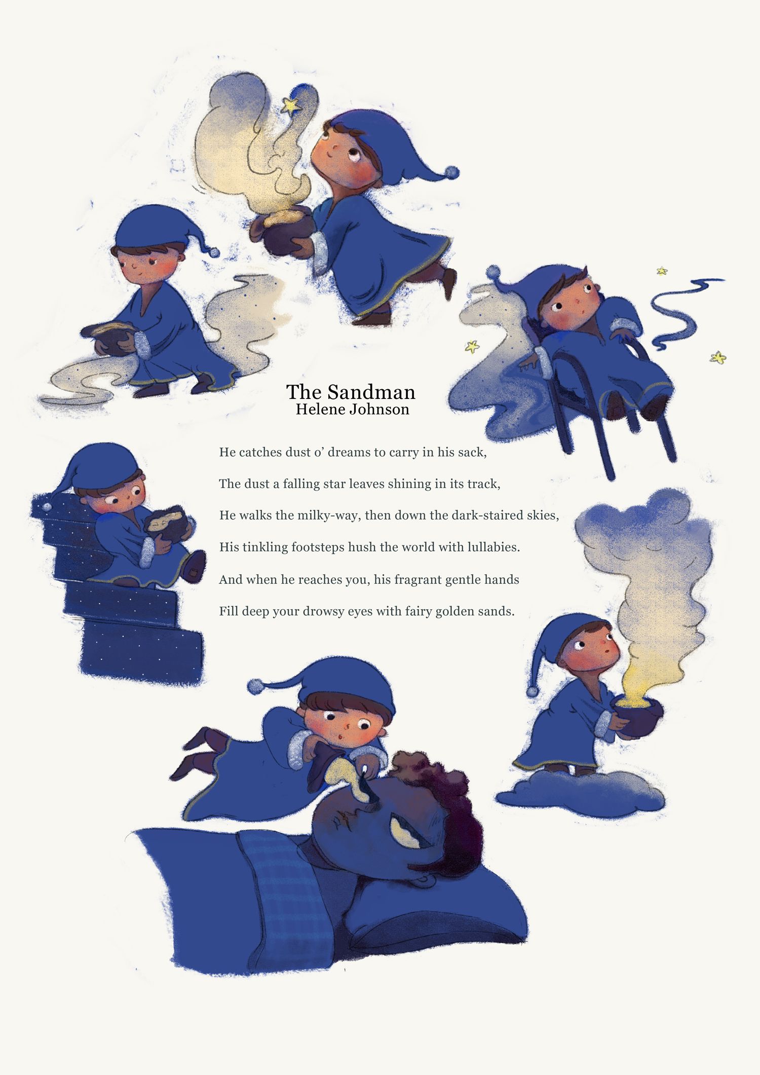
Thank you everyone for all of your invaluable input. Moving on to the next project.

-
Week 3!
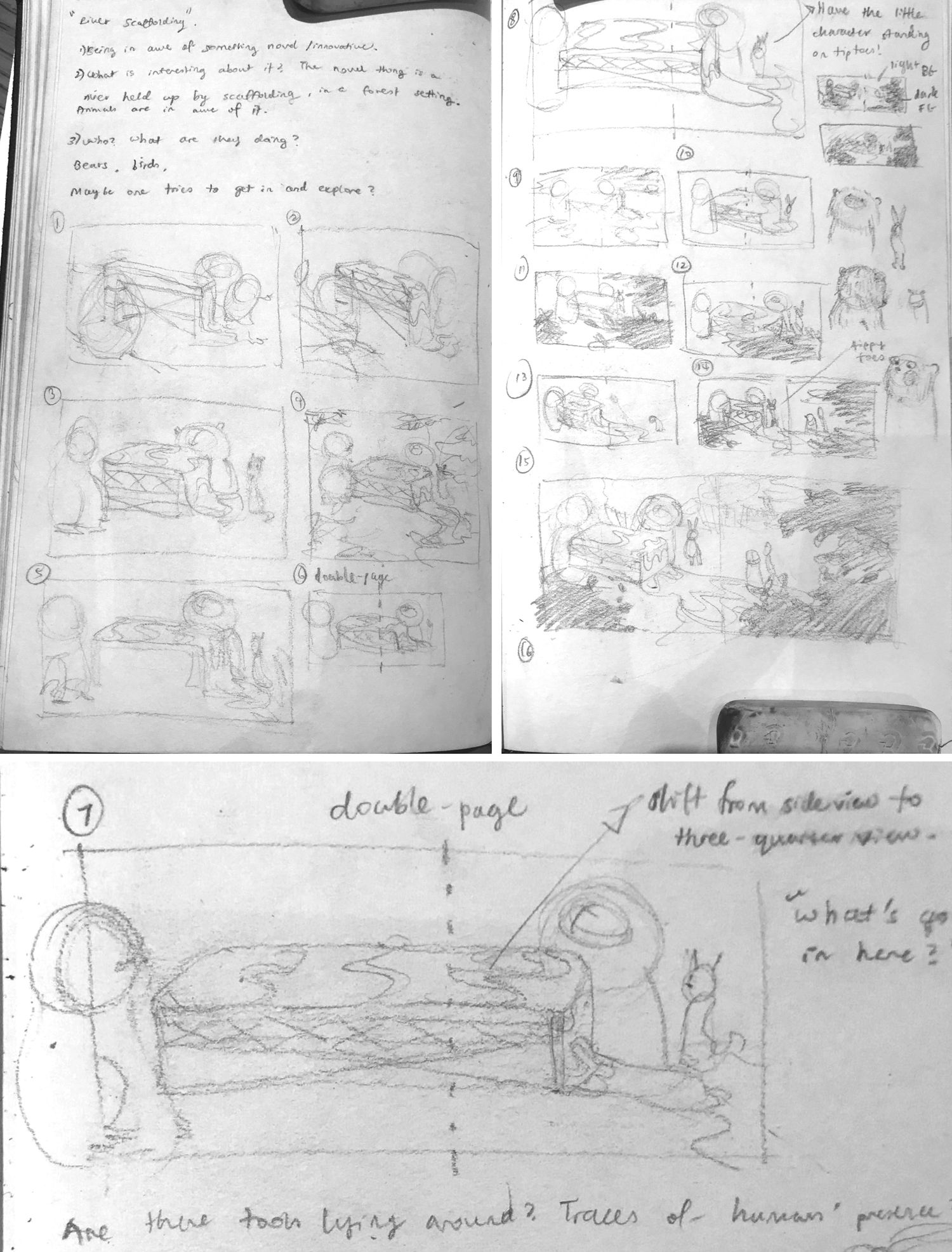
Thumbnails and a set of slightly more comprehensible idea sketches for a new illustration I'm working on. This would be my first attempt at a double-page spread for my portfolio, and also my first serious attempt at including animal characters in any composition. :S I'm quite nervous, lol.
-
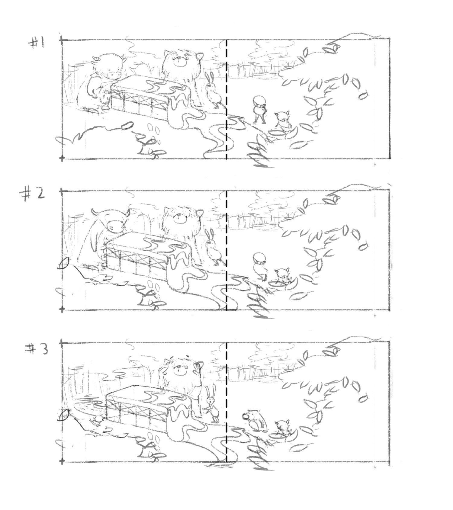
@animatosoor I like the third option. The expressions of the characters are clear and the character themselves look just funny

Maybe you can try the foreground bush on the first page to overlap the box ? (i am not exactly sure what it is) . The perspective feels kinda flat to me - so this might help it.
But I like that you added the mark behind it instead of the cow. That on the other hand is deepening the perspective well
Anyways it looks fun! Good luck

-
@Jonas-Zavacky Hi, and thank you so much for your feedback!
I realise what’s on the foreground on the first page looks like a bush, but it’s meant to be the leaves of a tree and we have a bit of a bird’s eye view with this one, so you’re right, it should overlap the box a little bit.
As for the box itself: your comment made me smile, lol, because I think the concept hardly makes sense to begin with and it’s perfectly understandable that you don’t know what it is. Let me have another go at the box and see if I can make that bit make a bit more sense. XD I might also eventually add a page before this to give this weird structure some context, haha.
Thanks again.

-
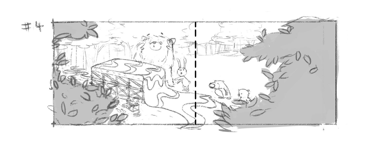
I've worked on it a bit more, and now I have this. I have experimented with adding a couple more details in an attempt to provide some context, but I'm thinking this still may not be making sense to viewers. I would like to hear how you guys interpret this!
-
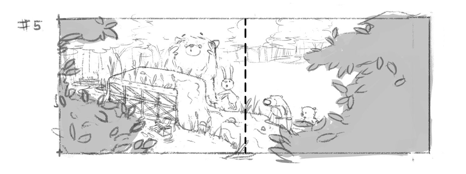
Fifth iteration - with several changes, in an attempt to make the idea clearer:
-
@animatosoor I like more characters in number one but I agree with @Jonas-Zavacky about the expressions. If you could add more expression to #1 that would be good. I also like the spacing in #1 vs #2 but haha now I see you have committed to the last one
 anyways -still really cute.
 -
@animatosoor I like how this is coming along. In earlier versions I wondered if the box was something that was melting-which I was curious about. Now it looks like the ground has grown over it? how, why?
Are you leaving for text? If not-the right hand side looks vacant compared to the left.
It's fun to see how you're developing this.
-
@Heather-Boyd Yeah, I removed the cow after versions #1 and #2 after a while, as I began to worry if there was just too much going on. If I could still find a way to add it in and make it work, I'll do so.
Thanks, Heather.

-
@Susan-Marks Thank you! I can see now why the box previously would have looked like it was melting, but yes, your latest guess about the ground comes close. It's a river that's nonsensically being held up, but apparently the way I've drawn the water, it still doesn't read that way yet, haha.
Yes, I'm leaving room for text, and I plan for it to be on the second page.
-
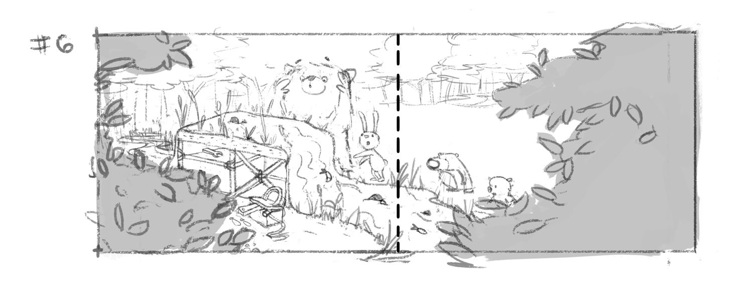
Sixth version:
