New User! Illustration Critique
-
Hey all! I just made an account here at the SVS forums, and I'm excited to get involved here! I've been a listener to the podcast since it came out and a huge fan of the artists that created this website. Just for some background on me, I am currently in my gap year between high school and college but I plan on attending Nossi school of art in the fall for their illustration course.
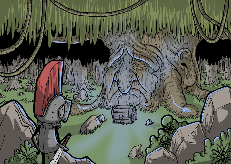
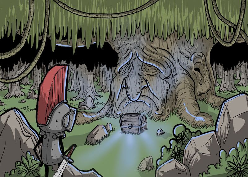
Now onto the critique. In the past week, I finally got an XP-pen drawing tablet. This is an illustration I made to practice using this tablet. Also, I am still kinda new to photoshop so any advice on how to better use it is much appreciated! What I really want a critique on is the composition of the piece and how I did with the storytelling aspect of it, but really any advice you all have on anything you see let me know! I am all ears. Also, this was my first time making the glowing effects that are coming off the chest and I am not 100% sold on the way I did it. If anyone has any better way Pleaaase share it.
Thanks, guys! -Isaac

-
@Hunter-Thaxton Welcome to the forum. I think you have a nice composition here. I see what you mean about the glow, unfortunately it is falling a little flat and affecting your story. There is some awkward space around the chest and it is not really standing out enough as a focal point. You did some great saturated highlights on the tree, rocks and surrounding items, but the light from the chest is very light and barley noticeable. The source of the light should be the brightest and most saturated, so if it is coming from the chest try making that area much brighter. That may resolve the awkward space and the storytelling issue.
Here is a quick draw over to how you what I mean...
(It exported a little light, should be more saturated)

-
Welcome, Hunter! This is a great community to get involved in.
I think the composition is working here. And I like your limited color palette. I usually have a hard time disciplining myself with that. The story seems pretty clear that your character has come upon this chest of wonders. Just echoing what Erin said, but having the chest glowing more would sell the lighting more effectively.
Perhaps revisiting the trees in the background? I get the feeling like it's a dense forest, but the trees way in the back seem too clear, detailed, and visible to be in a dark, densely shaded forest.
Hope to see more of your stuff on the forum. Best of luck on your illustration journey!
-
Hey Hunter! Glad to have you around! I'm new to this forum as well, and I think that we have at least a few things in common.
I'm also on a "gap year", and I got my first on-screen graphics tablet a month ago.
Critique wise:
I'm still a beginner but I must say that your piece reads nicely to me!
You are certainly very skilled!Only thing I would work on would be the glow on the chest. Why don't you make it open instead of shut? Then it would make much more sense. Dark wood doesn't glow that well! (I'll send to you a paintover if I can!)
Can't wait to see more of your work. We should definitely work together in the future.
Great love and respect!
-
Hi Isaac! Love the drawing! The storytelling is great and I’m immediately curious as to who the figure is to the left, what’s inside the chest, what significance the tree has in tmrw story, etc.
One thing I’d suggest is creating the highest amount of contrast in your focal point, which in this case is the chest. It also seems like the values in your drawing are all kind of at the same level (if you turned your drawing into black and white, all the colors would pretty much be the same shade of grey). I would suggest at least darkening everything away from the chest (the borders of the drawing) and create more contrast where the chest is.
I think the class about composition goes over this really well if you want to know more about what I’m talking about. Thank you so much for sharing!
-
@Erin-Cortese Wow, thank you so much! The glow that you added really helps the piece! Thank you so much for taking the time to reply and do the draw over. I honestly did not expect such a good response from everyone, I'm so excited to be a part of this community! As soon as I wrap some things up with a commission I will be revisiting this piece to use you guys great advice! Thanks so much again!
-
@Ashton-H Thank you! That's awesome! We do have a lot in common, and I would love to collab at some point. Do you have an art Instagram or website I could follow your work on? I was thinking about making it open but I really wanted to leave a little up to the imagination for story purposes (and partly because I don't know what is actually in the chest). Thank you so much for taking the time to reply!
-
@shinjifujioka Thank you! I was trying to practice with color by using more muted colors throughout. As far as the trees in the background, your advice makes a lot of sense and I think it would help push them back, thank you! When I was drawing them I was playing with atmospheric perspective, but I didn't think about the fact that as it's a dense forest the trees would be darker rather than a middle grey. Still learning! thank you so much for your advice, I will be posting the revised version soon!
-
@ashinmakes Thank you muchly! I was trying to leave a lot up to the imagination as I dont have the story fleshed out yet. The character is a knight character I made up years ago and have just kept drawing him since. I will be posting more of him! Thank you for the advice! I was so focused on playing with the colors, as I dont draw with color very much, that I completely forgot about using value properly. Thank you! The changes you suggest along with better lighting coming from the chest should make this piece more like what I pictured. Thank you so much for taking the time to reply, I really appreciate it!
-
@Hunter-Thaxton Such a pleasure Isaac! Hit me up on private messages and I'll explain to you my current situation! Cheers!