Group run through creative environment design week 1 art and feedback
-
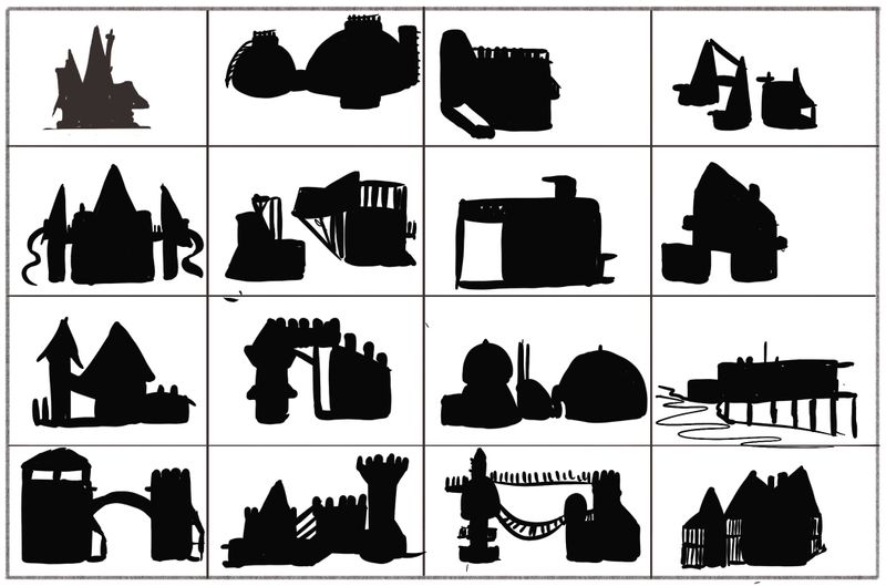
@Braden-Hallett good stuff, I’m gonna do some tonight. I like how you did a castle rather than a house
-
@Aleksey Thanks! yeah, it's a kind of magi-punk setting, so flying castles and air machines n stuff.
-
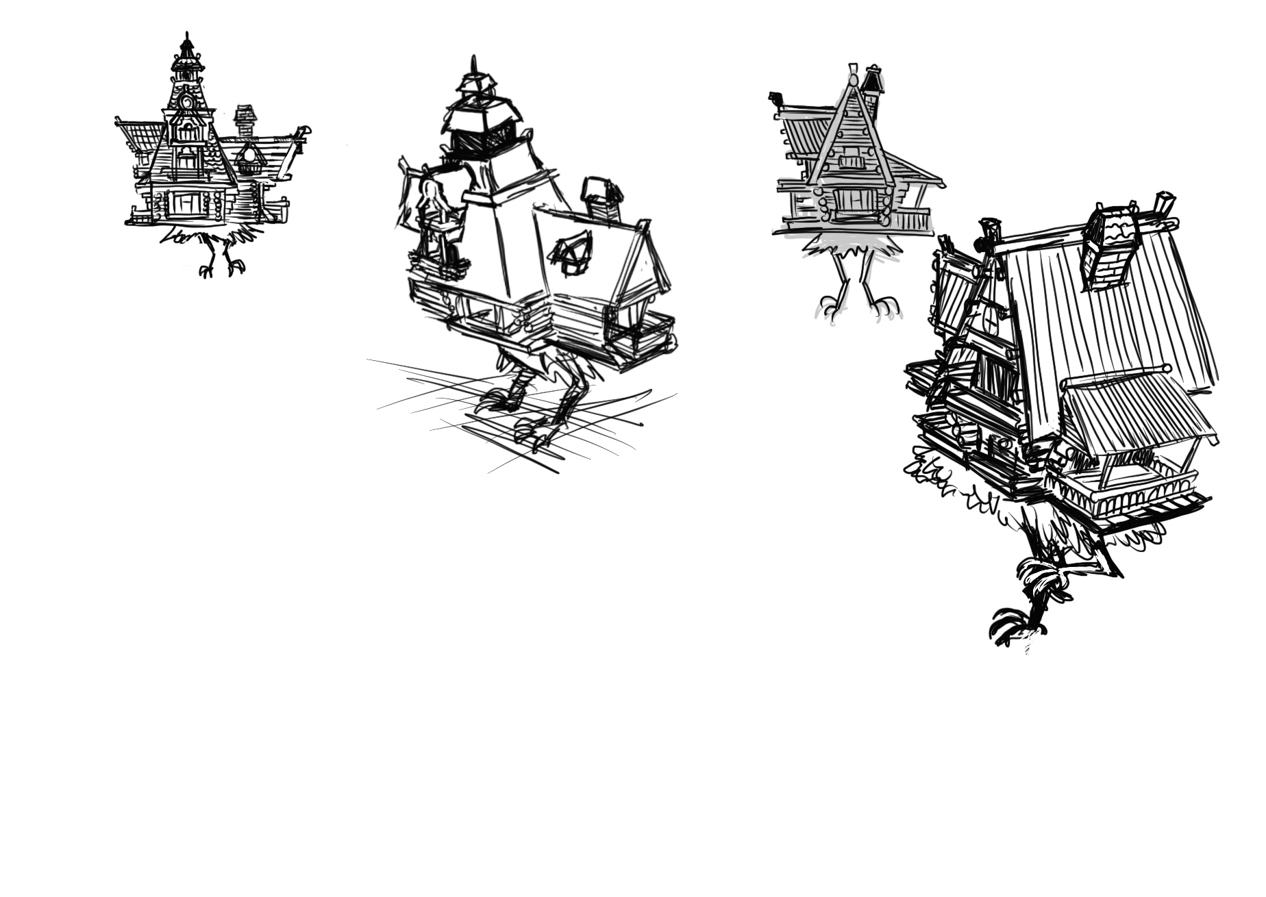
I’m gonna use this to come up with ideas for my own webcomic as well. The houses silhouette practice really helped me come up with some good ideas. I like the one on the right more cause it feels more Siberian log cabin and less Victorian, also easier to draw over and over again. I might move the chimney to the back since those old log houses were typically built around the chimney.

-
@Aleksey I am so curious why your houses have chicken feet.

-
@burvantill the “izbushka” is where Baba Yaga lives. Old slavic fairy tale.
-
@Aleksey I always loved the idea of Baba Yaga's hut. It's definitely on my list of 'if seen in forest run away' things.
Did you do a bunch of silhouettes to arrive at this particular design? If so, did you find that it helped?
Nice work, by the way
 Lots of details, but I think it still has a strong silhouette!
 -
@Aleksey @Braden-Hallett I always loved that fairytale, it was one of those that really stuck with me when I was young (probably because it scared me). Great job on the hut!
I am just about to start the course. I have to say the intimidation level is pretty high for me after seeing the level of work you guys are doing. They are both pretty stellar, especially for thumbnails!
-
@ErinCortese @Braden-Hallett
Yeah it was a bit daunting at first but what this is really good at is eliminating the biggest issue, thinking about the lines and details, you just focus on the shape and overall appearance which is surprisingly easier.
After i did a few regular thumbnails of houses, for the “free choice” part I started looking at old log houses on pintrest to make the silhouettes fit what im trying to accomplish. I would not have been able to do the latter if I didnt make the houses in the first section.
-
@Aleksey Thank You for Your Input Aleksey, I am still at Exercise 1, but was thinking about if I am doing it right or what after...
-
@Aleksey @Aleksey I recognize that name! (John Wick
 ) Unfortunately I haven’t read the story. I’ll have to remedy that.
@ErinCortese is right, your thumbnails are superb. Ditto to @Braden-Hallett
-
@MichaelaH do you have a question on the exercise?
-
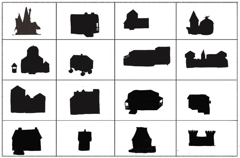
@Aleksey Yes I would like to see Your raw thumbnails, are You in discord? We were talking about the thumbnails now, I think I have to start, I always thought I should draw a building in all black, but Braden did some free loose sketching with a lot of geometric forms. Mine are very very simple, I hate this exercise, but I had to do it again, loosen myself more.
here mine simple buildings

-
@MichaelaH yeah ill send it once i get my ipad. The filter i tried to use was can i tell how big this building is or can it be resized to any dimension? If i cant tell how big it is, what elements can i add? Awnings Or balconies, maybe a patio, a chimney, weathervane etc.
-
@Aleksey said in Group run through creative environment design week 1 art and feedback:
can i tell how big this building is
That's a good question. I like that question. I'm gonna use that question

-
yeah how big it is relative to an average human size without drawing the human next to it
-
People on the discord were asking for my week 1 thumbs, so figured I'd post them here, too


-
Exercise 1, attempt nr. 2, now I was more loose and tried to no to think of real architecture while drawing. I also made my brush size bigger.

-
@MichaelaH cool good shapes, I recommend next trying to incorporate those architectural elements. Like a new batch
-
Can I still join without the discord and still get feedback?
I only have about an hour (two max) a day to work on this, so my progress is really slow. -
@murielle You can join us here and we will get YOu feedback, no problem, tak it slow, I have also only about 1 hour for this class a day.