Contest piece for SCBWI MM conference
-
Hello all, I haven't been on for some time - but I always come back. I hope everyone is well.
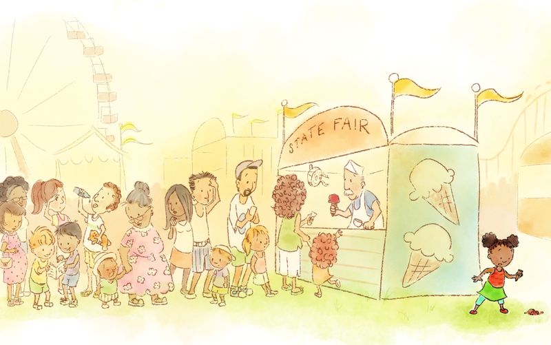
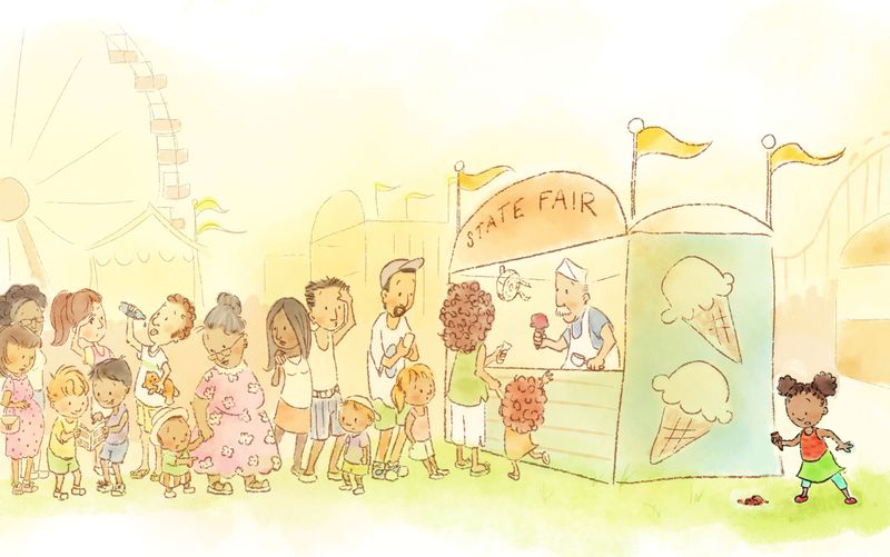
I will be attending the SCBWI regional Marvelous Midwest conference in May, and have chosen to do a piece for the illustrator contest. Of the two prompts, I chose "unfair at the fair", and this is my take on it. Before I send it off to be printed, I'd like to run it past your eyes and see if anyone notices any glaring errors. Of course, any crits or comments welcome. I hope to have more time to spend on the forum in the summer. Wishing you well in your creative endeavors.
-
Hey @RHirsch love the scene!
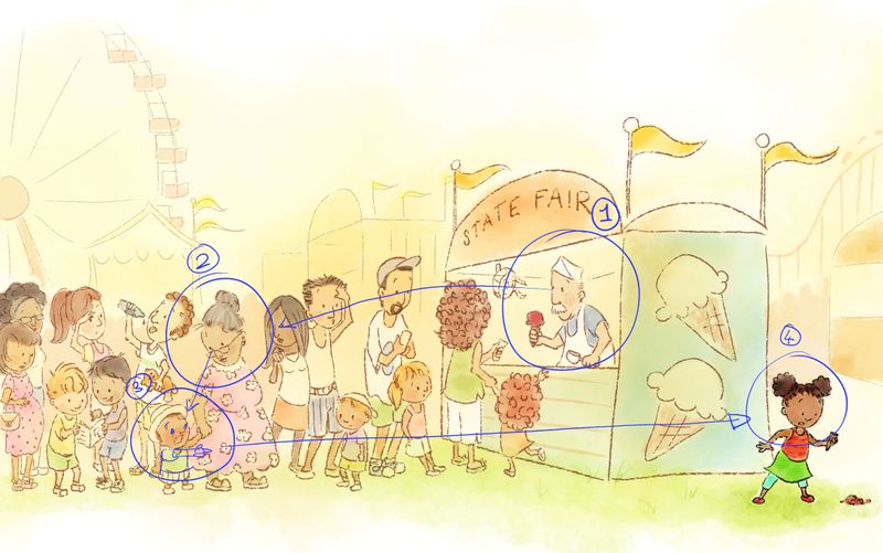
I really like how all the people are interacting with each other. It's super good.The only thing that stands out to me is that the ice cream seller seems to be the focal point and my eye tends to follow the line of people from him to the grandma in pink, from right to left. I think it's because of they way he's facing and the directional 'line' of the people.
The girl with the dropped ice cream doesn't really seem to fit and I know shes meant to be the focal point with the saturated colours but it's still the ice cream man for me. Probably as he's framed by the opening of the stall and the ice cream he's selling is red.
I think perhaps if you changed the position of the girl to the left in the foreground of the grandma and re-cropped the canvas it would read better?
Anyway just my thoughts, but I really love your style!
-
@Sliproot You're right, he does take some of the focus away. I'll play with it. Thanks for the crit!
-
@RHirsch I think if you just changed the little boy to direct the eye to the right it would let the piece read clearer. Anyway good luck on the competition!
-
Hello! The style of this is so nice, and all of the characters are really wonderfully done, in my opinion. I think you have a real strength in that area... gesture and facial expression. Also, the overall style is quite clean and easy to look at.
Here are a few more thoughts, to add to what others have said, in case you could find them helpful.

The other two comments so far address focal point and where the piece leads the eye, and I'd agree that by considering these topics the illustration could be improved.
It looks like you have a goal of making the girl with the dropped ice cream cone the focal point because the values are darker and the colors more saturated, so eventually my eye rests on her when I look at the piece. I would suggest finding a different way of making her the focal point to make the piece more easily readable.
Right now, her darker values suggest to me that she should be in the foreground, but since she's the same size as the other children, my mind just concludes that her colors are off compared to what the rest of the piece is communicating to me. The brighter green of the ground underneath her has a similar effect. One idea would be to bring her closer to the viewer to actually make her a foreground element.
As for composition, currently my eye sweeps from left to right down the line of people to the man serving ice cream, pausing there because he's turned in the other direction. Then I notice the girl and look to her, seeing that she's dropped the ice cream - oh no! She's facing toward the edge of the page, so my eye continues in that direction. The ice cream on the ground is almost like a period of the sentence. From there, my eye doesn't know how to re-enter the image to continue looking at it. You may want to explore what you want the viewer to see in the image and map out which elements lead the eye from spot to spot. For instance, if you want us to see the girl first, how could that be done compositionally? What do you want us to look at next, and what will lead our eye to that place?
Thanks so much for sharing this and for giving others a chance to learn by critiquing your art. Best of luck!!
-
@KathrynAdebayo Hi, thanks for the thoughtful comments. I do want the eye to travel down the hot, tired group of people first and lead you to the little girl, because she is the period at the end of the sentence. She has waited in that long line, finally got her ice cream, then dropped it as soon as she walked away. Something similar happened to my sister once, so it seemed the perfect thing for this contest.
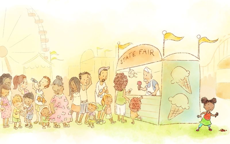
I do agree, the girl seems a bit too saturated, I think I'll step that back (five minutes work thanks to layers, whew), but I don't want to step her too far back as I do want her to be the eventual conclusion to this little story. Thanks to the advice here, I do see that the ice cream man directs attention back to the line, so I'm going to make the little kid point to her as suggested by Sliproot. I'll post the updated version soon. -
Updated with revisions. Thanks for the help!
-
@RHirsch Looks great! It's really easy to navigate and see the story now!

-
@Sliproot Thank you for helping me see that! Sometimes, you can stare at a piece too long...
-
@RHirsch Hi!
It looks really great, I would just make the girl facing the crowd, not the edge of the paper, it seams to be an eye trap (well, at least for me?). It should still tell the story of her, waiting for loooong time in the line, etc.
-
I really like the style. It reminds me of Quentin Blake. As far as the focal point issue others have raised, you could just move the little girl closer to the rest of the line (and I agree with the suggestion to turn her around.) If she just got her ice cream, she wouldn't be that far away from the front of the line but by tucking her behind the stand, it looks a little like she's hiding out and it makes me wonder why she went back there. The piece is overall really delightful, though.
-
@RHirsch i love this, I'm working toward my local conference as well so solidarity there lol. I'm jealous you got multiple prompts! Mine was just "an act of kindness along the way".
You've got such great feedback already, i guess all i would like to see different is a bit more fair flair, like that bear bigger like a prize not a bear from the store etc. The fair back in Oklahoma was something I loved so much, it was hot and hectic and loud and over the top. The food and prizes and sounds and smells were all over the top and I would like to see a bit more of that spirit here.
That's personal preference though! I love your style! -
@Heather-Bouteneff You make some excellent points. The bear does look more like a teddy bear right now, I'll make him look more like a prize. Thanks!
-
@demotlj You know, I did have her in front of the stand initially then moved her, but that was before she was painted and I didn't think she'd stand out as much. I also don't want her to be too close, because then she could just turn around and ask the man for another. Hmm, I'll play with it. Thanks!
-
@mag One of the beauties of working digitally is I can play with this and see what happens. I'll give it a go, thanks!
-
I'd have to agree with @demotlj . Perhaps raising the whole scene and placing her off the center of the line. showing she is leaving in a different direction and too far to receive another ice cream. It's just the composition that needs adjusting.
The warm colors and almost watercolor painting is working very well. Especially juxtaposed with the simple character designs.
Keep up the good work!
-
@RHirsch Quick cut and paste idea - i was thinking that if you flipped the line and made room for the little girl to be in the bottom right third of the painting it would allow the viewer to circle around the composition by way of the crowd - this would also put her in the midst of the crowd so you could have more reactions if you wanted to - just an idea though

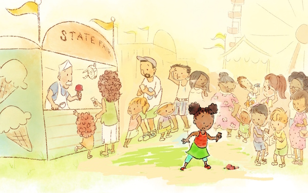
-
@Kevin-Longueil Ooh, that's interesting. I'll try it.
-
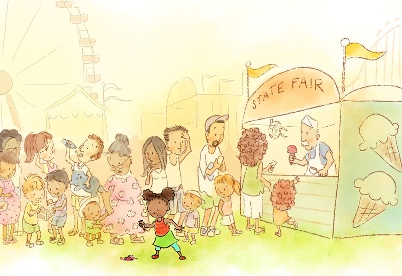
I made some changes. I'll have to let it sit overnight and look at it with fresh eyes tomorrow.
-
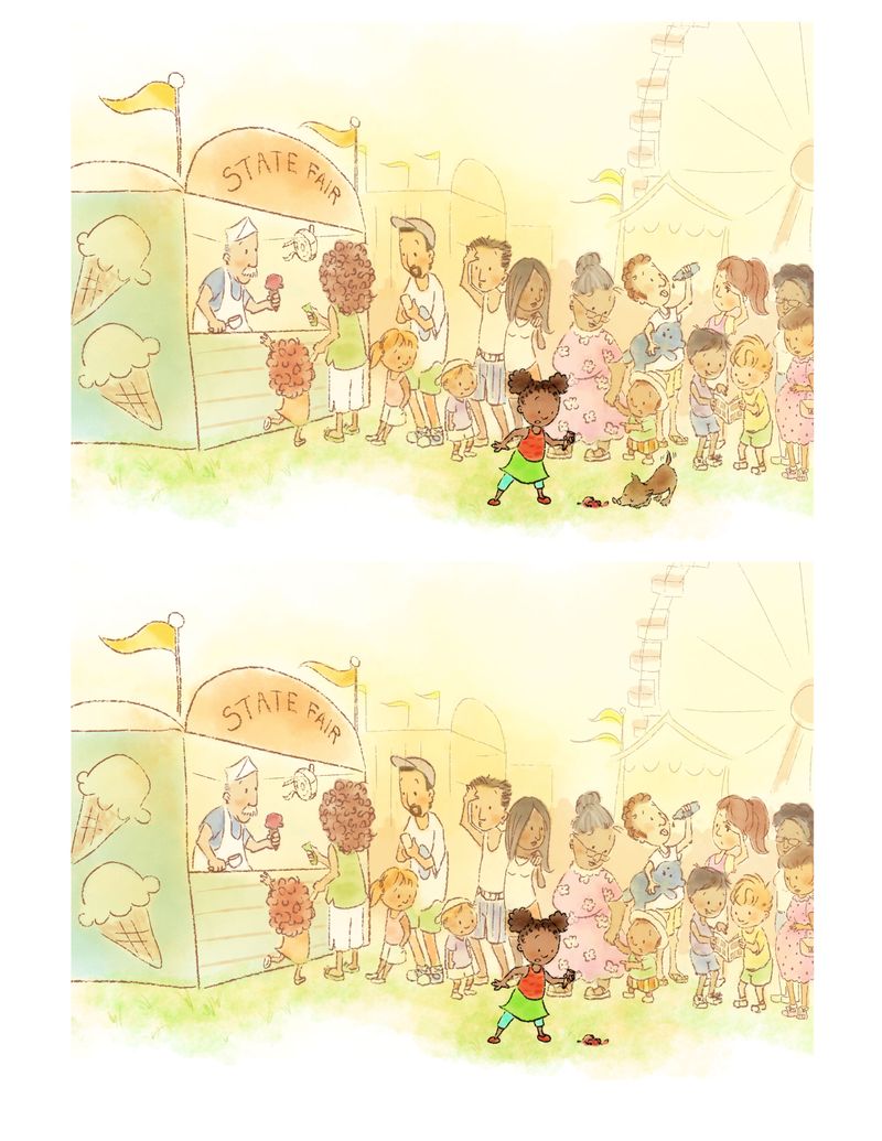
Okay, with the dog, or without?
