Book Illustrations critique
-
Hi everyone, I've just joined yesterday and I'm taking Creative Composition classes, I'm loving it, I've learned a lot already on the third video...
I'm currently working on a children's book and since it's
my first I'm having a lot of challenges and strugles, there are some pages that I like others... I don't know, stuff isn't working.
I'd really appreciate if you could give me some advices and opinions about it, I'm posting some pages... Thanks in advance!
Camila

 ") ...... I like the old school feel of these too and agree that your ability with the medium is very good
...... I like the old school feel of these too and agree that your ability with the medium is very good -
@Charlie-Eve-Ryan Thank you so much!

@Rob-Smith Thanks Rob!
@Kevin-Longueil Hi Kevin, thank you very much for the critique, I wanted to know if was too obvious that I used photoshop in the main character face, I was afraid it looked like I "cheated" too much hehe.
It's true, OMG, it's so hard to make the girl look the same in the whole book, a teacher told me that some artists contract models to take pictures ehhehe, it's a lot of work but maybe it's worth. -
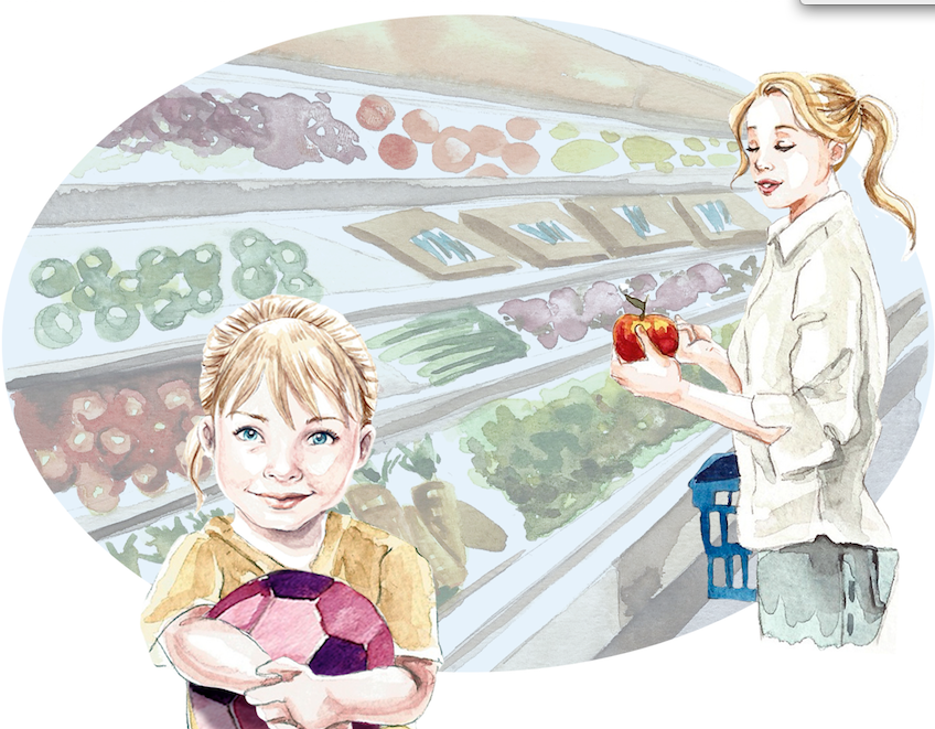
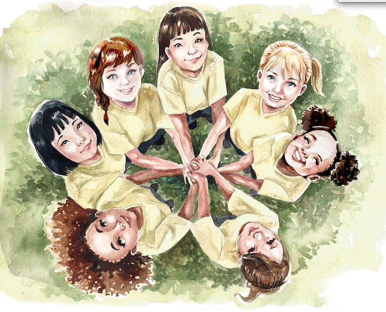
@Camila-Picheco Hi Camila, the style and compositions are really nice and have a classical 'feel'. I just love watercolor! There is one small thing that I notice, that is the ball is drawing so much attention, because of the color. It distracts from the nice girls. Very very nice!
-
@Leontine yes!! it's true, I didn't notice it... I'll fix. Thank you!
-
I'm always amazed by water color and what others can do with it! The faces of the girls are so sweet and delightful! I agree that it's got a classic feel to the style though, it think I get that feeling mostly from the first picture. The first seems a little too washed out when placed next to the others, and I'd like to see a little less contrast there.
Great work, and good luck on your first book!
-
Nice. Thank you for the comment.
-
I think your watercolor is lovely! I like your composition as well however there is something about the first image does not have the quality you have done to the other 3. I think it's the value differences. Anyway I really like your watercolor paintings!